Let’s get creative! Delve into your artistic skills and transform your plain space into a dazzling home to relax and entertain. Choosing the best colours to use throughout your home may be a tough decision to make. However, taking inspiration from others, considering light, planning each room and then applying your chosen colour scheme will help to brighten your rooms and reflect your personal taste. No matter whether you own a house in Edinburgh or rent an apartment in Liverpool City centre, adding your own flair and colour scheme is a great way to turn your house into a home, discover more.
Find inspiration
When choosing the best colours to use throughout your home, it’s important to consider favourite colours that would be deemed appealing first. This will vary for each person and household and there is not one definitive answer. It can be a daunting decision to make, as there are so many different colour schemes to choose from, from oranges and reds to blacks and greys.
It’s important to do a bit of research, take inspiration from a piece of artwork you love, a beautifully patterned piece of fabric, interior design magazines and images you see online. Doing so will help to give a clearer picture of what it is you truly want to achieve aesthetically in each room. Also, ordering and playing around with colour and fabric swatches is a great way to compare colours in the comfort of your own home.
Consider how lighting affects colour
Colours are a reflection of light and therefore lighting impacts a colour scheme massively. Under one type of lighting, such as in a bright and airy room, a colour may look completely different in comparison to a darker room. It’s important to keep this in mind, this is where testing out colours with swatches comes in very handy. Compare them in both daylight and at nighttime with artificial light to get a better idea of the true colour. Natural light changes dramatically in a 24 hour period, offering a spectrum of colours, as it changes from sunrise to sunset.
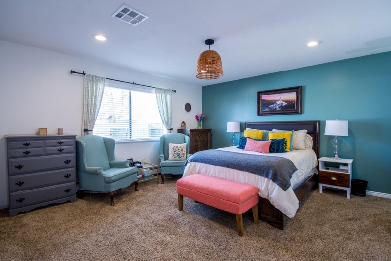
If a room is mostly only used before sunrise or after sunset, then choose colours that will look good under the lighting used in the room. White lighting gives a brighter look and feel, whilst more yellow lighting gives a warmer, cosier feel to the room. Understanding undertones will help in choosing the correct lighting for a particular colour scheme. Warm colours often have undertones of red, yellow or orange, whereas cool colours have undertones of purple, green or blue.
Plan each rooms colour scheme
Before picking up a paintbrush and getting carried away painting your entire home, why not sit down and plan it out first. Take it step by step, room by room and consider the best colour scheme for each room, depending on its lighting, size and functionality. Now that you have been inspired by colour swatches, interior designers, home images and assessed each room’s lighting, you should feel in a happier position to pick your colours. Another thing to consider is how the rooms flow into each other and the mood that is being depicted. For ease, a similar colour scheme could be used throughout the entire home, just in different proportions. For example, a neutral colour in the living room with green accessories and then green walls in the dining room with neutral accessories.
For a kitchen, a bright and airy scheme is a popular choice and for a living room, a scheme with warm undertones is often used. Again, this will completely depend on personal preference. If you are new to interior design, then it may be a bold move to experiment with intense colours straight away. Why not start with one or two neutral colours and then bring in a pop of colour one by one. There are several types of colour schemes, these include:
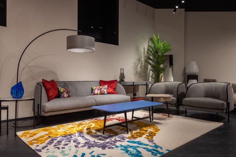
- Monochrome: this colour scheme is created by using different tones of one colour, for example light and dark reds. The monochrome you select will depend on the colour, rooms orientation, size and lighting.
- Complementary: if your taste is bold and creative, then a complementary design may be the one for you. This consists of two opposite colours, such as red and green, creating a wow factor for guests.
- Analogous: this is where a primary colour would be chosen, such as blue and then it would be matched with hues surrounding it, creating a soothing palette.
- Contrast: this provides a dramatic contrast in colours using the triadic method, using three colours that are in equal distance from each other on the colour wheel. This often takes a lot of experimentation in order to get the right balance.
How to apply each colour scheme
When adding colour to any room, this doesn’t mean it has to last forever. If you are someone who changes their mind a lot then opting for a neutral background and then simply adding and removing different colours through accessories may be a good idea. Once the walls have been painted and the carpet chosen, then it’s time for the fun part, which is adding accessories and furniture.
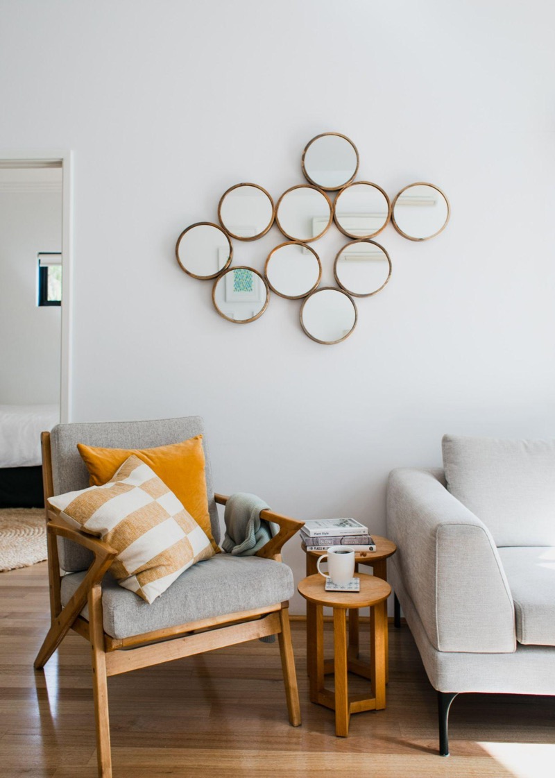
Textiles and fabrics such as throws, pillows and rugs are the perfect way to add colour, texture and pattern into a home. As well as this, plants can add to a colour scheme, for example, if the walls have been painted in pastel green, then a dark green plant will make for a great contrast.
Artwork should also be used to enhance the colours used throughout your home, if a neutral environment has been chosen then subtle designs and soft tones could be used within the artwork to blend in. Or if the aim is to stand out, then bold colours and striking lines would be optimal.
Now you have an idea of what colours to add throughout your home, are you ready to get started? Remember that interior choices are highly subjective, meaning there is no right or wrong colour scheme. It’s all about what feels right for you and your home.