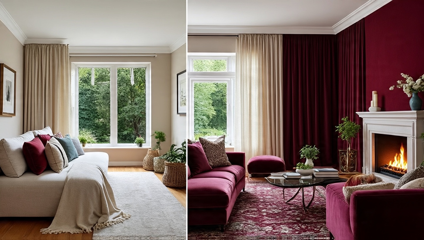
Colors are not just decoration they are atmosphere. I’ve walked into rooms where a soft sand-colored plaster felt like an exhale, and others where a sapphire velvet sofa lit up the space like fireflies in the night. Both worked. Both told a story. The question is: which story fits your life right now?
If you’ve been torn between the calm of neutrals and the drama of jewel tones, you’re not alone. Clients ask me this all the time. The truth is, there’s no single “right” palette. But there are principles, trade-offs, and very real sensations you should consider. Let me walk you through them, weaving in both technical notes and lived experiences from decades of practice.
Think of this as less of a manual and more of a conversation part design guide, part personal journal, with enough technical meat to ground the inspiration.
1. Why the Palette Decision Feels So Personal
Choosing a palette is like choosing your morning rhythm. Do you want calm tea or a sharp espresso? Neutrals soothe, jewel tones awaken. The decision has less to do with trends and more to do with your daily rituals.
Designer’s Note
I once advised a client who meditated every morning to stick with neutrals. She later told me the creamy walls felt like part of her breathwork. Compare that with a musician client who went with ruby curtains their living room became an extension of their stage.
2. Boho Neutrals: Calm, Airy, and Forgiving
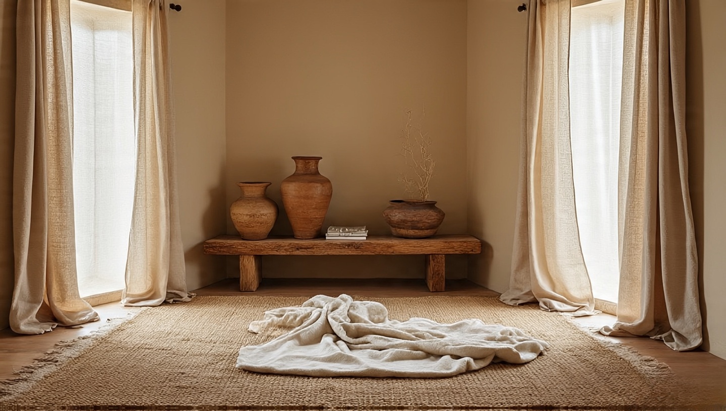
Neutrals are sandy beiges, warm taupes, soft whites, and pale grays. They expand space visually and allow textures to shine.
Materials & Finishes
- Linen curtains: breathable, durable, light diffusion.
- Jute rugs: grounding, inexpensive, wear-resistant.
- Plaster walls: tactile, natural variations add warmth.
Common Mistake
Flatness from too many smooth surfaces. Fix it by adding woven throws, unfinished wood, or pottery.
Check how materials pair with neutrals in this guide on bohemian palettes.
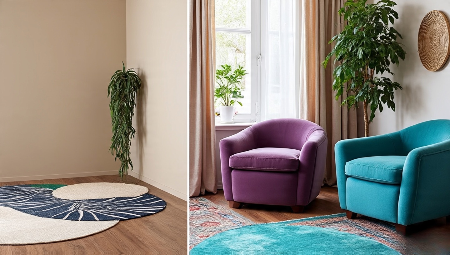
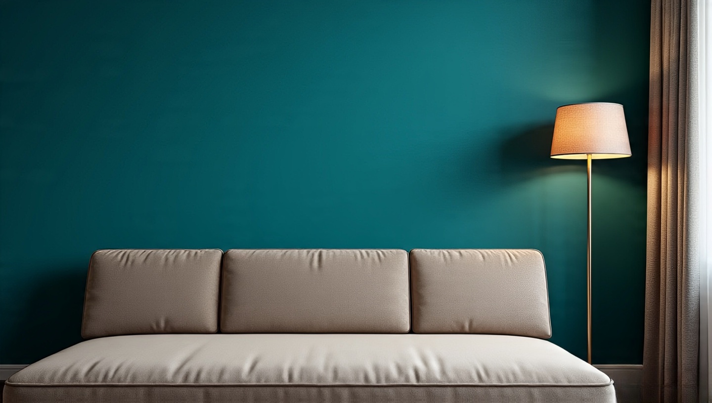
3. Jewel Tones: Bold, Luxurious, and Expressive
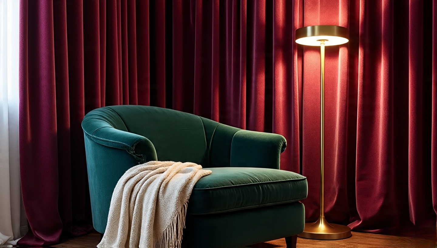
Sapphire, emerald, ruby, and amethyst these tones have gravity. They anchor a space instantly.
Lighting & Climate Considerations
Test colors in both daylight and artificial light. A teal wall might look aquatic in sunlight but moody and intimate by lamplight.
Common Mistake
Choosing jewel tones without light tests. Fix it by painting large swatches and observing over 48 hours.
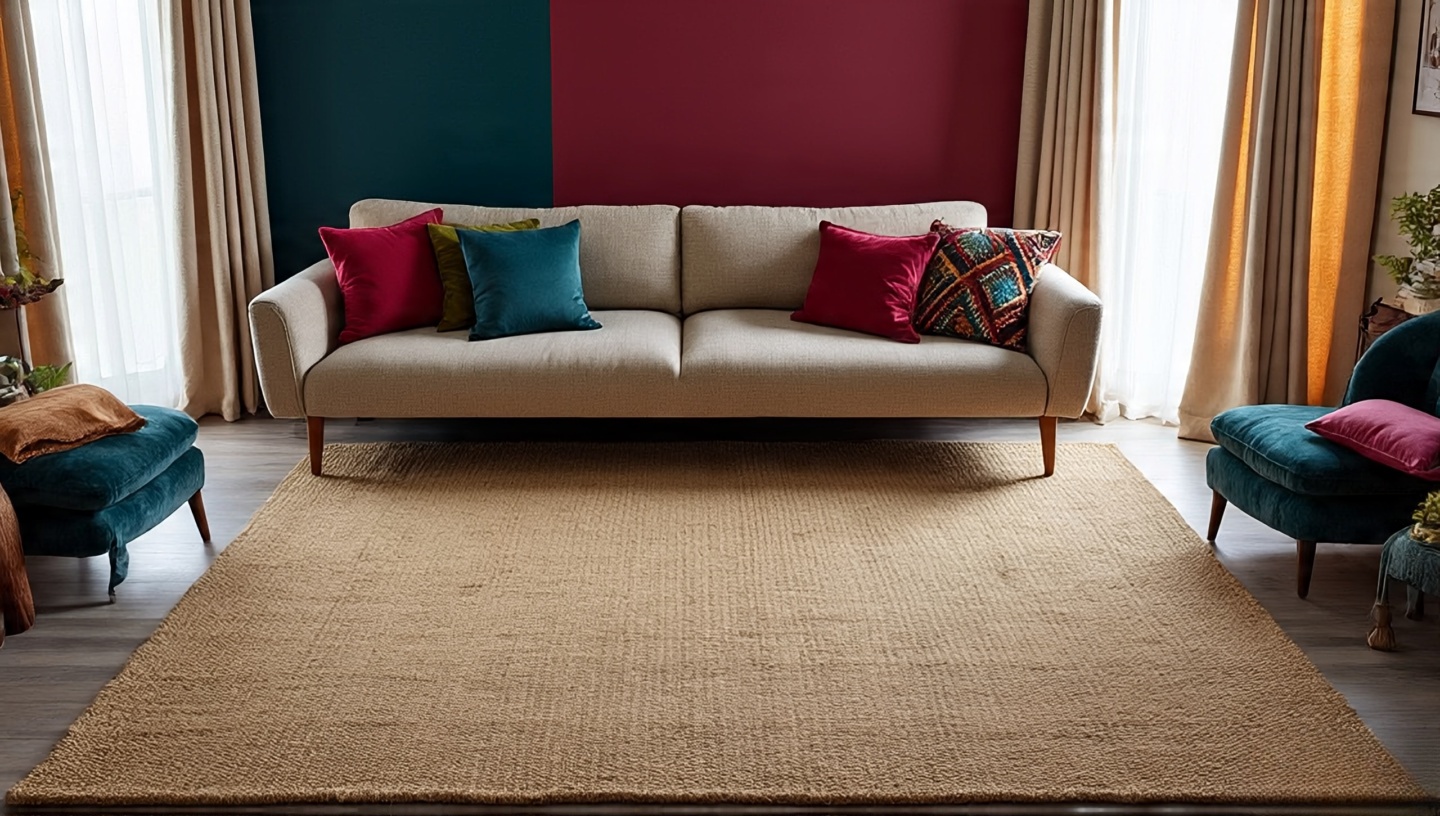
4. How Neutrals and Jewel Tones Play Together
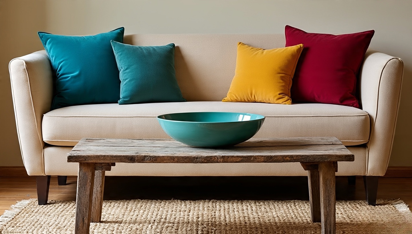
You don’t need to choose exclusively. Neutrals calm, jewel tones energize. Together, they create rhythm.
Decision Framework
- Base Neutral + Accent Jewel: Most balanced; easy to update.
- Base Jewel + Neutral Relief: Dramatic; works in large, well-lit rooms.
- 50/50 Split: High risk of clutter; only for skilled layering.
5. Sensory Reflections: How Each Palette Feels
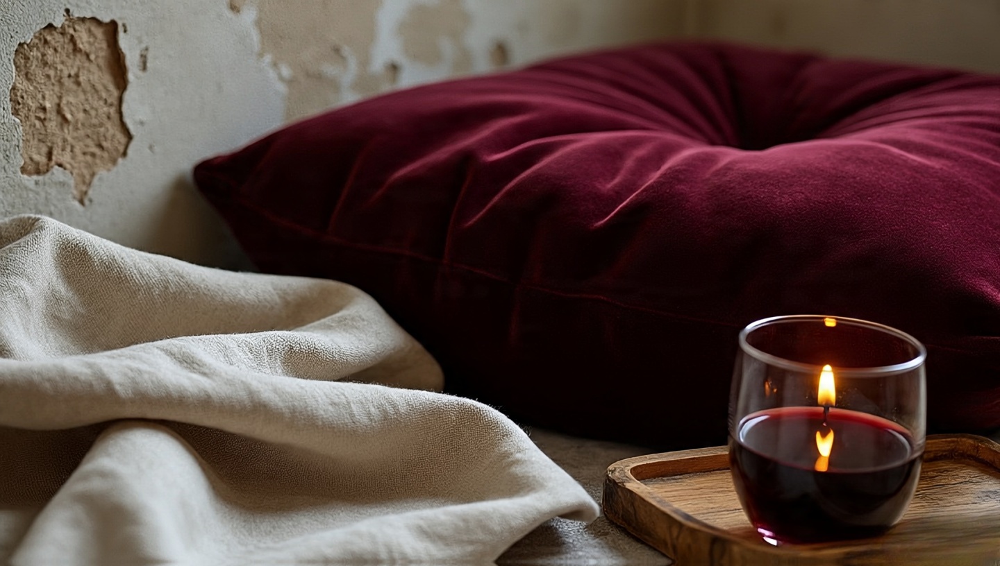
Neutrals: sunlight through linen, warm sand, candlelight on plaster. Jewel tones: velvet under fingertips, red wine aroma, antique jewelry weight. Which do you want greeting you after a long day?
Homes are lived in with bodies, not just eyes. Always test how a palette makes you feel physically.
6. Dimensions & Clearances in Practice
Neutral Applications
- Wall colors: light reflectance value (LRV) 70–85 for small rooms.
- Rug sizing: extend at least 18 inches beyond sofa edges.
Jewel Applications
- Accent walls: best under 12 feet wide unless room has ample light.
- Curtains: jewel tones should puddle slightly to enhance drama.
7. Cost & Value Considerations
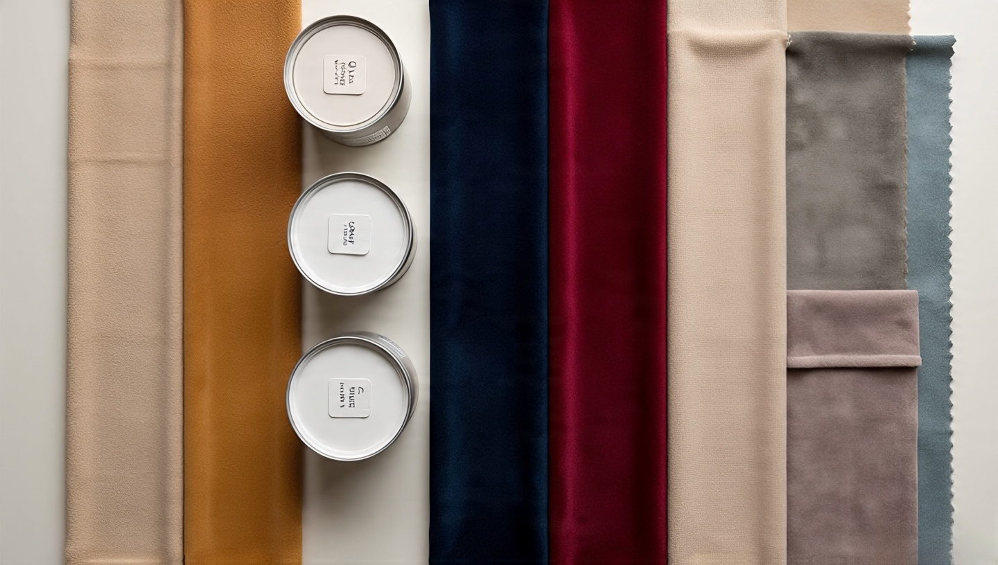
Neutrals often cost less because they use standard paints and fabrics. Jewel tones sometimes require custom dyeing or higher-quality finishes to maintain richness over time.
- Neutrals: $25–50 per gallon paint; fade-resistant.
- Jewel tones: $50–90 per gallon; touch-ups more obvious.
Designer’s Tip: Budget for professional application with jewel tones streaks show more easily.
8. Common Mistakes and How to Fix Them
Mistake: Overloading Neutrals
Fix: Add pattern and texture. Layer rugs, baskets, and handmade art.
Mistake: Jewel Tone Saturation
Fix: Balance with greenery, natural woods, or sandy ceramics.
9. Art, Décor, and Gallery Walls
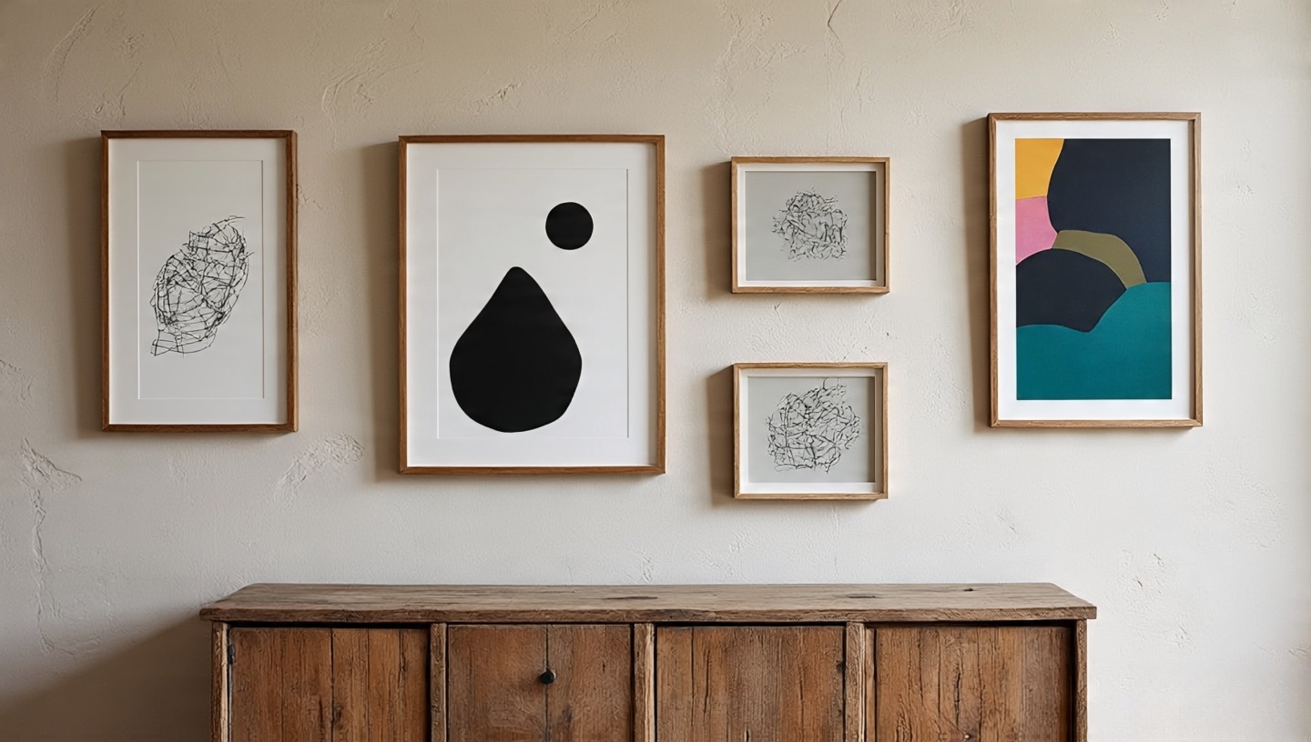
Art resolves tension between palettes. Jewel-toned prints on neutral walls sing, while earthy sketches tame bold walls. Explore this guide on boho gallery walls for layout ideas.
10. A Decision Checklist for You
- What mood do you want daily calm or energetic?
- How much natural light does your room get?
- What’s your budget for paints and textiles?
- Do you want flexibility to change accents easily?
Try one experiment first maybe a neutral rug or a jewel-toned vase. Live with it. Your instincts will guide the rest.
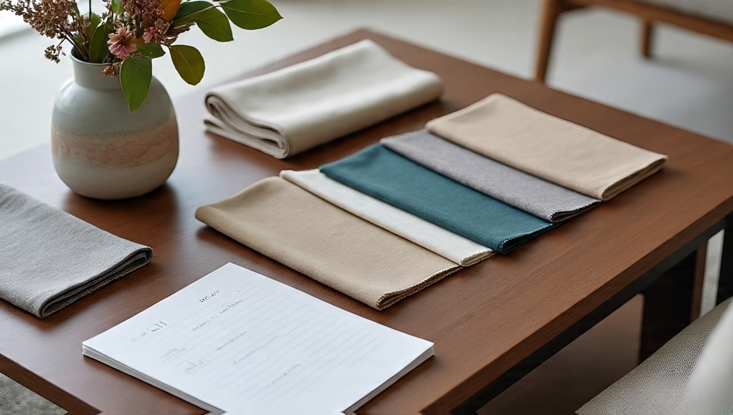
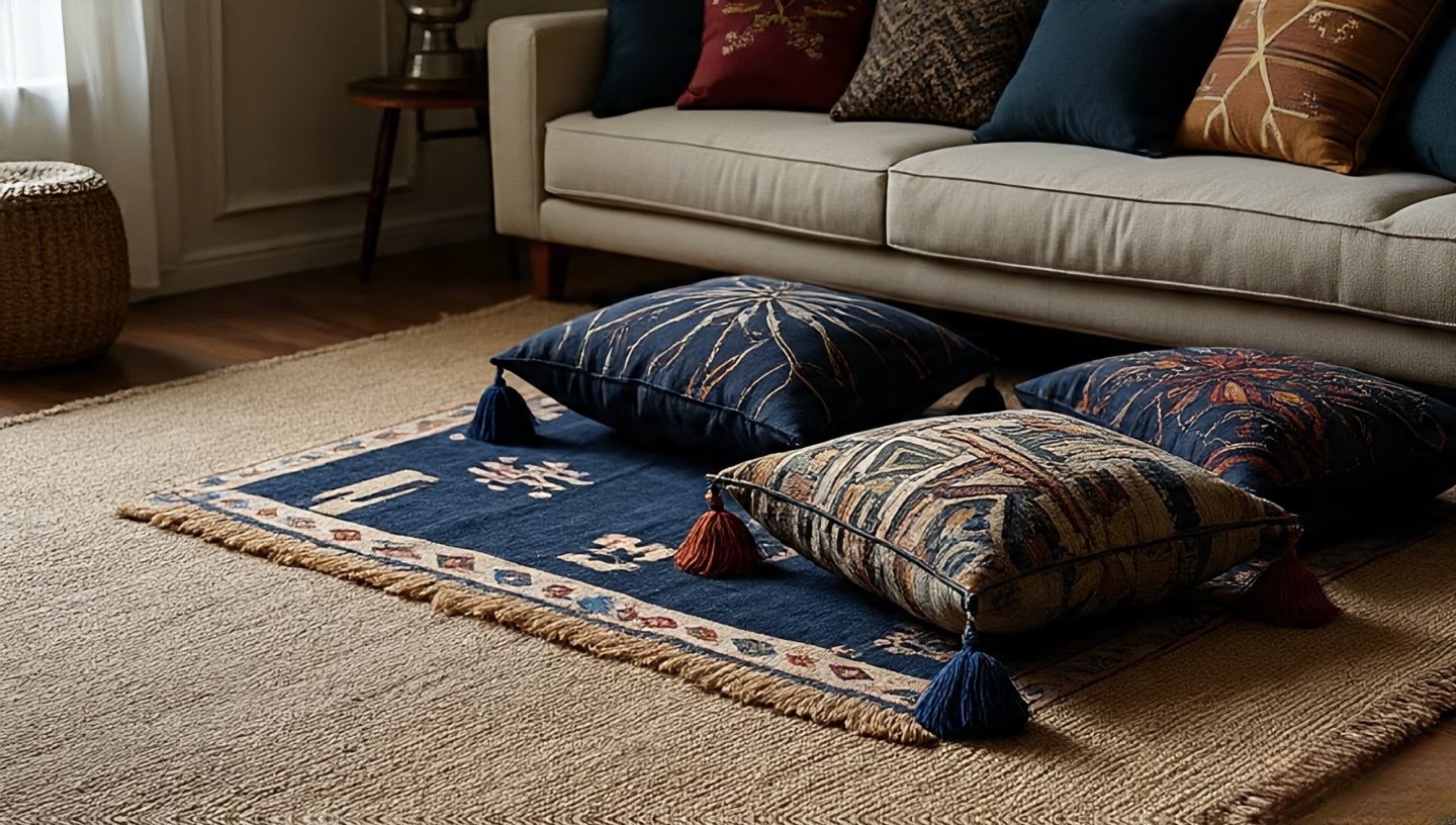
11. Layering Textiles: Where Palettes Come Alive
Boho design without textiles is like music without rhythm. The choice between neutrals and jewel tones often becomes most visible in throws, pillows, and rugs. Neutrals lean into texture linen, cotton, wool while jewel tones lean into saturation velvet, silk, heavy knits.
Designer’s Note
I once worked on a loft in Jakarta where the client insisted on only white walls. The magic came when we layered an indigo kilim over a jute base and added mustard cushions. Suddenly, the space had depth without changing a single wall color.
12. Lighting: The Hidden Palette Shaper
Light is the unseen paintbrush in your room. Neutrals reflect and amplify it, while jewel tones absorb and transform it.
Practical Tips
- Natural light: South-facing windows intensify jewel tones; north-facing windows soften neutrals.
- Artificial light: Warm bulbs (2700K) enrich jewel tones, while cool bulbs (4000K+) keep neutrals crisp.
Mistake & Fix
Mistake: Choosing a jewel tone under showroom lighting and hating it at home. Fix: Always test with your actual bulbs.
13. Seasonal Shifts: Adapting Palettes Year-Round
One advantage of neutrals is their adaptability. Jewel tones, on the other hand, can feel too heavy in tropical heat or too sparse in winter unless adjusted.
- Summer: Layer lightweight linen throws over jewel-toned furniture.
- Winter: Add jewel-toned velvet curtains to a neutral room for warmth.
14. Floors and Ceilings: The Overlooked Palette Anchors
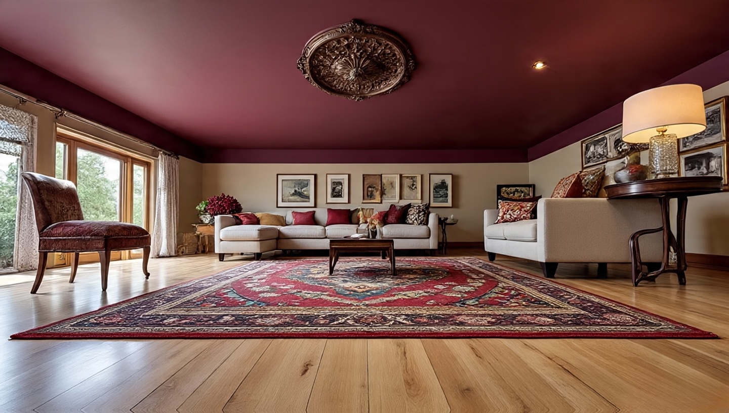
Many homeowners think only about walls, but floors and ceilings carry equal weight in palette balance.
Materials
- Neutral floors: Light oak or polished concrete expand visual space.
- Jewel accents: Moroccan rugs or painted ceiling medallions bring drama upward.
Designer’s Note
I once painted a ceiling in deep plum for a reading nook. It surprised everyone, but the room became cocoon-like and irresistible at night.
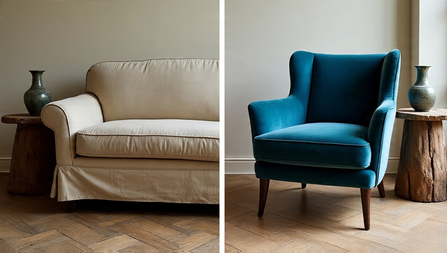
15. Furniture: Choosing the Right Statement Pieces
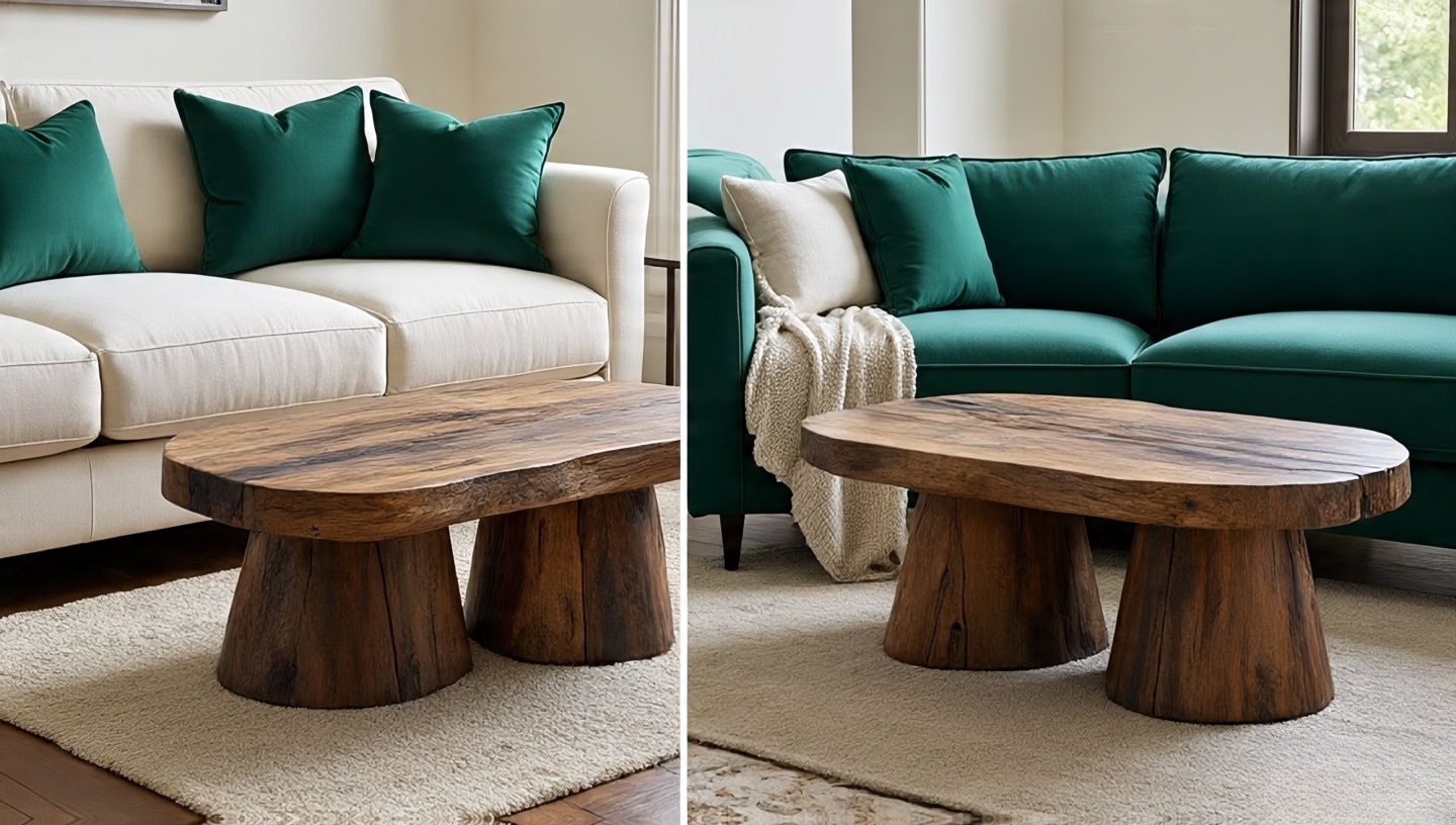
Large furniture pieces act like anchors. A neutral sofa invites rotation of colorful accents. A jewel-toned sofa demands loyalty it’s the star.
Decision Matrix
- Neutral sofa + Jewel accents: Flexible, budget-friendly.
- Jewel sofa + Neutral surrounds: Dramatic, harder to swap later.
16. Plants and Greenery: The Bridge Between Worlds
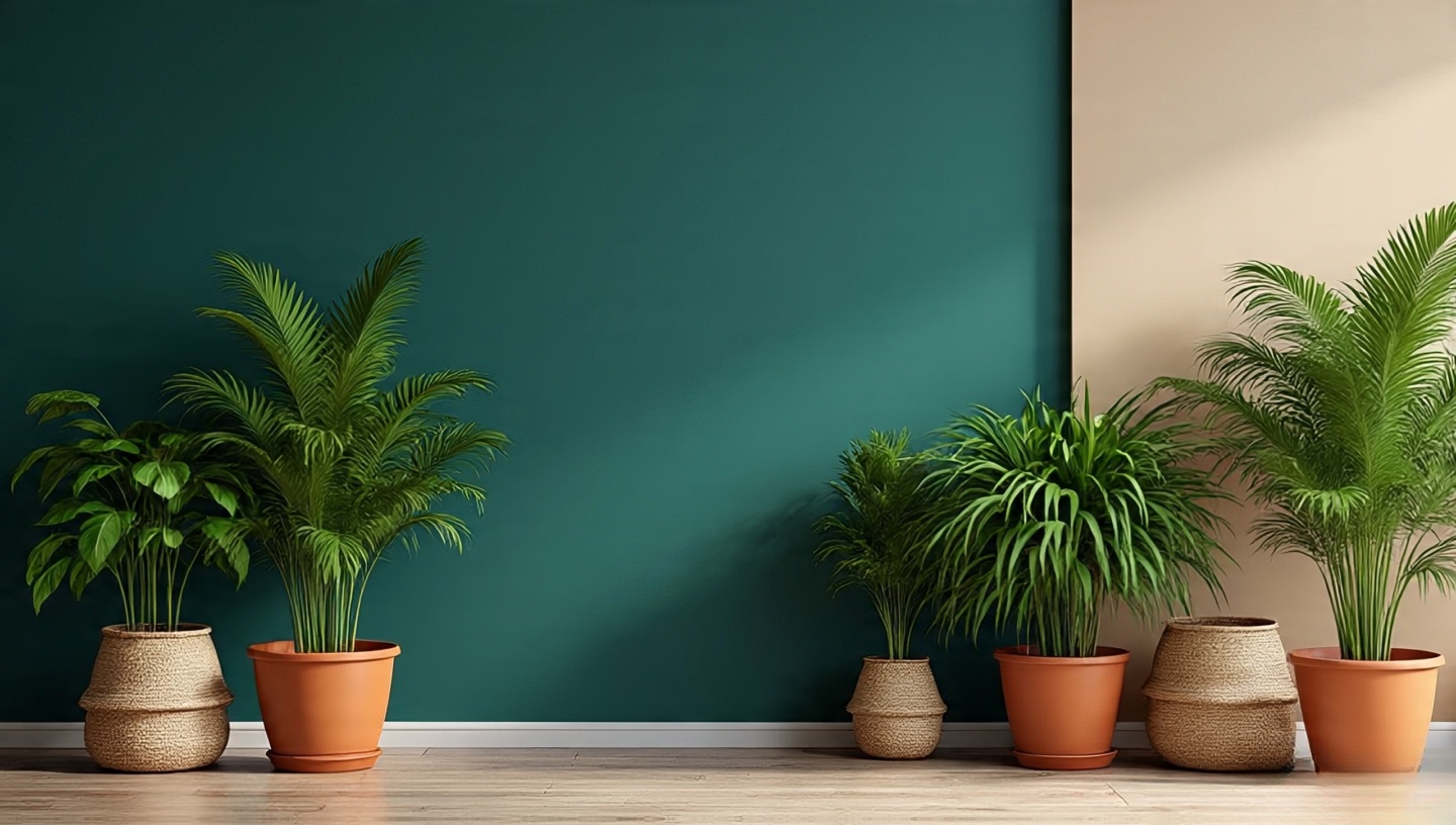
Plants are the diplomat between neutrals and jewel tones. Their organic greens soften intensity and enliven quiet palettes.
- Against neutrals: plants bring freshness and contrast.
- Against jewel tones: they prevent heaviness and echo natural vibrancy.
Mistake & Fix
Mistake: Using faux plants in jewel-toned rooms. Fix: Go real deep greens against emerald walls create harmony.
17. Accessories and Décor: The Low-Risk Experiments
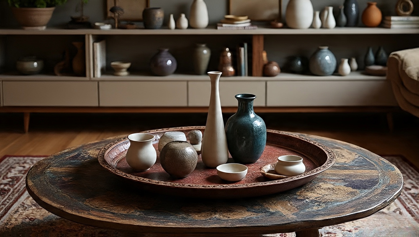
If you’re hesitant, décor is your testing ground. Vases, trays, and books are inexpensive and easy to rotate seasonally.
Practical Tip
Use a tray in a jewel tone on a neutral coffee table. Add a neutral vase to a jewel-toned bookshelf. Let accessories dance between palettes.
18. Budgeting for Change
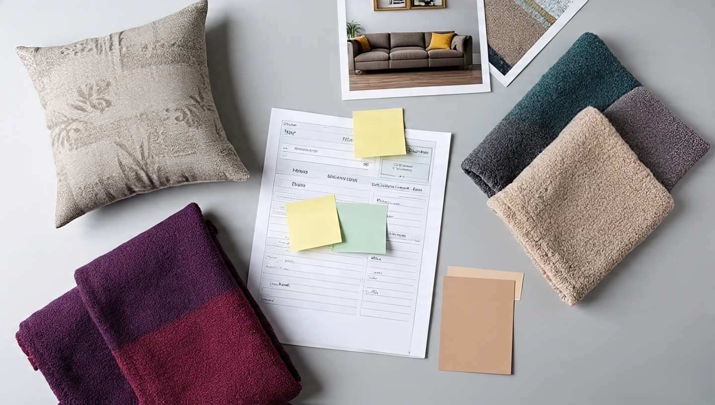
Design is not static. Life changes new jobs, kids, pets. Your palette should be flexible enough to evolve.
- Low-cost swaps: Pillow covers ($20–40), throws ($50–100).
- Medium-cost swaps: Rugs ($300–600), curtains ($200–400).
- High-commitment: Sofa ($1,000+), wall paint ($300–600 with labor).
Designer’s Note: Always leave 10–15% of your budget unassigned. It’s the cushion for unexpected needs or irresistible finds.
19. Cultural and Personal References
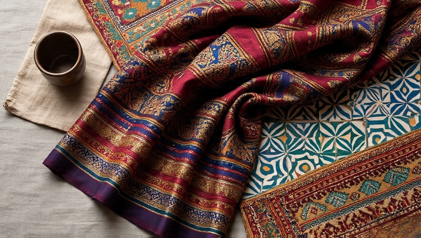
Jewel tones often recall cultural richness Indian saris, Moroccan tiles, Ottoman tapestries. Neutrals lean into global minimalism Scandinavian calm, Japanese wabi-sabi. Choosing a palette is also choosing which cultural echoes you invite home.
Your home should feel like your passport, stamped with places and stories that resonate with you, not just Pinterest trends.
20. The Long-Term Life of Palettes
Durability matters. Neutrals tend to age gracefully, fading softly. Jewel tones risk visible fading but can feel timeless when refreshed with new accents.
Maintenance Tips
- Use UV-protective finishes for jewel-toned fabrics.
- Choose washable slipcovers in neutral shades for longevity.
Final Reflections
After three decades of watching spaces transform, I’ve learned that no palette is permanent. Homes are living organisms; they shift as you shift. Neutrals will always give you a soft foundation. Jewel tones will always tempt you with drama. The real magic happens in the balance you craft.
If you’re still unsure, start small. Light a candle in a jewel-toned holder on your neutral table. Or roll out a sandy rug under your bold sofa. Listen to how your body reacts. The right palette won’t just look good it will feel like a sigh of relief when you walk in the door.
Closing Checklist
- Does your room get enough natural light for jewel tones?
- Do you crave calm or stimulation in daily rituals?
- What’s your swap-out budget for seasonal or future changes?
- Do you want your palette to whisper or to sing?
Take one step this week. Swap a pillow, hang a throw, buy that vase. Let your room speak back to you it will tell you what it wants next.
Quick Comparison Table: Boho Neutrals vs. Jewel Tones
| Aspect | Boho Neutrals | Jewel Tones |
|---|---|---|
| Mood & Feel | Calm, airy, grounding; like sunlight on linen | Bold, dramatic, luxurious; like velvet at night |
| Best Use | Base palettes, small spaces, flexible layering | Accent walls, statement furniture, curated art |
| Materials That Shine | Linen, jute, plaster, unfinished woods | Velvet, silk, brass, saturated ceramics |
| Lighting Response | Reflects light, brightens spaces | Absorbs/changes with light, more moody |
| Maintenance | Ages softly, stains may blend easier | Can fade with UV; needs protective finishes |
| Budget Impact | Generally more affordable, easy to update | Higher paint/fabric cost; harder to swap |
| Design Flexibility | Easy to change accents seasonally | More permanent; big impact, less flexible |
Designer’s Note: Most successful boho interiors I’ve seen combine both neutrals as the rhythm, jewel tones as the melody.