Redecorate Your Luxury Rental Apartment Using Color Theory
The beautiful design never goes without a cohesive color flow. Harmonious use of color ensures a positive visual experience as it satisfies our craving for aesthetics.
Deliberately or subconsciously, people will judge interior design on colors — and you can change their and your own perception of what your apartment is about. Luxury can be expressed with gold and glitter, sure, but it also often stems from the atmosphere in the place, the feeling. And colors matter a great deal for that vibe.
Explore Your Choices
Adjoining rooms of one apartment with clashing colors would have undesirable effects. Use a color scheme that will create a flow between rooms and unite all spaces of your apartment into one aesthetic unit. The best way to decide on a color palette is to make up your mind on what effect you’re going to create and how to accomplish it. This is where color psychology comes into play.
The color red is associated with emotions in its entirety. Red in the interior adds vigor and excitement to the space — love, desire, passion, intensity. Black is the color of versatility and elegance that can be a particularly excellent addition to interior design in any room. Brown is a color of reassuring essence resembling softness, coziness, and security.
If you’re not sure what color to use, search for inspiration in magazines, websites, and books on design. Pinterest can serve as an excellent source of inspiration too. Choose one unifying color that will serve as a background or accent in rooms. When you’re in the planning stage, view adjoining rooms in a complex, not as separate structures.
Choose a Basic Scheme
Monochromatic, analogous, and complementary colors are three basic color schemes. Each of them has its own effect — plan a color scheme carefully. Think not only about color combinations but what atmosphere they will create in every room. Here are the basic color schemes and ways to implement them in the interior.
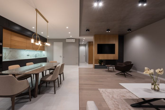
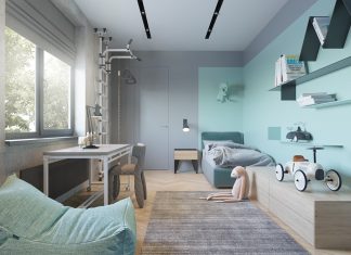
- Monochromatic Colors. A monochromatic color palette is the combination of different shades of the same color. The best options are hues of colors from grey and brown families. Apply different shades of one color on the areas you’re trying to bridge. Monochromatic colors are a popular choice since it lets create a coherent style and vary the looks of the room. Change accessories and accents to add a special accent to each room or leave the monochrome play solo adding elegance to it.
- Analogous Colors. These are two-three colors located to each other in a color wheel. A golden rule of using analogous colors to create a cohesive style of the room is to choose only one dominant color. The other is used to enhance the effect. Choosing two dominant colors will make them fight for attention and cancel each other out. Be careful with the number of colors you combine, especially when there’s a small space to paint. Three colors in this case are the limit. Some of the good examples are the combination of rose with peach and blue with violet.
- Complementary Colors. Complementary colors are those placed on the opposite sides of a color wheel. Uniting such colors in one interior would create a vivacious and stimulating environment. Complementary colors set off and enhance the temperature of each other, adding dynamics to décor. A good example of a complementary scheme in practice is warm shades against cold colors or adding accessories to contrast and highlight the color of the walls.
Tourists often choose their apartments by color schemes. Rent luxury properties and get an aesthetic experience not only from living in a beautiful city but also from resting within an apartment that radiates class. Or — redecorate your rental taking inspiration from the luxurious color schemes — take note of what colors are expensive, unique brands are using, what’s the word on color in high fashion, etc.
Choose Your Home Pallette
Your home palette should consist of three to five favorite colors that look good once combined. See if the colors you’re about to use match. This can be done by painting small areas on the wall to see how colors interact with each other.
To facilitate the “torture of choice”, here are a few universal color combinations that work in every design:
- Blue+White
- Black+Orange
- Grey+White+Black
- Blush Pink + Black
- White + Pops of Color.
Decide what color or hue works best as the background color and what is better to use as an accent across all the adjoining rooms. Don’t forget about furnishings and textures especially when you’re using similar shades across the space. Silky and wool blankets, plants, ceramic and wood elements would add special charm to your interior.
Create Your Color Flow
The smoothest transitions are achieved by combining two closely related colors or hues. If the open spaces of your apartment are not separated by doors or other partitions, use monochromic combinations. Choose one color as a prominent one and paint another room in the same color but in a few shades lighter or darker.
When implementing complementary or analogous color schemes, make sure the same color tone echoes in all rooms. The key moment when working with these schemes is to transit colors from one area to another.
Of course, before redecorating your apartment, don’t forget to negotiate the changes with your landlord — otherwise, there might be trouble.
