

Minimalist kitchens can organise daily tasks in very different ways. This gallery focuses on the relationship between working surfaces, storage and eating space. Use it alongside measured room and appliance information; an attractive rendering cannot establish the clearance or installation requirements of a real project.
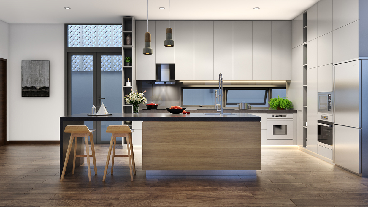
1. Place casual seating on the room-facing side
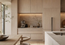
The stools sit along the front of the island while the tall storage remains behind it. That relationship keeps the visual roles clear: a working side and a room-facing seating edge. Check the actual routes and open doors before assuming the same arrangement fits a smaller room.
2. Connect a dining surface to the kitchen composition
The pale eating surface and moulded chairs belong to the same light palette as the cabinetry. A broad glazed opening adds another strong edge to the room. Decide whether you need casual seats, a full dining table or both, then measure each in use rather than only when tucked away.

3. Read the storage wall as part of the layout
Dark storage and a tall timber-toned plane sit behind a low, pale platform with integrated-looking seating. The result is more architectural than a collection of separate cupboards. Treat changes of level and built-in seating as design questions requiring proper access and construction assessment.

4. Keep the eating zone distinct without a wall
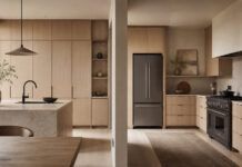
The central block, lighter cabinets and separate rug make different activities visible in one open room. This works as a zoning idea, not a reason to reduce circulation. Draw the routes between entrance, appliances and seats before deciding the size of the central furniture.

5. Coordinate an island with a large window
The long pale island and hood sit beside extensive glazing. Daylight is a benefit, but it does not decide where cooking equipment may be installed. Check extraction, opening windows, service routes and the appliance manufacturer’s requirements with the project designer.

6. Use contrast to identify the work area
A dark background makes the white island read as a separate volume. The large decorative pendant and broad window also compete for attention. Decide which element leads, and verify that task lighting still reaches the working areas rather than relying entirely on the central fitting.

7. Give the dining table its own lighting position
The timber table sits close to the pale kitchen surfaces, under a branching pendant. This creates a distinct place to eat without changing the whole palette. Compare the pendant’s size and sightlines with the table, seating and cabinet doors in their usable positions.

8. Combine a compact table with organised wall storage
Here a smaller dining setting sits next to a long work surface and open storage. The table remains recognisable as a separate activity within the kitchen. Check what will actually live on those shelves and whether daily items can be reached without crossing a busy work route.

A few images also appear in the wood-accent kitchen collection, where the comparison is about finishes. Here the useful distinction is layout. Make a shortlist by task and access first, then select the colours and materials that suit the chosen arrangement.