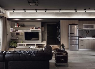
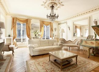
Naturally curious and social, human beings are excellent consumers for television programs based around the home. We have bonded over our seemingly inexplicable enjoyment of peeking into the domestic lives of others, and there are now thousands of episodes of shows featuring the “behind-the-scenes” and other adventures where people are buying, selling, renovating, cleaning, repairing, or otherwise modifying houses.
Regardless of the show’s premise, two elements remain constant:
1) The kitchen is almost always a critical part of the experience.
2) All of these homes have interiors and exteriors fashioned in someone’s preferred style.
Taste is subjective, and two houses are rarely, if ever, fully identical. Nevertheless, over time, trends and artistic choices have created many defined design styles that we use to help label and categorize certain looks. These look collections become pools of inspiration for those who are creating their own new, updated, renovated, or reorganized home.
When considering investing time, energy, and money into a home project, it is widely known that fixing up the kitchen provides the greatest reward for the effort. The kitchen is an integral part of the home and is often considered the gathering space, other than the living room, supporting routine activities for families of all sizes. Traditionally, it is a place where families and friends spend quality time together over good food and drinks, so the atmosphere of the space tends to be very important to the host’s tastes and intended mood and feeling.
While styles like Mediterranean, country farmhouse, contemporary, and French country are more liberal with colors and textures, often combining a variety of elements into one complex look, the sleek, modern, mid-century modern and other styles are much more minimalist.
Not everyone prefers a sleek, modern kitchen look for their own home, but for all who do, achieving this aesthetic relies on a few key design tips everyone can follow.
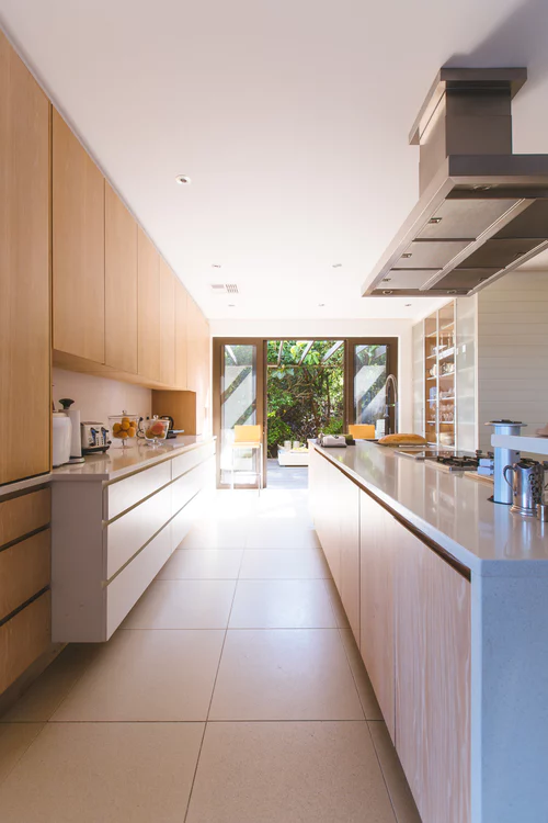
When we think of something sleek, we often think of something clean with elegant lines, and, when designing a sleek kitchen, those qualities are no less important. Bring a streamlined feel to your kitchen (regardless of its shape) by opting for linear cabinet hardware. Use long handles, often called European bar pulls. For extra visual interest, mirror hardware patterns where possible, but keep handles horizontal. Add a modern touch by choosing a handle finish like stainless steel or bamboo, depending on your kitchen’s color palette. If your kitchen already has ample length drawing the eye along (galley style, long floor boards, etc.), you may want to even opt for hardwareless cabinetry!
Whatever finishes and colors you choose, be sure to make them consistent or matching, wherever applicable. A visual trick that contributes to the success of the sleek look is the choice to make many design elements roughly the same color; for example, choosing an excellent high-gloss black dishwasher to match high-gloss black cabinetry, where all accented pieces (hardware, sconces, plumbing, and so on) are also of a matching finish, such as stainless steel, gold, bronze, white, etc.
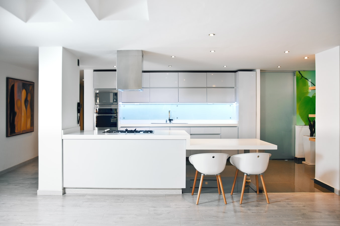
The palette for a sleek and modern kitchen should have comparatively few colors (aim for 3-5 at most), and a sleek space can be made to feel much more modern by selecting bright white as a predominant color, be it in the paint, countertops, cabinetry, or all of the above. This sharp white look is often accented by a warm element, such as grey marble backsplash, wooden fixtures, and accessories, or warm paint colors and fabrics where possible. Be careful not to mix and match too many options, as maintaining a sleek look still requires a limited, more refined color and texture palette. Try to go for a 1:1 ratio—one main color, one accent color (including options like bamboo).
Again, unlike some of its aesthetic counterparts, the sleek design rarely adds much obvious texture. Finishes, surfaces, and accessories in the space should all be predominantly slick to really emphasize a sleek look, though choices to add certain muted textures or patterns could certainly be a way to add more of a modern edge. For example, adding industrial elements or geometric patterns.
Speaking of accessories, the few that you have should be with a purpose! One of the most critical ingredients for a sleek, modern space is lack of clutter. Store or remove all appliances and items that you are not functionally using on a regular basis. For easy, neat access to the items you use frequently, find baskets or containers that fall within your chosen aesthetic and house your former “clutter” in these hideaways. Baskets and containers also work nicely for maintaining a well-ordered pantry of snacks and dry goods as well, keeping your look cohesive.
For additional storage, you can use wall-hanging accessories to clean counters and drawers free of mail, school or work papers, and receipts. Aim to maintain counters that stay as free of clutter as possible, but feel free to fill drawers and cabinets as efficiently as you can to help achieve that classically sleek and modern, which is flawlessly clean countertop on a daily basis.
Another easy place to make a dramatic impact is with your light fixtures. Choose long, flute-like pendants or line-based chandeliers to emphasize the sleek look; opt for larger, but still very clean and simple, shapes and finishes to highlight the modern look a bit more.
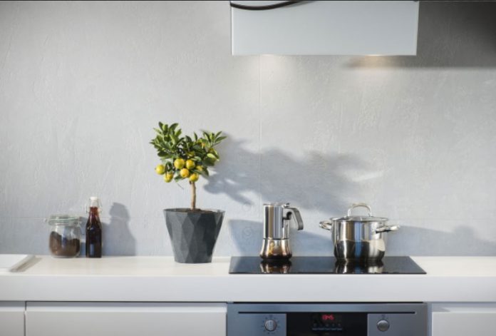
With both sleek and modern designs for kitchens, floral life of some sort is almost a staple. Growing herbs, setting up terrariums, displaying succulents, or showcasing a simple flower arrangement is common to help bring some warmth and life to these types of spaces, which can potentially look a bit sterile after removing as much as possible from the countertops, cabinet faces, and refrigerator front. Whatever plant option is preferred, just remember to apply the same rules when incorporating clean lines, no clutter, and nothing that sticks out too drastically. A single-flower look (like an orchid) is a beautiful and fresh option for a more modern, bright white kitchen, while rich green succulents in glass globes enhance a darker, sleek look without creating a sensation of disarray.
Whether you are looking for a big or a small design project, remember that simplifying is a huge step in achieving a sleek, modern kitchen. Clean away as much excess as you can and dial back to just a few colors and no competing patterns or textures that overtly grab the eye. Accentuate length by drawing the eye horizontally, favoring a sleek look. You can change out hardware and light fixtures, or perhaps even install a muted, long-tile backsplash. If it’s in your plan, choose appliances that match each other and their surroundings as much as possible, in coloring or paneling. When, your space starts to feel too sparse or too chilly, cozy it up with warm accent colors or plant life that matches your aesthetic.
Happy designing!
Resources: Living Spaces, Apartment Therapy
