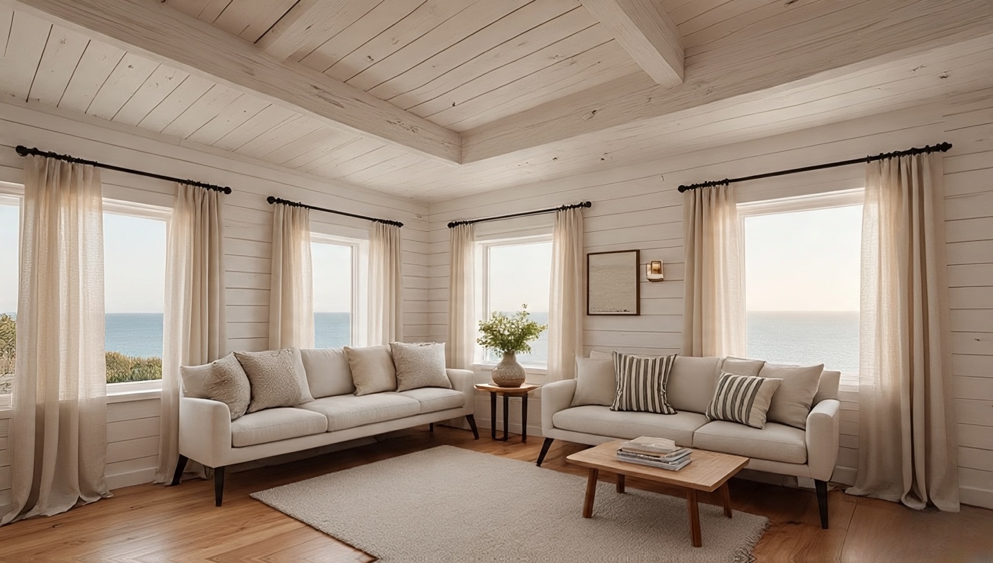
Roohome.com – Bohemian style isn’t about rules it’s about feelings. The warmth of worn wood under your feet, the shimmer of hammered brass catching candlelight, the way a tapestry smells faintly of earth and dye. I’ve lived with these materials, mixed them in clumsy ways at first, and slowly learned which ones dance together and which ones argue. The fun is in the layering. In this guide, I’ll share my top 20 palettes of color and material that shape a Boho home into something soulful, textured, and very alive.
If you’re new to Boho style, I recommend also checking out this complete guide to Bohemian interiors or exploring 48 Bohemian bedroom ideas for even more inspiration. But right now, let’s dig into colors, woods, metals, and fabrics that really sing.
1. Earthy Ochres and Sun-Baked Clay
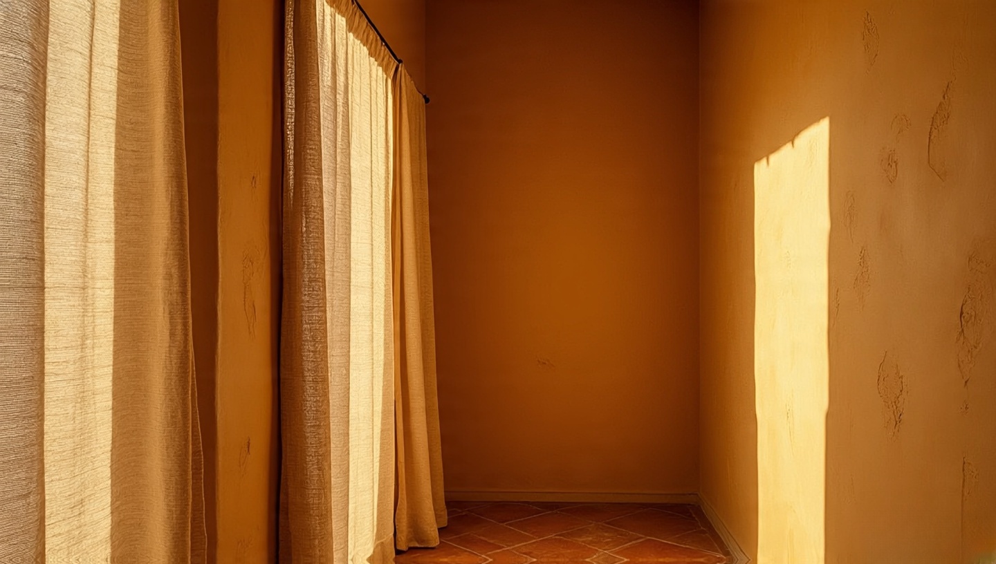 I once painted a narrow hallway with ochre limewash, and every morning it looked like desert light had spilled indoors. These colors muted yet radiant do more than decorate; they steady you. My advice: avoid synthetic gloss. Choose clay-based paints or textured finishes so the wall feels alive under your hand. And pair it with rough linen curtains; the combination grounds the space like stone meeting fabric.
2. The Dark Romance of Mahogany
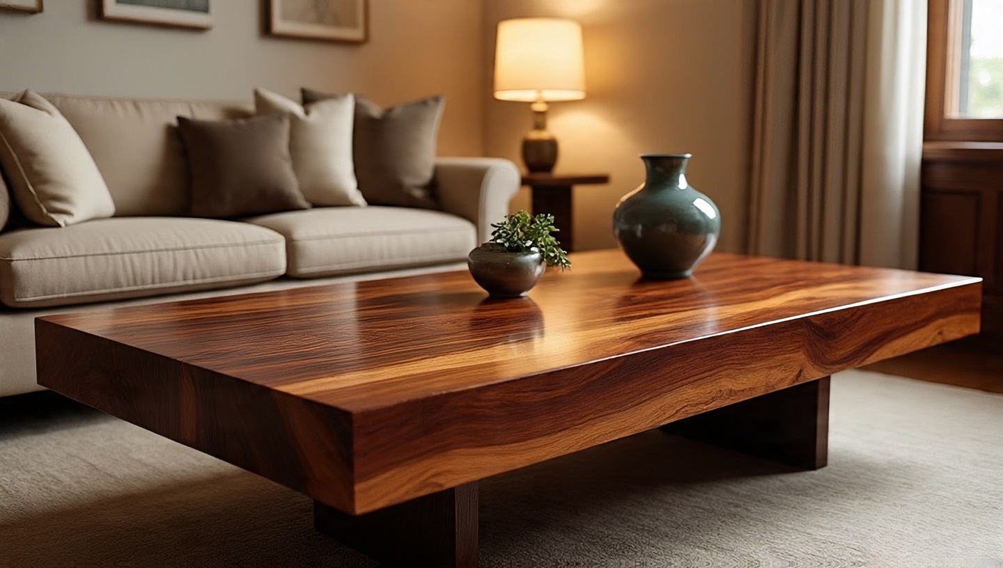 Mahogany is a conversation starter. Its reddish undertones warm a room without needing much else. In one project, I placed a mahogany coffee table in a pale room and watched it command respect, like an anchor. But here’s the trick: don’t lacquer it to perfection. Allow the wood’s natural pores to show imperfections make it approachable rather than intimidating.
3. Indigo Textiles That Whisper of Travel
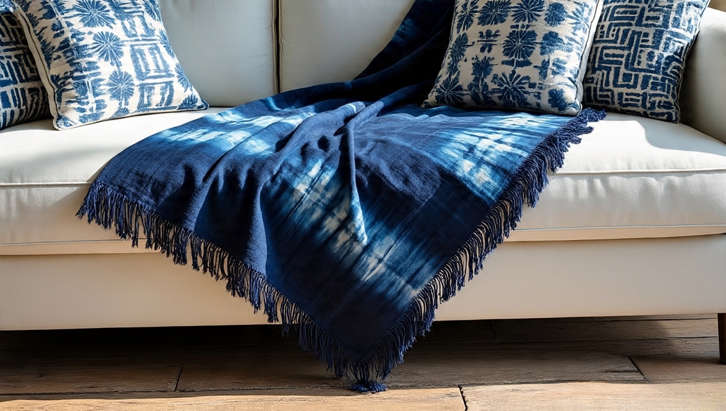 Have you ever unrolled an indigo-dyed throw and caught that faint earthy scent of natural dye? It’s like history woven into cloth. Indigo works best when layered against light neutrals. I draped one across a white sofa once, and suddenly the space felt like it belonged to a traveler, not a showroom. For balance, sprinkle a few smaller indigo accents pillows or a wall hanging so the palette doesn’t swallow the room whole.
4. Brass: The Warm Glow of Evening
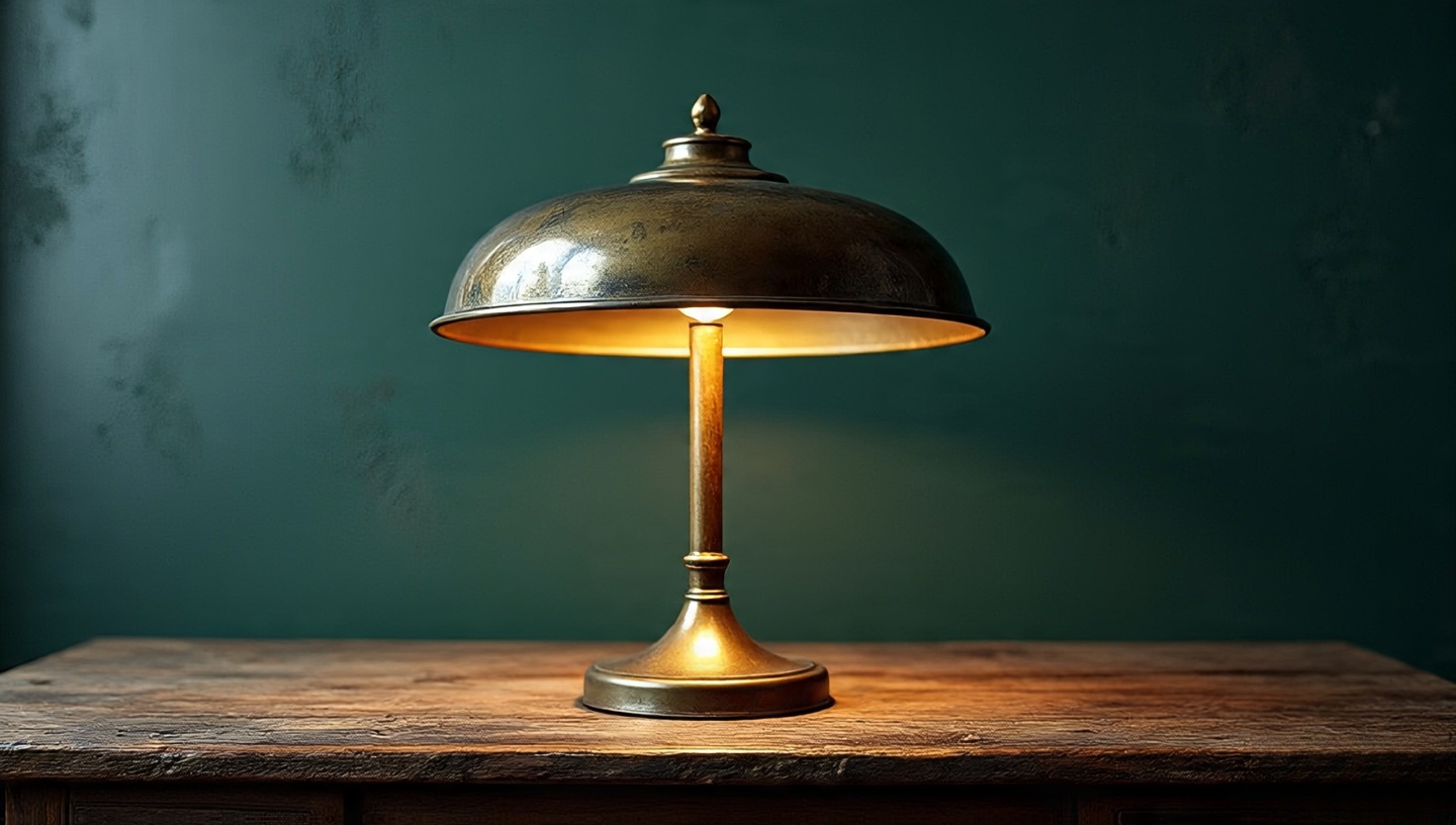 I have a brass lamp on my desk that has aged with me for decades. Its patina has shifted from shiny to mellow, and that’s the beauty of brass: it grows old gracefully. Many clients worry when their brass dulls don’t. That soft gleam in candlelight is worth more than mirror shine. Use it where you want warmth: sconces, trays, even drawer handles. And remember, brass pairs beautifully with deep blues or forest greens.
5. Woven Jute and Sisal Rugs
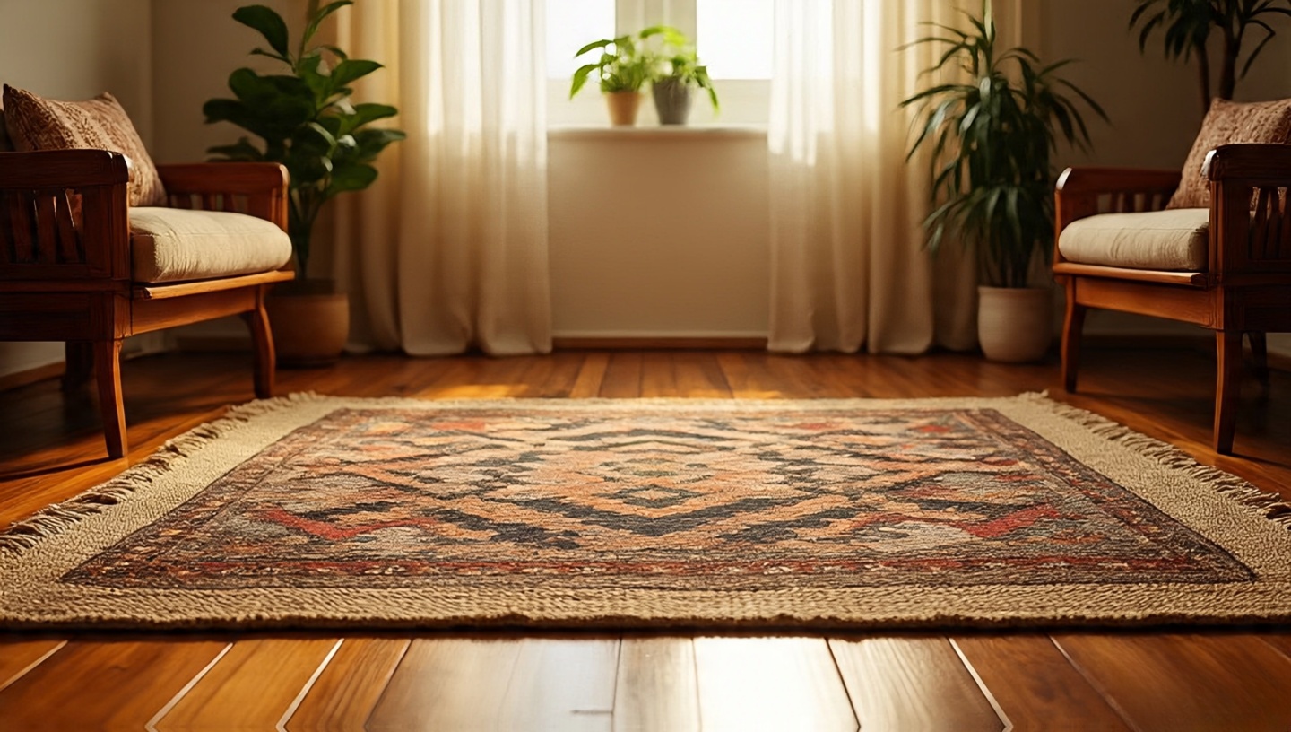 Step barefoot on jute and you’ll feel its rustic honesty scratchy, but grounding. I often use sisal as a base rug, then throw a patterned kilim on top. This layering is not just aesthetic; it adds insulation and comfort. Practical tip: if you’re placing a jute rug in a living area, add a felt underlay. It not only protects the fibers but softens the step without losing that earthy character.
6. Walnut Wood with Linen Whites
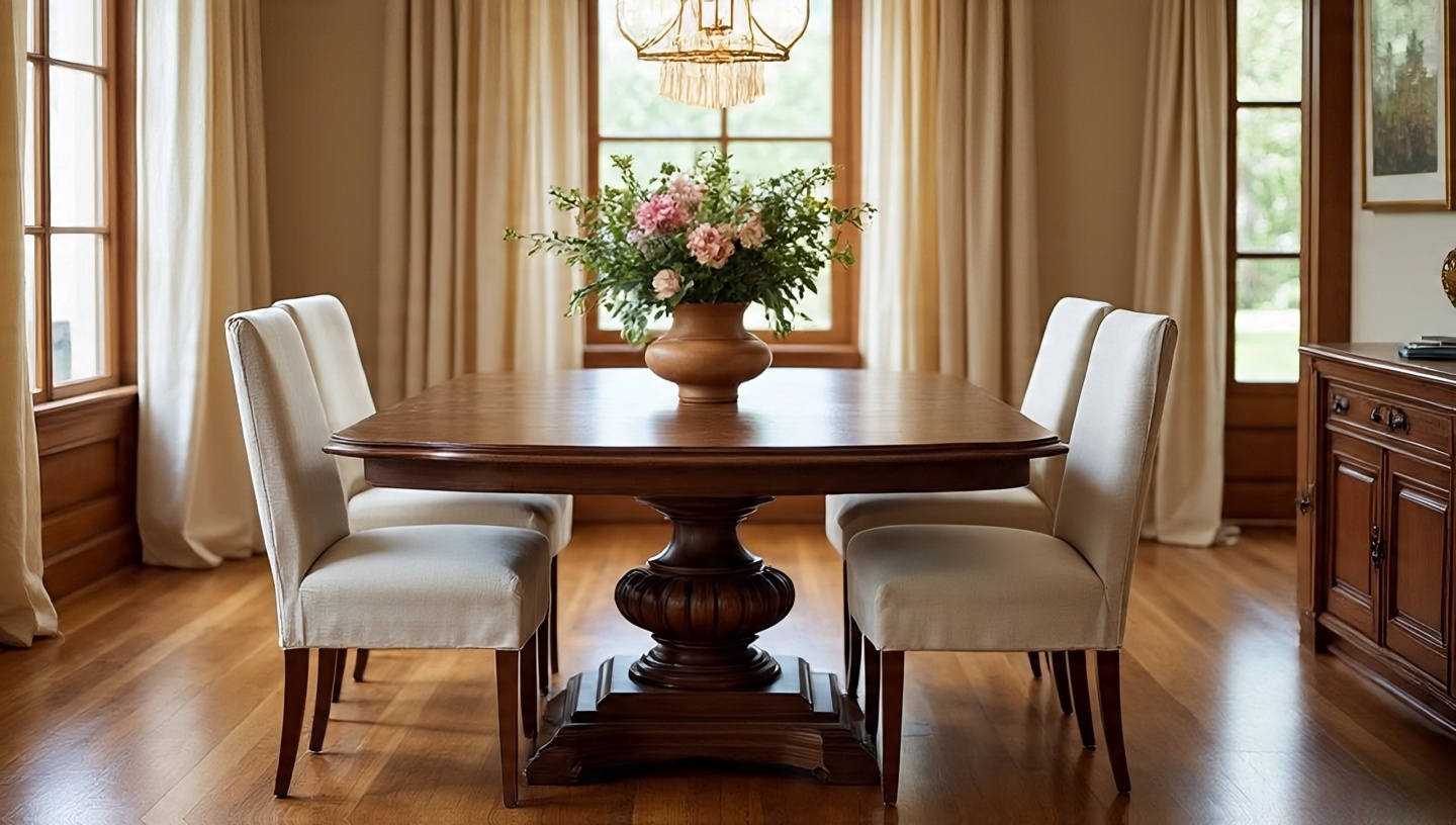 Walnut and white linen are like old friends who never argue. I designed a dining room once with walnut floors and linen slipcovered chairs, and guests always lingered longer there than in other rooms. The depth of walnut balances the airiness of linen, creating calm without sterility. Add a single bold element perhaps a terracotta vase to avoid falling into monotony.
7. Terracotta Tiles that Hold the Sun
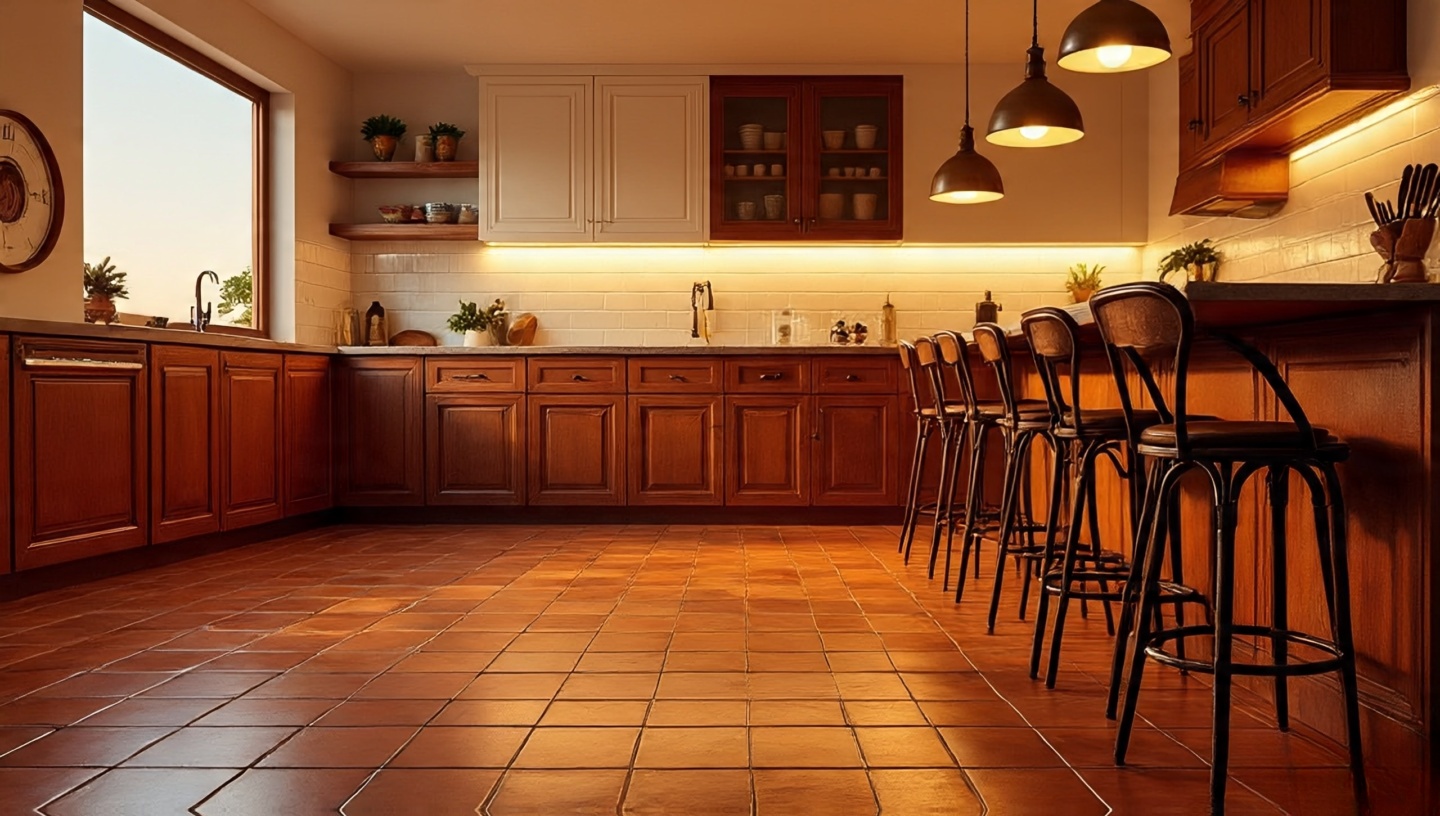 I remember laying terracotta tiles in a small kitchen. In the mornings they were cool like shaded stone, but by evening they radiated a soft heat stored from the day. This duality makes terracotta unique it changes with time and temperature. Pair it with wrought iron stools or brass accents, and you have a palette that feels Mediterranean, timeless, and practical. Tip: seal with a breathable wax, not plastic resin, so the tiles age with dignity.
8. Velvet in Jewel Tones
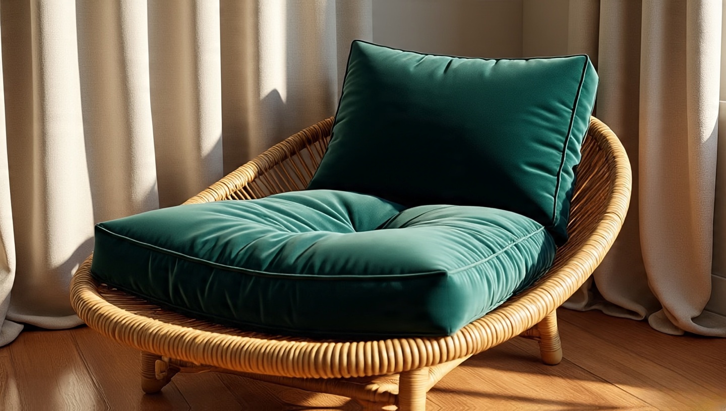 Velvet is indulgence in fabric form. But used right, it’s not luxury it’s comfort. A deep emerald velvet cushion tossed onto a sun-bleached rattan chair creates contrast that feels alive. I warn clients: too much velvet and the room becomes a stage set. Use it sparingly, like seasoning, to highlight texture against rawer materials linen, rattan, or wood.
9. Copper with Green Patina
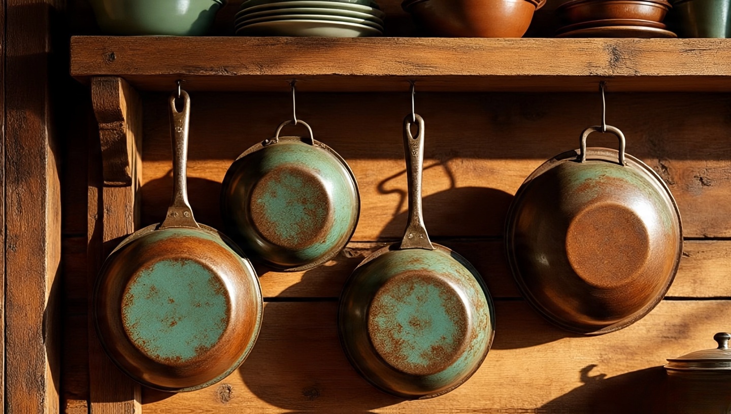 One of my fondest memories is restoring a 1920s kitchen where copper pans still hung above the stove, their patina green as moss. That natural aging isn’t decay it’s history you can see. Copper works wonders in kitchens or outdoor spaces. If you’re impatient for patina, yes, vinegar accelerates it, but I’d say let time do the work. A patina earned slowly feels authentic, like wrinkles on a well-lived face.
10. Wicker and Rattan in Sunlit Corners
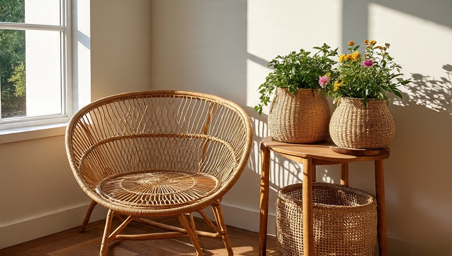 I’ll admit it: I have a weakness for rattan. Place a rattan chair by a window and listen it creaks as the seasons shift, almost like it’s breathing with the weather. Wicker baskets, meanwhile, are more than storage. They scatter light with their weave, casting tiny patterned shadows on the wall. Together, they bring movement into otherwise static corners. Practical note: avoid placing them in damp bathrooms; humidity weakens the fibers over time.
11. The Softness of Wool Kilims
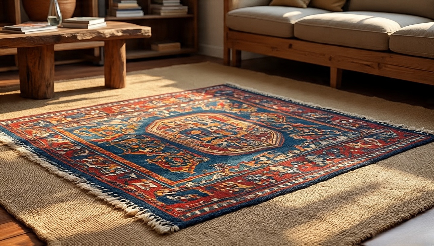 Not all rugs are created equal. Wool kilims, with their flat weave and rich colors, tell stories of villages, landscapes, and hands that wove them. I once hung a vintage kilim on a white wall, and it became more compelling than any painting I could have chosen. They’re light, versatile, and durable. If you place one on the floor, consider layering it over a jute base for both comfort and preservation. And yes, even a slightly frayed edge adds charm it shows the rug has lived a life before yours.
12. A Palette of Moss and Forest Green
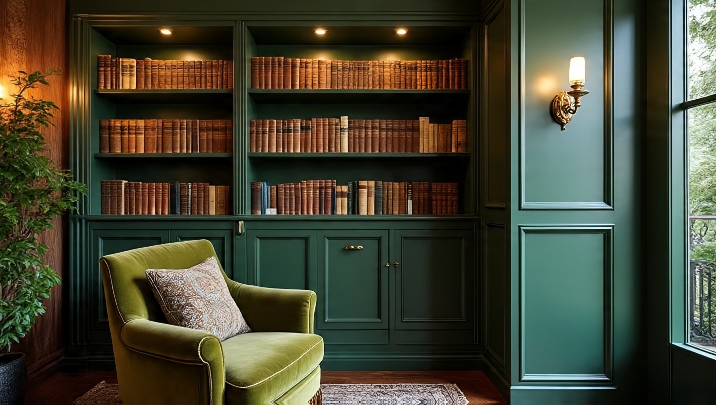 Green isn’t just for plants. A moss-green velvet armchair or a forest-toned cabinet anchors a room with calm strength. The color has a way of making man-made structures feel organic, almost rooted. I once painted built-in shelves in forest green and placed brass sconces above them; at night, it felt like sitting in a woodland library. If you’re nervous about dark greens, start with textiles throws or cushions before committing to paint.
13. Raw Pine with Whitewash
 Pine is a humble wood, often dismissed because of its softness. Yet, when treated with a gentle whitewash, it carries a coastal-Bohemian vibe that’s hard to replicate. The faint resinous scent lingers for months, reminding you that the material is alive. In one small cabin project, I used whitewashed pine boards on the ceiling, and the light bounced back softly, almost like a perpetual morning. Just remember: use matte finishes, not glossy. Gloss kills the authenticity.
14. Tactile Throws: Linen, Cotton, Wool
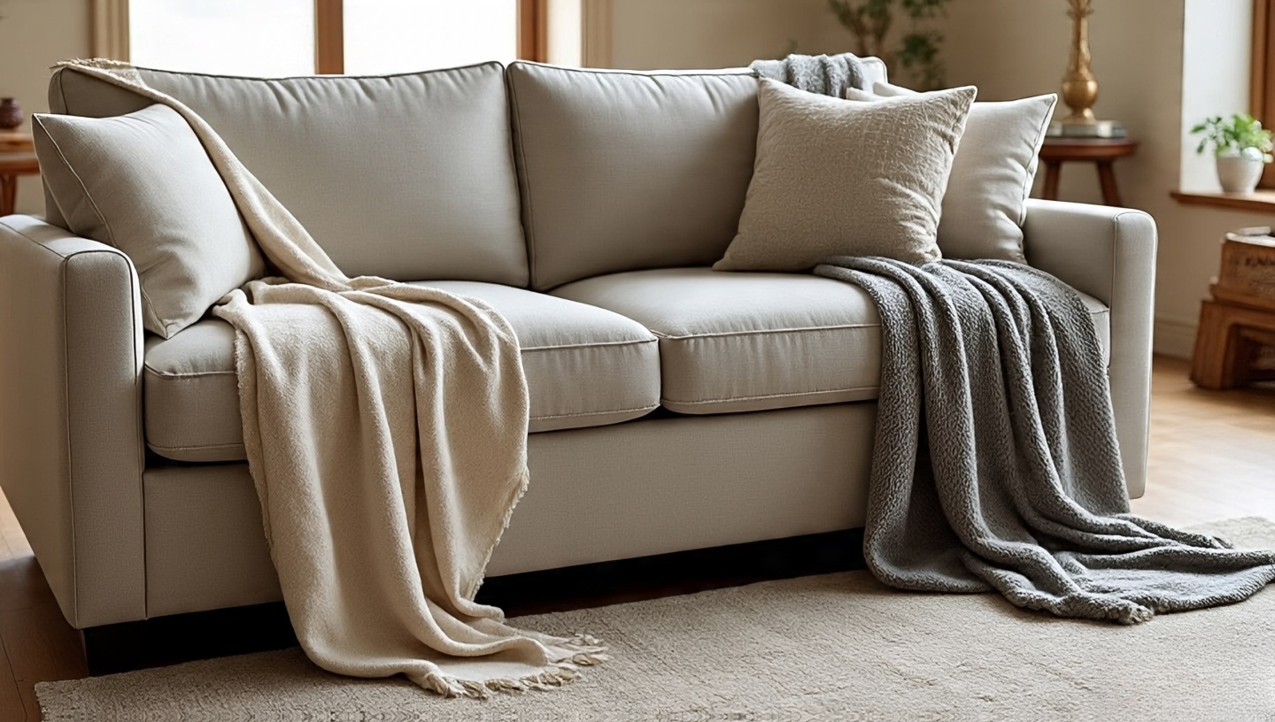 Textiles are like the punctuation marks of a home. They don’t dominate, but they change the rhythm. I keep a stack of throws by my sofa linen for breezy evenings, cotton for everyday use, wool for winter nights. They’re practical, yes, but also symbolic: each fabric creates a different mood. Try it yourself swap a cotton throw for a wool one when the seasons change, and notice how your whole room suddenly feels cozier without moving a single piece of furniture.
15. Hand-Painted Ceramics
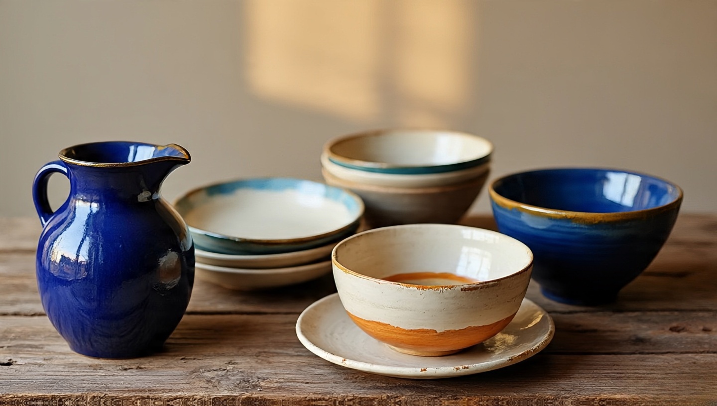 In many homes I’ve designed, the soul isn’t in the architecture but in the ceramics. A chipped bowl, a mismatched set of hand-painted plates these are daily art forms. They clink with a different timbre than factory-made dishes. A cobalt-blue ceramic jug on a wooden table can transform a meal into an experience. My advice: buy ceramics from local artisans, not stores. They bring irregularities that machine perfection simply cannot reproduce.
16. The Glow of Burnt Orange and Rust
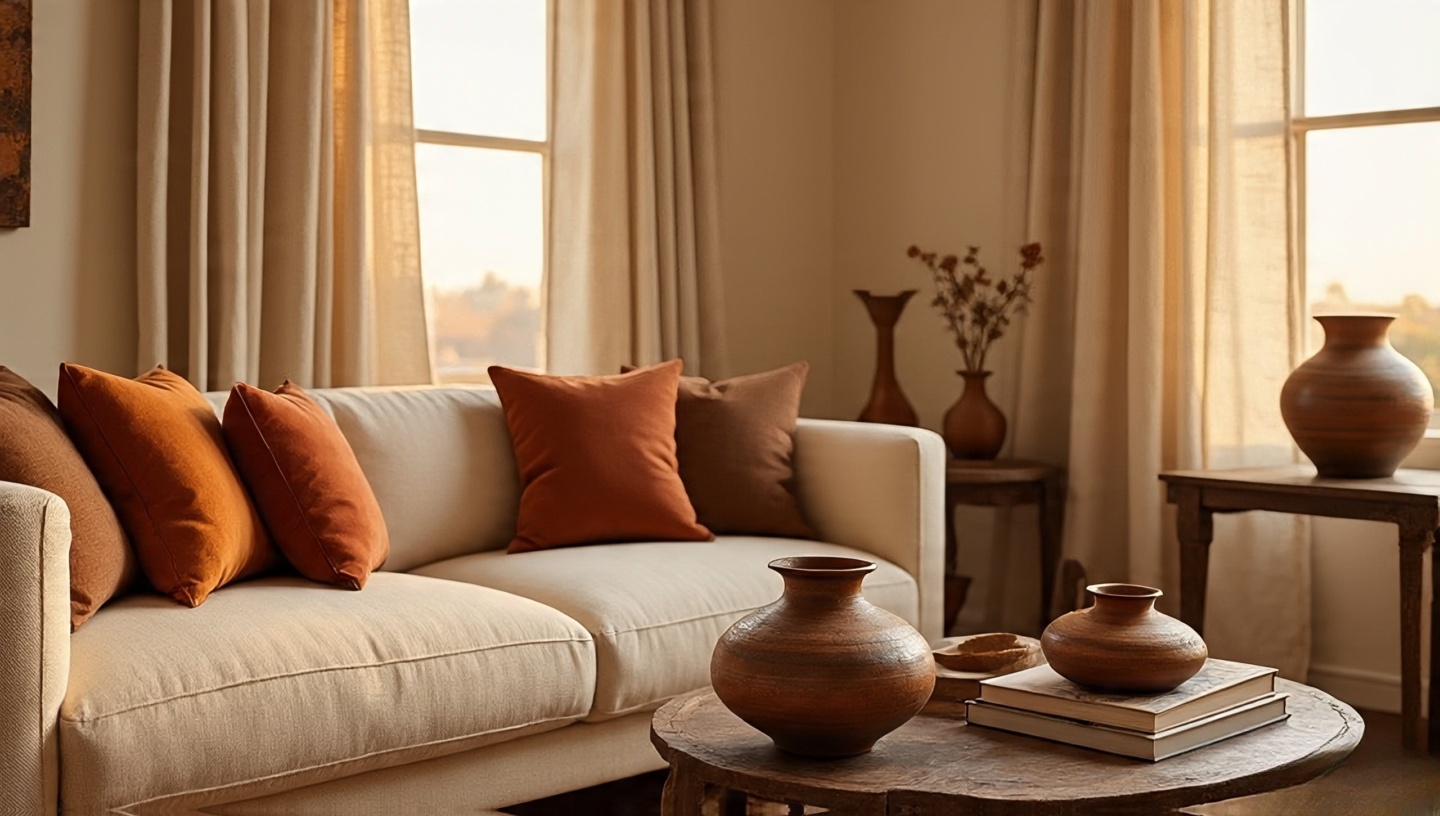 I often use burnt orange like I would use spices in cooking sparingly but decisively. A rust-colored cushion on a cream sofa feels like sunset bottled indoors. In one loft project, we painted a single accent wall in rust, then softened it with neutral linen drapes. Guests always said the room felt warmer than the thermostat suggested. For smaller experiments, introduce these hues in pillow covers, wall art, or even pottery.
17. Driftwood and Weathered Surfaces
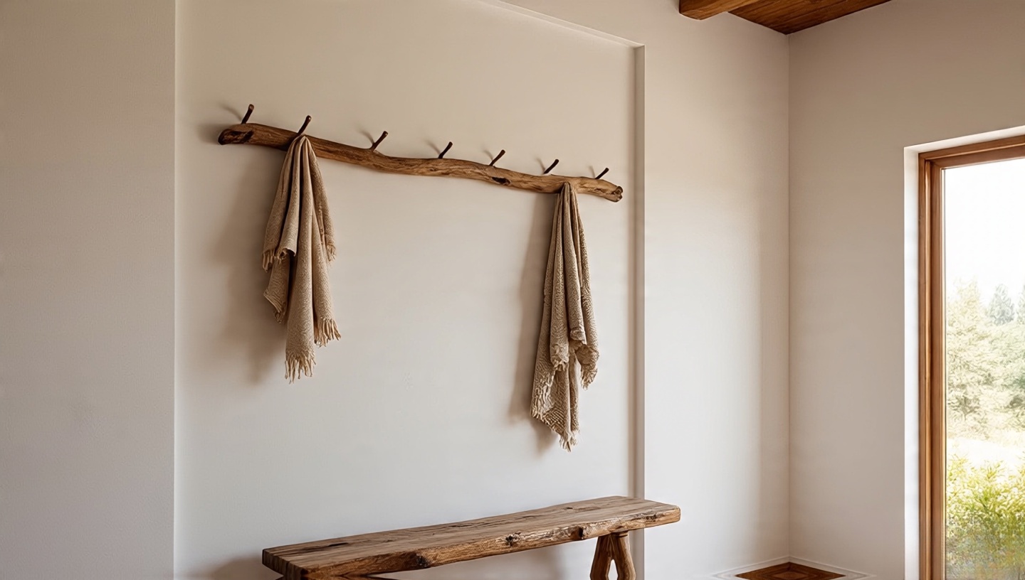 Some materials only come with time. Driftwood, weathered by salt and sun, carries an honesty you can’t fake. I once crafted a coat rack from a piece I found on a quiet beach; it’s still the most complimented object in that home. These pieces remind us of patience. When paired with indigo textiles or simple white cotton, driftwood adds a calm, poetic contrast. If you can’t find natural driftwood, even reclaimed beams with a weathered finish can evoke the same story.
18. Gold Accents, but Sparingly
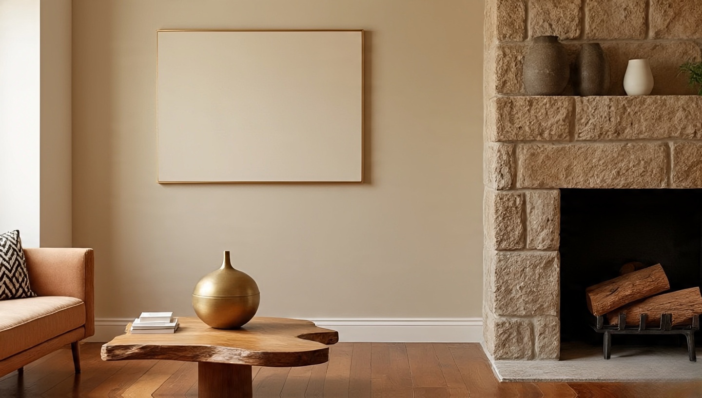 Gold is tricky it dazzles and overwhelms in equal measure. I prefer to treat it like a whisper rather than a shout. A thin gold picture frame, or the small detail of a lamp base, can feel like jewelry for the room. I remember a client who insisted on a gold coffee table; it dominated so heavily that we had to strip everything else back. Lesson learned: gold works best as a subtle accent against raw materials like wood or stone, not as the star of the show.
19. Patchwork and Mixed Fabrics
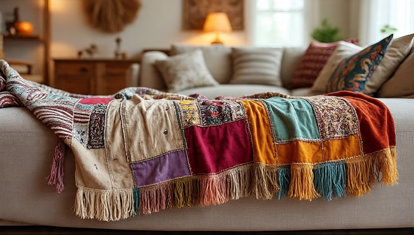 There’s something deeply Bohemian about imperfection stitched together. Years ago, I asked a seamstress to create a throw from leftover fabric samples velvet squares, linen scraps, cotton swatches. It turned out mismatched and beautiful, and it became the most talked-about piece in that room. Patchwork reminds us that beauty doesn’t come from uniformity, but from layers of history combined. If you try this yourself, don’t aim for perfect lines let the fabrics speak in their own textures.
20. Black as a Bold Contrast
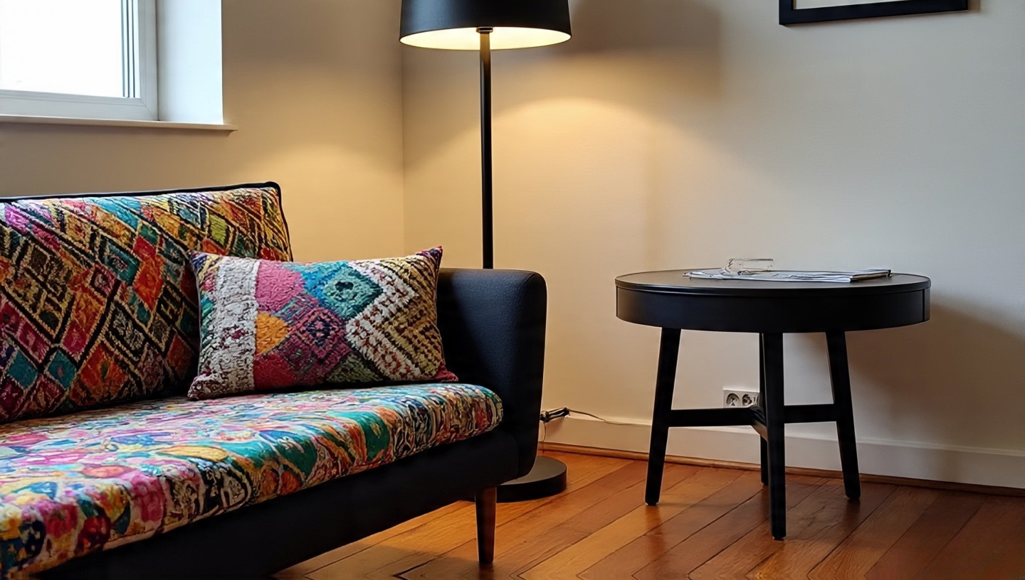 People rarely associate black with Bohemian style, but after decades of experimenting, I’ve learned that a little black sharpens everything else. Think of it as the punctuation at the end of a vibrant sentence. In one project, a simple matte-black floor lamp beside a riot of colorful cushions was enough to give the space gravity. Don’t overuse it too much black pulls a room into severity. Use it sparingly, and it becomes the anchor that keeps your colors from floating away.
Extra Tips for Blending These Palettes
- Layer thoughtfully: Start with one dominant base (like wood or neutral walls), then add 2–3 accents. Any more, and it risks chaos.
- Play with light: Natural sunlight changes terracotta, brass, and velvet dramatically. Test materials at different times of day.
- Mix old and new: A brand-new sofa covered with a vintage kilim instantly feels seasoned.
- Trust your senses: If it feels too polished, rough it up. If it feels too messy, pull back one item. Balance is dynamic.
So, What’s the Real Secret?
It’s not just about materials. It’s about memory. That brass bowl from a flea market, the faded pillow your grandmother passed down, the rug you hauled back in a suitcase they weave into your home’s story. That’s what makes Bohemian style so magnetic: it’s personal, layered, and textured with life itself.
Try just one thing from this list maybe a jute rug, or maybe a rust-colored throw and see how it shifts the energy of your space. You don’t need to redo your whole house. Sometimes one color, one material, is enough to set the Boho spirit free. You can also browse Boho Bathroom Ideas to apply it into your lovely bathroom.