Roohome.com – I still remember the moment a plain, beige room woke up: I rolled out a woven Moroccan rug, draped a block-printed throw on the sofa, and lit a beeswax candle. The air smelled faintly of honey and smoke, the light warmed to amber, and the whole scene softened. That’s the power of a Bohemian living room it isn’t just decor; it’s atmosphere. It’s the scuff of old wood, the sway of a palm leaf in the A/C, the clink of a ceramic cup on a handmade table. It’s layered, cozy, and collected.
This guide gathers 42 Bohemian living room ideas that balance intuition with design know-how. You’ll find principles (scale, color, proportion), practical tips (measuring rugs, hanging art, arranging seating), plus small sensory cues that invite you to slow down. Use it as a checklist, or as a gentle nudge to trust your eye. Ready?
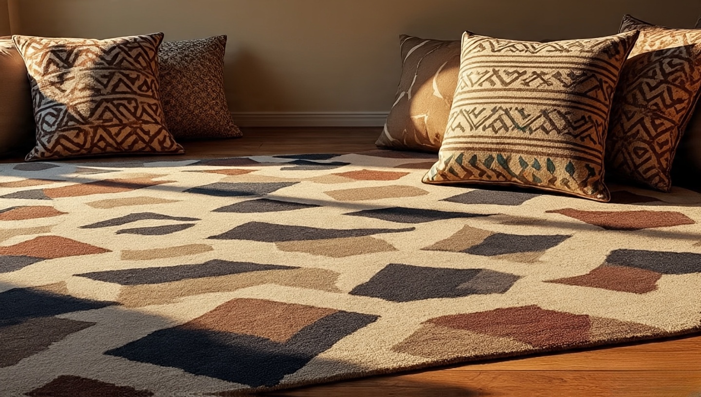
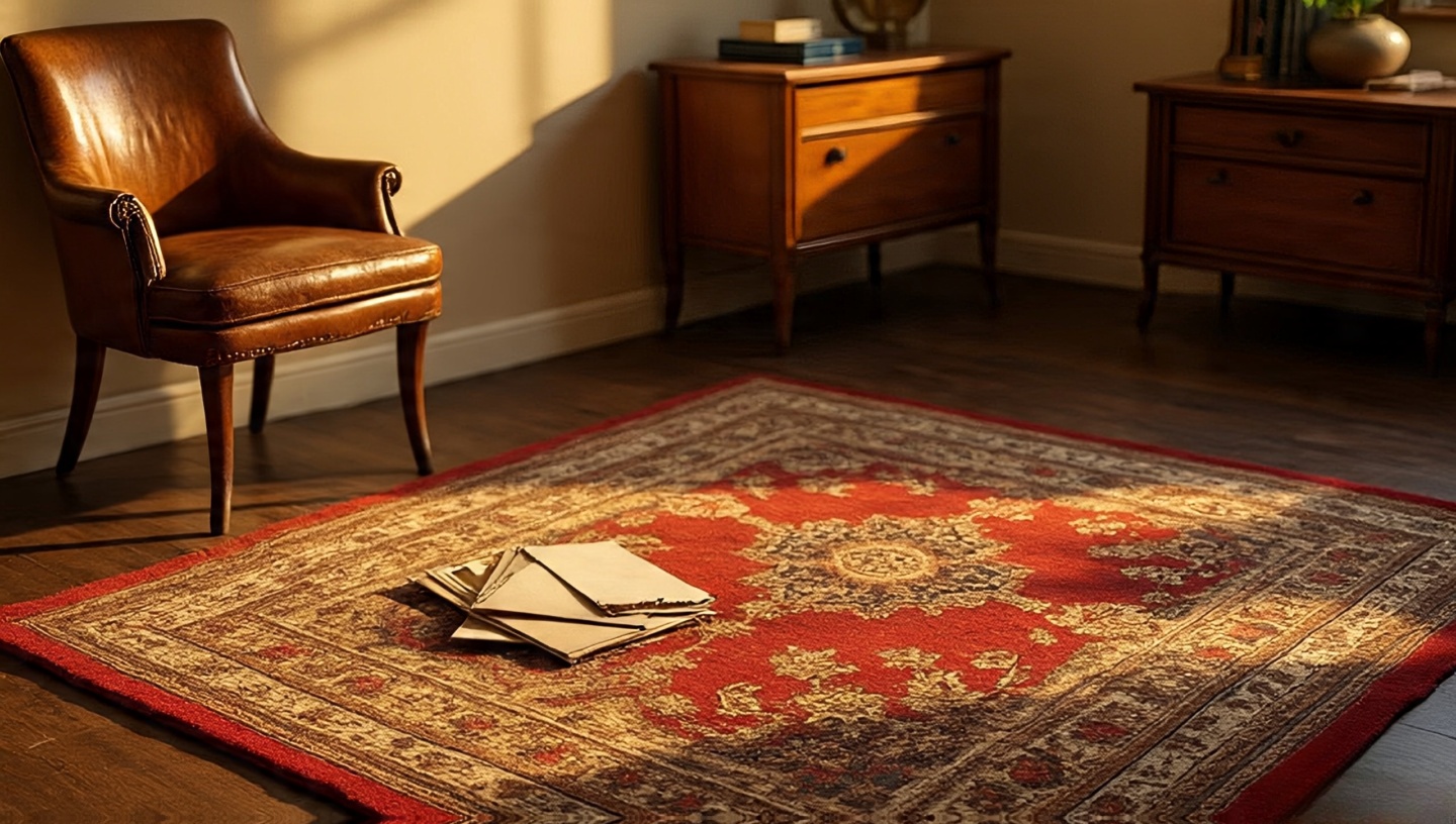
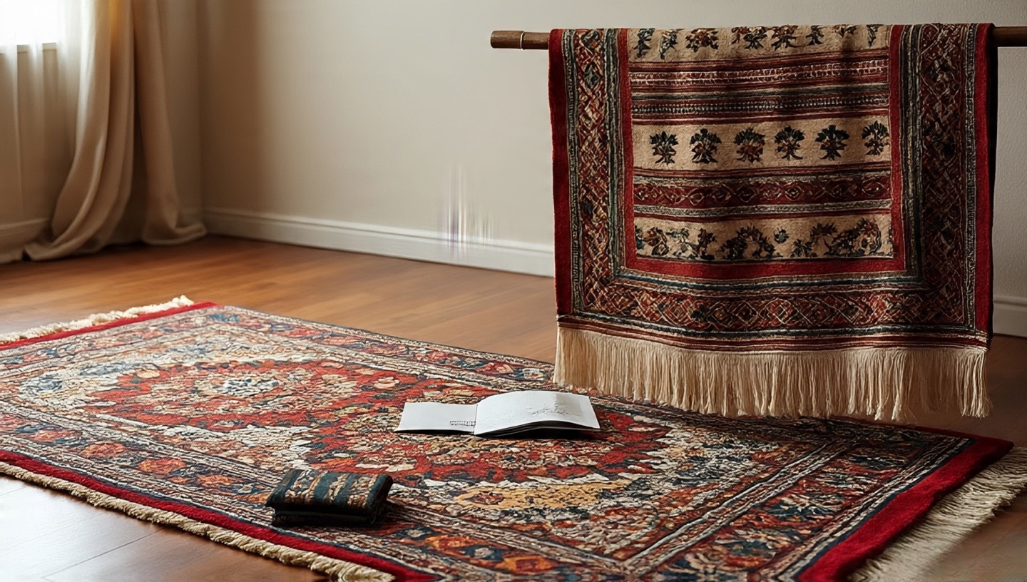
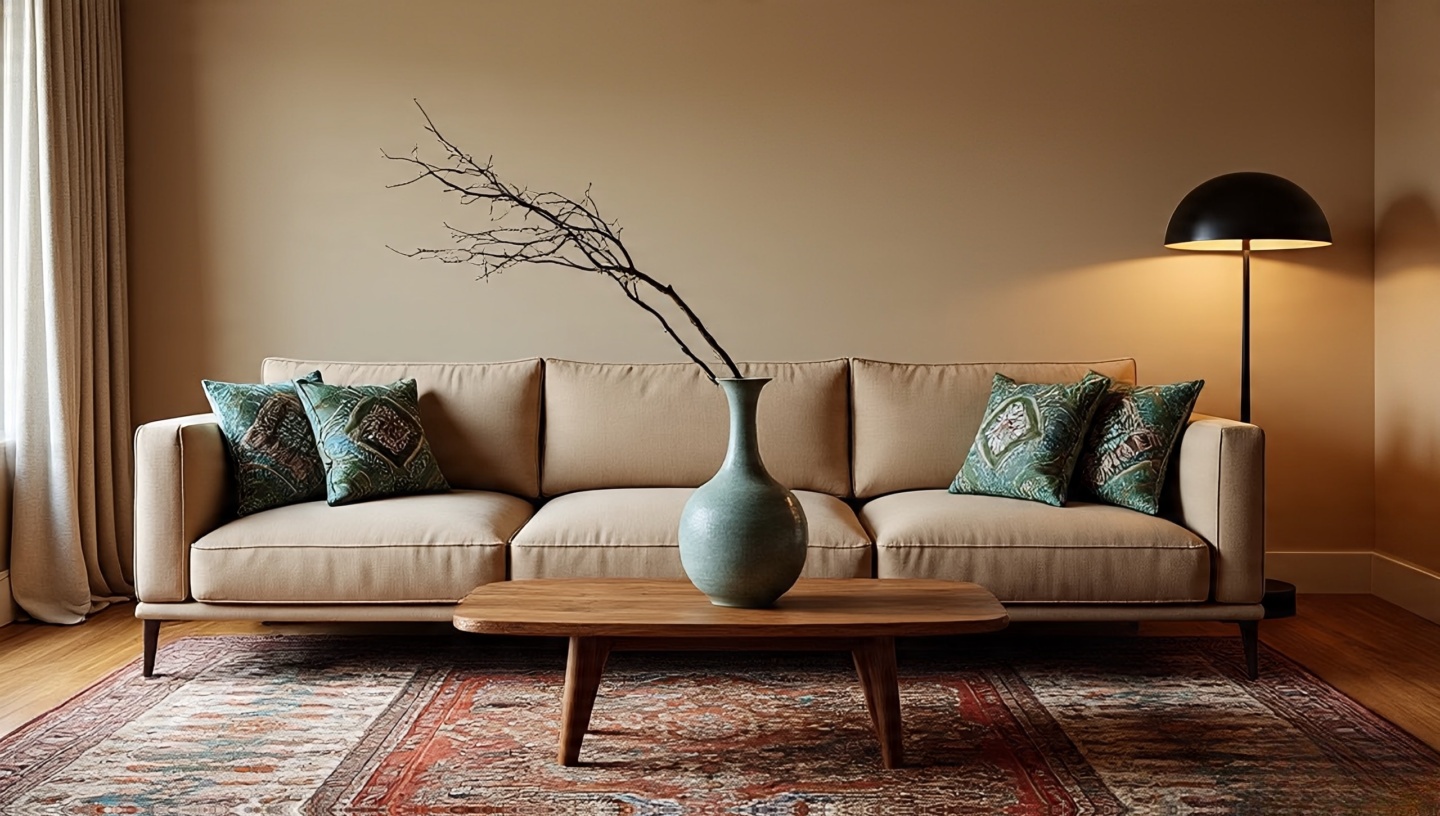
1) Start with a grounded rug (then layer)
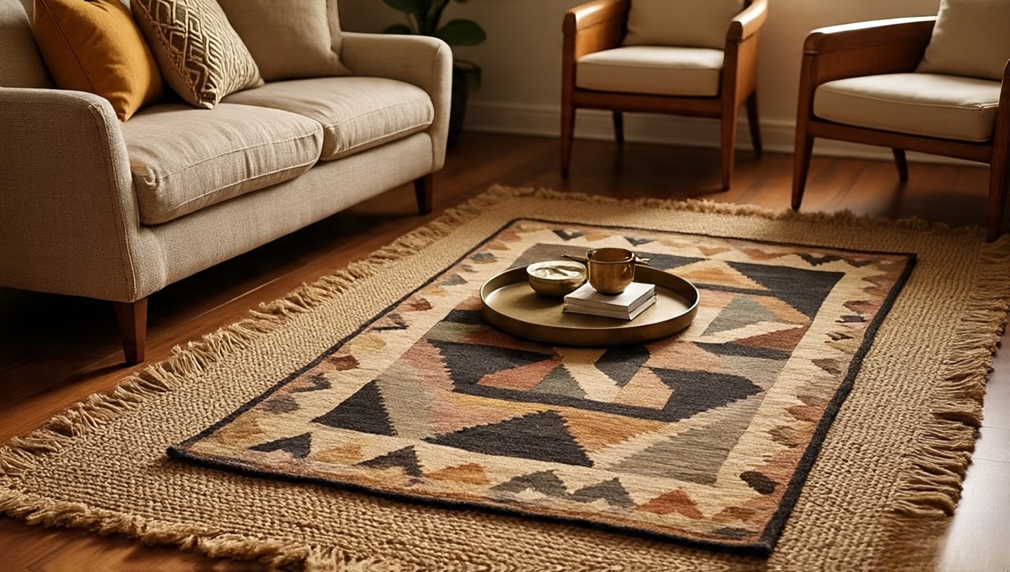 Architect’s take (30 years in): Your rug is not just a textile; it’s a zoning tool. If it’s too small, everything floats; too large, and your borders disappear.
How to nail it: For most sofas, an 8×10 ft (240×300 cm) is the real starting point; 9×12 ft (270×360 cm) if you have armchairs. Let at least the front legs of all seating sit on the base rug. Layer a smaller flat-weave (kilim or dhurrie) on top to pull focus where conversations naturally happen.
- Practical tip: Use a natural felt pad under the base rug and a thin non-slip pad under the top rug so the layers don’t “creep.”
- Material match: Wool over jute gives soft-over-coarse texture; cotton over wool keeps maintenance easy.
Five-minute fix: If the room still feels scattered, rotate the top rug 15–30° to “tilt” the vignette and add movement.
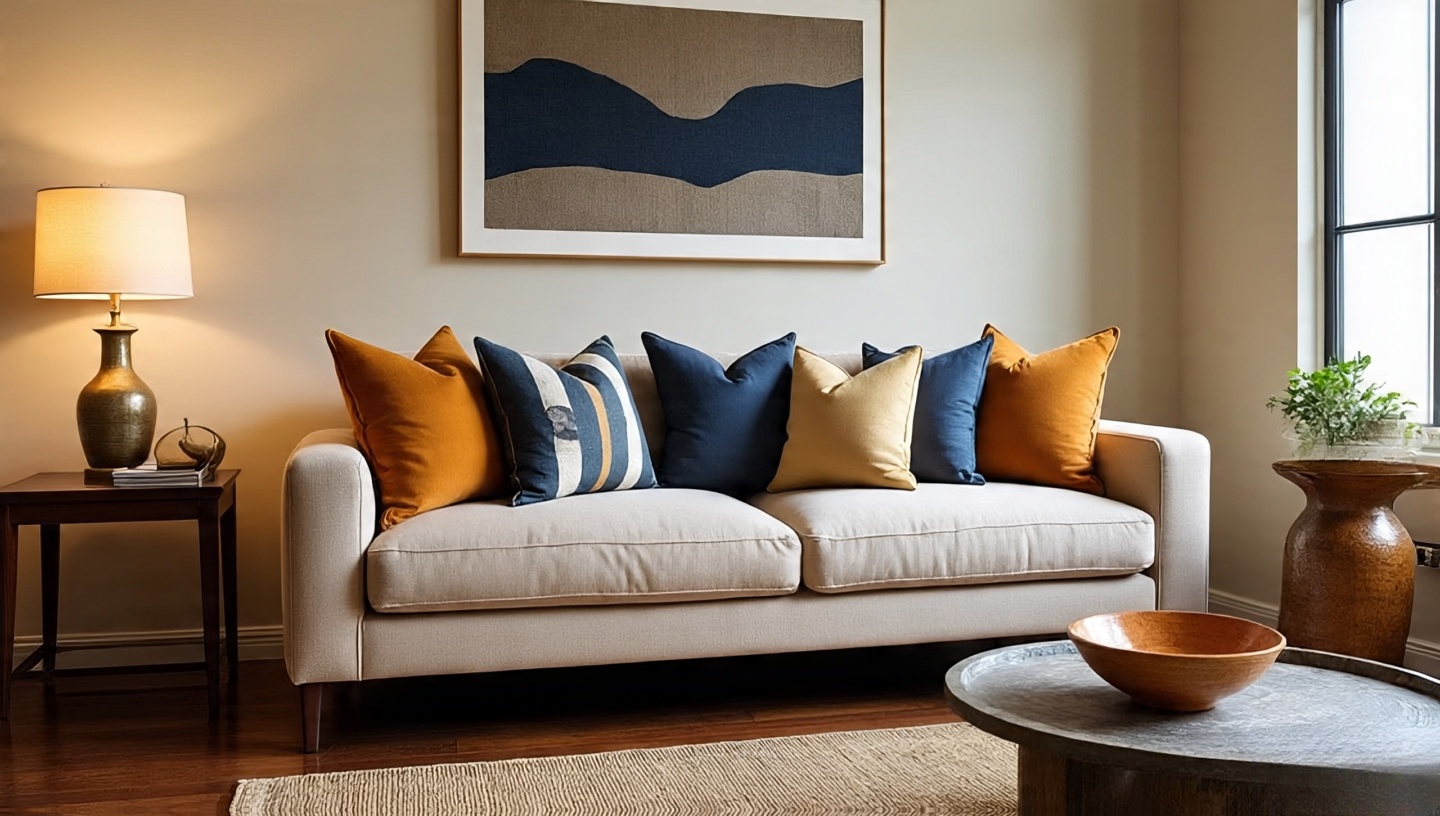
2) Color palette: earth first, accents later
 Think of clay, sand, olive, rust as your “ground.” Now, test one accent indigo, turmeric, or pomegranate through small textiles first. You’re listening to the room before you speak louder.
- 70-20-10 rule: ~70% warm neutrals (walls, big rug, sofa), 20% muted color (throws, curtains), 10% high-contrast accents (a bold pillow, a ceramic bowl).
- Architect’s tip: Swatch paint on two walls and view at 8am, 1pm, and 8pm. Boho palettes live or die by how dusk warms them.
Sensory check: If the room smells like beeswax and the shadows look honeyed at night, you chose well.
3) Mix textures you can feel without looking
 I run my hand across the arm of a linen sofa; it rustles lightly. Then the palm hits a tooled leather cushion smooth, slightly cool before landing on a crocheted throw. That is Bohemian coherence.
- Contrast matrix: Pair open weave (rattan) with dense weave (kilim), matte (limewash) with sheen (brass), soft (mohair) with structured (saddle leather).
- Durability note: If you have kids or pets, prioritize wool blends and removable covers. Texture shouldn’t become a chore.
Architect’s micro-rule: Each sitting spot deserves three textures within reach.
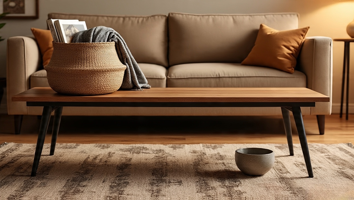
4) Vintage wood table with a story
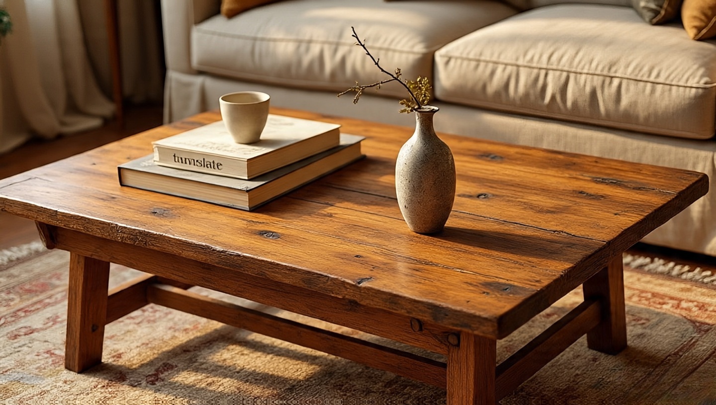 A good coffee table reads like a piece of driftwood that learned manners. Nicks, butterfly joints, old stains leave them. They are your patina, not your problems.
- Size & scale: Target table height at 16–18 in (40–46 cm) and keep 16–24 in (40–60 cm) between sofa edge and table for knee room.
- Stability test: Press down at each corner; if it rocks, add discreet felt levelers or a hidden stretcher bar.
- Finish: Hardwax oil preserves the grain, adds a low sheen, and ages gracefully.
Architect’s note: If the wood tone fights your rug, insert a neutral runner on the tabletop to “translate” between them.
5) Plants, plants, and more plants
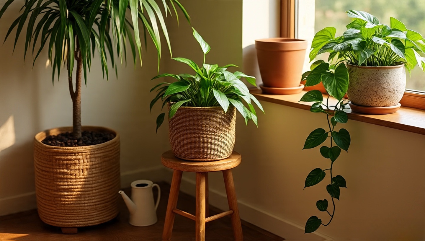 The quiet hiss of a mist sprayer, the damp scent after watering plants turn rooms into ecosystems. Don’t sprinkle them like confetti; compose them.
- Light logic: Snake plant (low), pothos (medium), fiddle leaf fig (bright, indirect). Group by light needs; rotate a quarter-turn each week for even growth.
- Pot recipe: 40% peat-free compost, 40% perlite, 20% bark for drainage; add a top dressing of pebbles or lava rock to keep soil splash off your rugs.
- Architect’s cluster: One floor plant + one mid-height on a stool + one trailing plant at shelf height = layered green without visual noise.
Maintenance trick: Water on the same day you change sheets habit stacks keep your jungle alive.
6) Pattern play anchored by scale
 Patterns are a band; somebody must play bass. Let the rug carry the low notes (large scale), pillows handle melody (medium), and a throw whisper rhythm (small, tight motif).
- Mixing formula: 1 large geometric + 1 organic (floral, ikat) + 1 tiny repeat. Keep one color consistent across all three.
- Architect’s warning: If everything is mid-scale, your eye gets tired. Change one element’s scale, not just its color.
Quick test: Squint. If one pattern still leads, your hierarchy is working.
7) Curate, don’t clutter
 I love collections a bowl of matchbooks, a line of travel books but I love air more. Bohemian is not maximalism; it’s edited memory.
- Rotation box: Keep one lidded box in a closet. When a surface feels crowded, remove three objects and “rest” them for a month.
- The 80/20 shelf: Fill only 80% of shelf length; leave the last 20% for negative space so your eye can breathe.
Architect’s cue: If dusting feels like a penalty, you have too many smalls out at once.
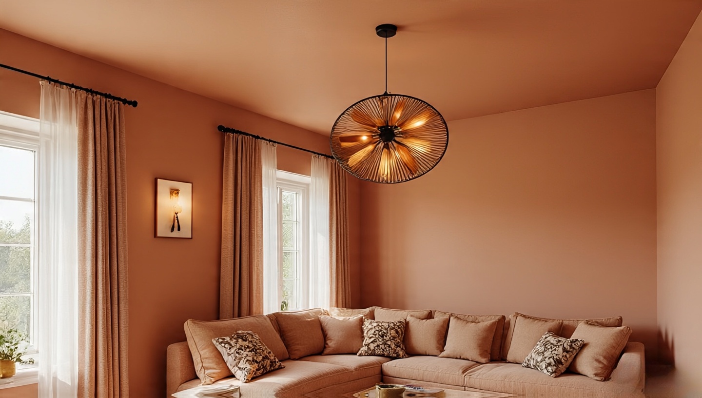
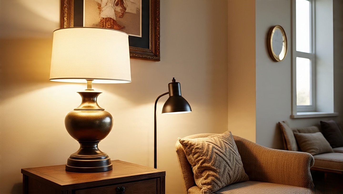
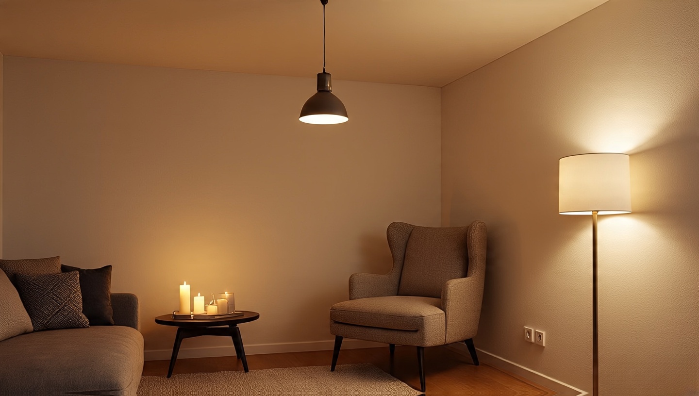
8) Layered lighting, not big overhead glare
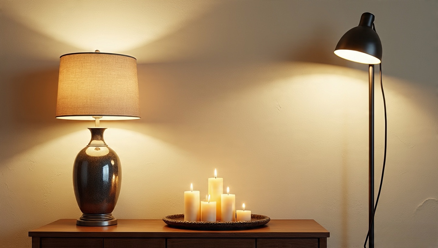 Overhead cans are like noonday sun use sparingly. In Bohemian living rooms, light should graze, pool, and glow.
- Kelvin & lumens: Aim for 2700–3000K bulbs; distribute ~1,500–2,500 lumens across 3–5 sources rather than one blast from the ceiling.
- Beam trick: A narrow-beam floor lamp aimed at limewashed walls creates soft scallops of light instant atmosphere.
- Dimmers everywhere: They cost less than one designer pillow and do more for mood than a new sofa.
Scent-light combo: One beeswax candle near woven textures will make the room smell faintly of warm honey and look like golden hour.
9) Low seating: poufs, floor cushions, ottomans
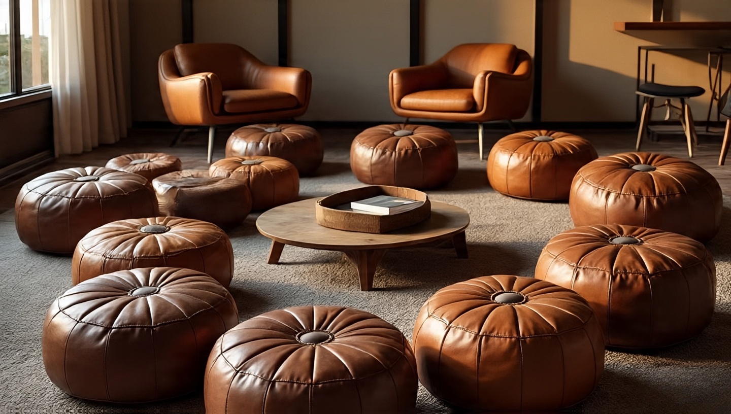 Bring conversation down a notch. Literally. Low seating changes posture and tone people linger, voices soften.
- Ergo basics: Poufs at 14–16 in (36–41 cm) height pair best with coffee tables at ~16–18 in (40–46 cm). Keep a tray handy to stabilize cups.
- Layout: Create a crescent around the main rug corner rather than scattering. It looks intentional and keeps pathways clear.
- Material call: Tanned leather ages into gorgeous caramel; heavy cotton floor cushions zip off for easy cleaning.
Architect’s caution: Too many low seats without a standard-height anchor can feel like a camping gear display. Balance with one structured chair.
10) A gallery wall that isn’t precious
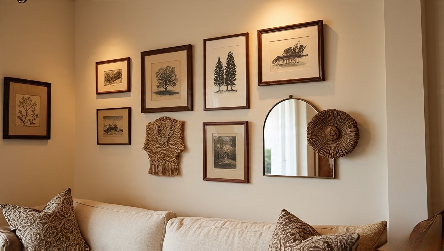 I’ve installed dozens of gallery walls, and the best ones have one thing in common: they feel found, not forced.
- Centerline rule: Start with a centerline at 57–59 in (145–150 cm) from the floor for the anchor piece, then build out asymmetrically.
- Paper mock-up: Cut kraft paper to frame sizes, tape them up first, live with it for a day. Adjust where your body naturally looks.
- Glass glare fix: Use non-glare acrylic for pieces opposite windows; tilt frames a hair downward to reduce reflections.
- Mix the mediums: One textile (a small kilim panel), one mirror, two prints, one personal photo. That blend reads Bohemian without looking like a poster shop.
Architect’s finishing move: Tie the wall to the room with a nearby object say, a brass sconce echoing the frames or a clay vase repeating a color from the art.
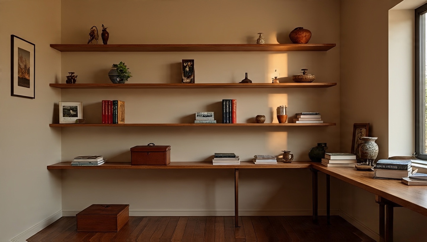
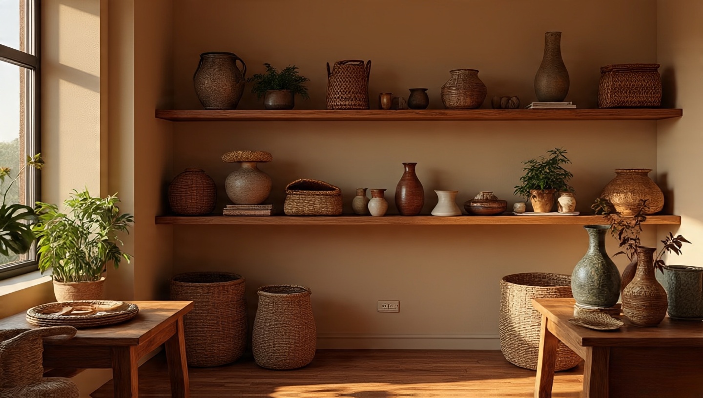
11) The “travel shelf,” curated like a tiny museum
 Architect’s take: A travel shelf isn’t a dumping ground for souvenirs. It’s a small narrative device in your boho living room one that slows visitors down and pulls them closer.
- Shelf spec: Depth 8–10 in (20–25 cm) is perfect for small ceramics and framed postcards; install at eye level for most adults (57–59 in / 145–150 cm to center).
- Lighting: Add a low-glare picture light or an uplight on the floor so textures (carved wood, beadwork, glazed pottery) catch a warm rim of light.
- Arrangement: Use the “tall–medium–low” rule across each grouping; vary finishes (matte clay, glossy ceramic, raw wood) for layered interest.
Field test: If every object has a memory and a material contrast with its neighbor, you’re doing it right.
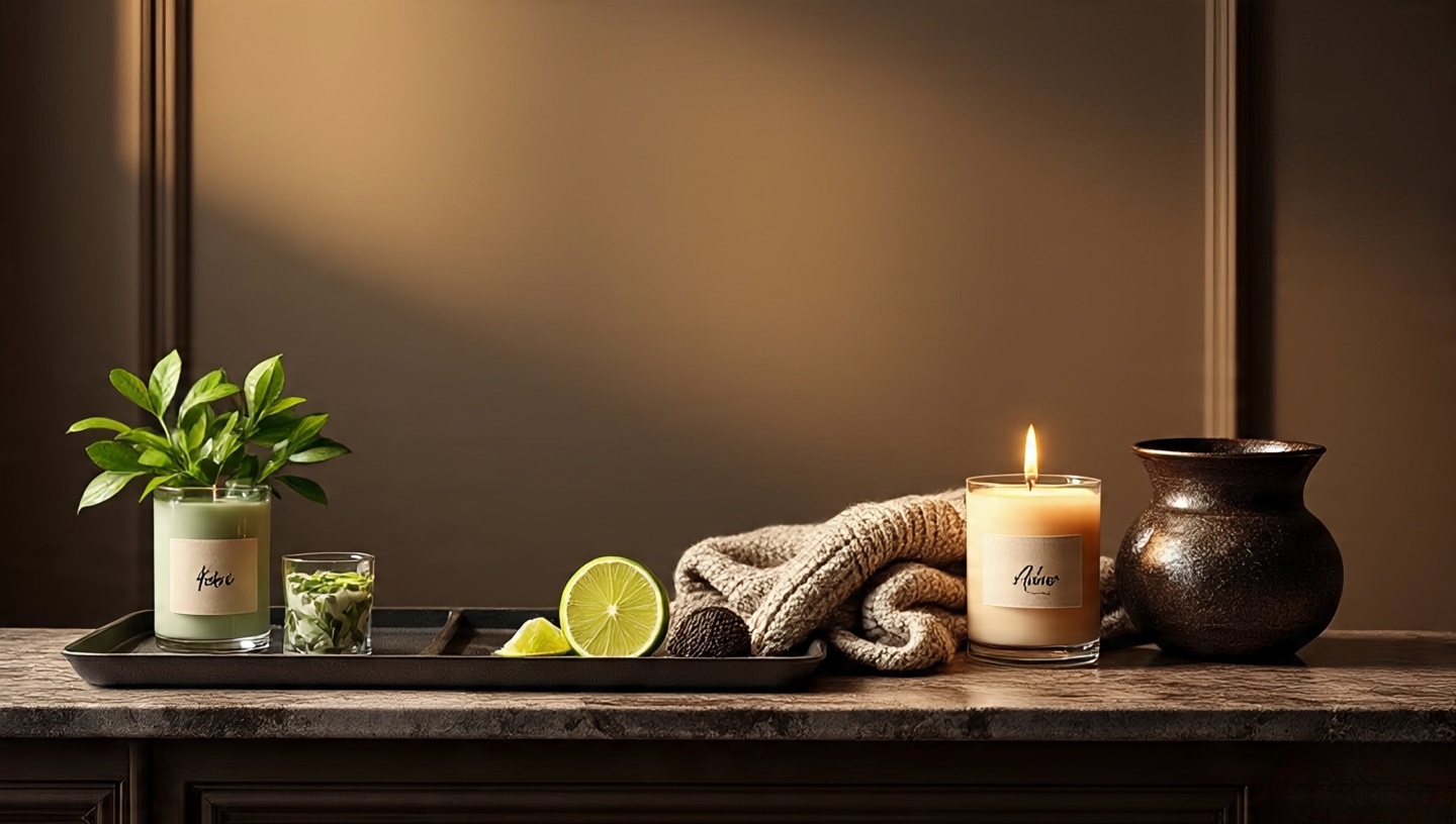
12) Fragrance layers: quiet, natural, intentional
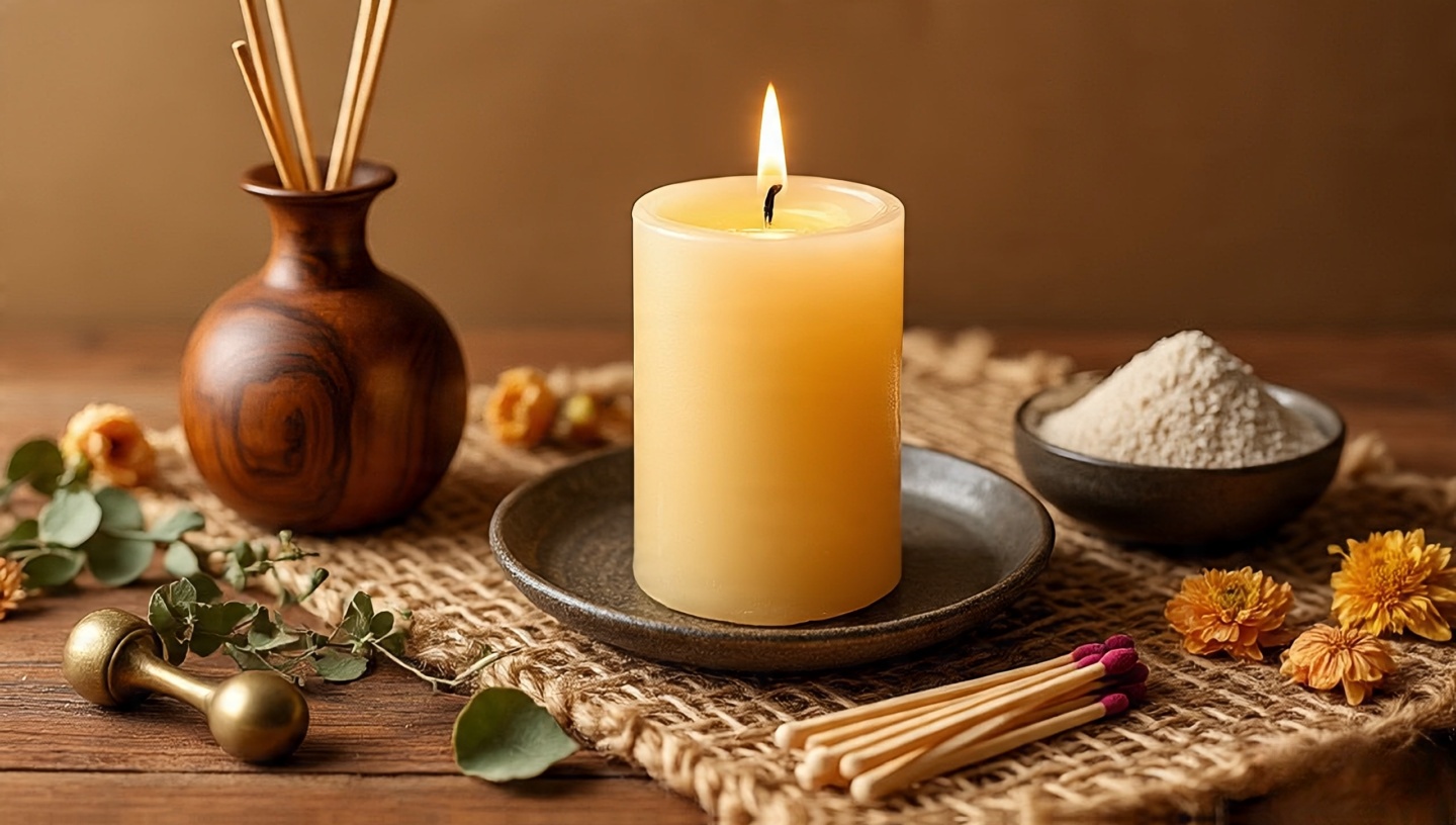 Bohemian living room ideas work best when scent and light collaborate. Think beeswax candles for a honeyed base note, then add a whisper of cedar or fig never a blast. You’re after a background mood, not a perfumery.
- Placement: Keep diffusers away from HVAC returns so the fragrance doesn’t “vanish” into ducts; position candles where light grazes woven textures.
- Seasonal map: Spring (green fig), summer (herbal citrus), autumn (cedar + clove), winter (smoke + amber). Rotate with the pillows; reset your nose.
- Safety note: Sand-filled bowl for match disposal; a brass snuffer keeps soot off walls.
Architect’s cue: If guests notice the room feels calm before they place the scent, you’ve hit the right intensity.
13) Handwoven throws texture therapy you can wash
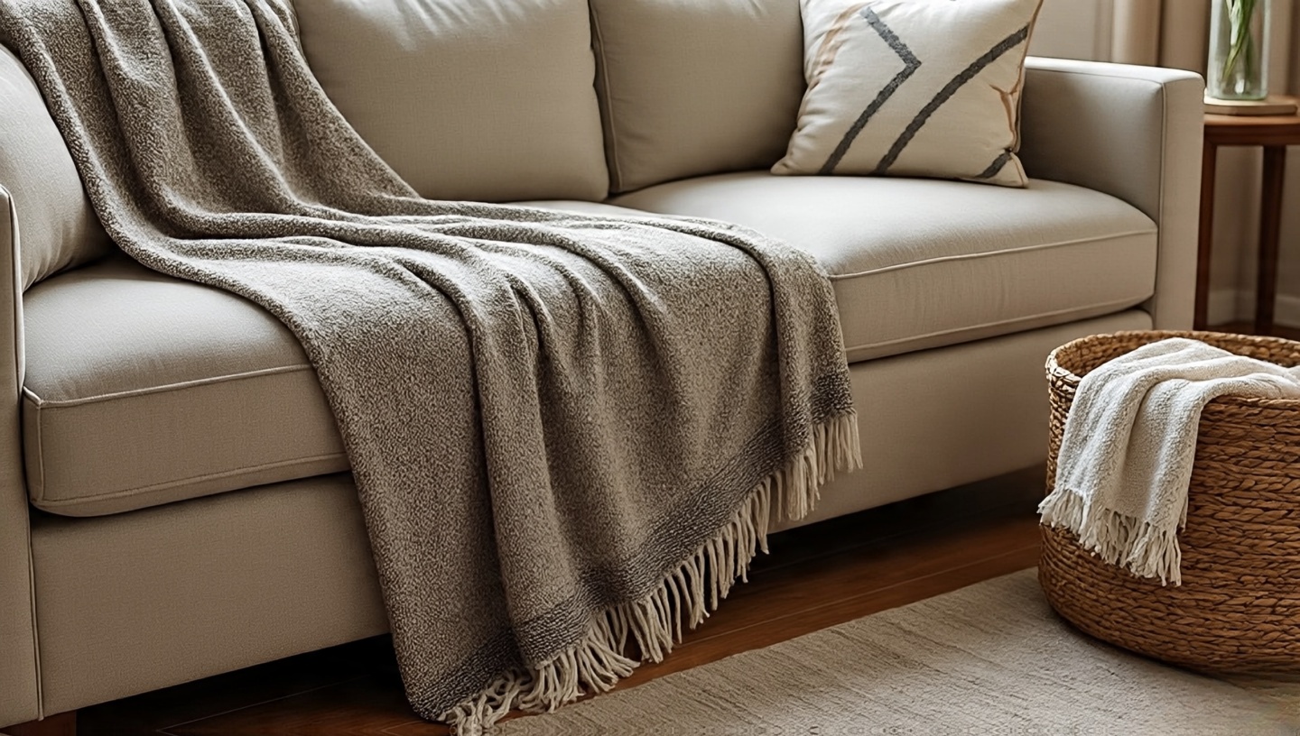 The rustle of hand-loomed cotton, the soft drag of wool against linen pillows are punctuation, but throws are the paragraph breaks in a boho living room.
- Sizing: Aim for 50×70 in (127×178 cm) minimum so it drapes generously over sofa arms without looking stingy.
- Material picks: Wool for warmth and resilience; cotton for easy washing; linen for summer weight and that rumpled, lived-in look.
- Care: Cold wash, lay flat; brush wool with a soft garment brush to lift fibers and revive texture.
Fast style move: Fold once lengthwise, then offset the throw diagonally across the cushion stack to break symmetry.
14) Rattan, cane, and natural fibers lightness with backbone
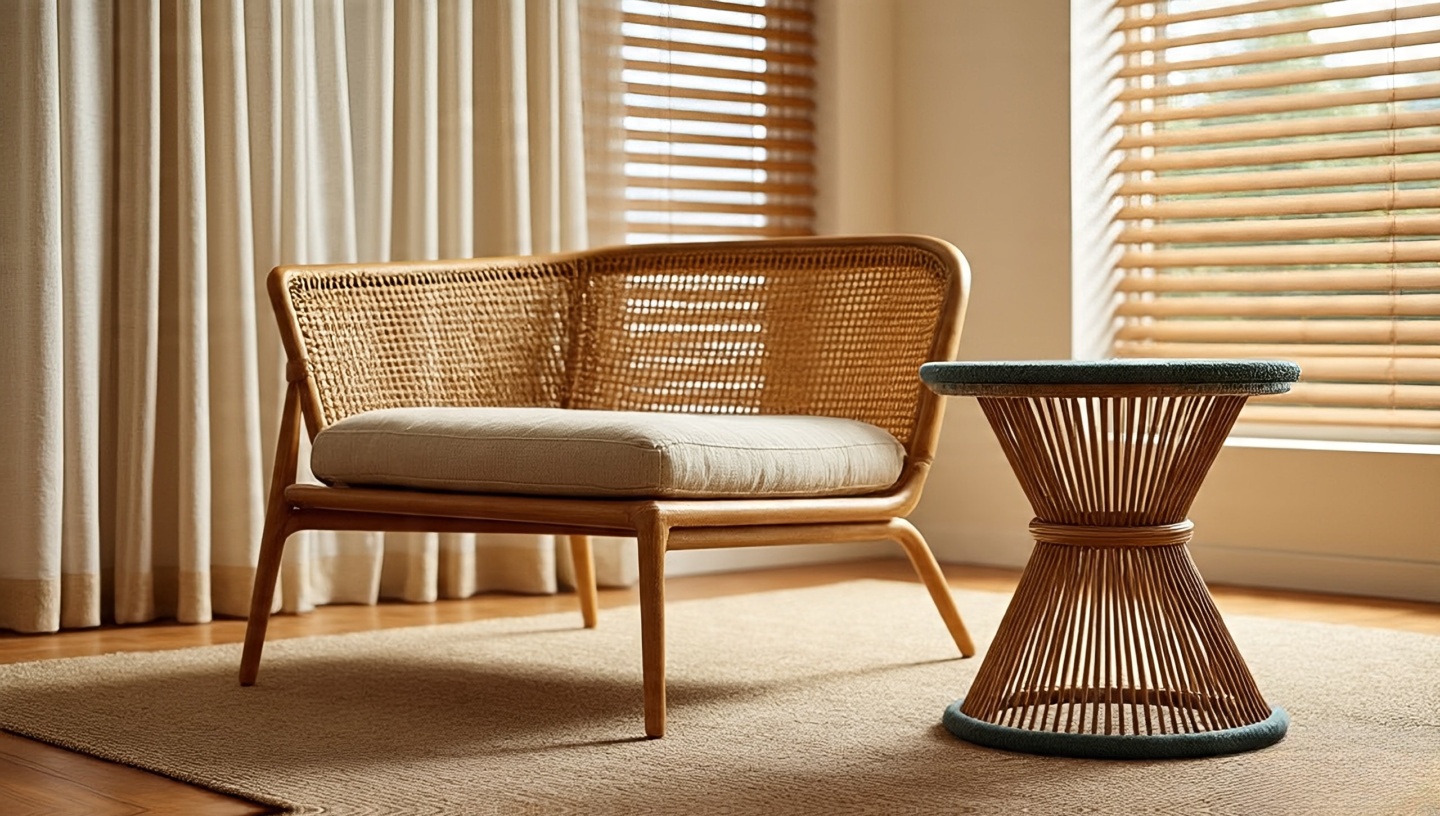 I love how cane crackles softly when you sit, the way rattan frames catch oblique light. But natural fibers need smart handling.
- Quality check: Even, tight caning with no frayed edges; rattan joints wrapped and pinned, not just glued.
- Climate tip: In humid homes, wipe frames monthly with a barely damp cloth and dry immediately; add breathable felt pads under feet so moisture doesn’t wick from floors.
- UV watch: Keep direct sun off cane for long stretches sheer curtains filter light and extend life.
Architect’s pairing: Balance airy rattan with a dense, low rug (flat-weave kilim) so the room feels anchored, not floaty.
15) Macramé, but substantive
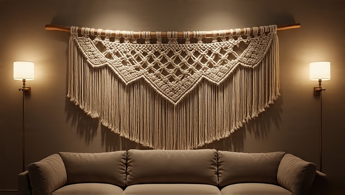 A single, creamy macramé can act like soft architecture especially above a sofa where art might feel too formal.
- Scale: Target a piece that spans 60–70% of the sofa width; too small reads like a potholder, too large swallows the wall.
- Mounting: Use a smooth dowel or a sanded branch sealed with matte poly; hang on two points to prevent bowing.
- Restraint: One hero macramé is elegant; three is a craft fair. Let negative space do its job.
Tactile note: The shadow play from macramé knots at dusk is half the magic aim a dimmable sconce from the side for soft relief.
16) Eclectic, not random choose a through-line
 Boho living room, meet thesis statement. Without one, your layered rugs and vintage decor start arguing. With one, they sing.
- Pick the thread: A color duo (saffron + indigo), a motif (geometrics), or a material pair (oak + brass). Repeat in 3–5 places.
- Edit with intent: When adding a new object, ask: does it amplify the thread or create new noise?
- Wall aid: If you’re working in an open plan, study these strategies for flow and zoning: Bohemian style for an open-floor living room design.
Architect’s mantra: Cohesion ≠ matching; it’s repetition with personality.
17) The truly useful tray (and why it matters)
 A tray is small architecture: it defines boundaries on a coffee table, it says “this chaos is intentional.”
- Proportion: Tray width at ~40–60% of the table’s short side leaves room for books and elbows.
- Material logic: Brass tray warms cool stone tops; oak tray softens glass; ceramic on wood adds a soft sheen break.
- Anti-scratch: Stick clear bumpers under metal trays no one wants circular ghost marks.
Quick vignette: Candle (flame), small plant (flora), hand-thrown cup (form). Play with heights. Done.
18) Books as texture, invitation, and color control
 Nothing humanizes a boho living room faster than spines with a little wear. I like to stack three ways: vertical for rhythm, horizontal for pedestals, and face-out for one conversation starter.
- Color strategy: If spines fight your palette, group by tone (earthy, cool, dark) rather than hue; tuck neon out of the primary sightline.
- Scale: Large art books belong low (coffee table); paperbacks belong high (eye-level shelves) where their small scale reads as texture, not clutter.
- Invite use: Keep a bookmark and pen on the table this signals that books are for living, not staging.
Architect’s whisper: If nobody reaches for a book in a week, rotate the top three.
19) Secondhand, but expertly
 The best bohemian living room ideas often start at a flea market. Go with a checklist and your nose.
- Rugs: Flip them. Look for uniform knots, no brittle backing, and edges that haven’t been machine-serged to death. A little fading? Beautiful. Dry rot? Walk away.
- Wood: Push at joints; if they rack (twist), you’ll need glue and clamps. Hairline checks are fine; deep, active cracks near mortises are not.
- Leather: Smell test for mildew; bend lightly if it flakes, the hide is gone. Conditioning can revive dryness, not decay.
- Upholstery: Budget for new foam + fabric; vintage frames with fresh guts beat new, flimsy builds.
Money tip: Put 20–30% of the savings toward professional cleaning or minor repairs you still come out ahead with better soul.
20) Statement ceiling (paint, limewash, or soft canopy?)
 Look up. If your ceiling is a big blank, it’s stealing warmth from your boho living room.
- Paint path: Dusty peach, pale clay, or warm sand in matte or eggshell; avoid high gloss unless you have perfect plaster.
- Limewash: Velvety movement that turns light into a slow ripple. Test swatches in corners and at night shadows are part of the effect.
- Textile canopy: Mount a linen panel from two slim ceiling tracks to “tent” a reading corner. Keep it 6–8 in (15–20 cm) off the wall so air circulates.
- Fan + fixture: If you have a ceiling fan, pick a warm wood blade and pair with a dimmable sconce elsewhere to avoid the interrogation vibe.
Sensory win: A warm ceiling tone makes evening lamplight feel like candlelight. It’s subtle and addictive.
Design principles (why these ideas work)
Layering: When you stack textures rug on rug, linen on leather you create micro-contrasts that “slow” the eye. That slowness feels like coziness. It’s visual acoustics.
Proportion: Big rug + medium sofa + small accessories is easier to balance than medium everything. Anchor with one or two large elements.
Color temperature: Warm metals, earthy paint, and dimmable lamps keep the palette cohesive even with varied patterns. Aim for 70% neutrals, 20% muted color, 10% high-contrast accents.
Scent and sound: Soft fragrances and rustling plants are low-effort ways to “finish” the room. Our brains read them as hospitality.
21) Seating that hugs the conversation (not the TV)
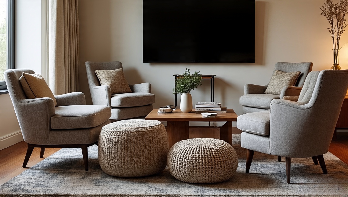 Architect’s read: Living rooms succeed or fail on circulation and conversation. A Bohemian living room thrives when seating creates a relaxed inward arc, so people can see faces and pass plates without a choreography degree.
- Angles: Toe chairs in by 5–15° toward the coffee table. It softens the posture and pulls focus to the middle.
- Distances: Keep 18–24 in (45–60 cm) between seat fronts and the table. Farther = shouty. Closer = knee bumps.
- Flow: Maintain at least one 30–36 in (75–90 cm) clear path through the room; rugs can “announce” the path with a visible edge.
- Anchor: Mix seat heights: one structured armchair + low poufs = tiered comfort, not campfire chaos.
Field test: Sit everywhere for two minutes. If you’re turning your neck more than your torso to speak, nudge the angle not the furniture size.
22) Accent wall: limewash, clay paint, and the art of grazing light
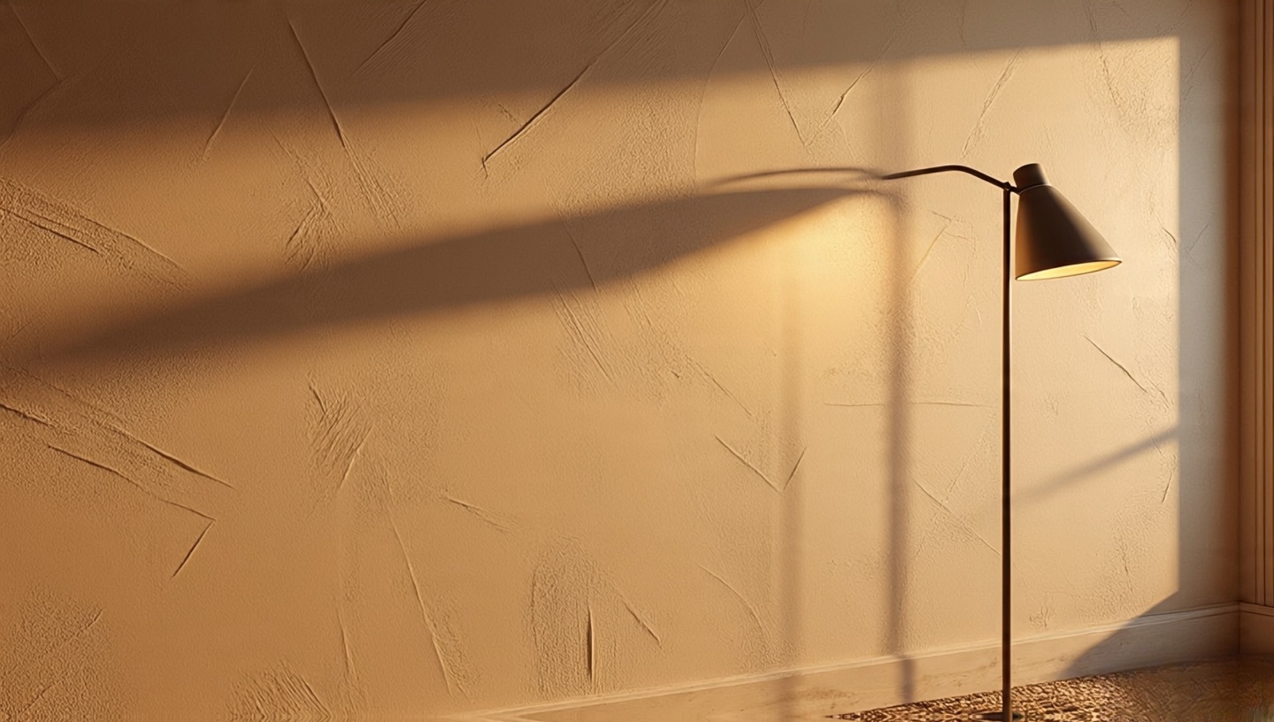 The right textured wall turns light into a slow-moving story. You don’t just see it you feel it on your skin at dusk.
- Prep properly: Patch, sand, prime matte. Limewash and clay telegraph lazy prep.
- Brush, not roller: Use a wide, soft bristle brush in overlapping X-strokes. That’s where the depth comes from.
- Color temperature: Warm clays (peach, sand, camel) make lamp light read like candlelight. Cool greiges can flatten woven textures.
- Light placement: Aim a narrow-beam floor lamp or sconce to graze the wall from 12–18 in (30–45 cm) away. Hello, subtle shadows.
Architect’s caution: Avoid strong HVAC blasts across limewash; micro dust lines are the enemy of romance.
23) Woven baskets: storage that looks like sculpture
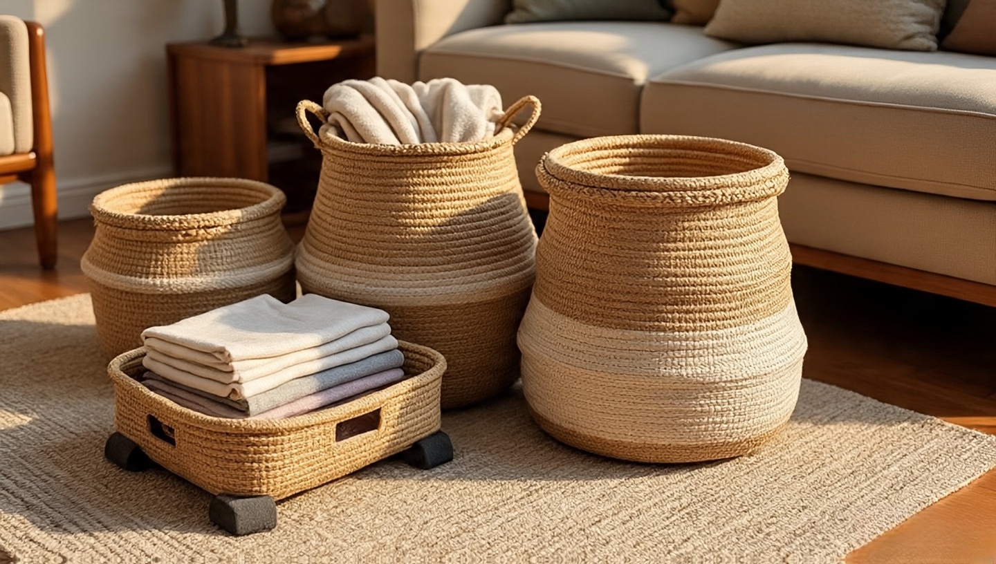 The soft thud of a lid, the dry-grass smell when you open it baskets make clutter feel intentional.
- Material menu: Seagrass (light, springy), kubu rattan (dense, durable), sisal (tough, slightly coarse). Mix textures across the room, not on one shelf.
- Loads & lids: For blankets, choose 16–18 in (40–46 cm) tall with a loose lid; for magazines, go lidded and stackable to hide the visual noise.
- Humidity care: In damp climates, air them monthly in shade; wipe rims with a barely damp cloth and dry immediately.
- Under-sofa trick: Low-profile slide baskets (6–8 in / 15–20 cm) on felt sliders keep toys and remotes accessible without shouting.
Architect’s pairing: Put a heavy, flat-weave rug under basket clusters so their feet don’t dimple soft piles.
24) Music corner: small rituals, big mood
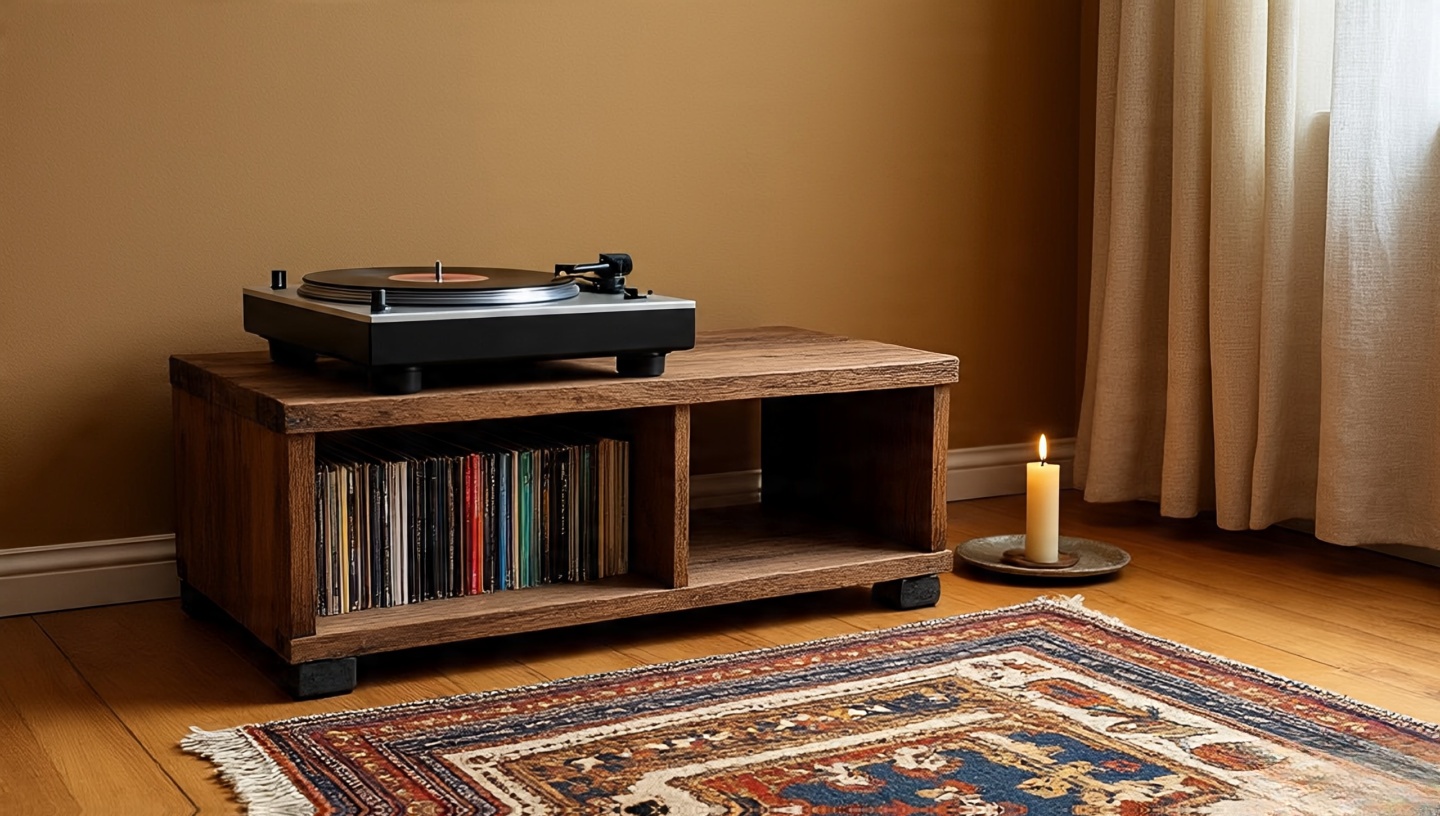 A Bohemian living room hums when sound meets texture. Think: a turntable, a stool, a tiny tray with matches and a beeswax taper. Simple.
- Isolation: Place turntables on a rigid shelf or a slab (stone/wood) with rubber feet; vibrations muddle warm vinyl tones.
- Acoustics: A kilim under the setup and a linen curtain nearby tame slap echo without killing the room’s breath.
- Shelving spec: LPs prefer 13 in (33 cm) clear shelf height; weight adds up use wall studs or heavy-duty brackets.
- Safety: Flames and fabric don’t mix; keep candles one forearm’s length from textiles. Measure it. Every time.
Quick win: A small bowl of fresh citrus near the player subtly brightens the nose and your ear’s perception of “sparkle.” Try it.
25) Layered curtains (sheer glow + linen privacy)
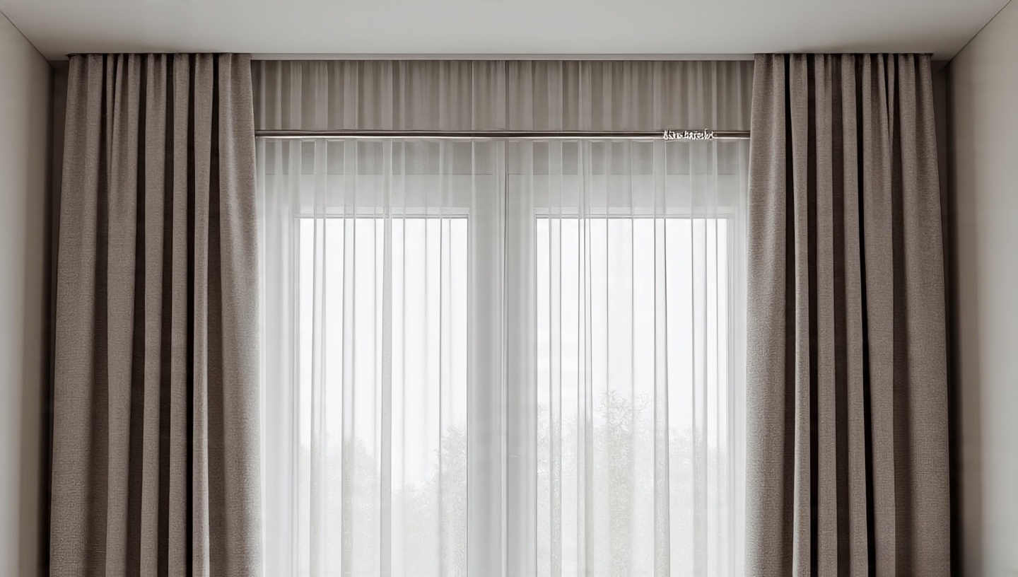 Daylight should arrive like a whisper, not a glare. Two layers do the trick.
- Rod height: Mount 8–12 in (20–30 cm) above the window or just below the crown to elongate the room.
- Fullness: Aim for 1.8–2.2× the window width. Skinny panels look like afterthoughts.
- Lengths: Sheers can “kiss” the floor; heavier linen may “break” 1–2 in (2–5 cm) for relaxed boho softness.
- Lining: Thermal or dim-out backing on the outer layer deepens evening color and saves your textiles from UV fade.
Architect’s nudge: If you have an open plan, coordinate with your zoning strategy here: Bohemian style for an open-floor living room design.
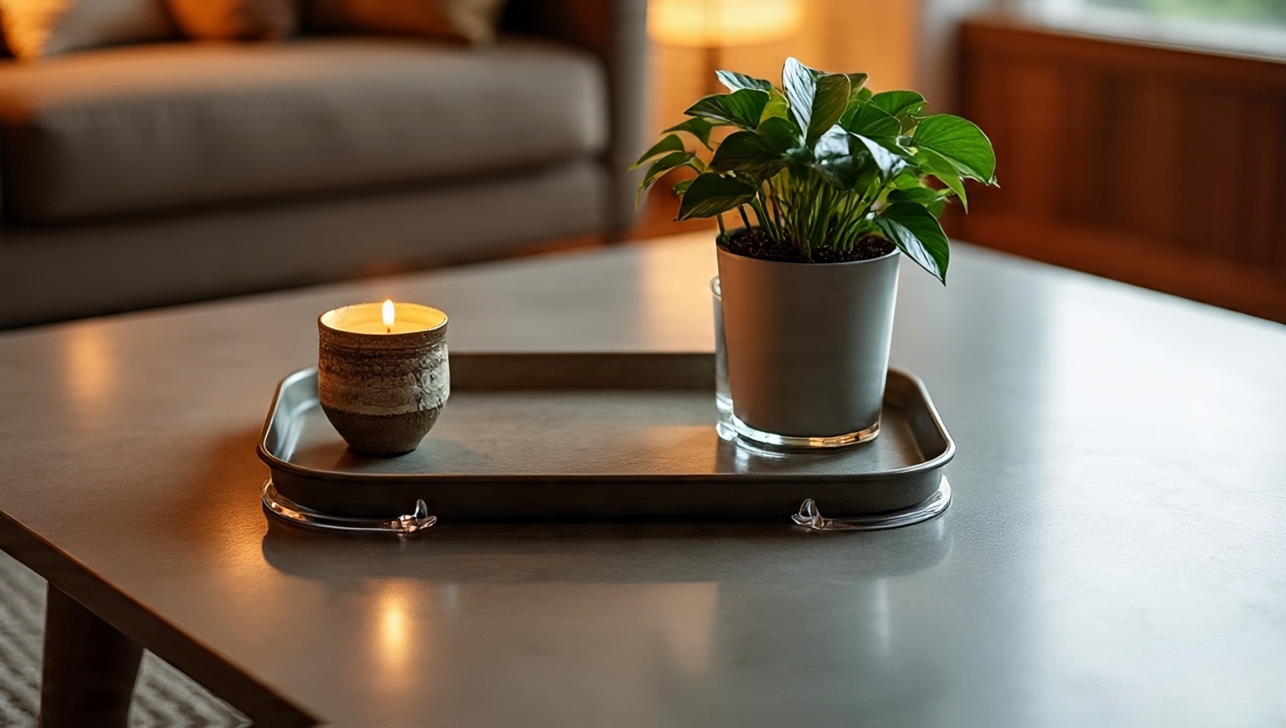
26) Coffee table vignette: compose, don’t pile
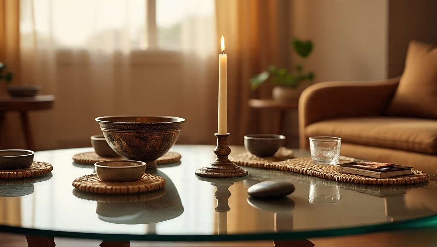 Vignettes are small stories. Give them a beginning, middle, and end.
- Coverage rule: Start at ~60–70% of the tabletop; leave negative space so cups and elbows have somewhere to land.
- Triangle method: Tall (a candle or branch), medium (a bowl or cup), small (a stone, matchbox). Heights = rhythm.
- Material logic: If the table is rustic wood, introduce one glazed piece for sheen contrast; on glass, add woven coasters to ground the lightness.
- Rotation: Swap one object monthly. The room will feel newly breathed-in without buying a thing.
Small-space swap: Nesting tables let you “edit” the vignette by pulling a surface away during gatherings.
27) Global textiles, ethically and durably
 Bohemian living room ideas often lean on story-rich textiles Berber rugs, mud cloth, suzanis. Treat them like the cultural documents they are.
- Provenance: Ask vendors about origin, age, fiber content, and techniques. Fair-trade and co-op labels are not just badges; they’re supply chain clarity.
- Care & fade: Rotate quarterly; UV eats reds first. Gentle vacuum on low suction with a mesh screen keeps fibers happy.
- Hanging textiles: Use a sleeve and thin rod or Velcro strips on a backing board to spread weight no corner pins that stress threads.
- Mix with humility: One hero piece per wall is usually enough. Let silence frame the song.
28) Negative space: the pause that makes the music
 Layered doesn’t mean loud. It means paced.
- Surfaces: Leave 20% of shelves and tabletops empty. The eye needs landing strips.
- Walkways: 30–36 in (75–90 cm) of clear width lets the room breathe and keeps toes unbruised.
- One-in/one-out: When a new piece enters, remove or relocate one. It’s ruthless. It’s right.
- Photo trick: Snap a phone pic in black & white; clutter reveals itself when color is muted.
Architect’s reminder: Negative space is not emptiness it’s invitation. It makes the layered moments feel intentional.
29) Mirrors for light (and a little magic)
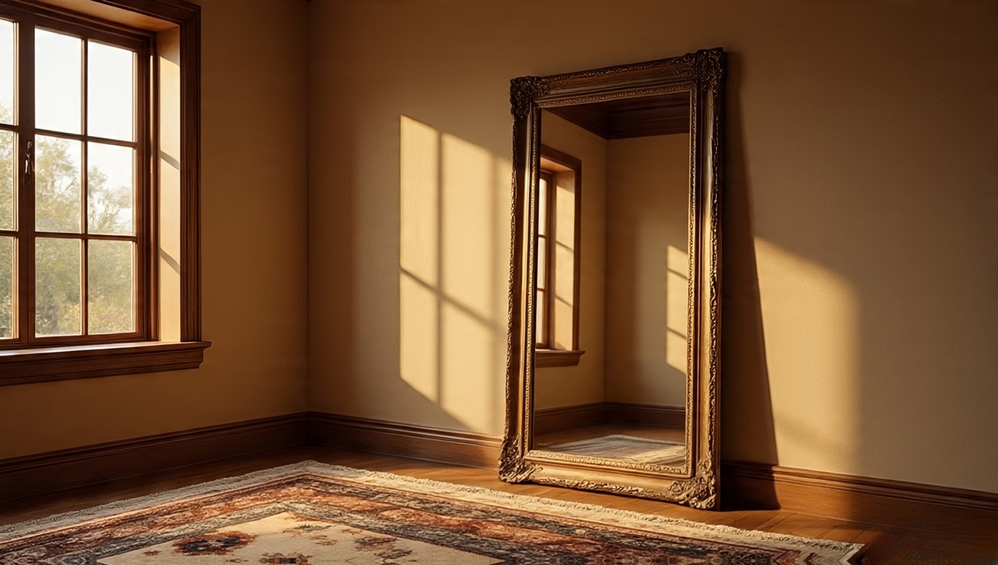 A well-placed mirror is a second window, not a selfie station.
- Placement: Catch cross-light, not direct glare. Opposite a side window is better than square-on to a sunny one.
- Height & safety: Center at 57–60 in (145–152 cm). Strap large mirrors to studs; heavy vintage frames deserve French cleats.
- Finish: Antiqued glass softens reflections and flatters earthy palettes; crisp modern glass sharpens a very soft room.
- Rug trick: A mirror reflecting the rug’s edge makes small rooms feel one size up.
Don’t: Bounce harsh task light into seating eyes. If it squints, you move it.
30) A tiny altar (or simply, a small place to mean something)
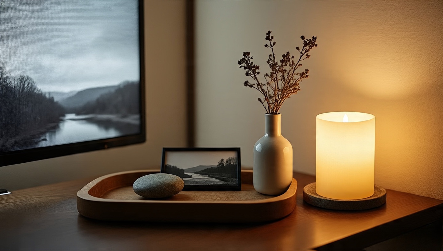 This isn’t about ceremony so much as presence. A shallow tray, a smooth stone, a photo, a sprig in water. That’s enough.
- Scale & spot: 10–12 in (25–30 cm) tray on a side table you pass often. Eye level if wall-mounted.
- Rotation ritual: Change one element each month a leaf for spring, a beach pebble for summer, a seed pod for fall. Your room will remember.
- Scent & flame: If you use candles, keep a snuffer and a heat-proof base. Beeswax near woven textures = evening magic.
- Balance: Place it opposite a screen (TV) to re-humanize the sightline.
Architect’s note: The altar’s job is to slow you down for five seconds. If it nags for dusting, edit it until it doesn’t.
31) Low bench behind the sofa (function first, poetry second)
 Architect’s intent: A slim bench is visual punctuation tying a floating sofa to the room without bulky casework. It doubles as overflow seating and a landing strip for books and baskets.
- Size & scale: Height 16–18 in (40–46 cm). Length = 70–85% of sofa width so it reads as a partner, not a tail.
- Depth: 12–15 in (30–38 cm) keeps circulation smooth in tight rooms.
- Material match: Oak or teak for warmth; iron base + reclaimed top for boho-industrial grit. Add felt feet so it glides over rugs.
Styling move: One woven basket for throws, a small stack of dog-eared paperbacks, and a low bowl for keys. Done useful and quiet.
32) Warm metals over cold (and where to break the rule)
 Brass, bronze, and aged gold bring candlelight even when the lamps are off. They flatter clay paints, sisal, jute, and vintage woods.
- Mix ratio: One dominant metal (70%) + one supporting (30%). Too many finishes = glitter, not glow.
- Patina, not polish: Choose brushed or antiqued over mirror-shine; fingerprints vanish and the room feels gentler.
- Break the rule, smartly: A single chrome or blackened-steel piece can sharpen an over-soft scheme think a modern reading lamp beside a rattan chair.
Architect’s test: Turn the lights down. If metal edges still read as soft highlights rather than hot spots, you’ve balanced the mix.
33) Candlelight as nightly ritual
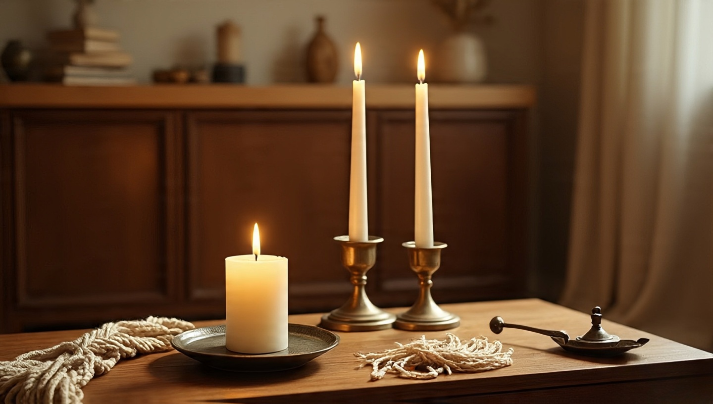 I strike a match and the room exhales: macramé knots gain shadows, brass blinks awake, and the rug looks deeper. Candlelight is design, not decor.
- Positions: One on the coffee table (low), one on a side table (mid), one on the mantel or shelf (high). This three-height “constellation” gives movement.
- Wax wisdom: Beeswax for the faint honey scent and clean burn; soy for long evenings. Unscented near dinner plates.
- Safety & soot: Trim wicks to ¼ in (6 mm); use a snuffer. Place on heat-proof dishes, especially over woven surfaces.
Micro-habit: Light at dusk, snuff at bedtime. The room and your nervous system will remember.
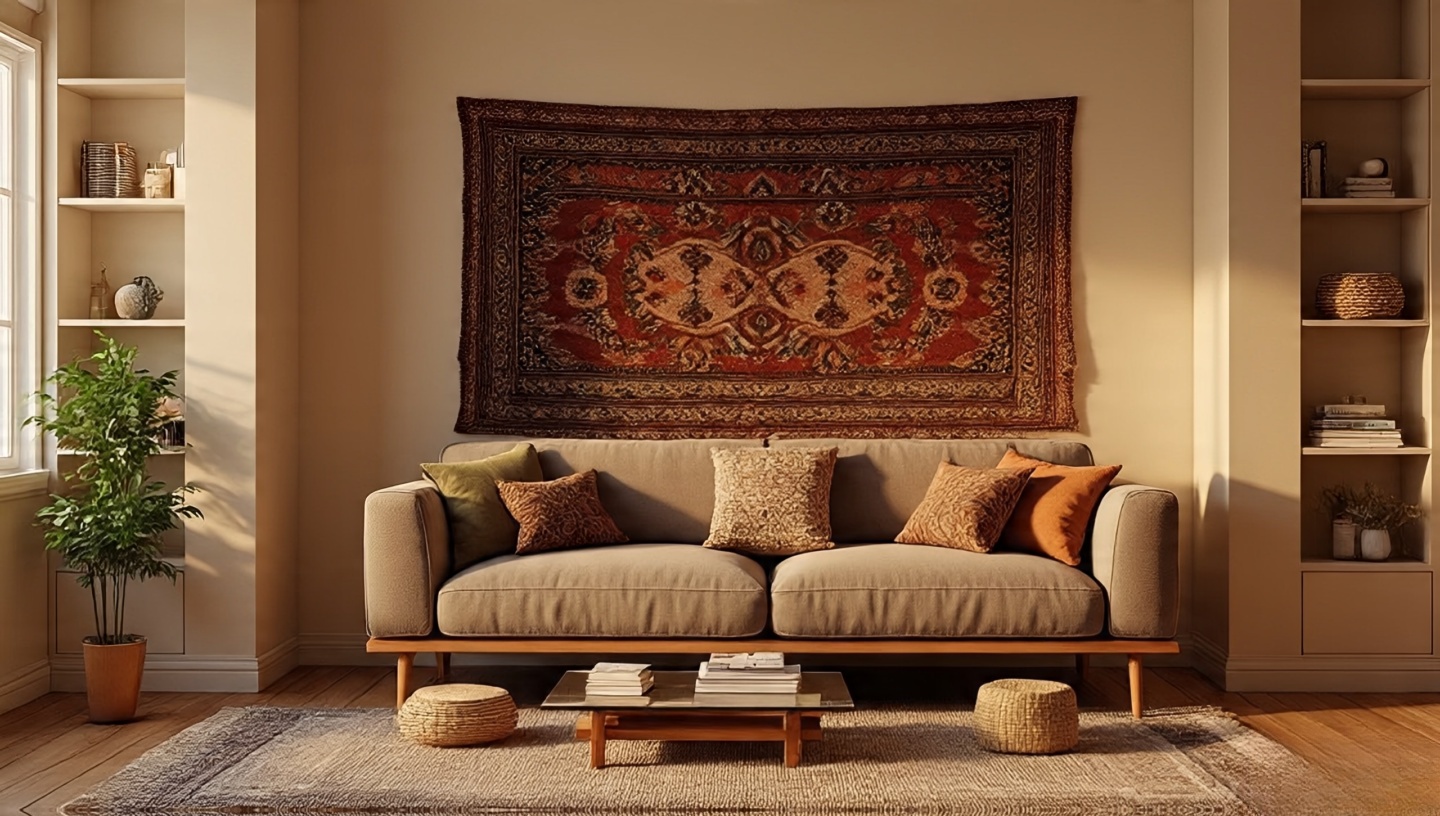
34) Art you can touch: hung textiles (sound + softness)
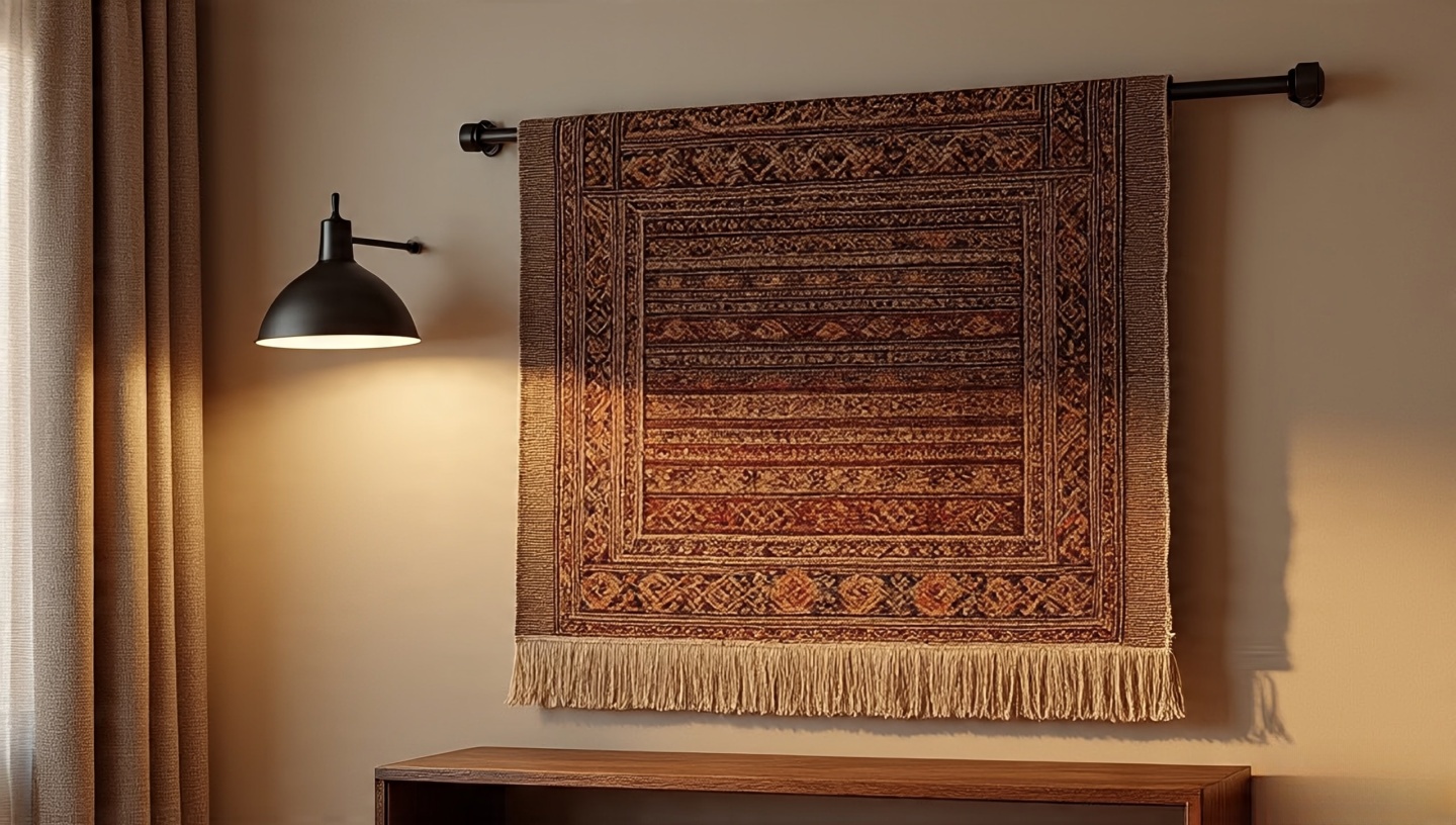 Textiles on the wall do three jobs at once: soften acoustics, add tactile story, and bring color without the glare of glass.
- Mounting: Sew a sleeve and slide a thin rod, or attach Velcro to a backing board to distribute weight. No thumbtacks in corners threads will stress and tear.
- Scale: 60–75% of the furniture width beneath feels calibrated; anything smaller needs companions.
- Light: Side-graze with a dimmable sconce to coax shadow from the weave.
Care note: Rotate seasonally; UV eats reds first. A mesh screen + low suction on the vacuum keeps dust off the fibers.
35) The “sip station” (hospitality on standby)
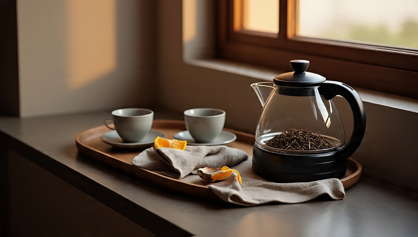 A tray with a small kettle, cups, loose-leaf tin, and linen napkins turns a living room into a living invitation. It’s domestic theater with taste and steam.
- Location: End of a console or a deep windowsill. Keep it away from textiles and cables.
- Stability: If using a soft ottoman, place a rigid wood or stone board beneath the tray. No wobble, no spills.
- Flavor + fragrance: Citrus peel in a tiny bowl brightens the nose and the mood; a sprig of mint in water looks alive.
Architect’s tie-in: Echo one hue from the tray (glazed cup, napkin edge) in a nearby pillow so the station feels integrated, not parked.
36) Open-plan flow, Boho edition drawing rooms without walls
 When the living room bleeds into dining and kitchen, you need soft architecture: rugs, pendants, and sightlines.
- Zoning: Use a large base rug to anchor seating; a second, flatter rug can sketch the dining zone. Leave a 4–6 in (10–15 cm) “river” of floor between them so each area breathes.
- Ceiling cues: Pendant lights at ~30–34 in (76–86 cm) above the dining table define that island of activity without shouting.
- Back-of-sofa strategy: The bench from idea 31 becomes your low “spine,” directing paths without blocking views.
For more layout strategies, see our guide on Bohemian style for an open-floor living room design.
37) Small Bohemian living room, big moves (yes, it works)
 Constraints sharpen design. In small rooms, you trade bulk for air and still keep soul.
- Sofa legs: Choose a leggy silhouette to show more floor space reads as bigger when edges are visible.
- Tables: Glass, open-base, or nested. Pull out only when needed, then tuck away.
- One bold textile: A hero rug or a wall-hung kilim can lead the whole composition; echo its color once more in a pillow or vase.
- Vertical storage: Tall, narrow shelves beat low, wide ones. Keep the top shelf light plants, baskets, sky for the eye.
Photo trick: Shoot the room in black & white; if it feels crowded, remove one object per surface and retake.
38) Budget boho: prioritize touchpoints, not everything
 Money spent where your skin meets the room outperforms money spent on brand names.
- Spend here: Rug (underfoot comfort and scale), one excellent lamp (light quality), sofa upholstery (hand + durability).
- Save here: Side tables, trays, frames thriftable and paintable.
- Upgrade cadence: Replace one item per quarter. Slow design ages better; your eye calibrates between steps.
For whole-home balance and more sourcing notes, keep this reference handy: 50 Bohemian Interior Design Ideas: The Ultimate Guide.
39) Modern boho edge (when you crave a cleaner line)
 Too much softness can turn to mush. A clean-lined sofa or a sharp-legged chair is the structural chord under your layered melody.
- Recipe: 1 modern anchor (sofa or chair) + 2–3 wildcards (vintage rug, patterned pillows, sculptural branch) = tension that reads intentional.
- Color discipline: Keep the anchor neutral (oat, clay, charcoal). Let pattern carry the personality.
- Metal moment: A blackened-steel lamp or table frame cuts sweetness and frames the scene.
Architect’s read: If your room feels like a costume, remove one “theme” object and add one plain, beautifully-made thing.
40) A scent for seasons (quiet shifts, big feelings)
 Scents are mood dimmers. Rotate lightly so the room feels new without a single furniture move.
- Spring: Green fig + soft florals. Windows cracked; linen throws come out.
- Summer: Citrus and mint near the “sip station” fresh, not sugary.
- Autumn: Cedar, clove, a hint of smoke. Wool blankets reappear; brass glows deeper.
- Winter: Amber, vetiver, quiet woodstove notes. Candles low and steady.
Calibrate: If you can name the scent from the doorway, it’s too strong. You want the room to smell like itself, just more itself.
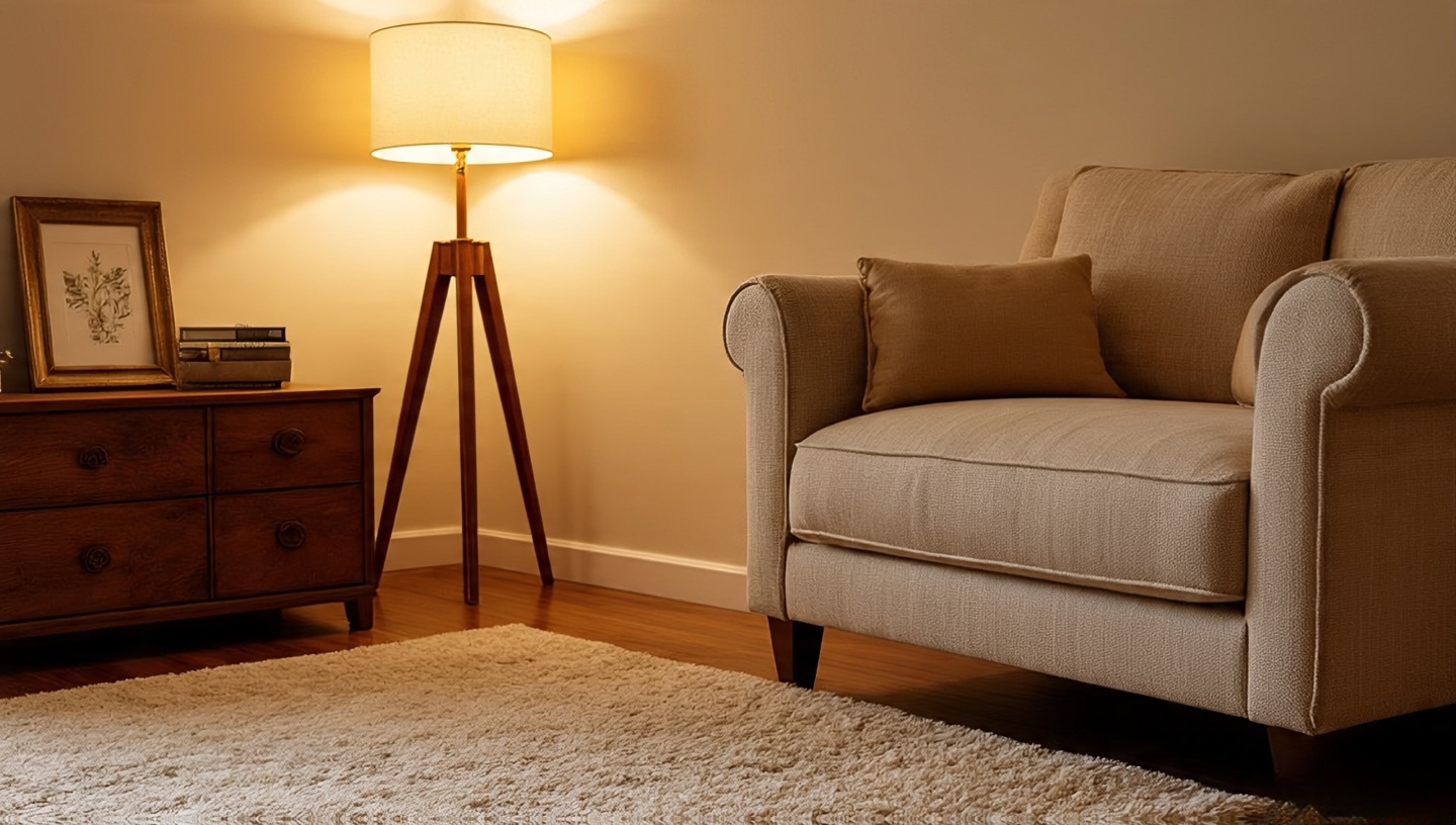
41) Lighting, quick hits (because glow beats glare)
 Architect’s truth: The right light turns texture into theater. Aim for layers, dimmers, and beams that graze not blast your surfaces.
- Three-layer rule: Ambient (glow), task (focus), accent (drama). If you can point to each, your lighting plan lives.
- Color temperature: 2700–3000K for evening warmth that flatters earthy palettes and textured textiles.
- Beam spread: Use narrow beams to skim limewash or clay walls shadows become soft stripes that shift with you.
- Height games: Mix low (table candles), mid (shaded lamps), and high (a discreet pendant) so light pools at different levels.
- Shade fabric: Linen diffuses with a velvety edge; parchment is crisper; rattan throws subtle latticework on nearby walls.
- Dimmer math: Put every lamp on a dimmer or smart plug. It’s the cheapest, most powerful mood control you can buy.
- Glare checks: Sit in every seat at night and look toward each source. If your eyes squint, redirect or soften with a shade.
- Candles (the analog filter): Cluster three heights on a tray; trim wicks to ¼ in (6 mm) to avoid soot on macramé and woven baskets.
One-minute upgrade: Swap cool bulbs for warm, then angle a floor lamp to graze your textured wall. Watch the room exhale.
42) The final edit: feel it with your body (not just your eyes)
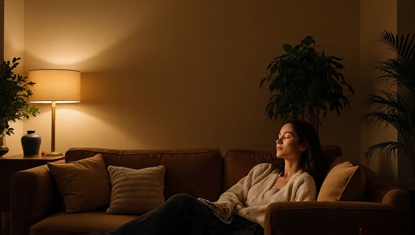 I walk the room in bare feet, grazing fingertips over a tooled leather cushion, then a cool brass tray. I sit everywhere. I listen. The rug muffles, the plants whisper at the window, the lamp throws honey on the wall. This is the test I give every project before I call it done.
- Doorway pause: Stand at the threshold. If your shoulders drop, you’re close. If they rise, remove one object per surface and try again.
- Route check: Ensure one clear 30–36 in (75–90 cm) path through the space. Bohemian living room ideas still need grown-up circulation.
- Touchpoint audit: Where hands and feet land most (sofa arms, rugs, throws) should feel soft, sturdy, and clean.
- Sound & scent: A linen curtain and a wall-hung textile tame echo; a quiet cedar or beeswax note should whisper, not announce.
- Night proofing: Dim all lights to 20–30%. If the room turns to amber, not gray, you’ve tuned the palette right.
Last move: Remove one “pretty” thing that doesn’t serve comfort. Add one small habit lighting a candle at dusk, rotating the record, misting plants. Design ends; living begins.
Micro-tips you’ll actually use
- Rug math: In small rooms, let the rug run at least the sofa’s full width; in larger rooms, let it extend 20–30 cm (8–12 in) past the sofa arms.
- Pillow recipe: 2 large solids + 1 bold pattern + 1 small pattern. Swap one per season.
- Art height: Center at 145–150 cm (57–59 in) from floor for a relaxed, gallery-ish sightline.
- Plant care: Group by light needs; rotate pots quarterly to even out growth and sun-fading.
- Lighting: One lamp per “zone”: reading chair, sofa, entry sightline.
Common mistakes (and easy fixes)
- Too many tiny patterns: Add one large-scale print to lead the orchestra.
- Everything at the same height: Mix floor cushions, standard seating, and a tall plant to tier the view.
- Cold light: Switch bulbs before you switch sofas. Warmth changes everything.
- All neutrals, no nerve: Choose a single saturated color (indigo, persimmon) and repeat it twice.
Want to go deeper?
For a whole-home perspective including bedrooms, dining, and entries bookmark our broader guide: 50 Bohemian Interior Design Ideas: The Ultimate Guide. It expands these principles beyond the living room so your spaces speak the same language.
Keywords and how they appear naturally
Main keyword: “Bohemian living room ideas” (used throughout in headings and explanations).
Related keywords: boho living room, eclectic living room, layered rugs, natural materials, vintage decor, rattan furniture, macramé wall hanging, textured textiles, earthy color palette.
Long-tail keywords (sprinkled naturally): how to style a bohemian living room, small bohemian living room, budget bohemian living room ideas, modern boho living room, bohemian living room lighting ideas, bohemian living room rug layering tips, open floor plan bohemian living room.
A closing note from the sofa
When I swapped my plain rug for a woven Moroccan one, the room didn’t just look different it felt different. The air seemed warmer, the evening quieter. That’s the quiet superpower of Bohemian design: it turns a living room into a living story. Write yours slowly, with your hands, your eyes, your nose. Let it be imperfect. Let it be yours.


")


")