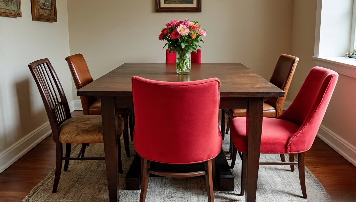
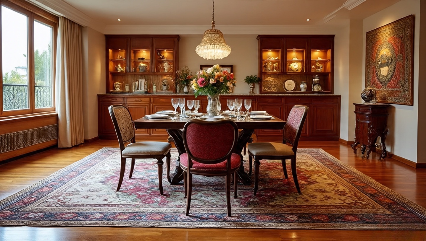
Roohome.com – When I first stepped into my own 38-square-meter city apartment, I felt the walls press in like a curious crowd. I loved Bohemian interiors the layered rugs, the scent of worn leather, the stories each piece of furniture told but how could all that fit without turning the place into a dusty storage unit? Over three decades of practice, I’ve discovered that small-space Boho is less about the quantity of furniture and more about the choreography of space. It’s a design dance where every item moves with purpose and the pauses the negative spaces play their own quiet music.
This guide distills what I’ve learned as an architect and a lifelong Boho enthusiast: from precise dimensions for walkways to the way light can spill across rattan and make a room feel twice its size. Whether you rent a studio or own a tiny cottage, these principles will help you create a home that feels expansive, personal, and alive.
1. Flow First, Furniture Second
Before you bring in a single pouf, study how people will move through the room. Think of it as a river: you need clear channels for daily life.
Dimensions & Clearances
Maintain at least 60–75 cm of continuous walkway between major pieces.
Door swings require a minimum 80 cm radius avoid placing tall plants or lamps in that arc.
Common Mistake & Fix
Mistake: Lining furniture flush against walls, leaving a tight corridor in the center. Fix: Float key pieces a few centimeters from the wall to create depth and easier movement.
Designer’s Note: I once rearranged a living room at midnight just to straighten a traffic path. The next morning, the client swore the space had grown overnight.
Image idea: Overhead floor plan sketch showing clear circulation paths through a compact living-dining area.
2. Scale Isn’t Size It’s Visual Weight
A single oversized sectional can swallow a studio; too many tiny stools create visual noise. Balance is about presence, not just dimensions.
Materials & Finishes
Choose pieces with slender legs or open weaves rattan, cane, or slim steel so light filters through and the eye keeps moving.
Budget Tip
A sculptural vintage chair from a flea market often costs less than a new bulky sofa and becomes an instant focal point.
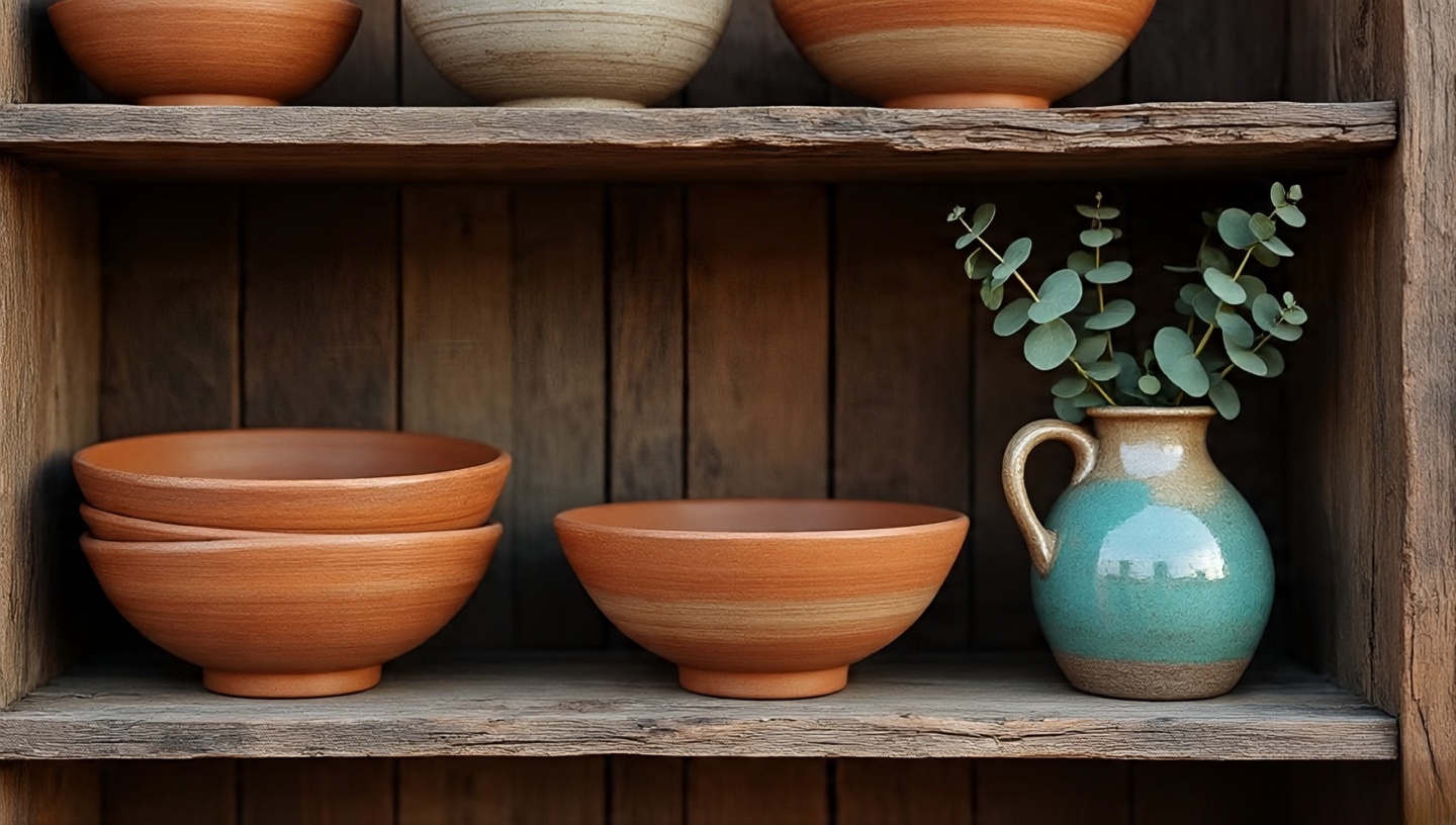
Image idea: Close-up of a lightweight rattan armchair casting patterned shadows on a pale wall.
3. Negative Space: Your Invisible Asset
The air around furniture is as important as the furniture itself. Leave breathing room so sunlight can wrap objects like a soft shawl.
Installation & Sequencing
Place the largest item first (sofa, bed), then add secondary pieces only if they don’t interrupt circulation.
Leave at least 15 cm gaps between tall items to define silhouettes.
Common Mistake & Fix
Mistake: Filling every wall with shelves. Fix: Reserve one bare wall as a “visual exhale,” perhaps with a single statement art piece.
Image idea: Sunlit corner with a single plant and empty floor, highlighting negative space.
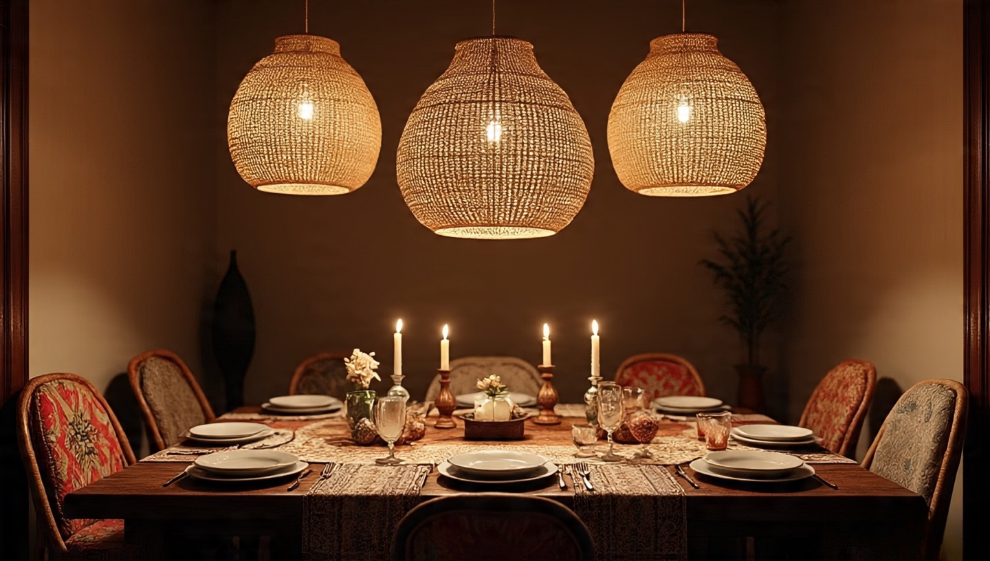
4. Sensory Layers That Expand Perception
Texture, sound, and scent trick the mind into feeling spaciousness. A beaded curtain that clinks in a breeze, a jute rug underfoot these sensations add dimension without square meters.
Lighting Framework
Combine ambient (warm LED strips), task (adjustable wall sconces), and accent (fairy lights) to create visual depth.
Avoid overhead glare; bounce light off pale walls for a gentle glow.
Image idea: Warmly lit Boho living room with layered rugs and string lights hidden behind a carved wood panel.
5. Color Strategy: Whisper Walls, Singing Textiles
Bold paint can shrink a room. Keep walls soft sand, misty sage, warm ivory and let kilim pillows and tapestries bring the drama.
Common Mistake & Fix
Mistake: Dark accent walls in already dim spaces. Fix: Use deep color only in well-lit niches or on removable panels.
6. Multi-Use Furniture for Agile Living
In small Boho homes, pieces must moonlight. A Moroccan tea table becomes a coffee table by day, plant stand by night.
Decision Matrix
Storage + Seating: Benches with lift-up lids.
Guest Ready: Daybeds with hidden drawers.
Flexible Zones: Folding screens for temporary separation.
Image idea: Bench with woven top lifted to reveal hidden blanket storage.
7. Plants as Living Architecture
Greenery adds vertical rhythm and softens edges. Think of plants as sculptures that change with the light.
Climate Considerations
High-humidity regions: choose hardy pothos or philodendron.
Dry climates: succulents and snake plants thrive with minimal watering.
Group by light needs to simplify care. A ladder shelf with trailing vines can frame a window like living curtains.
Image idea: Tall fiddle-leaf fig next to a window with sheer curtains fluttering.
8. Mixing Old and New Without Chaos
A chipped brass lamp or weathered rocker can anchor a room, but each vintage find deserves space to breathe. For sourcing gems, see this expert guide.
Cost & Value
Vintage often costs less than mass-market reproductions and ages gracefully. Just inspect joints and finishes for hidden repairs.
9. Layout Tricks & Zoning
Define areas with layered rugs one for lounging, another for dining.
Place key furniture on the diagonal to soften rectangular rooms.
Use low-profile seating to exaggerate ceiling height.
Image idea: Overhead view of a studio apartment showing distinct rug zones.
10. Art, Accessories, and Editing Gracefully
Rotate art seasonally. Lightweight frames or frameless canvases keep walls from feeling heavy. Keep a “maybe box” for accessories store items for a week and see if you miss them before letting them go.
Designer’s Note
I’ve watched rooms “exhale” when just one crowded shelf was cleared. Sometimes less truly is more.
Mini FAQ
Q: How much clearance should I leave around a coffee table? A: 45–50 cm for leg comfort and circulation.
Q: Best rug size for a 3×4 m living area? A: At least 2×3 m to anchor seating while revealing 20–30 cm of floor around the edges.
Q: Can I mix five different wood tones? A: Yes, if you repeat each tone at least twice to create balance.
Closing Checklist
Mark clear 60 cm circulation paths before buying furniture.
Choose one statement piece and keep supporting items visually light.
Reserve at least one negative-space wall for calm.
Layer sensory elements sound, scent, texture to expand perception.
Edit regularly; if you don’t miss it, release it.
Light a candle tonight, slide your sofa a few inches, and listen. A room will tell you when it’s right.
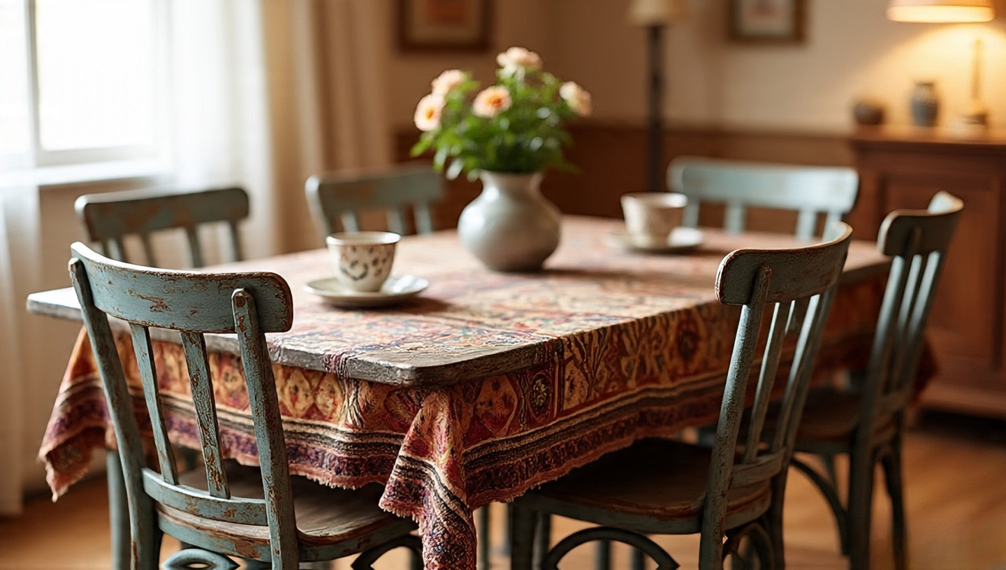
Roohome.com – There’s a particular smell when you step into a vintage shop—warm dust, sun-bleached wood, maybe a whisper of old incense that lingers in the fabric of a hand-loomed rug. After three decades designing homes around the world, I still feel a spark of adventure every time I duck into a flea market or estate sale. A boho interior thrives on these unexpected finds, but sourcing them well takes more than luck. It takes a practiced eye, an understanding of structure and materials, and the patience of a seasoned builder. Whether you live in a bustling city or a quiet coastal town, here’s how to bring authentic character into your home with professional confidence.
What follows isn’t a shopping list. It’s a field guide drawn from years of architectural practice, full of anecdotes, precise measurements, and hard-won tips. If you’ve ever wanted a home that feels like a layered travelogue rather than a catalog set, these tactics will help you hunt, evaluate, and integrate vintage pieces that last for decades.
The Architect’s Eye: Training Yourself to See Beyond Dust
When I approach a vintage market, I scan lines and proportions before I even notice finishes. Structural integrity comes first. Sight down the edge of a table to spot warping; tap a chair leg and listen for a solid, low tone rather than a hollow rattle. Bring a small flashlight to check joints and undersides—good joinery is the skeleton of longevity.
Dimensions & Clearances
Dining tables: confirm a minimum 28–30 in (71–76 cm) height for comfort.
Seating: seat height should fall between 17–19 in (43–48 cm) for most adults.
These numbers may sound dry, but they’re the difference between a beautiful conversation piece and a daily frustration.
Mapping the Hunt: Where Quality Hides
Decades of projects taught me that location dictates style. Coastal estate sales yield driftwood frames and salt-bleached teak; industrial cities hide steel cabinets and machinist stools. Rural charity shops are best for solid hardwoods. Early mornings remain unbeatable—merchants restock before crowds arrive.
Designer’s Note: Keep a simple floor-plan sketch with key room dimensions on your phone. A quick glance can save you from a costly misfit.
Understanding Materials & Finishes
A seasoned architect reads materials like a book. Oak with tight grain will outlast softer pine. Brass gains a rich patina but avoid pieces coated with thin lacquer that flakes under fingernails. Cane and rattan should feel springy, not brittle. For mixed-material items, confirm that fasteners are stainless or brass to avoid galvanic corrosion in humid climates.
Common Mistake
Buying veneer furniture assuming it’s solid wood.
Fix/Prevention
Check edges: true veneer shows thin layers over a substrate. Solid wood reveals continuous grain around corners.
Budgeting the Boho Way
Set a ceiling before you leave home. I recommend a “60/30/10” framework: 60 % of your budget on key anchors (sofa, dining table), 30 % on accent pieces, 10 % on spontaneous treasures. This keeps the thrill of the hunt without blowing your renovation fund.
Cost & Value
Mid-century teak credenza: $400–$900 depending on region.
Hand-knotted Moroccan rug: $250–$700 for a 5×7 ft size.
Negotiation Without the Awkwardness
Bargaining is a conversation, not a confrontation. Compliment craftsmanship first, then politely ask if the price is flexible. Silence is powerful; let the seller speak next. I often secure 10–15 % off with this simple rhythm.
“This teak carving has such beautiful grain—would you consider $120?”
Texture as the Soul of Boho
Run your fingers across a jute rug or a cane headboard and you’ll feel life itself. Mixing rough with smooth—like a glossy ceramic vase on a raw wood console—creates a tactile richness that makes a room vibrate. For layout inspiration, visit this guide on mixing vintage rattan.
Image idea: Close-up of a hand brushing across woven jute with sunlight filtering through sheer curtains (alt text: hand touching jute rug texture).
Integrating Old with New
Boho isn’t clutter; it’s curation. Pair a vintage indigo textile with a modern linen sofa so each sings. Group small objects in odd numbers—three ceramic bowls, five brass candlesticks—for visual rhythm. For more ideas, see the ultimate bohemian interior guide.
Lighting: The Unsung Hero
Lighting transforms secondhand pieces from “junk shop” to “gallery treasure.” Swap harsh bulbs for warm LEDs. Aim for 2700 K color temperature to mimic late-afternoon sun. Place thrifted lamps near textured walls so shadows dance across woven baskets and carved wood.
Image idea: Warm-lit reading nook with vintage lamp casting patterned shadows (alt text: boho corner with glowing thrifted lamp).
Installation & Sequencing
Integrating heavy vintage pieces requires planning. Always anchor tall cabinets to wall studs—use 2.5 in screws for drywall over wood framing. When layering rugs, place a natural rubber pad beneath to prevent slipping. Sequence large deliveries before delicate décor to avoid damage.
Common Mistake
Bringing in soft textiles first and staining them during furniture moves.
Fix/Prevention
Protect rugs with plastic sheeting until all major pieces are placed.
Climate & Code Considerations
Humidity is the silent killer of vintage finds. In tropical zones, aim for indoor humidity below 60 %. Use dehumidifiers and check local electrical codes before rewiring antique fixtures. In colder climates, allow wood to acclimate 48 hours before installation to prevent cracking.
Decision Matrix: Keep, Restore, or Let Go
Condition
Effort
Recommendation
Solid frame, minor finish wear
Low
Buy and refinish
Loose joints, rare material
Medium
Buy and professionally restore
Rot or active pests
High
Pass unless historically significant
Mini-FAQ
How do I remove musty odors?
Sprinkle baking soda, seal in a bag for 24 hours, then air in direct sunlight.
Is mixing metals okay?
Yes—limit to two finishes (e.g., brass + matte black) for cohesion.
What’s the best first purchase?
A statement rug. It anchors the room and guides your palette.
Closing Checklist: Ready for Your First Hunt?
✔ Floor-plan sketch with key measurements saved on your phone.
✔ Flashlight and tape measure in your bag.
✔ Budget split: 60/30/10.
✔ Humidity and climate considerations noted.
Start with one thrifted find this week—maybe a woven basket or hand-painted mug—and let it guide the next choice. Soon you’ll have a home that smells of aged wood and morning coffee, a place where every corner invites you to sit, touch, and stay awhile.
Advanced Furniture Restoration Tips
Sometimes the perfect vintage piece needs more than a light sanding. Over my career, I’ve supervised countless restorations and learned a few crucial steps:
Materials & Finishes
Shellac vs. Polyurethane: Shellac creates a warm, natural glow but requires more maintenance. Polyurethane is more durable and water-resistant for high-traffic surfaces.
Natural Oils: Linseed or tung oil penetrate deeply and highlight wood grain, perfect for mid-century teak.
Common Mistake
Skipping a grain filler on open-pore woods like oak leads to uneven finishes.
Fix/Prevention
Apply a sanding sealer or grain filler before staining for a smooth surface that ages gracefully.
Textile Sourcing & Care
Textiles hold scent and memory, but they need special handling. When hunting for vintage fabrics:
In regions like Texas and the Pacific Northwest, where extreme weather and grid instability frequently result in prolonged blackouts, having an essential home backup system is crucial. From spoiled food to unusable appliances, the consequences of being left without electricity can be both inconvenient and costly.
When considering battery backup for your home, two popular options stand out: portable power stationsand Vehicle-to-Home (V2H)systems. Each offers distinct advantages depending on your lifestyle, power needs, and budget. In this guide, we will compare these two forms of backup power for homes, helping you decide which solution offers the best protection and flexibility when the grid goes down.
What is V2H? What is A Portable Power Station?
Two rising solutions in home energy resilience are Vehicle-to-Home (V2H) systems and portable power stations.
Vehicle-to-Home (V2H): Your EV as a Backup Power Source
V2H technology allows you to transform your electric vehicle (EV) into a powerful, mobile backup power source. During a power outage, electricity flows in reverse, that is, from your EV’s battery back into your home, providing enough energy to keep essential appliances running. This is especially useful during storm power outages or prolonged hurricane power outage situations where grid power may be down for days.
Modern electric vehicles, such as the Ford F-150 Lightning or Hyundai Ioniq 5, can deliver several kilowatts of power for hours or even days, depending on the vehicle’s battery size and the home’s energy consumption. V2H offers both energy security and cost savings through smart energy use.
How V2H Works: Key Components?
A V2H system includes three essential parts:
Bi-directional Charger: Unlike conventional EV chargers that only allow electricity to flow into the vehicle, a bi-directional charger enables two-way power transfer. This means it can not only charge your EV but also pull energy from the vehicle’s battery to power your home during an outage.
Inverter: Since electric vehicles store energy in DC (Direct Current), an inverter is essential to convert that energy into AC (Alternating Current), which is what home appliances use. This component ensures the power from your EV can be safely and efficiently used by your household systems.
Home Grid Connection: The system connects to your home’s electrical panel, allowing the distributed power to flow directly into selected circuits. This connection enables automatic or manual switchover during a grid outage, ensuring essential rooms and appliances stay powered.
Together, these components create a seamless energy loop that automatically activates when the grid goes down.
Portable Power Station: Flexible Backup for Homeowners
A portable power station is a compact, all-in-one backup power source that typically includes a rechargeable battery, an inverter, and multiple output ports. Unlike V2H, these units don’t require a vehicle or installation. They are plug-and-play solutions ideal for short-term blackouts or emergencies. Most models can power small appliances, medical devices, and lights, making them a practical option for storm power outages.
While they may not offer the capacity of an EV-based system, portable stations shine in their simplicity and portability, providing immediate battery backup for homeswithout complex setups.
Comparison Between V2H And Portable Power Stations
Here is a comparison table that clearly contrasts the core differences between Vehicle-to-Home (V2H) and Portable Power Stations as battery backup for homes.
Feature
Vehicle-to-home (V2H)
Portable Power Station
Capacity & Run Time
Massive capacity (40-100+kWh) can power a home for days.
Limited capacity (0.3-5kWh), powers essentials for homes.
Power Output
High output (5–10 kW+); supports large appliances simultaneously.
Varies (300W to 3kW+); suitable for small to mid-range devices
Cost (initial & operating)
High upfront investment (EV+ bi-directional charge)
More affordable, prices start from
Installation and convenience
Complex installation: needs professional setup and compatible EV
Plug-and-play: no installation required
Flexibility & Mobility
Limited mobility: tied to your parked EV
Highly portable: ideal for indoor and outdoor, and travel use.
Environmental friendliness & noise
Clean, quiet energy from EV battery
Clean and quiet, though fans may produce mild noise.
Use Cases
Best for whole-house backup during major outages (e.g. hurricanes)
Great for powering essentials, outdoor activities, or short outages
How to Choose the Right Battery Backup for Home: Practical Tips Based on Your Needs
Selecting the right battery backup for home depends on more than just price or capacity. Your lifestyle, energy habits, and even the infrastructure of your house play major roles.
Below are key factors to consider when deciding between a Vehicle-to-Home (V2H) system and a portable power station:
Assess Your Energy Needs
Start by identifying which appliances and systems are crucial during a power outage. This might include:
Refrigerator (100–800W).
Lights (5–60W each).
Wi-Fi router (5–15W).
Medical devices (varies).
Heating/cooling systems (up to 2000W+).
Phone/laptop chargers (10–100W).
Once you have listed the devices, calculate their combined wattage and estimate how long you want to run each item. For instance, if your essential load is 2000W and you need power for 5 hours, your battery backup for home must supply at least 10,000Wh (or 10 kWh). This will help determine whether a portable power station with 1–5 kWh is sufficient or if a V2H system, capable of delivering 40–100+ kWh, is a better fit.
Budget Considerations
Your budget is a significant factor. Portable power stations range from $300 to $3,000+, depending on capacity and features. They are more accessible and involve no installation costs.
In contrast, a V2H system requires:
A compatible electric vehicle.
A bi-directional charger ($4,000–$7,000).
Professional installation ($1,000–$3,000).
Possibly electrical panel upgrades.
V2H offers more capacity but comes with a high initial investment. Evaluate what you are willing and able to spend on your battery backup for home, especially if it is intended to support critical loads or your entire household.
Do You Own an Electric Vehicle (EV)?
This is a make-or-break factor for V2H. If you don’t already own a V2H-compatible EV, this option may not be viable unless you plan to purchase one soon. Some EVs like the Ford F-150 Lightning, Hyundai Ioniq 5, and certain Nissan Leaf models support V2H, but compatibility varies by region and charger availability.
Without an EV, a portable power station remains your most straightforward and flexible battery backup for the home. It requires no vehicle integration, works right out of the box, and can be easily moved or scaled to meet your evolving energy needs.
Installation Environment and Compatibility
Before investing in V2H, assess the electrical infrastructureof your home to ensure it is suitable for the system.
Do you have space for a charger and an inverter?
Is your electrical panel compatible, or will it need an upgrade?
Can your home safely disconnect from the grid during outages (islanding)?
V2H installation is not a DIY job. It demands certified professionals and permits in many areas. Moreover, older homes may require significant rewiring or the addition of a dedicated sub-panel to support V2H functionality. You will also need to check local utility regulations, as not all regions currently allow bi-directional power flow without specific approval.
On the other hand, portable power stations avoid these complications entirely. They do not require complex installation. They are ready to use out of the box, making them an idealbattery backup for home renters or smaller homes.
Long-Term Value and ROI
When evaluating the long-term return on investment (ROI) for a battery backup for your home, it’s important to consider the ongoing benefits and savings each solution can deliver.
Here is a closer look at the value each option offers:
Energy arbitrage: By charging your electric vehicle during off-peak hours and using that stored energy to power your home during peak-rate periods, you can significantly lower your energy bill. This practice, known as energy arbitrage, is only possible with bi-directional systems like V2H.
Grid independence: You are better protected against rising electricity prices and blackouts. It allows you to store a large amount of power and automatically switch to EV-supplied electricity during power outages, ensuring the continued operation of critical appliances.
Incentives: Many regions offer incentives for EV infrastructure, including bi-directional chargers, smart home energy systems, and installation services. These can take the form of tax credits, rebates, or utility grants, significantly reducing the overall cost of a V2H setup.
While portable power stations don’t provide ongoing utility savings like V2H systems, their low initial cost and plug-and-play design make them an attractive option for households that need occasional backup or temporary emergency power. They are also ideal for renters or those who want energy security without modifying their home’s electrical system.
Additionally, some higher-end portable models support solar recharging, offering modest long-term benefits for off-grid or eco-conscious users. Although they may not deliver the same ROI as V2H in the long run, they are a smart and practical investment for short-duration outages and mobile use.
Lifestyle Considerations
If you enjoy camping, road trips, tailgating, or living off-grid part-time, a portable power station is unmatched in terms of mobility and convenience. These units can power your gear wherever you go, making them versatile beyond home use.
Meanwhile, V2H is a stationary solution, ideal for those who prioritize whole-house backup power and rarely need to move their power source.
Why the Jackery Explorer 5000 Plus Is a Smart Battery Backup for Home — Better Than V2H for Many Households
The Jackery Explorer 5000 Plus is a powerful and versatile solution for anyone looking for a battery backup for the home. While Vehicle-to-Home (V2H) systems offer whole-home energy solutions, they require a compatible EV, costly installations, and space for specialized hardware.
In contrast, the Jackery Explorer 5000 Plus delivers plug-and-play backup power with high capacity, clean energy, and ease of use, making it a practical alternative for most homes.
Stay Powered Through Hurricanes, Storms & Blackouts
With a 5–60 kWh expandable capacity and 7200–14400W output, the Jackery Explorer 5000 Plus is designed to keep your home running for up to 30 days during extended power outages. Whether it’s your refrigerator, washer, Wi-Fi router, or even power-hungry appliances like dryers or freezers, this unit handles it all without breaking a sweat.
0ms Switchover for Critical Devices
The built-in 0ms Uninterruptible Power Supply (UPS) ensures that essential electronics, such as computers, routers, or medical equipment, remain powered with no downtime. Unlike many portable power stations that experience a delay in power transition, the Jackery Explorer 5000 Plus offers seamless backup, which is ideal for remote workers, online meetings, and sensitive electronics.
Power Where You Need It with Smart Transfer Switch
Pair the Jackery Explorer 5000 Plus with Jackery’s Smart Transfer Switch, and you can directly connect it to your home’s essential circuits. That means you will have uninterrupted power for select rooms, lights, outlets, or kitchen appliances without needing to run extension cords.
Fast & Flexible Charging Options
With up to 4000W of solar inputand five charging methods, including hybrid options, the unit can be fully charged in as little as1.7 hours. You can use:
AC charging (1800W, 3.5 hours).
Smart Transfer Switch (4000W, 1.7 hours).
Solar panels (1000W, ~6.5 hours with 2x 500X panels).
Hybrid setups for maximum speed and flexibility.
Eco-Friendly and Safe for Indoor Use
The Explorer 5000 Plus is zero-emission, making it safe for indoor use, which gives it a major advantage over gas generators. It also features a dual-voltage output (120V/240V), allowing you to power a wider range of appliances both indoors and outdoors, from air conditioners to power tools.
Wrapping It Up
Choosing between V2H and a portable power station depends on your lifestyle, budget, and home setup. V2H offers a long-term, high-capacity solution with strong ROI for EV owners, while portable power stations provide flexibility, affordability, and ease of use.
For most households seeking a reliable battery backup for their homes, especially during storms or blackouts, a powerful portable solution like the Jackery Explorer 5000 Plus stands out. With its high capacity, fast charging, and smart features, Jackery delivers dependable performance without the complexity of V2H, making it a smart and accessible choice for tackling power outages with confidence.
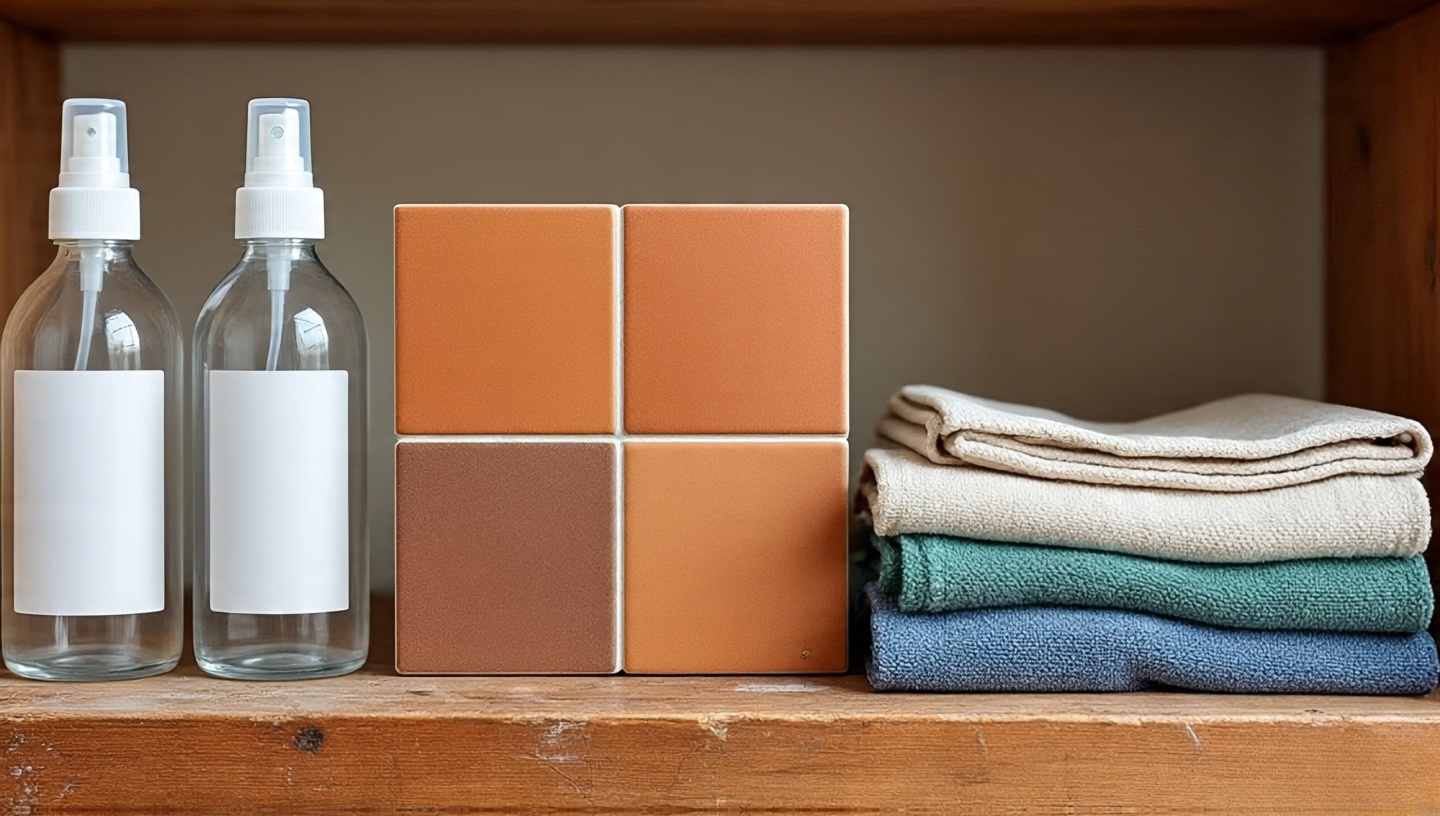
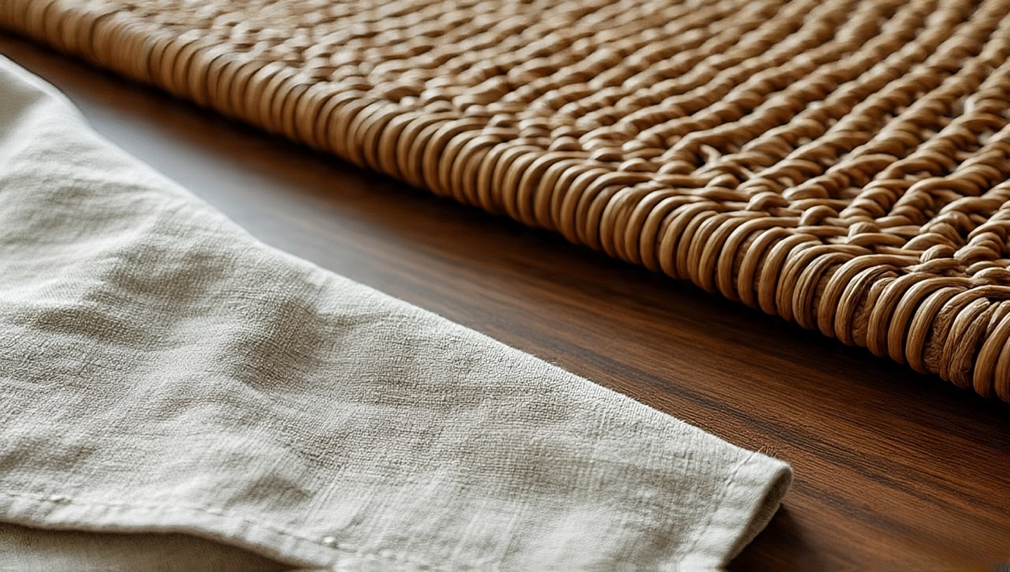
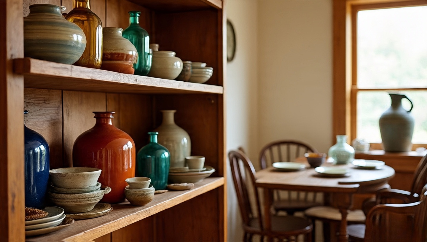
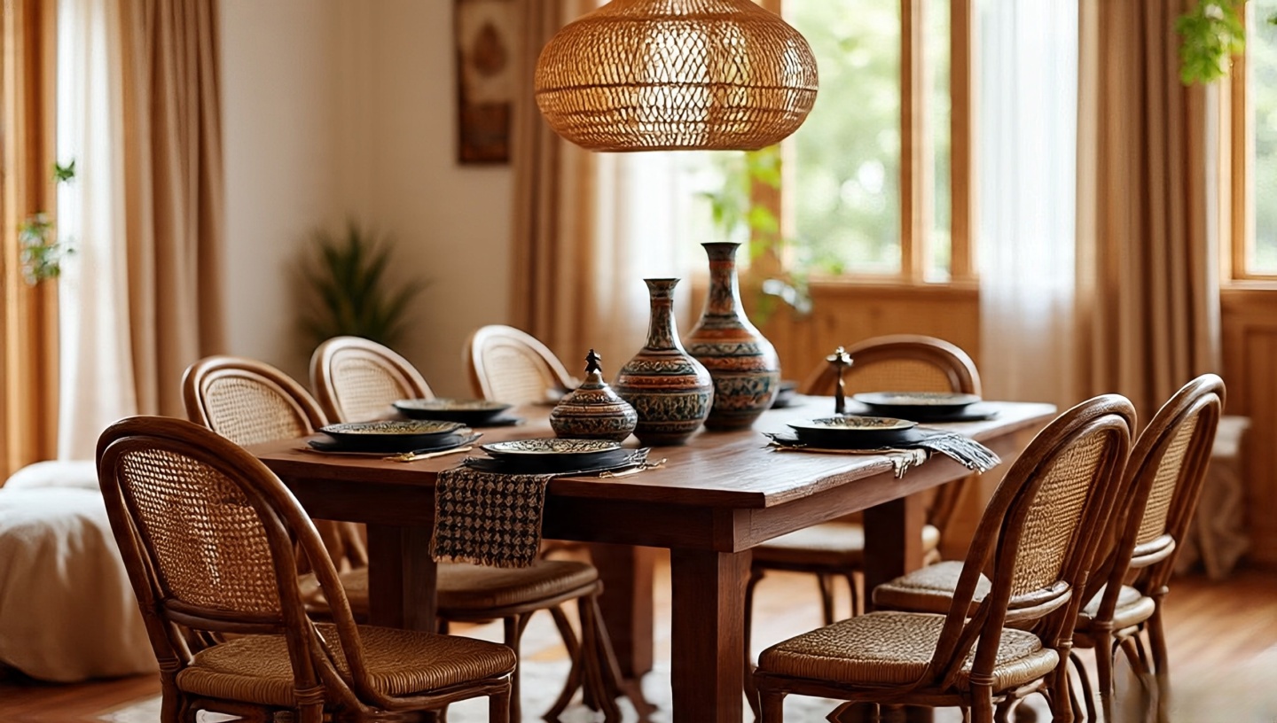
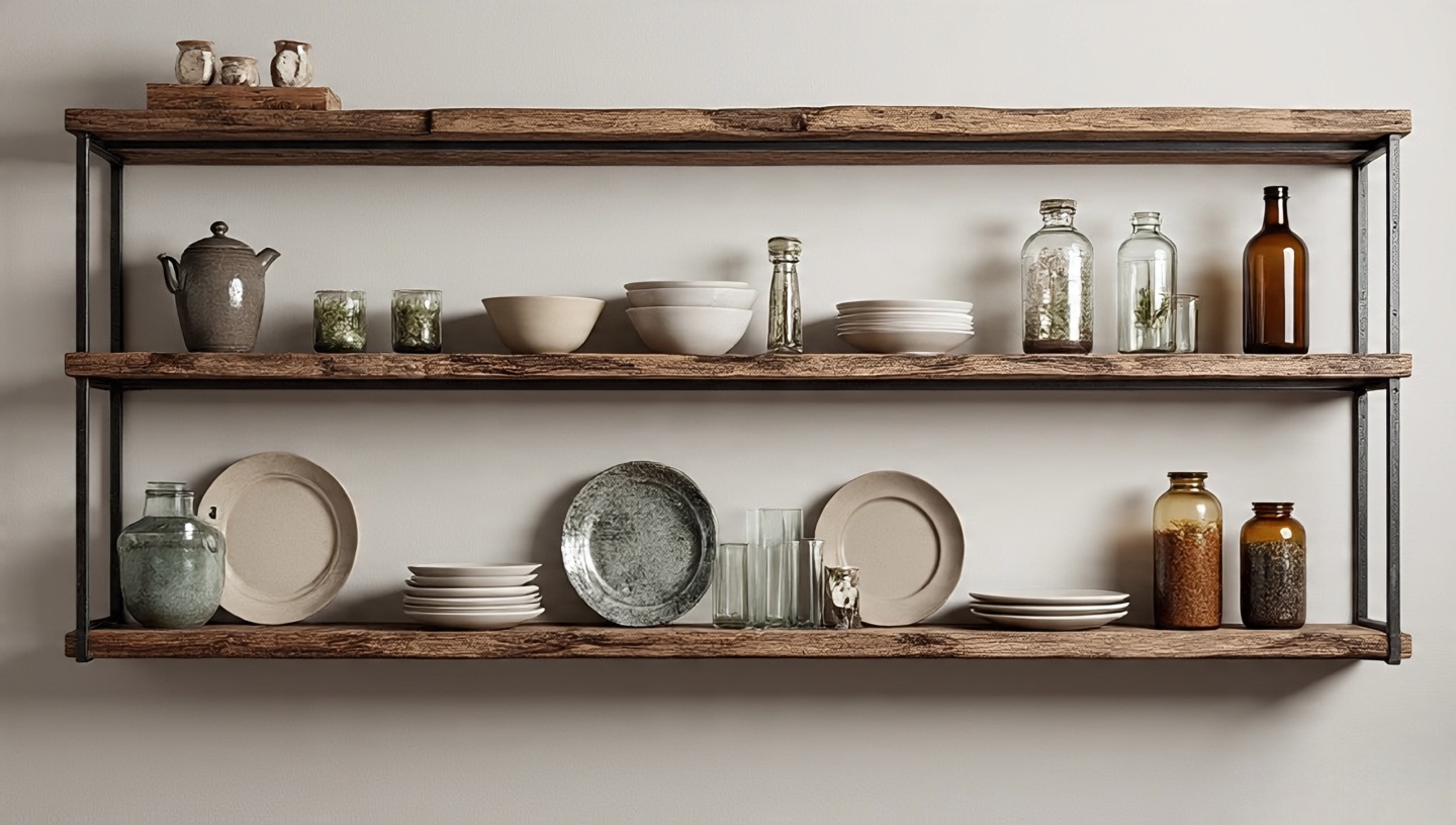
Roohome.com – People often think Boho interiors are about patterned pillows, bright rugs, or colorful souvenirs. But in truth, the heartbeat of Boho style lies in natural materials. They are the threads that hold everything together, whispering authenticity. Jute scratching under bare feet, rattan glowing golden in sunlight, cane filtering light like lace, and wood carrying its quiet strength. Without them, Boho becomes costume instead of lifestyle.
I’ve spent over three decades designing homes across different climates and cultures. And time and again, I’ve seen that spaces come alive not because of perfect symmetry or glossy finishes, but because of texture, imperfection, and honesty. This article is for homeowners, renters, and even design students who want to understand why natural materials matter and how to use them without falling into the common traps.
1. Why natural textures matter more than we admit
Years ago, I replaced a synthetic rug in my living room with a handwoven jute rug. Nothing else changed, yet the whole space shifted. Suddenly, the room breathed. The rough weave carried memories of countryside summers and barefoot mornings in Bali. This is what natural materials do: they don’t just decorate, they evoke.
Designer’s Note
In interiors with strong patterns, natural fibers like jute and cane calm the energy. They ground the room so it doesn’t become visual noise.
Image idea: close-up of a jute rug under a coffee table with a steaming cup of coffee resting on it, morning light streaming in (alt text: “jute rug under coffee table with warm morning light”).
2. Jute: raw, rustic, and tougher than it looks
Where it works: Rugs, poufs, wall art, even lampshades.
Dimensions & Clearances: For rugs, leave at least 18–24 inches of visible floor around edges in living rooms; 12 inches in bedrooms.
Cost & Value: A quality 6×9 ft jute rug can range from $150–$350, and lasts 5–7 years under moderate wear.
Common mistake: Using jute outdoors
Fix: Jute is highly absorbent. If you want the same look outdoors, opt for polypropylene blends that mimic jute but withstand moisture.
Image idea: living room with a golden jute rug and jewel-toned pillows (alt text: “boho living room with jute rug and colorful accents”).
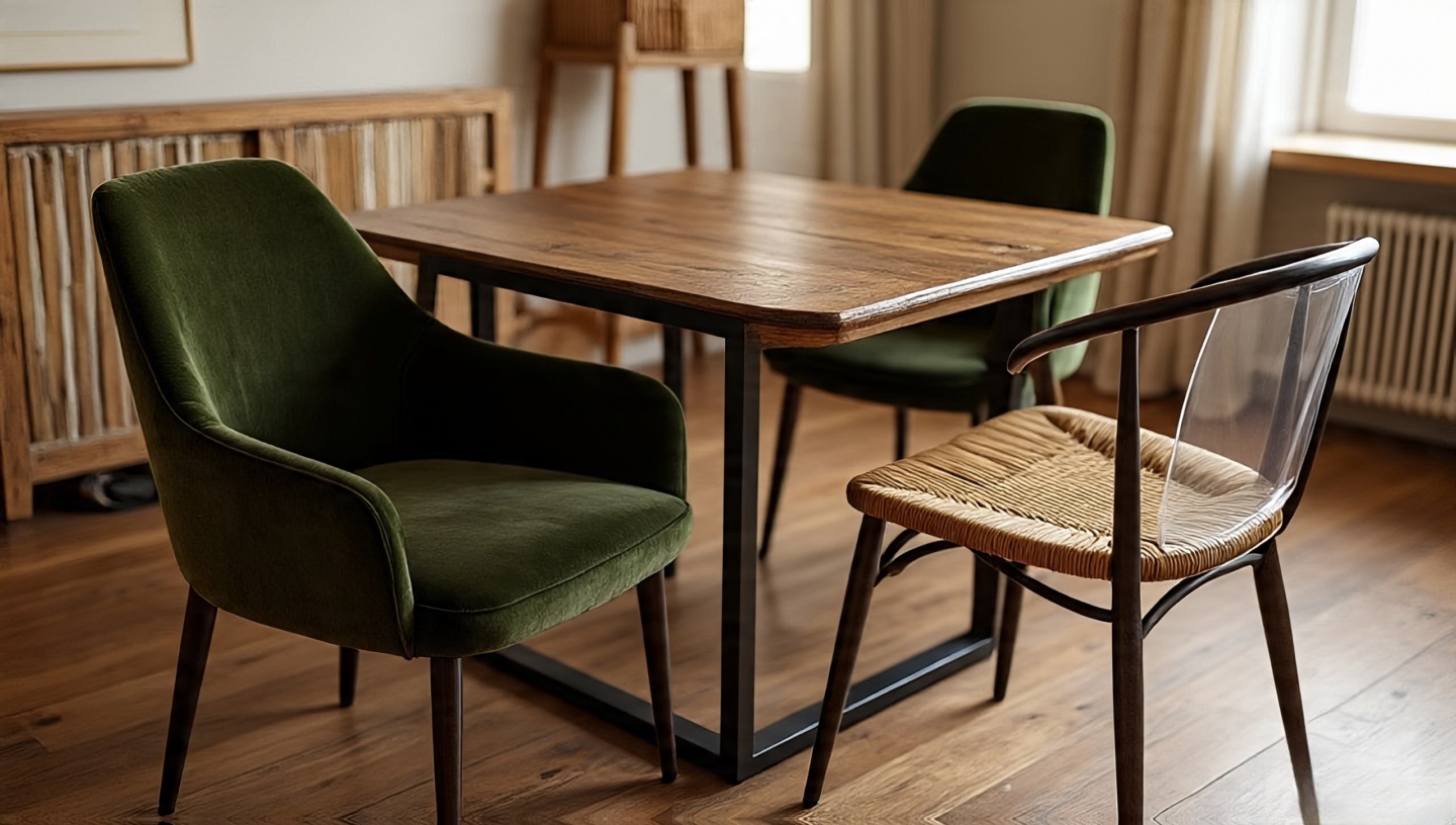
3. Rattan: the golden glow of casual elegance
Rattan has a unique ability to glow. When light hits, it scatters in warm, honeyed tones. It’s why vintage rattan pieces remain timeless.
Varnished rattan: easier to clean but less organic in feel.
Common mistake: Overloading a room with rattan
Fix: Use rattan as an accent, not the whole orchestra. A chair, a pendant lamp, or a single side table is enough to set the tone.
Image idea: rattan lounge chair near a leafy indoor plant, sunlight casting woven shadows (alt text: “rattan chair with indoor plant and sunlight”).
4. Cane: lightweight, flexible, and a little romantic
Cane is more delicate than rattan, but it offers a charm that’s hard to replicate. The perforated weave filters light, creating dotted patterns across floors and walls.
Durability & Maintenance
Average lifespan: 10–15 years with gentle use.
Keep humidity balanced. Spritz with water to prevent sagging.
Common mistake: Ignoring tension
Fix: If cane seats sag, don’t discard them. Re-wetting and re-tightening often restores the weave.
Image idea: cane cabinet doors with sunlight filtering through (alt text: “cane cabinet with sunlight patterns on the floor”).
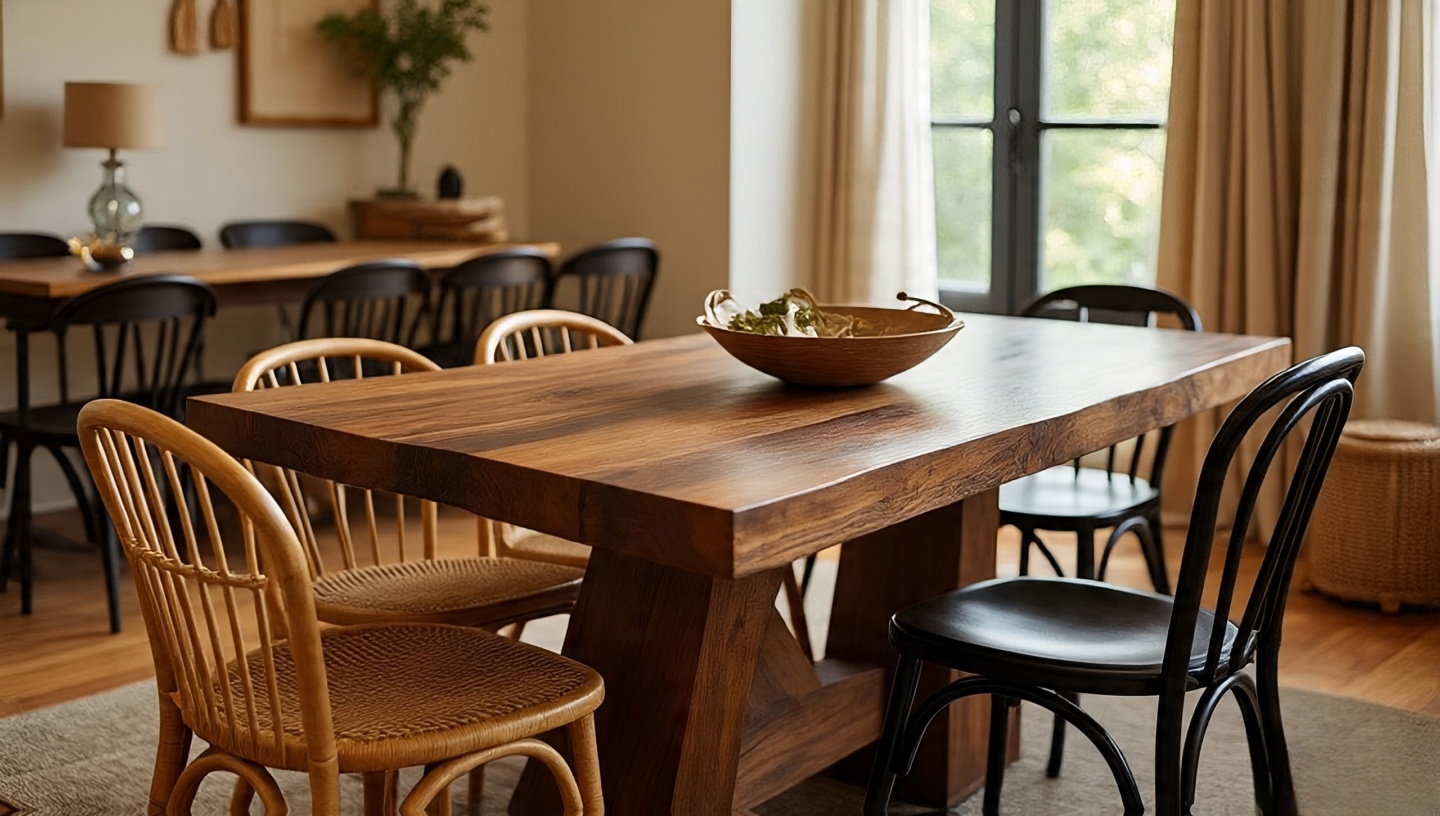
5. Wood: the anchor of authenticity
Wood is the structural soul of Boho decor. Its weight, smell, and grain tell stories of forests, time, and craftsmanship.
Materials & Finishes
Teak: Dense, water-resistant, best for humid climates.
Oak: Durable, classic, ideal for heavy-use furniture.
Mango wood: Affordable, sustainable, with rich grains.
Common mistake: Over-sanding reclaimed wood
Fix: Leave the imperfections. Knots and scratches are part of its character.
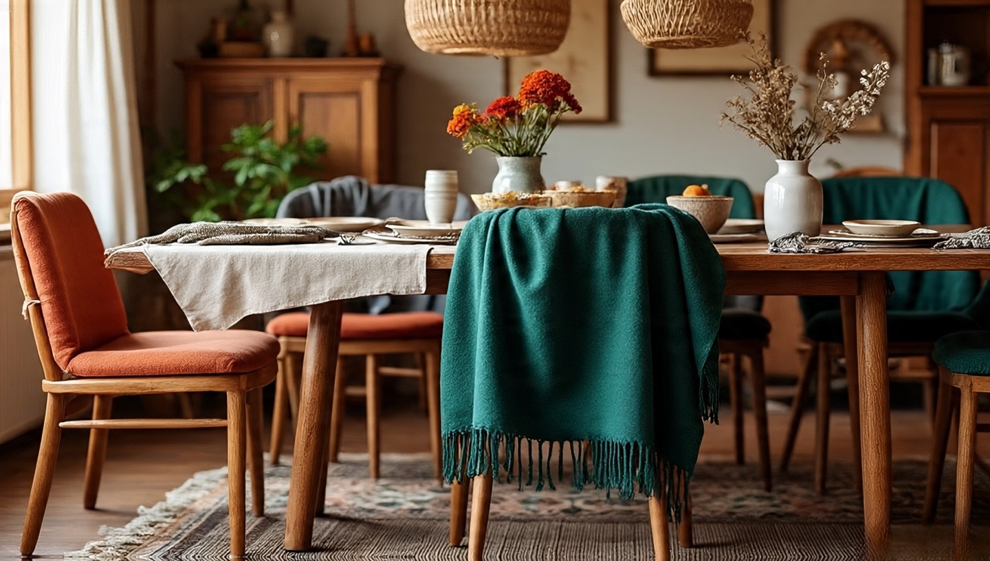
6. Mixing them all without creating chaos
Layering is beautiful, but too much creates noise. I teach a simple “3-anchor rule”: choose one grounding piece (wooden table), one textural base (jute rug), and one playful accent (rattan or cane chair).
Image idea: living room showing a wooden coffee table, jute rug, and rattan chair balanced together (alt text: “balanced boho living room with wood, jute, and rattan”).
7. Sustainability and ethical choices
As architects, we are responsible for material lifecycles. FSC-certified wood, recycled rattan, and fair-trade jute are investments in the planet as much as in your home. Read more on sustainable decor here.
8. Climate and code considerations
In humid climates: stick with teak or bamboo; avoid untreated jute.
In dry climates: humidify cane and rattan periodically to avoid cracking.
Fire codes: untreated jute and cane are flammable. Always check local code for commercial use.
9. Cost framework: budgeting natural materials
Budgeting isn’t just about purchase it’s about lifecycle cost. A $200 jute rug replaced every 5 years may cost more than a $500 wool rug that lasts 20.
Material
Entry-level
Mid-range
Premium
Jute rug (6×9)
$120
$250
$500+
Rattan chair
$150
$300
$800+
Cane-back dining chair
$200
$400
$1000+
Wood dining table
$600
$1200
$3000+
10. Common mistakes and how to fix them
Mistake: Over-polishing wood
Fix: Use matte oils or wax to keep the organic feel. Glossy varnishes kill the soul of wood.
Mistake: Using synthetic blends as “natural”
Fix: Check labels. If you want authenticity, look for 100% natural fiber certification.
11. Decision matrix: which material for which room?
One of the questions I hear most often is: “Where should I actually use these materials?” The answer depends on the room’s function, climate, and traffic. Below is a quick matrix I’ve used in consultations:
Room
Best Material
Why
Living Room
Jute rug + Wood table
Durability under moderate traffic, grounding warmth.
Dining Room
Wood table + Cane chairs
Wood anchors, cane adds comfort and texture.
Bedroom
Rattan headboard + Jute rug
Lightweight elegance + tactile comfort underfoot.
Patio/Outdoor
Teak or bamboo
Weather-resistant, sustainable for outdoor use.
Designer’s tip: Avoid jute in bathrooms or kitchens it doesn’t forgive spills or moisture.
12. Lifecycle vs. upfront cost framework
Clients often compare price tags, but the smarter question is: “What’s the cost per year of use?” A $120 jute rug lasting 3 years costs $40/year. A $500 wool rug lasting 20 years costs $25/year. Suddenly, the premium option looks cheaper in the long run.
Material
Average lifespan
Annualized cost (mid-range)
Jute
3–5 years
$40–$70/year
Rattan
10–15 years
$20–$30/year
Cane
10–12 years
$25–$35/year
Wood (solid)
30+ years
$15–$40/year
Rule of thumb: Think in decades, not in shopping seasons.
13. Climate-based recommendations
Different climates punish different materials. Here’s a quick guide:
Cold climates: Wood is king. Pair with layered textiles to offset its hardness.
Climate code note
Some municipalities require fire-retardant treatments for commercial spaces. Always confirm if your cane or jute products meet local codes before using them in cafes, hotels, or retail interiors.
14. Decision tree: which material fits your lifestyle?
When I guide clients, I often sketch this simple decision tree:
Do you entertain often? → Choose wood as anchor (durable, repairable).
Do you live barefoot? → Add a jute rug (tactile comfort).
Do you want a lightweight, movable setup? → Go with rattan or cane (easy to shift, airy feel).
Do you rent? → Invest in smaller accents like cane side tables or jute poufs; save wood investment for your permanent home.
15. Mistake-and-prevention framework
Mistake: Choosing beauty over durability
Prevention: Always check weight-bearing capacity. Cane chairs look delicate because they are. Don’t expect them to handle daily rough use.
Mistake: Ignoring maintenance cycles
Prevention: Schedule seasonal care. Oil wood once a year, spritz cane every 6 months, rotate jute rugs every 3 months to even out wear.
16. Mixing matrix: texture balancing
One of my go-to frameworks is a balance matrix. The goal: avoid monotony by mixing textures.
Anchor
Base
Accent
Wood
Jute
Rattan lamp
Rattan
Cotton fabric
Wood side table
Cane
Wool rug
Wood shelves
Jute
Concrete floor
Rattan chair
Designer’s note: Never let all three layers be woven textures you’ll lose hierarchy.
17. Performance vs. aesthetics grid
Every material lives somewhere between functional and emotional appeal. Plotting them helps clients choose wisely:
Jute: High texture, medium durability, low maintenance.
Rattan: Medium durability, medium comfort, high mood impact.
Cane: Medium-low durability, high elegance, high light-play quality.
Wood: High durability, high cost, timeless presence.
Tip: Anchor your big-ticket items in the upper-right (wood), then layer emotions with rattan or cane.
18. Installation and sequencing guide
Step 1: Place your largest anchor (wooden table or bedframe).
Sequencing matters. If you buy accents first, you risk “decorating around decoration,” which leads to clutter.
19. Long-term maintenance matrix
Material
Seasonal Task
Annual Task
Jute
Rotate rug quarterly
Deep vacuum (no water)
Rattan
Dust weekly
Oil every 12 months
Cane
Mist lightly in dry months
Re-tighten or replace weave after 10 years
Wood
Wipe with damp cloth
Oil/wax once a year
20. Decision checklist: before you buy
Have I checked if this material fits my climate?
Do I know the maintenance cycle, and can I commit to it?
Is this piece an anchor, a base, or an accent?
How long will it realistically last in my home?
Does it pass the “touch test” do I actually enjoy how it feels?
Trust me, the last question matters more than you think. If you don’t love touching it, you’ll end up ignoring it.
Mini FAQ
Can I mix cane and rattan in the same room? Yes. They’re related but distinct. Use rattan for structure, cane for detailing.
How do I protect jute from stains? Apply a natural fiber protector spray; blot spills immediately.
Is bamboo considered Boho? Absolutely. It’s sustainable, light, and works especially in tropical climates.
Bringing it all together
Boho interiors thrive not on perfection, but on collected authenticity. Natural materials age with you, absorbing life rather than resisting it. If you’re starting out, try one swap this week: a jute rug instead of synthetic, a rattan chair in a reading corner, or a wooden bowl on your table. Notice how it shifts the mood of your space. Chances are, you’ll feel it immediately a subtle reminder that home is not just visual, it’s sensory.
When it comes to setting up your living room, one of the first pieces of furniture you’ll likely need is a TV stand. It’s more than just a place to put your television, it’s a key part of your room’s style and can help keep things organized. In the UAE, where design is a big deal and quality matters, picking the right TV stand is important. There are a lot of options out there, from different sizes and materials to designs that suit every taste. So, if you’re on the hunt for the perfect TV stand, this guide will walk you through everything you need to consider before making your choice.
What Should You Consider Before Buying a TV Stand?
Size and Space
The size of your TV stand is one of the first things to think about. Obviously, you need to make sure the stand fits your TV – but you also want it to fit the space you have available. A stand that’s too small might not give your TV the support it needs, and one that’s too large could take up too much room, making your space feel cramped.
To get it just right, measure your space before you shop, and think about how much room you have around your TV. You don’t want the stand to overpower the room or make it feel cluttered, but you also want it to be large enough to hold your TV and any other gadgets like gaming consoles, few art pieces or media players.
Material Choices
The material of your TV stand is another big decision. Different materials can bring a different feel to your room. Here are a few common ones you can easily find in the UAE:
Wood: Wooden stands are timeless and can add a warm, natural feel to your space. They come in all kinds of finishes, from light to dark tones. Wood is sturdy and looks great in both traditional and modern spaces.
Glass: If you like a modern, minimalist style, a glass TV stand could be a good fit. They often have metal frames and are sleek, clean, and easy to maintain. Glass stands work well in smaller rooms, too, since they don’t take up much visual space.
Metal: Metal TV stands are usually chosen for their industrial or modern look. They are very durable, low-maintenance, and often paired with wood or glass to create a stylish combination. If you like a bold, edgy look, metal might be the way to go.
MDF or Particle Board: These are engineered wood materials that are often more affordable than solid wood. While they might not have the same durability as real wood, they’re still a solid option and come in many styles and finishes, offering good value for money.
Storage Options
Think about how much storage you need. Many TV stands come with extra shelves, drawers, or cabinets to store your DVDs, gaming consoles, remotes, and other accessories. If your living room tends to get cluttered, a TV unit with plenty of storage can help you stay organized. Some even have compartments to hide wires, which can be a lifesaver for keeping your space tidy.
If you are someone who likes to keep everything neat and within reach, look for a stand with a good mix of open shelving and closed storage. That way, you can store some things out of sight while still having easy access to the essentials.
Design and Style
The style of your TV stand should blend well with your room’s overall vibe. Do you prefer a sleek, modern look? Or is a more traditional wooden design more your style? In the UAE, there’s a wide range of TV stands to choose from, whether you’re looking for something minimalist or more classic.
Modern designs often feature clean lines, metal finishes, and glass. These are great if you want your TV stand to look light and airy, fitting in with a contemporary decor.
Traditional wooden designs are great for adding warmth and elegance to a space. Whether you choose dark, rich wood or something lighter, wooden stands give off a timeless vibe.
Take a look at the rest of your room – whether you have other modern furniture, a cozy traditional setup, or something in between, make sure your TV stand matches the rest of the space.
Height and Viewing Comfort
A key thing to keep in mind is the height of the TV stand. You want the TV to be at a comfortable viewing height when you’re sitting down. A stand that’s too low can make it uncomfortable to watch TV, while one that’s too high could cause neck strain.
Some people prefer adjustable TV stands or wall-mounted options, which allow you to change the height depending on your seating arrangement. This can be a great solution if you have multiple seating areas or simply want more flexibility in your living room setup.
Popular TV Stand Designs in the UAE
Modern, Minimalist TV Stands
If you like sleek and simple, you’ll love modern TV stands. These are all about clean lines and minimal decoration. Many modern designs have open shelving, which helps keep things looking airy and uncluttered. Some even come with built-in cable management systems, which can help keep your wires neat and out of sight.
A minimalist stand can add a modern touch without distracting from the rest of your room’s decor. It’s a great choice for those who prefer clean, functional design.
Classic Wooden TV Stands
Wooden TV stands are perfect for creating a more traditional or cozy atmosphere in your living room. They’re sturdy, reliable, and have a timeless appeal. Whether you like simple, rustic designs or something with a bit more detail, there are plenty of wooden TV stands to choose from.
These stands also offer great durability, so if you’re looking for something that will last for years, wood is a good choice. Whether you go for dark or light wood, it’ll bring a warm, natural vibe to your space.
TV Units with Extra Storage
If you need a TV stand that doubles as storage, look for a unit with drawers or cabinets. These are perfect for families or anyone who has a lot of gadgets, books, or other items to store. A storage-focused TV stand lets you hide away clutter while still keeping things within easy reach.
These stands often have a mix of open shelves and closed compartments, making it easy to store media devices, books, or even decorative items like plants or vases.
Floating TV Stands
Floating TV stands are great for adding a modern, streamlined look to your room. These units are mounted on the wall, which gives the illusion that your TV is floating. This design can make a room feel more spacious because it frees up floor space and gives the room an open, airy feel.
Floating stands typically have less storage, but some designs include small floating shelves or hidden compartments for storing smaller items.
Where to Find Best TV Stands in the UAE
When it comes to buying a TV stand, there are lots of places to check out in the UAE. Whether you prefer shopping online or in-store, you’ve got plenty of options to choose from but I am going to list trending and best tv units that are available to be ordered right now:
Loria Tv Unit
Kanaba Home is well-known for offering a wide variety of stylish and affordable furniture. Their TV stands are functional and come in different sizes and styles, so you’ll be able to find something that fits your space and budget. One of their best-selling Tv Stand is Loria Tv Unit, that can be ordered right now and delivery is fast as well.
Oni Wall-Mounted Tv Stand
People often dislike the ordinary TV stands they have in their homes from the late 90s. Space-saving and wall-mounted TV stands look great and are also space-saving. One of the best wall-hanging TV stands is available on Kanaba Home, whose name is Oni Wall-Mounted TV Stand, and they have options that will suit your needs. They also offer TV units with storage, which can help keep your living room neat and organized.
X Eleven X Tv Unit
If you’re after something more upscale, stylish, and unique at the same time, then do not forget to take a look at this X Eleven X Tv Unit from KanabaHomes. This is a little higher in pricing, but the investment is worth it if you’re looking for a statement piece.
Taking Care of Your TV Stand
Once you’ve chosen the perfect TV stand, it’s important to take good care of it so it lasts for years. Here are a few tips:
Dust Regularly: Wood and glass TV stands can attract dust, so wipe them down often with a microfiber cloth.
Keep It Out of Direct Sunlight: Sunlight can damage wood and cause fading, so try to keep your TV stand out of direct light.
Use Coasters or Mats: If you’re placing electronics or other items on your stand, using coasters or mats can help prevent scratches or heat damage.
Final Thoughts
Picking the right TV stand can transform your living room, making it more functional and stylish. With so many options available in the UAE, you’re sure to find a stand that fits your needs and your space. Consider the size, material, storage, and design, and don’t forget to check out both physical stores and online retailers for the best deals. With a little thought and planning, you can choose a TV stand that complements your home and enhances your viewing experience.
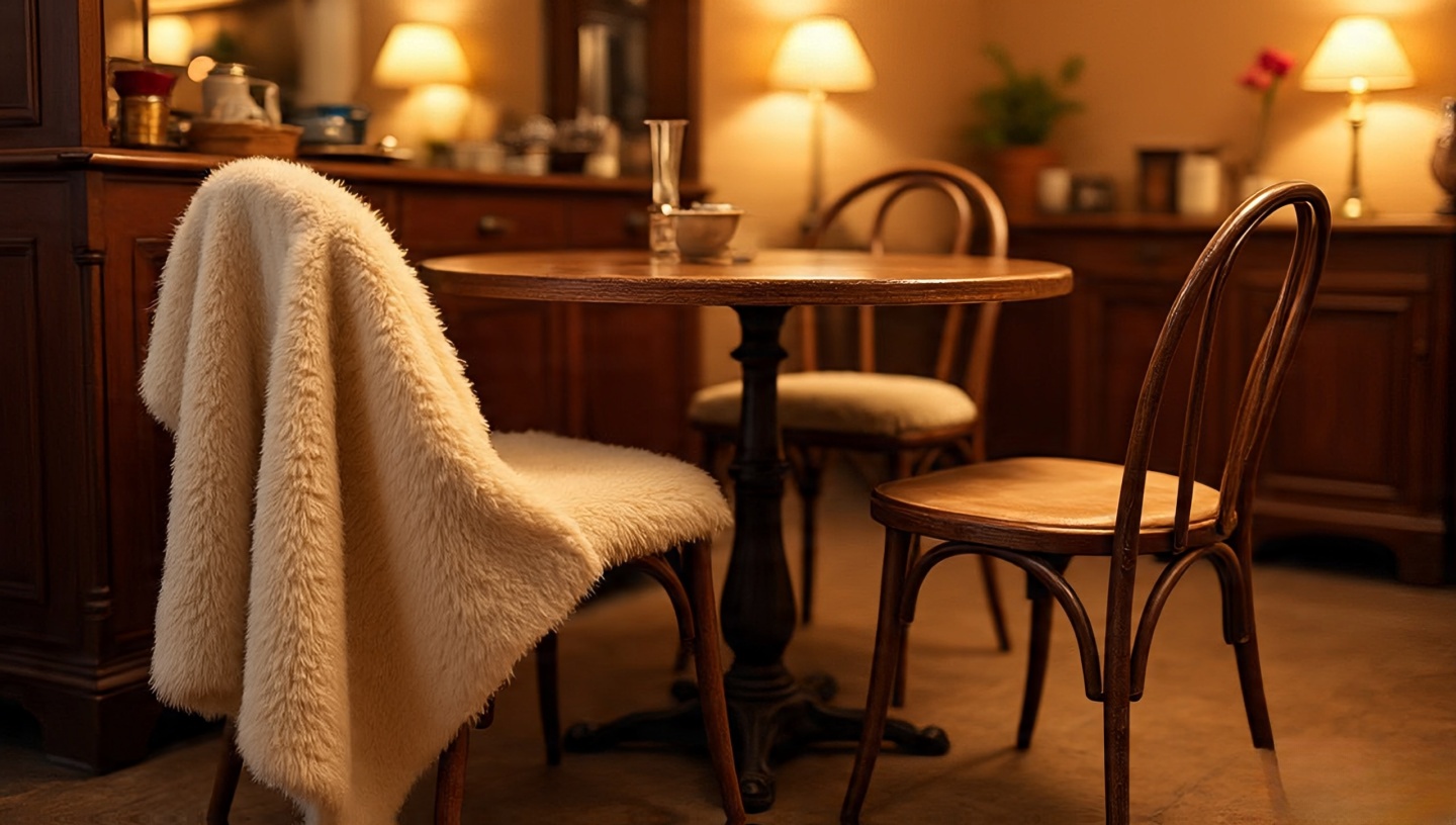
Colors are not just decoration they are atmosphere. I’ve walked into rooms where a soft sand-colored plaster felt like an exhale, and others where a sapphire velvet sofa lit up the space like fireflies in the night. Both worked. Both told a story. The question is: which story fits your life right now?
If you’ve been torn between the calm of neutrals and the drama of jewel tones, you’re not alone. Clients ask me this all the time. The truth is, there’s no single “right” palette. But there are principles, trade-offs, and very real sensations you should consider. Let me walk you through them, weaving in both technical notes and lived experiences from decades of practice.
Think of this as less of a manual and more of a conversation part design guide, part personal journal, with enough technical meat to ground the inspiration.
1. Why the Palette Decision Feels So Personal
Choosing a palette is like choosing your morning rhythm. Do you want calm tea or a sharp espresso? Neutrals soothe, jewel tones awaken. The decision has less to do with trends and more to do with your daily rituals.
Designer’s Note
I once advised a client who meditated every morning to stick with neutrals. She later told me the creamy walls felt like part of her breathwork. Compare that with a musician client who went with ruby curtains their living room became an extension of their stage.
2. Boho Neutrals: Calm, Airy, and Forgiving
Neutrals are sandy beiges, warm taupes, soft whites, and pale grays. They expand space visually and allow textures to shine.
Sapphire, emerald, ruby, and amethyst these tones have gravity. They anchor a space instantly.
Lighting & Climate Considerations
Test colors in both daylight and artificial light. A teal wall might look aquatic in sunlight but moody and intimate by lamplight.
Common Mistake
Choosing jewel tones without light tests. Fix it by painting large swatches and observing over 48 hours.
4. How Neutrals and Jewel Tones Play Together
You don’t need to choose exclusively. Neutrals calm, jewel tones energize. Together, they create rhythm.
Decision Framework
Base Neutral + Accent Jewel: Most balanced; easy to update.
Base Jewel + Neutral Relief: Dramatic; works in large, well-lit rooms.
50/50 Split: High risk of clutter; only for skilled layering.
5. Sensory Reflections: How Each Palette Feels
Neutrals: sunlight through linen, warm sand, candlelight on plaster. Jewel tones: velvet under fingertips, red wine aroma, antique jewelry weight. Which do you want greeting you after a long day?
Homes are lived in with bodies, not just eyes. Always test how a palette makes you feel physically.
6. Dimensions & Clearances in Practice
Neutral Applications
Wall colors: light reflectance value (LRV) 70–85 for small rooms.
Rug sizing: extend at least 18 inches beyond sofa edges.
Jewel Applications
Accent walls: best under 12 feet wide unless room has ample light.
Curtains: jewel tones should puddle slightly to enhance drama.
7. Cost & Value Considerations
Neutrals often cost less because they use standard paints and fabrics. Jewel tones sometimes require custom dyeing or higher-quality finishes to maintain richness over time.
Neutrals: $25–50 per gallon paint; fade-resistant.
Jewel tones: $50–90 per gallon; touch-ups more obvious.
Designer’s Tip: Budget for professional application with jewel tones streaks show more easily.
8. Common Mistakes and How to Fix Them
Mistake: Overloading Neutrals
Fix: Add pattern and texture. Layer rugs, baskets, and handmade art.
Mistake: Jewel Tone Saturation
Fix: Balance with greenery, natural woods, or sandy ceramics.
9. Art, Décor, and Gallery Walls
Art resolves tension between palettes. Jewel-toned prints on neutral walls sing, while earthy sketches tame bold walls. Explore this guide on boho gallery walls for layout ideas.
10. A Decision Checklist for You
What mood do you want daily calm or energetic?
How much natural light does your room get?
What’s your budget for paints and textiles?
Do you want flexibility to change accents easily?
Try one experiment first maybe a neutral rug or a jewel-toned vase. Live with it. Your instincts will guide the rest.
11. Layering Textiles: Where Palettes Come Alive
Boho design without textiles is like music without rhythm. The choice between neutrals and jewel tones often becomes most visible in throws, pillows, and rugs. Neutrals lean into texture linen, cotton, wool while jewel tones lean into saturation velvet, silk, heavy knits.
Designer’s Note
I once worked on a loft in Jakarta where the client insisted on only white walls. The magic came when we layered an indigo kilim over a jute base and added mustard cushions. Suddenly, the space had depth without changing a single wall color.
12. Lighting: The Hidden Palette Shaper
Light is the unseen paintbrush in your room. Neutrals reflect and amplify it, while jewel tones absorb and transform it.
Practical Tips
Natural light: South-facing windows intensify jewel tones; north-facing windows soften neutrals.
Mistake: Choosing a jewel tone under showroom lighting and hating it at home. Fix: Always test with your actual bulbs.
13. Seasonal Shifts: Adapting Palettes Year-Round
One advantage of neutrals is their adaptability. Jewel tones, on the other hand, can feel too heavy in tropical heat or too sparse in winter unless adjusted.
Summer: Layer lightweight linen throws over jewel-toned furniture.
Winter: Add jewel-toned velvet curtains to a neutral room for warmth.
14. Floors and Ceilings: The Overlooked Palette Anchors
Many homeowners think only about walls, but floors and ceilings carry equal weight in palette balance.
Materials
Neutral floors: Light oak or polished concrete expand visual space.
Jewel accents: Moroccan rugs or painted ceiling medallions bring drama upward.
Designer’s Note
I once painted a ceiling in deep plum for a reading nook. It surprised everyone, but the room became cocoon-like and irresistible at night.
15. Furniture: Choosing the Right Statement Pieces
Large furniture pieces act like anchors. A neutral sofa invites rotation of colorful accents. A jewel-toned sofa demands loyalty it’s the star.
High-commitment: Sofa ($1,000+), wall paint ($300–600 with labor).
Designer’s Note: Always leave 10–15% of your budget unassigned. It’s the cushion for unexpected needs or irresistible finds.
19. Cultural and Personal References
Jewel tones often recall cultural richness Indian saris, Moroccan tiles, Ottoman tapestries. Neutrals lean into global minimalism Scandinavian calm, Japanese wabi-sabi. Choosing a palette is also choosing which cultural echoes you invite home.
Your home should feel like your passport, stamped with places and stories that resonate with you, not just Pinterest trends.
20. The Long-Term Life of Palettes
Durability matters. Neutrals tend to age gracefully, fading softly. Jewel tones risk visible fading but can feel timeless when refreshed with new accents.
Maintenance Tips
Use UV-protective finishes for jewel-toned fabrics.
Choose washable slipcovers in neutral shades for longevity.
Final Reflections
After three decades of watching spaces transform, I’ve learned that no palette is permanent. Homes are living organisms; they shift as you shift. Neutrals will always give you a soft foundation. Jewel tones will always tempt you with drama. The real magic happens in the balance you craft.
If you’re still unsure, start small. Light a candle in a jewel-toned holder on your neutral table. Or roll out a sandy rug under your bold sofa. Listen to how your body reacts. The right palette won’t just look good it will feel like a sigh of relief when you walk in the door.
Closing Checklist
Does your room get enough natural light for jewel tones?
Do you crave calm or stimulation in daily rituals?
What’s your swap-out budget for seasonal or future changes?
Do you want your palette to whisper or to sing?
Take one step this week. Swap a pillow, hang a throw, buy that vase. Let your room speak back to you it will tell you what it wants next.
Quick Comparison Table: Boho Neutrals vs. Jewel Tones
Aspect
Boho Neutrals
Jewel Tones
Mood & Feel
Calm, airy, grounding; like sunlight on linen
Bold, dramatic, luxurious; like velvet at night
Best Use
Base palettes, small spaces, flexible layering
Accent walls, statement furniture, curated art
Materials That Shine
Linen, jute, plaster, unfinished woods
Velvet, silk, brass, saturated ceramics
Lighting Response
Reflects light, brightens spaces
Absorbs/changes with light, more moody
Maintenance
Ages softly, stains may blend easier
Can fade with UV; needs protective finishes
Budget Impact
Generally more affordable, easy to update
Higher paint/fabric cost; harder to swap
Design Flexibility
Easy to change accents seasonally
More permanent; big impact, less flexible
Designer’s Note: Most successful boho interiors I’ve seen combine both neutrals as the rhythm, jewel tones as the melody.
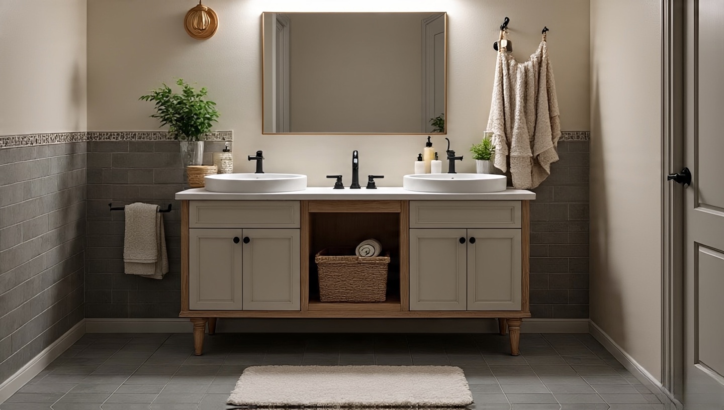
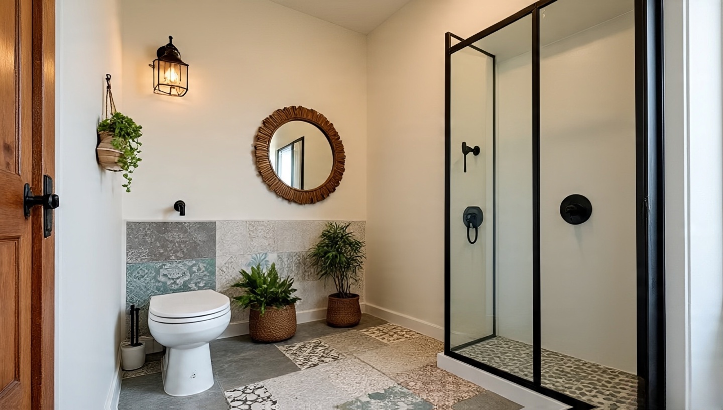
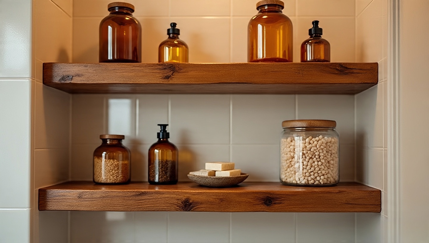
Roohome.com – Bathrooms have always fascinated me. They’re compact, functional, and often ignored when it comes to design. Yet, after decades in practice, I’ve seen how the smallest design tweaks especially the addition of plants can change the entire character of these spaces. I still remember walking into a client’s flat in Madrid. It was a plain tiled bathroom until a trailing pothos had been trained around the mirror. That single gesture softened the whole room. Suddenly, it didn’t feel like a utility corner anymore it felt like a retreat.
If you’ve ever hesitated to add plants to your bathroom because of low light, humidity, or lack of counter space, this guide is for you. I’ll share not just a list of plants, but practical design frameworks: where to place them, how to choose the right containers, how to balance textures, and even the mistakes I’ve seen countless homeowners make. And yes, there will be stories because design is never just about objects, it’s about how they make us feel every single day.
1. Why Bathrooms Are Surprisingly Good for Plants
Most people assume bathrooms are plant graveyards. In reality, their humidity is a gift. Ferns sigh with relief in steamy corners. Orchids, often fussy elsewhere, find their rhythm here. The secret is knowing your room’s light levels and pairing them correctly.
Rule of Thumb: If your bathroom has a frosted window, treat it as bright, indirect light. If there’s no window, stick to low-light champions like snake plant or pothos.
Designer’s Note: Bathrooms with skylights are gold mines don’t waste that vertical shaft of light. Hang trailing ivy or macrame baskets where the sun naturally pours in.
2. Ferns: The Steam Lovers
The Boston fern has been my favorite test subject. On a bamboo shelf near the shower, it thrived like it had been waiting years for the right home. Ferns soak up humidity but demand consistent moisture.
Dimensions & Placement
Leave at least 30–45 cm clearance above to allow fronds to spread. They dislike cramped shelves.
Common Mistake & Fix
“My fern always drops leaves.”
Fix:
Check airflow. Bathrooms that stay damp but unventilated can suffocate roots. Add a small vent fan cycle after showers to balance humidity with oxygen.
3. Snake Plant: Sculptural and Forgiving
I call snake plants the stoics. They stand tall, striped, and unbothered by low light or missed watering. They’re especially powerful in Boho bathrooms because of their vertical form, which pairs beautifully with patterned tiles.
Materials & Finishes
Best Container: Unglazed clay pots regulate excess moisture.
Finish Tip: Pair with woven rattan baskets to soften their sharp geometry.
4. Pothos: The Versatile Climber
Few plants adapt like pothos. I’ve trained them along mirrors, across shower rods, even up tiled walls with small hooks. Every time, they turn into living drapery.
Installation & Sequencing
Start with 2–3 trailing vines, guide them with adhesive hooks or wire supports.
Check once a month and redirect tendrils before they latch permanently onto grout.
Cost & Value: At under $10 for a starter plant, pothos are budget-friendly mood shifters. Their payoff in atmosphere is immense.
5. Peace Lily: The Spa Classic
Peace lilies exhale calm. Their glossy leaves and white blooms bring hotel-spa energy without needing professional maintenance. They thrive in medium light but tolerate less.
Climate Consideration
They dislike temperatures below 15°C. In colder climates, keep them slightly away from drafty windows.
Common Mistake & Fix
“My peace lily never blooms.”
Fix:
It’s likely not getting enough light. Shift it closer to a window or supplement with a warm-spectrum grow bulb above the vanity.
6. Orchids: Luxury in Small Doses
I’ve placed orchids in countless projects, often against natural stone or patterned tiles. Their flowers are dramatic but not overwhelming when used sparingly.
Designer’s Note
One white orchid on a floating shelf can elevate a bathroom instantly, no extra styling required. Let the architecture breathe around it.
7. Aloe Vera: Functional Meets Decorative
Aloe is a plant with a purpose. In more than one project, I’ve watched clients smile when they realized their bathroom “decoration” doubled as first-aid for burns.
Dimensions & Clearances
Aloe needs at least 20 cm soil depth and a sunny sill. If your bathroom lacks direct sun, it will stall.
Cost & Value
Moderate upfront cost, long-term utility. It’s one of the few plants that’s both a design feature and an herbal tool.
8. Boho Planter Ideas That Truly Work
Rattan & Baskets
These create warmth against cold bathroom tiles. Slip nursery pots inside to avoid water damage.
Macrame Hangers
Great for vertical layering, especially in small bathrooms. They make ceilings feel taller.
Repurposed Containers
Old copper jugs, cracked ceramic bowls, even woven laundry baskets anything with history adds Bohemian soul.
9. Decision Matrix: Choosing the Right Plant
Condition
Best Plant
Why
No window
Snake plant, pothos
Low-light tolerance
Bright skylight
Ferns, orchids
Love humidity + filtered sun
Functional need
Aloe
Medicinal + sculptural
Spa mood
Peace lily
Glossy leaves, white blooms
10. Linking Tiles, Plants, and Atmosphere
Plants don’t exist in isolation. Pairing them with Boho bathroom tiles amplifies their impact. A snake plant beside patterned tiles reads sculptural. Pothos trailing across earthy zellige tiles feels like nature reclaiming the space. For inspiration, explore this Boho bathroom tile guide and this earthy bathroom idea collection.
11. Lighting Tricks for Windowless Bathrooms
One of the biggest hurdles in bathroom plant design is the dreaded “no window” scenario. I’ve walked into countless apartments where bathrooms felt like caves. Yet, with the right artificial lighting, plants can still thrive.
Installation & Sequencing
Use LED grow bulbs disguised as vanity lights. Warm-spectrum versions look natural and double as mood lighting.
Set them on timers 12–14 hours daily keeps low-light plants alive.
Designer’s Note: A mirror flanked by two grow-bulb sconces feels like Hollywood glam lighting, while secretly nurturing your pothos in the corner.
12. Seasonal Care Shifts
Bathrooms change with the seasons, and so do plants. I’ve seen orchids bloom all winter in a heated loft bathroom, only to suffer in summer when the AC vent blasted them.
Checklist by Season
Winter: Keep plants away from drafty windows or vents. Mist sparingly.
Summer: Increase watering slightly. Ventilate to prevent mildew buildup.
Personal Anecdote: My aloe in Jakarta thrived all year, but the same variety sulked in a Berlin flat when cold drafts hit every December.
13. Mixing Plants and Natural Scents
Bathrooms are often filled with synthetic scents. When you add living plants, they subtly change the atmosphere. A peace lily’s faint freshness, or the earthy smell after watering ferns, feels more honest than plug-ins.
Practical Tip
Pair plants with natural essential oils like eucalyptus in a hanging bundle near the shower. It creates a layered sensory experience, like stepping into a spa with living walls.
14. Budget vs. Premium Planter Choices
Not all planters are created equal. I’ve worked with clients who splurged on artisan ceramics, and others who used repurposed thrift-store finds. Both can work beautifully.
Premium: Hand-glazed ceramics, stone planters, custom macrame hangers.
Value Note: It’s not about price it’s about personality. A chipped $2 jug with character often outshines a $200 pot that feels soulless.
15. Vertical Garden Experiments
Bathrooms are often tight on floor space. That’s where vertical gardens shine. I once designed a wall of modular planters in a compact Tokyo bathroom. It turned an ordinary shower stall into a lush green box.
Installation Sequence
Use moisture-resistant backboards.
Add removable pockets for easy re-potting.
Position near natural or artificial light sources.
16. Plant-Friendly Materials and Finishes
The finishes around your plants matter. Bathrooms are harsh environments steam, heat, and cleaning chemicals all interact with surfaces.
Materials Guide
Ceramic: Durable, easy to wipe down.
Wood: Needs sealing, otherwise mold risk.
Metal: Great for rustic Boho, but prone to patina with steam.
Designer’s Note: I once used a copper jug as a planter. Over time, steam aged it into a deep green patina that looked deliberate. Not everyone loves patina, but Boho style embraces it.
17. Mistakes I’ve Seen Too Many Times
Mistake 1: Overwatering in Already Humid Spaces
Fix: Always check soil moisture with your finger humidity in the air doesn’t mean soil is wet.
Mistake 2: Blocking Ventilation with Plants
Fix: Never place large planters directly over air vents. It disrupts airflow and encourages mold.
Mistake 3: Choosing Plants for Looks Only
Fix: Match plants to conditions, not just Pinterest boards.
18. Small Bathrooms: Making Every Inch Count
Even the tiniest powder rooms can host plants. A single fern on the back of a toilet tank, or a pothos trailing from a wall shelf, creates life without clutter.
Dimensions & Clearances
Leave at least 15 cm clearance around mirrors for cleaning access.
Keep hanging planters at least 190 cm from floor to avoid head bumps.
Anecdote: I once squeezed a mini peace lily into a 2 m² guest bathroom. It turned into the most complimented detail of the entire flat.
19. The Psychology of Green Bathrooms
Design isn’t only about aesthetics it’s about how spaces make us feel. Studies show greenery lowers stress levels. But you don’t need research to feel it: stepping into a plant-filled bathroom feels more like entering a retreat than a utility zone.
“It feels like camping, but fancier.”
I’ve heard clients say this exact phrase after adding plants. And honestly, they’re right.
20. Experiment First, Perfect Later
After three decades, my best advice is simple: start small. Try one plant. Watch how it reacts. Bathrooms are tricky microclimates, and not every plant will love yours. But half the fun is in the trial and error. The mistakes teach you as much as the successes.
Pick one low-maintenance plant (snake plant or pothos).
Place it in a moisture-tolerant container.
Observe for 4–6 weeks adjust light, position, and water schedule.
Designer’s Note: Don’t fear imperfection. A bathroom filled with evolving greenery feels more authentic than one staged for a magazine shoot.
Wrapping It All Together
Designing a bathroom with plants isn’t about following a perfect formula. It’s about listening to your space the light, the humidity, the dimensions and then pairing it with greenery that thrives in those conditions. Over time, the plants respond, grow, and change the way you use the room. A shower feels softer under trailing vines. A quick face wash feels calmer with a peace lily in view. Even the air feels fresher, though sometimes that’s as much psychological as it is biological.
If you’ve read this far, here’s my gentle nudge: pick one idea and try it this week. Maybe it’s a pothos in a woven basket, maybe it’s a fern near the shower, maybe it’s just adding a quirky repurposed teapot as a planter. You don’t need to redesign the whole bathroom to feel the shift just a single plant can tip the mood toward something soulful and alive.
And don’t worry about getting it perfect. Some plants will sulk and fail. Others will surprise you by thriving against all odds. That’s the beauty of living with greenery it’s a conversation, not a finished product.
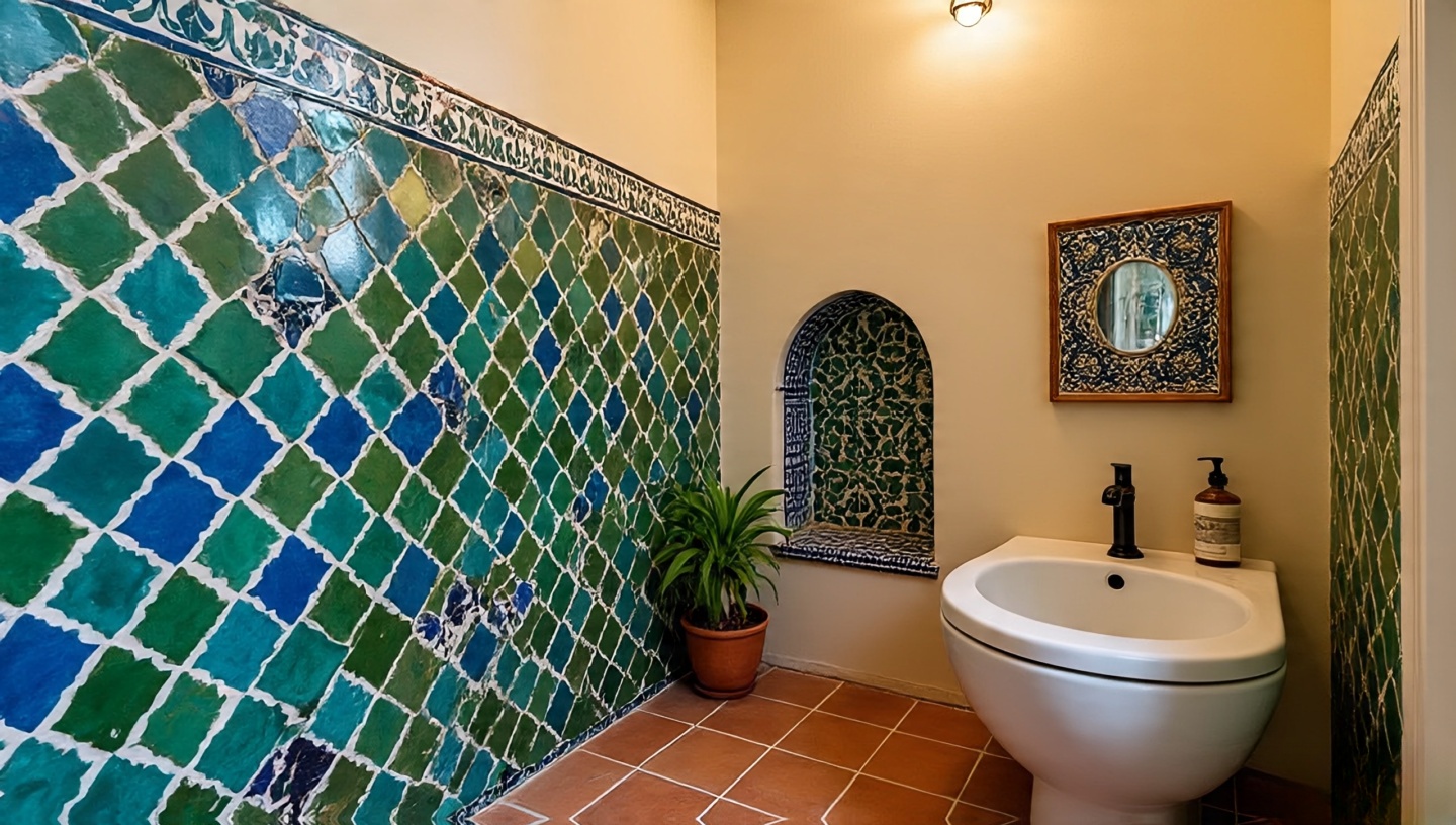
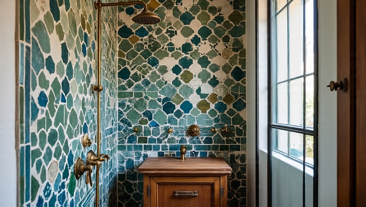
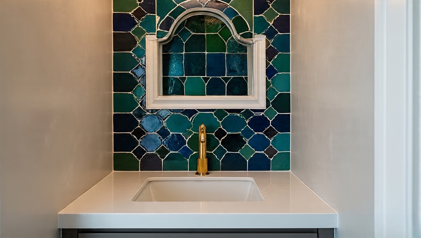
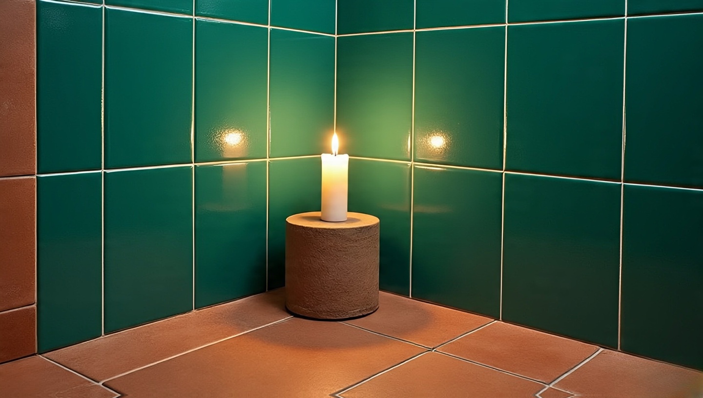
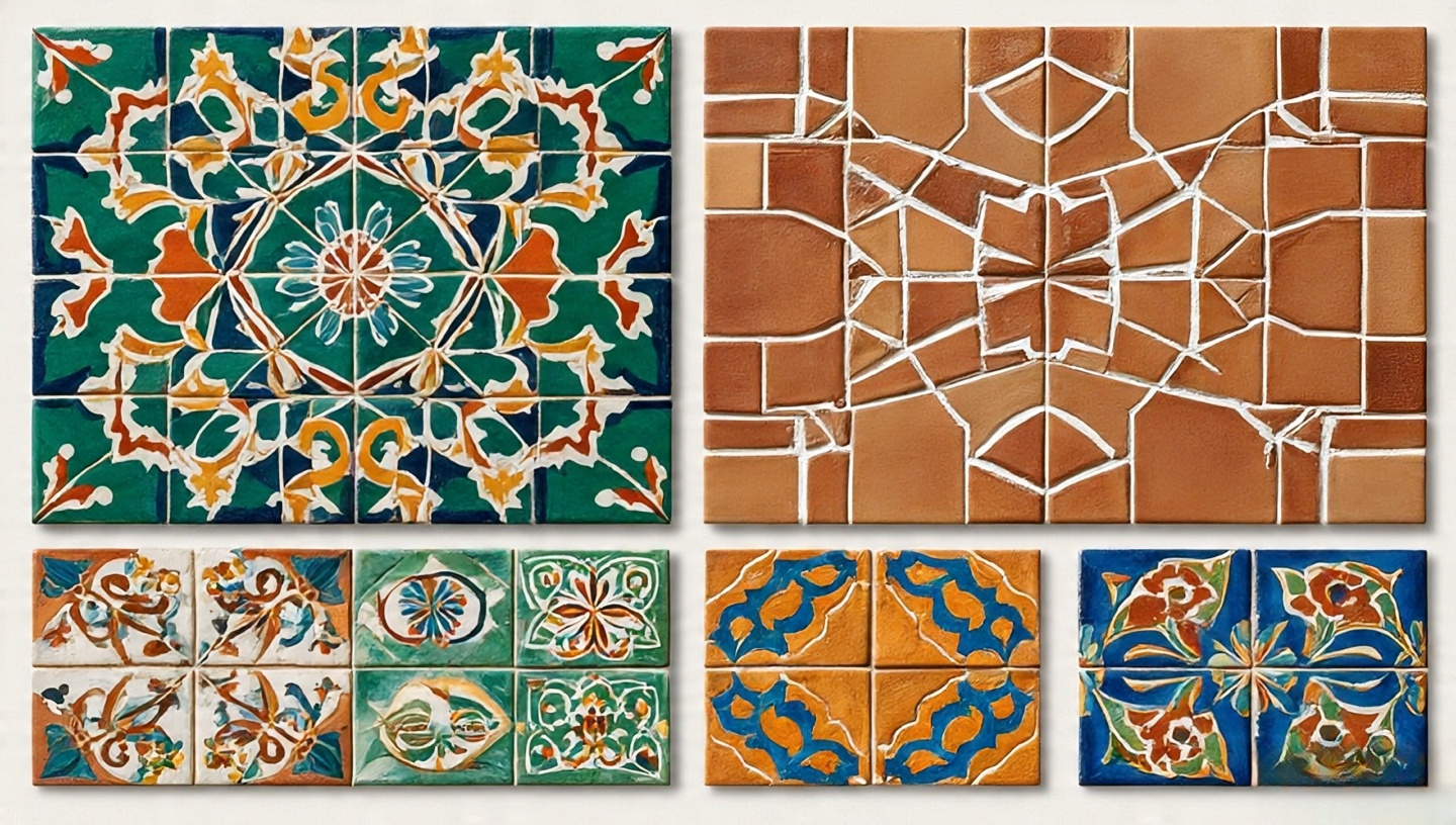
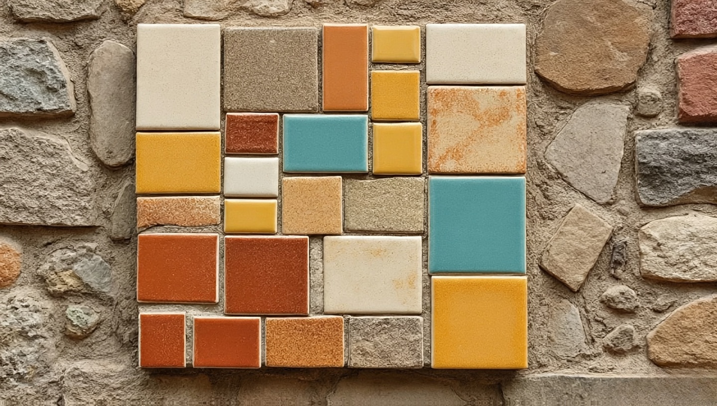
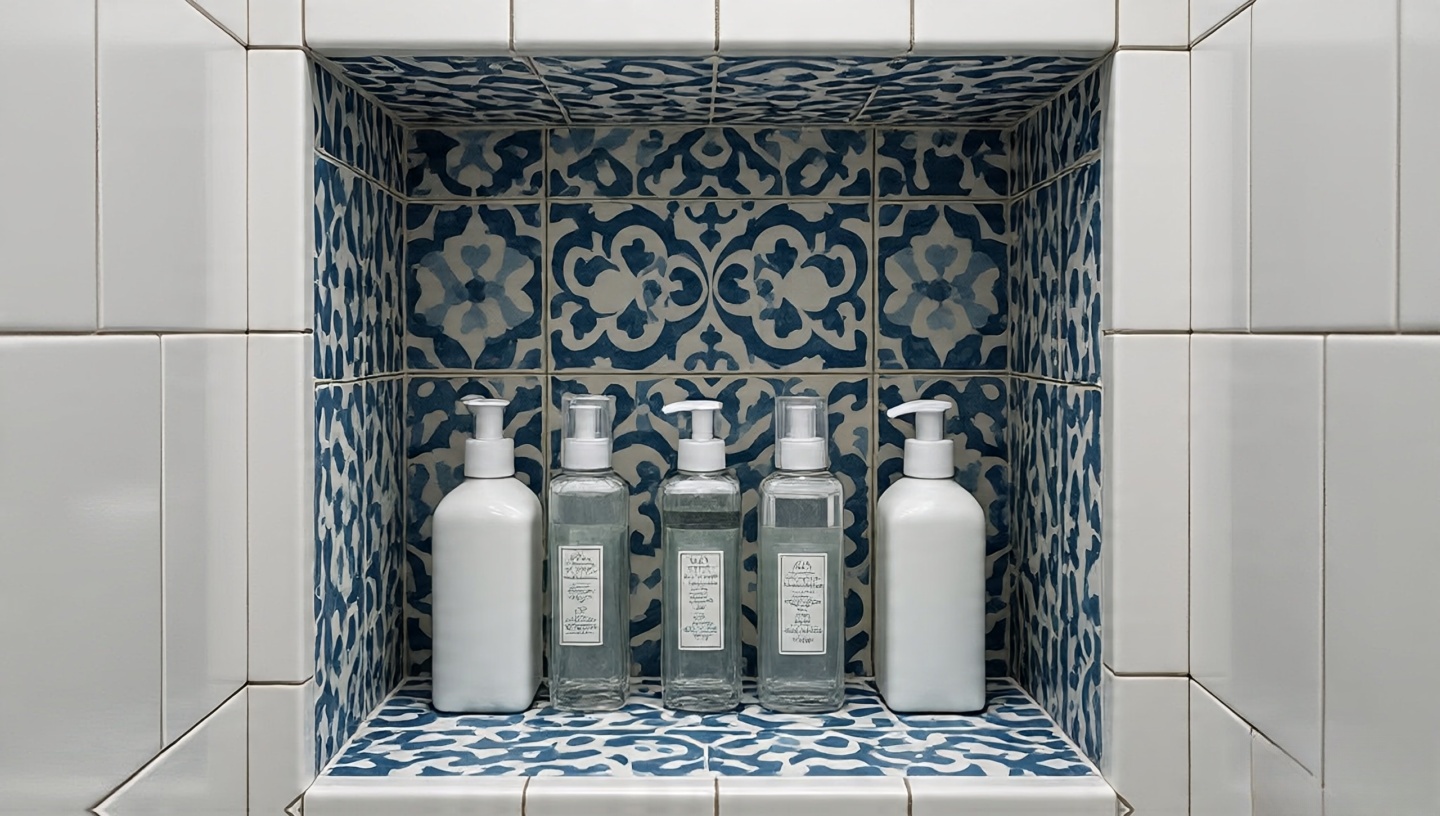
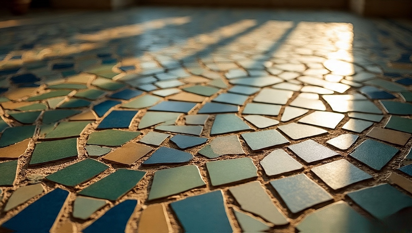
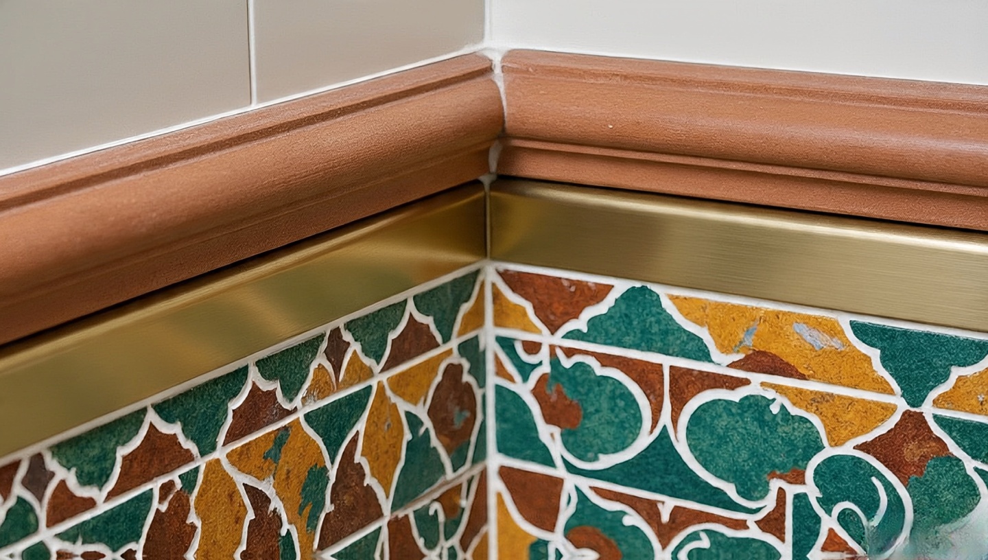
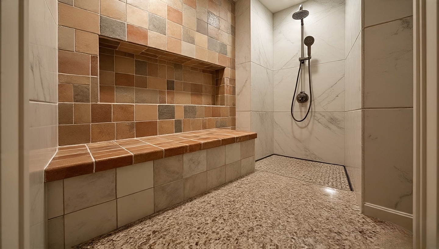
Roohome.com – I’ve always believed a bathroom should feel more than just functional. It’s where mornings begin with half-shut eyes, and where evenings end in quiet ritual. Adding Boho elements especially through tiles shifts the mood instantly. I still remember stepping barefoot onto hand-cut Moroccan zellige tiles: they were cool, imperfect, and alive. Each glaze ripple caught the light differently, telling a story. That, to me, is the essence of Bohemian design: soulful imperfection.
If you’ve ever looked at your plain bathroom and thought, “This space could sing,” you’re in the right place. This guide goes far beyond pretty inspiration. You’ll find practical dimensions, cost trade-offs, installation notes, and lessons from decades of practice. Whether you’re remodeling a master bath or refreshing a powder room, Boho tiles can transform it into a story-filled retreat.
1. Why Boho Bathrooms Speak to the Soul
Unlike minimalist spaces, Boho bathrooms celebrate imperfection and layers of culture. Tiles become a language of memory: Moroccan courtyards, Spanish afternoons, Mexican fiestas. In small spaces, these fragments combine into a collage that feels grounding and adventurous.
Designer’s Note
Don’t aim for showroom polish. Lean into chipped edges and glaze variations. These details add authenticity and character.
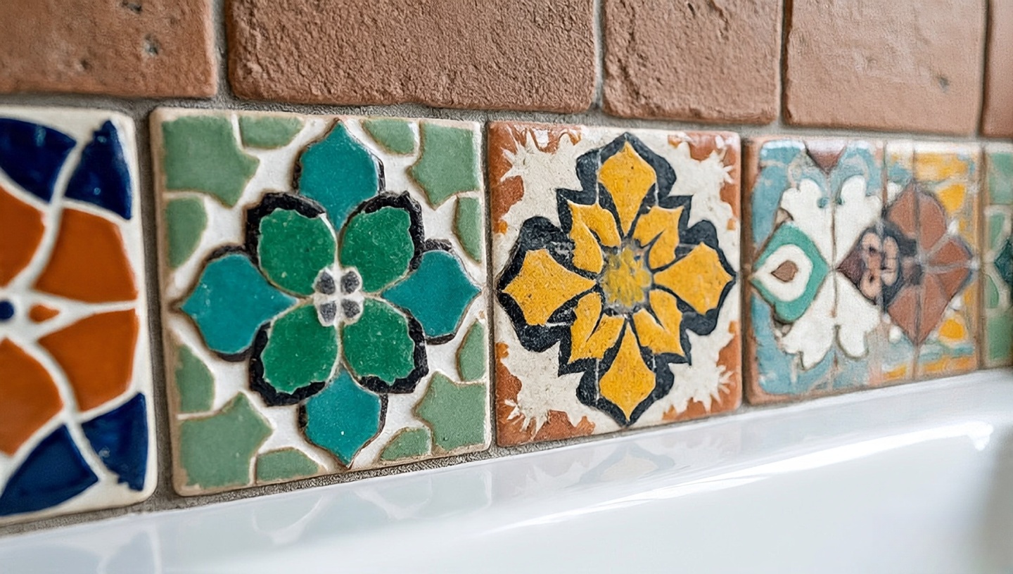
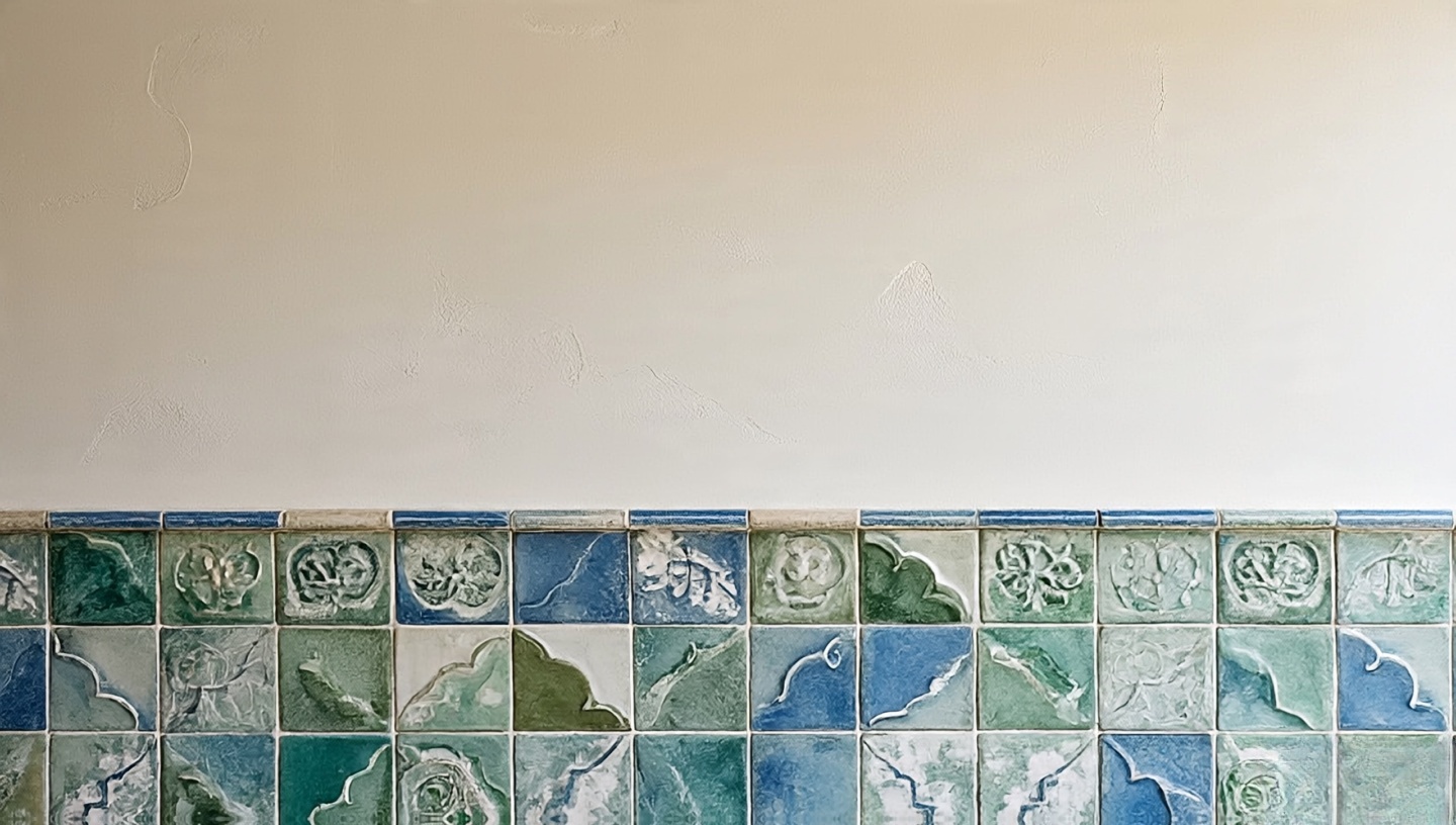
2. Patterns That Tell Stories
Moroccan mosaics: Rich and intricate. Best as a feature wall or backsplash.
Terracotta: Warm and earthy. Works beautifully under natural light.
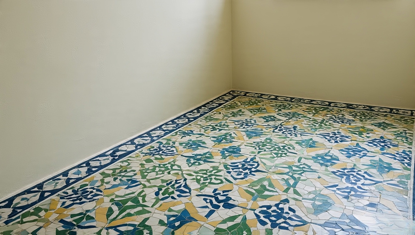
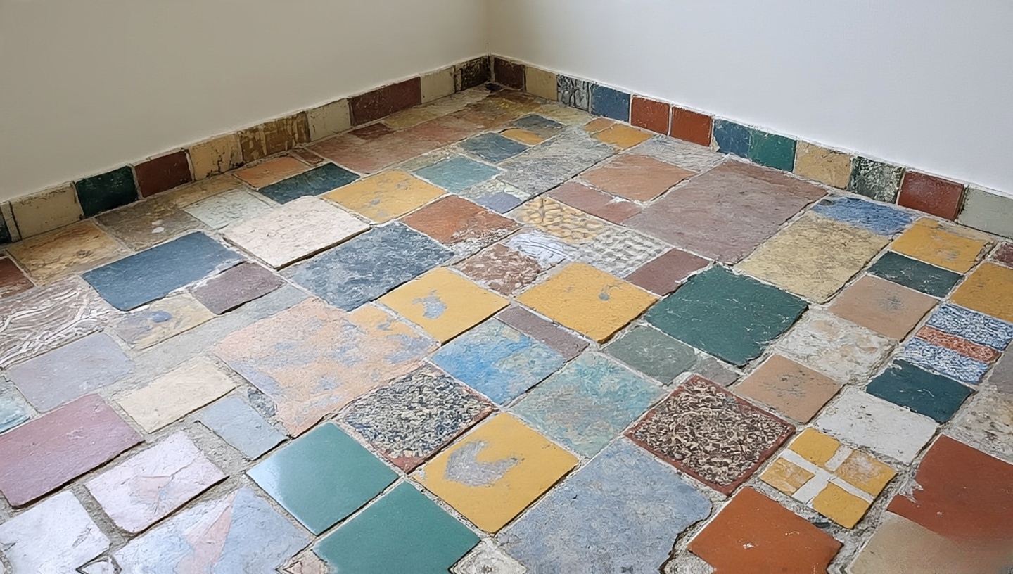
Patchwork: Collect vintage or leftover tiles for a scrapbook floor effect.
Common Mistake
Using heavy pattern on all surfaces can overwhelm. Balance with plain walls or plaster to let patterns breathe.
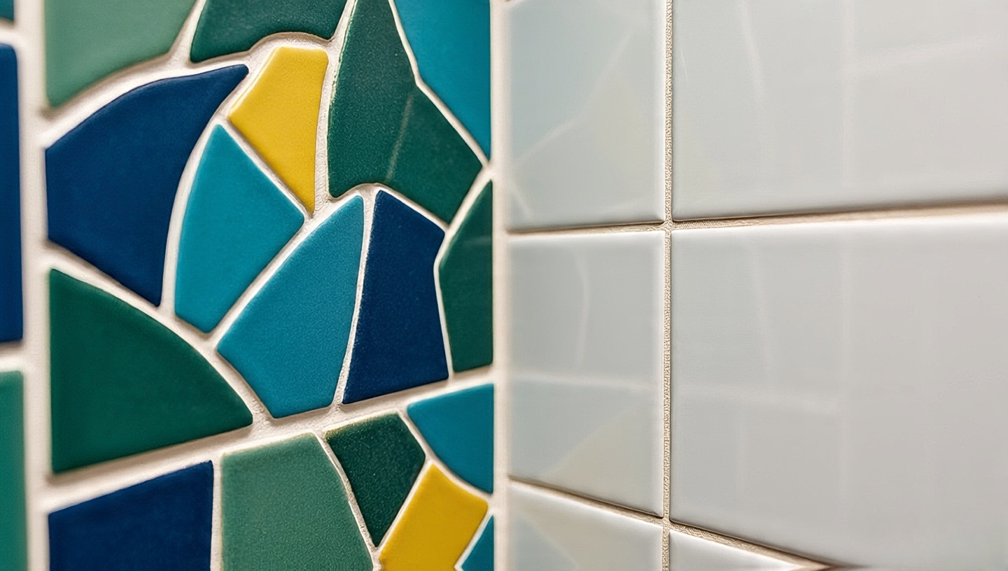
3. Zellige: Perfectly Imperfect
Zellige tiles embody the Boho spirit with uneven edges and shade variations. Their shimmer changes throughout the day, offering movement and life.
Installation Tip
Don’t align too perfectly. Let natural irregularities create rhythm. Pair with rustic wood vanities or brass taps.
4. Balancing Boldness and Calm
Think of design like music. If every instrument is loud, there’s no melody. Bold patterned floors work best with calm walls, and vice versa.
Dark grout: Frames tiles like art, hides dirt in traffic zones.
Colored grout: Adds playful detail, e.g., turquoise with white tiles.
Neutral grout: Keeps focus on patterned tiles.
Common Mistake
Pure white grout on busy floors stains quickly. Choose sand, gray, or mid-tone alternatives for longevity.
6. Textures That Invite Touch
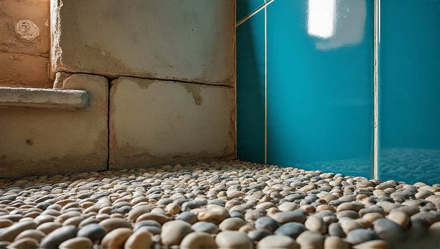
Tiles engage more than sight. Smooth zellige, rough cement, or pebble mosaics underfoot create tactile memories. A pebble floor in a Marrakech riad once felt like a morning massage for my feet a design surprise that stayed with me.
7. Practical Selection Tips
Durability: Ensure slip- and water-resistance for floors.
Samples: Test under natural and artificial light before bulk orders.
Scale: Mix large and small tiles to avoid visual clutter.
Maintenance: Use textured tiles on walls more than floors to avoid soap buildup.
8. Designing for Small Bathrooms
Even compact powder rooms can shine with Boho tiles. A backsplash or shower niche lined with jewel-toned zellige becomes a focal point.
Handmade tiles are pricey, but you don’t need full coverage. Use artisan tiles as accents and fill gaps with plain ceramics. Half-tiled walls topped with limewash are rustic and economical.
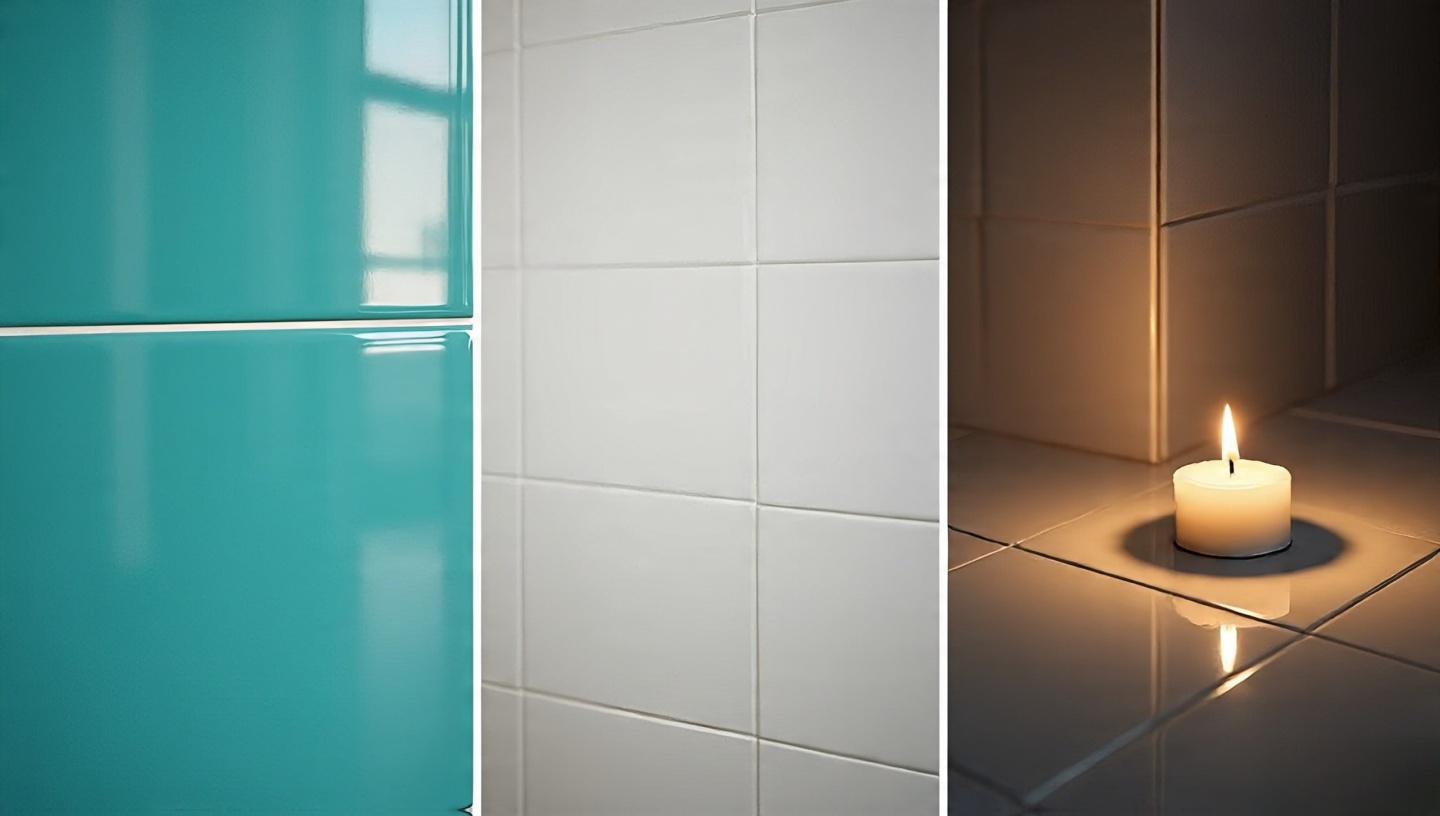
Glossy tiles reflect, expanding small spaces. Matte tiles absorb, creating intimacy. Candlelight against glossy tiles feels like camping only refined.
11. Dimensions and Clearances That Work
Tiles are beautiful, but bathrooms demand precision. Even the most artistic design fails if you can’t move comfortably in the space.
Recommended Clearances
Floor tiles: Aim for slip-resistant surfaces with a minimum DCOF (Dynamic Coefficient of Friction) of 0.42 in wet areas.
Grout width: 3–5 mm for handmade tiles like zellige; tighter joints (1–2 mm) for machine-cut ceramics.
Shower walls: Keep tile coverage up to 2.1 m (7 ft) to prevent moisture damage above.
Designer’s Note
I once reviewed a bathroom where the zellige was installed with machine-tight grout lines within months, cracks appeared. Handmade needs breathing room.
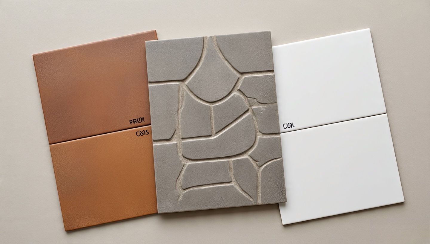
12. Materials and Finishes: Pros and Cons
Terracotta: Warm, breathable, but porous. Needs sealing every 2–3 years.
Cement tiles: Bold patterns, highly durable, but heavy. Best for floors if substrate is strong.
Porcelain look-alikes: Budget-friendly, durable, but may lack the soulful irregularity of handmade tiles.
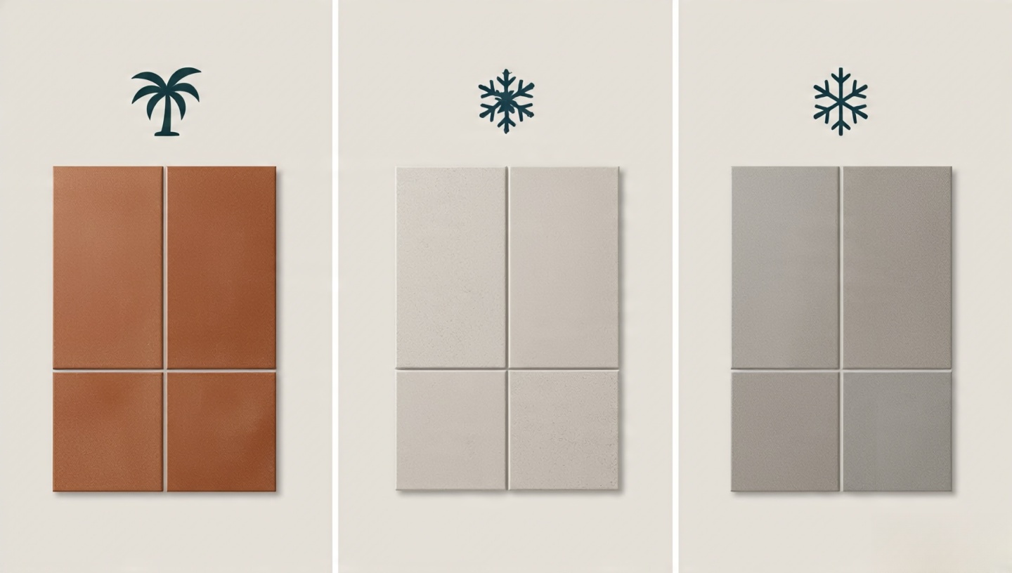
13. Climate and Code Considerations
Not all Boho tile choices behave the same in different climates.
Tropical humidity: Prioritize sealed terracotta or porcelain to prevent mold growth.
Cold climates: Choose frost-resistant tiles for bathroom floors near exterior walls.
Building codes: Many jurisdictions require non-slip tiles (R10 or higher) in wet zones.
Common Mistake
Using outdoor terracotta indoors without sealing in humid regions. Fix: Apply breathable sealant and reapply regularly.
14. Installation Sequencing
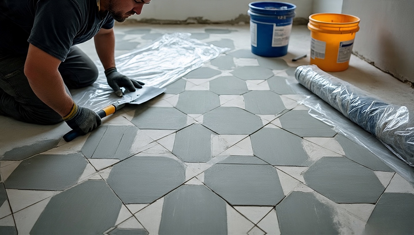
The order of work matters. A misstep can cause costly rework.
Plan tile layout before purchase (avoid awkward half-tiles in corners).
Start with wall tiles before floors to prevent damage from falling debris.
Allow 24–48 hours of curing before grouting.
Seal porous tiles before installation to prevent grout staining.
15. Mistakes and Fixes from the Field
Mistake: Overmixing Patterns
Fix: Limit to 1–2 bold motifs, balance with solids.
Mistake: Ignoring Tile Thickness
Fix: Use transition strips where artisan tiles meet thinner ceramics.
Mistake: Using Wrong Adhesive
Fix: Cement tiles need flexible adhesive rated for weight; zellige works best with lime-based mortar.
16. Cost vs. Value
Handmade tiles can be expensive, but consider lifecycle value.
Handmade zellige: $25–$40/sq ft. Adds cultural value and resale appeal.
Cement patterned tiles: $15–$25/sq ft. Long-lasting, but requires sealing.
Porcelain replicas: $5–$12/sq ft. Budget-friendly, less unique.
Decision Framework
If budget is tight, invest in artisan tiles for focal areas (backsplash, niche) and use porcelain elsewhere.
17. Cultural Inspirations and Fusion
Boho is not one culture it’s a blend.
Moroccan: Zellige and starburst mosaics.
Spanish: Terracotta floors and Andalusian patterns.
Mexican: Talavera tiles with bold painted motifs.
Indian: Jaipur block-inspired encaustics.
18. Sustainable Choices
Eco-conscious design can coexist with Boho aesthetics.
Choose reclaimed or vintage tiles to reduce environmental footprint.
Use lime-based mortars that are breathable and lower in carbon output.
Mix handmade artisan tiles with mass-produced ones for responsible use of resources.
Designer’s Note
I once sourced discarded tiles from renovation sites for a patchwork project. The result was budget-friendly and environmentally kind.
19. Boho Bathrooms for Families
Style must meet function when kids are involved.
Choose slip-resistant tiles (R11 rating for shower floors).
Avoid sharp tile edges opt for rounded trims.
Consider darker grout to reduce cleaning stress.
20. When to Call a Professional
DIY is tempting, but artisan tiles demand skill. Hire a professional when:
Working with zellige or encaustic cement tiles (they need careful spacing and sealing).
Your bathroom has complex slopes or niches.
You’re mixing multiple materials that need precise transitions.
21. Lighting Case Studies: Tiles Under Different Conditions
Tiles change dramatically with lighting. In one client’s home, glossy turquoise zellige looked vibrant in daylight but too reflective under cold LED. We swapped LEDs for warm 2700K bulbs, and suddenly the space felt like a Mediterranean spa.
Natural light: Glossy tiles bounce sunlight, enlarging small spaces.
LED downlights: Matte tiles reduce glare, keeping balance.
Candlelight: Best paired with uneven finishes to create shimmer.
22. Regional Durability Considerations
Where you live matters in choosing tiles.
Coastal homes: Salt air corrodes metal trims; choose brass or stainless steel with protective coatings.
Urban apartments: Porcelain is practical for limited ventilation spaces.
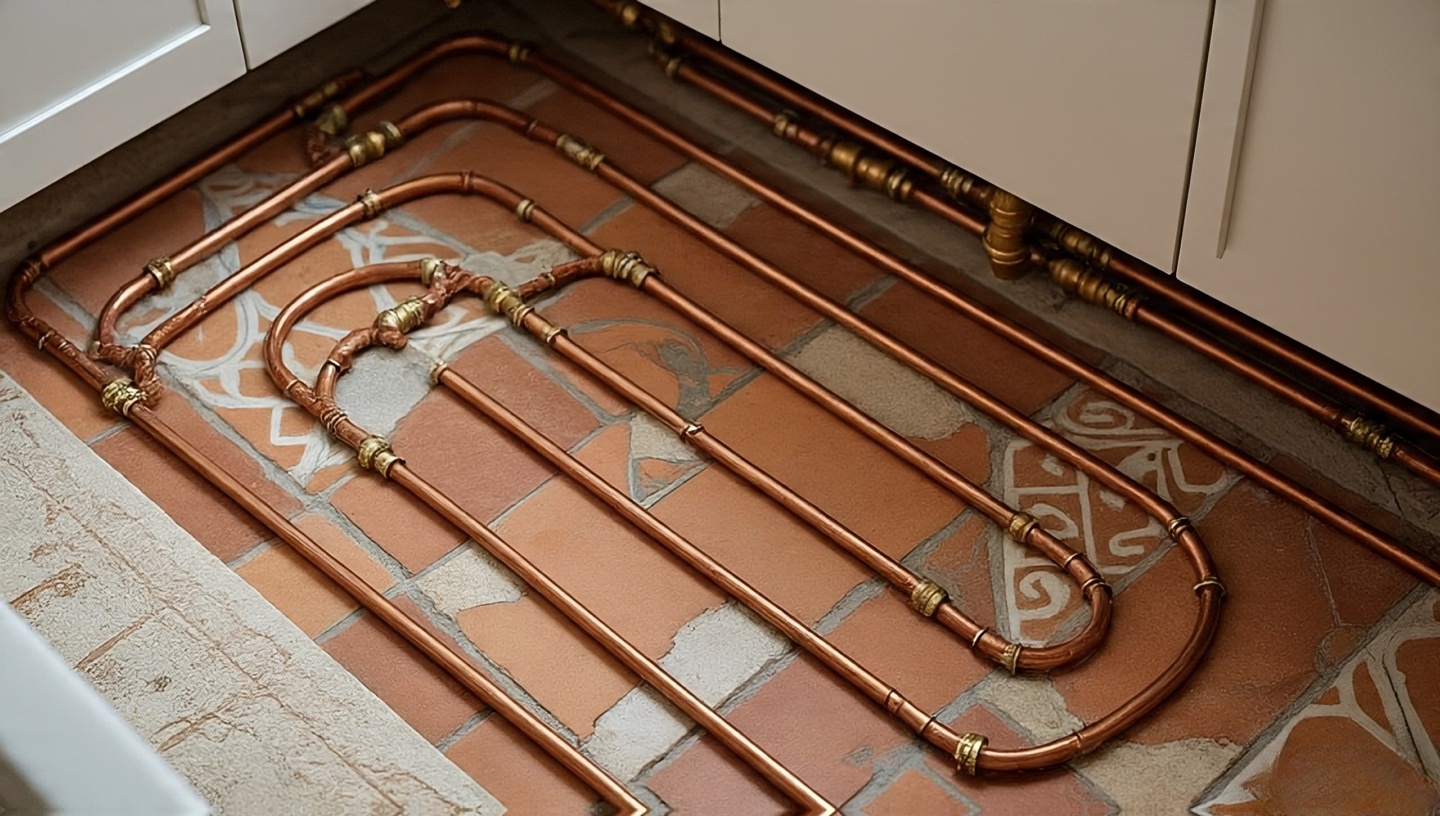
Mountain cabins: Terracotta pairs well with radiant heating systems but must be sealed.
Common Mistake
Using untreated cement tiles in coastal humidity. Fix: Apply penetrating sealers to block salt damage.
23. DIY vs. Professional Installation: Cost Breakdown
DIY seems cheaper upfront but may cost more in mistakes.
DIY: $5–$10/sq ft (materials only). Risk of uneven spacing, grout haze, water leaks.
Professional: $20–$40/sq ft installed. Higher upfront, but guarantees waterproofing and alignment.
Decision framework: If tiles are handmade, textured, or heavily patterned, hire a pro. For simple porcelain squares, DIY can be safe with patience.
24. Maintenance Schedules That Work
Weekly: Wipe down surfaces to prevent soap scum buildup.
Monthly: Reseal grout in heavy-use showers with spray-on protectants.
Every 2–3 years: Reseal terracotta or cement to keep water resistance.
Designer’s Note
I revisit projects after a decade. Bathrooms with consistent resealing still look fresh; neglected ones show early erosion and staining.
25. Boho Bathrooms and Resale Value
Some clients worry Boho tiles might scare buyers. In my experience, thoughtfully chosen artisan tiles increase resale value, especially in high-end markets. Buyers appreciate uniqueness when balanced with neutral anchors.
Tip
If you plan to sell within 5 years, focus Boho tiles on easily replaceable surfaces (backsplashes, niches) rather than full floors.
26. Storage Solutions with Tile Integration
Boho isn’t clutter storage matters. Built-in tiled niches above bathtubs or in showers double as design statements.
Use patterned tiles inside niches for surprise pops of color.
Extend tile backsplashes upward to form open shelving ledges.
27. Safety and Accessibility in Boho Bathrooms
Beauty must not compromise safety.
Slip resistance: R11-rated tiles for shower floors.
Edges: Use bullnose trims or rounded stone caps.
Accessibility: In walk-in showers, opt for larger-format tiles with minimal grout for wheelchairs.
Common Mistake
Choosing polished marble for wet floors. Fix: Reserve polished surfaces for walls only.
28. Mixing Boho with Other Styles
Boho blends well with other design languages:
Industrial: Pair patterned cement tiles with matte black fixtures.
Scandinavian: Whitewashed plaster with a single colorful Boho accent wall.
Minimalist: Neutral palette floors with one patchwork backsplash.
29. Case Study: The Scrapyard Floor
One of my most memorable projects involved scavenging tile remnants from demolition sites. We pieced them into a patchwork bathroom floor. The result? A mosaic of decades, telling stories through each square. Visitors often said it felt like stepping on history itself.
30. The Emotional Impact of Tiles
Design isn’t just visual it shapes emotion. A polished marble bath may impress, but a Boho bathroom comforts. Imperfect tiles whisper of human touch, travel, and authenticity. In stressful times, stepping onto a hand-laid mosaic feels grounding, a daily reminder that beauty need not be flawless to be meaningful.
31. Waterproofing Layers You Can’t Skip
Tiles are not waterproof by themselves; it’s the layers beneath that protect your bathroom.
Membranes: Always use liquid-applied or sheet waterproofing before tiling showers.
Slopes: Shower floors need a minimum slope of 1/4 inch per foot toward the drain.
Backer boards: Cement boards outperform drywall in wet zones.
Common Mistake
Skipping waterproofing behind zellige or terracotta. Fix: Apply RedGard or Schluter Kerdi systems before tile installation.
32. Tile Transitions and Edge Detailing
Edges often make or break the design. Unfinished edges cheapen even the most beautiful tiles.
Bullnose trims: Smooth edges, ideal for family bathrooms.
Metal edging strips: Modern and durable, available in brass, chrome, or matte black.
Mitered edges: Seamless but requires skilled craftsmanship.
33. Advances in Grout Technology
Today’s grout options go beyond cement-based basics.
Epoxy grout: Waterproof, stain-resistant, great for showers but more expensive.
Pre-mixed grout: Convenient for small DIY jobs, consistent color.
Flexible grout: Essential for tiles installed on heated floors.
Designer’s Note
I specify epoxy grout in hotels for long-term durability, but for homes, flexible grout often balances cost and performance.
34. Radiant Heating and Boho Tiles
Few things beat the comfort of warm tiles underfoot.
Ceramic & porcelain: Excellent heat transfer, stable under heat cycles.
Terracotta: Retains heat beautifully but needs sealing.
Cement: Heavy, takes longer to warm but stores heat well.
Installation Tip
Use flexible adhesive and grout to accommodate thermal expansion. Avoid natural stone prone to cracking unless engineered for heating systems.
35. Acoustic Qualities of Tiled Bathrooms
Tiles amplify sound great for singing in the shower, less so for quiet relaxation.
Add soft finishes like rugs, curtains, or woven baskets to absorb echo.
Consider acoustic panels disguised as decorative wood or plaster elements.
36. Tile Layout Planning: Beyond Aesthetics
Layout isn’t just about looks it prevents awkward slivers of tile at edges.
Dry lay first: Place tiles on the floor before installation.
Center focal patterns: Align starbursts or medallions with vanities or tubs.
Symmetry: Balance patchwork so busy areas don’t cluster at corners.
Common Mistake
Starting layout in one corner without alignment. Fix: Always measure and start from the centerline of the room.
37. Ventilation and Tile Performance
Good ventilation preserves tiles and grout. Bathrooms without proper airflow breed mold in porous finishes.
Install exhaust fans rated at 1 CFM per square foot of bathroom floor area.
For high ceilings, increase airflow capacity by 50%.
Position fans near showers for maximum efficiency.
38. Integrating Niches and Benches
Niches and benches extend tile storytelling.
Shower niches: Use contrasting tiles to highlight recesses.
Benches: Terracotta or cement-tiled benches add warmth but must slope slightly for drainage.
39. Case Study: The Jewel Box Powder Room
A client wanted a guest powder room to feel like a “treasure chest.” We tiled all four walls in emerald zellige, used brass accents, and dimmed the lighting. Guests often lingered, saying it felt like stepping into a secret Moroccan courtyard.
40. Advanced Lighting Design with Tiles
Tiles and light can be choreographed like theater.
Wall washers: Highlight textured tiles with grazing light for dramatic shadows.
Recessed LEDs: Place under vanities to make floors glow subtly.
Pendants: Hang above patterned backsplashes to create focal points.
Closing Thoughts: Bringing It All Together
Designing a Boho bathroom with tiles is less about following strict rules and more about curating stories, textures, and emotions. From the soulful shimmer of zellige to the grounding warmth of terracotta, every choice you make can transform a purely functional room into a sanctuary that feels alive. Whether you lean on patterns, grout contrasts, or subtle textures, remember that balance is key: bold needs calm, and imperfect details often create the most beauty.
Decision Checklist
Have you chosen one “hero” tile as your centerpiece?
Is there a balance between bold patterns and calm surfaces?
Did you consider grout color and durability for long-term use?
Are your tiles appropriate for your climate and code requirements?
Have you budgeted smartly mixing artisan pieces with simpler fills?
Start small if you’re unsure: a backsplash, a niche, or a strip of mosaic can already shift the mood of your bathroom. Over time, you can layer more character as your story grows. That’s the beauty of Boho it’s never finished, always evolving, just like life itself.
Roohome.com – I still remember walking into a client’s old townhouse in Lisbon, where the dining table had survived three generations. Around it were chairs gathered like characters in a novel: a velvet throne, a café bentwood, a pair of sturdy farmhouse stools. At first glance, the mix looked chaotic. But when sunlight cut across the room, highlighting the scratches and patina of each surface, it felt harmonious like a room that had grown wiser with time.
This is where Boho dining shines. It’s not about perfection or uniformity. It’s about personality layered into wood grains, fabrics, and finishes. For over three decades, I’ve watched families, students, and seasoned collectors attempt the “mismatched look.” Some succeed effortlessly, others stumble into clutter. The good news? With a few rules of thumb, anyone can transform an ordinary dining area into a stage for warmth and storytelling.
Whether you’re outfitting a first apartment or reimagining a family home, this guide is for you. We’ll cover textures, ergonomics, budget choices, even code-related notes you might not expect. Along the way, I’ll share lessons from practice both the happy accidents and the avoidable mistakes.
1. Why Boho dining rooms embrace imperfection
Bohemian design thrives on honesty. A polished showroom set might photograph well, but it rarely makes a guest lean back and sigh, “This feels good.” Imperfection invites intimacy. A chair with faded paint or a table with burn marks holds memory. And in the end, memory is the texture that makes a space personal.
Designer’s Note
When I specify reclaimed wood tables, I often leave minor scratches untouched. Clients resist at first, then months later, they tell me those same marks became conversation starters.
2. The sensory joy of textures
Think beyond looks what you touch matters as much as what you see. Oak, teak, rattan, linen, and iron each bring different sensations to dining. It’s like seasoning food; you layer contrasting textures until the blend feels right.
Materials & Finishes
Wood: Warm, renewable, but sensitive to humidity.
Rattan: Lightweight, breathable, ideal for tropical climates.
Metal: Durable but can feel cold without cushions or textile pairing.
Linen: Softens edges, easy to swap seasonally.
3. A chair doesn’t have to match to belong
I once designed a loft dining area where every chair was unique yet they all shared similar curves and muted earth tones. The key was rhythm, not replication. Think of it like jazz: instruments differ, but the harmony unites them.
Common Mistake
Choosing chairs with radically different seat heights. It disrupts dining comfort.
Fix
Keep seat heights within a 1.5-inch tolerance (about 38–41 cm standard). If one piece sits lower, add a thin cushion to equalize height.
4. Comfort vs. style: The hidden equation
Many vintage finds look romantic but sit poorly. I once watched guests squirm through a 2-hour meal on antique café chairs. Lesson: beauty without comfort backfires.
Dimensions & Clearances
Seat depth: 16–18 inches (40–46 cm) for comfort.
Backrest angle: 95–105 degrees from seat for relaxation.
Clearance: 24 inches (61 cm) per diner around the table.
Pro Tip
If a chair looks gorgeous but feels stiff, drape a sheepskin throw. It softens both look and feel instantly.
5. Wood grains, woven seats, and metal frames
Mixing materials is the soul of Boho dining. But balance is key. Too much iron, and the room feels industrial. Too much wicker, and it becomes beachy instead of eclectic.
Decision Matrix
Base Table
Best Pairing Chairs
Effect
Walnut slab
Light rattan chairs
Grounded yet airy
Pine farmhouse
Black iron chairs
Rugged, rustic
Marble top
Vintage school chairs
Studio-meets-luxury
6. Lighting: the silent texture
Once, a client’s dining set looked lifeless until we dimmed the overhead and introduced pendant lighting. Wood came alive, linen glowed, iron softened. Lighting is not accessory it is architecture.
Installation Note
Center pendants 28–34 inches (71–86 cm) above the tabletop. For long tables, use two or three pendants spaced evenly.
7. Display matters: ceramics, glass, and shelving
Chairs and tables are the stage, but shelves and ceramics are the chorus. Surrounding your dining area with open displays creates layers of personality. See this guide on open shelving for deeper inspiration.
Cost & Value
Open shelving is cheaper than cabinetry (30–50% less), but requires disciplined curation. Not every chipped mug deserves display choose pieces with texture, glaze, or sentimental value.
8. Is too much mixing a mess?
Yes, if you ignore rhythm. I’ve walked into dining rooms where every chair, color, and texture screamed for attention. It felt more like a thrift shop than a home.
Fix
Repeat at least one material twice be it cane, linen, or color. Human brains crave patterns, even subtle ones.
9. Seasonal refresh strategies
Instead of swapping furniture, rotate textiles. In summer: cotton seat pads in terracotta. In winter: wool throws in emerald or plum. Clients love this trick it keeps the dining mood fresh year-round.
Climate Note
In humid climates, avoid heavy upholstery. Opt for removable slipcovers that can be laundered easily.
10. Mistakes I’ve seen and how to prevent them
Mistake: Ignoring ergonomics
Fix: Test every chair at the table before committing. Style without comfort is short-lived.
Mistake: Overspending on trend pieces
Fix: Invest in a solid table; treat chairs as rotating characters. Tables carry 70% of lifecycle value.
Mistake: Forgetting circulation space
Fix: Maintain at least 36 inches (91 cm) clearance around the table for walkways.
Mini-FAQ
Can I mix upholstered chairs with benches? Yes. Place the bench on the wall side, upholstered chairs where guests linger longer.
What rug size works best? Add 24 inches (61 cm) beyond table edges so chairs slide without catching.
Do all chairs need arms? No. Mix armchairs at the heads, armless along the sides for space efficiency.
Closing checklist for your dining project
Pick a strong base table it anchors the room.
Mix chairs within seat height tolerances.
Repeat at least one texture or material.
Layer lighting at multiple levels.
Keep clearance and comfort in mind.
If you’ve been tempted to ditch the showroom-perfect look, start with one mismatched chair. Add a textured throw, change your lighting, and notice how the space shifts. The Boho spirit is less about buying more and more about seeing beauty in what already exists. Try one idea this week and see how your dinners transform.
11. Budget hacks for the Boho dining look
Not everyone has the budget for designer furniture. Some of my most charming projects started with secondhand markets, Craigslist finds, or family hand-me-downs. The beauty of Boho style is that it thrives on this mix. A $30 chair can look like a treasure when paired with a carefully chosen tablecloth or a handmade cushion.
Cost & Value Insight
Solid wood secondhand table: $150–$400 (refinish if needed).
Assorted vintage chairs: $30–$80 each.
Slipcovers or throws: $20–$60.
By layering, you create value far beyond the ticket price.
12. Cultural layering: weaving in stories
In one project, I paired a Spanish farmhouse table with Indonesian rattan chairs and Moroccan ceramics. Guests told me it felt like traveling the world in one room. Boho is inherently global, borrowing from different eras and cultures. The trick is respect each piece should be celebrated, not treated as exotic décor.
Designer’s Note
When mixing cultural pieces, avoid stereotypes. Choose items with genuine craftsmanship and personal resonance, not just tourist trinkets.
13. Scale and proportion matter more than style
I’ve seen clients fall in love with oversized armchairs that swallowed half their dining space. Beauty vanished the moment people tried to sit down. Proportion is your quiet ally.
Rule of Thumb
Chairs should tuck at least two-thirds under the table apron. Leave 12 inches (30 cm) from seat to underside of tabletop for knee clearance.
Mistake & Fix
Mistake: Choosing a narrow table with bulky chairs.
Fix: For tables under 36 inches (91 cm) wide, pick chairs with slim profiles or open backs.
14. The role of rugs in defining the dining zone
A rug is often the unsung hero. It anchors mismatched chairs and prevents the space from looking scattered. In open-plan apartments, a rug instantly defines “this is the dining area.”
Dimensions & Clearances
Extend rug 24 inches (61 cm) beyond table edges.
Low-pile rugs are easier for sliding chairs.
Natural fiber rugs (jute, sisal) reinforce texture but may shed seal edges for durability.
15. Wall treatments that complement mismatched dining sets
Walls are often overlooked. A bold mural, textured plaster, or even a gallery wall can reinforce the eclectic dining mood. I once specified a limewash wall behind a walnut table, and suddenly, even simple chairs felt elevated.
Pro Tip
Warm wall tones (terracotta, clay, olive) enhance wood and rattan textures, while cooler shades (deep teal, indigo) make metals pop.
16. Greenery as texture and life
A fern cascading near the table or a vase of eucalyptus branches can soften hard surfaces. Plants also balance the eclectic mix by introducing a common “living” texture. In one project, a single fiddle-leaf fig tied together an otherwise chaotic dining set.
Installation & Care
Keep plants at least 18 inches from direct tabletop flame sources.
Choose low-shed varieties for dining rooms (rubber plant, monstera).
17. When to splurge and when to save
Design is about smart allocation. Over three decades, I’ve learned one truth: invest in what takes the most wear. Splurge on the table it’s the workhorse. Save on chairs, textiles, and lighting, where swapping is easier.
Decision Framework
Splurge: Solid wood or stone table, high-quality pendant lighting.
I advise clients to “mock-up” their dining area. Bring chairs into the showroom, or if shopping secondhand, sketch proportions on the floor with painter’s tape. This low-cost rehearsal prevents costly regrets.
Pro Tip
Photograph your trial mix in black and white. Without color distractions, you’ll see if shapes and proportions balance well.
19. Boho dining for families with kids
Families often ask me, “Will mismatched chairs survive my kids?” The answer: yes, with strategy. Choose durable finishes, rounded edges, and washable textiles.
Materials & Finishes
Laminate-top tables: easy to clean, cheaper than stone.
I often tell clients: Boho isn’t a trend, it’s a mindset. When you collect chairs from different decades and tables with scars of time, you’re resisting disposability. You’re saying, “I value story over catalog spreads.” That mindset, more than the furniture itself, is what makes a dining room feel like home.
So next time you’re tempted by a showroom set that looks flawless but soulless, remember: dinner is about people, stories, and textures that hold them together. The mismatched route might take more patience, but the reward is a space that feels alive long after trends fade.
Roohome.com – There’s something quietly rebellious about leaving your shelves open. No cupboard doors to hide behind, no quick fixes of tossing clutter out of sight. It’s an invitation to display the things that matter whether that’s hand-thrown ceramics, flea market jugs, or glassware that glows like jewels in the sun. Done right, Bohemian shelving becomes more than storage. It transforms into a stage for your personality.
I’ve designed homes where cabinets were lined up like soldiers, precise and uniform. They worked, but they rarely made anyone smile. Then there are the Boho kitchens and living rooms I’ve helped clients build spaces where shelves carried mismatched cups, vintage bottles, and treasures from travel. These places always felt alive. That’s the spirit we’ll dive into here.
So if you’re curious about turning open shelving into an authentic Boho feature, here’s my full guide equal parts design theory, practical advice, and stories from years of experimenting in my own and clients’ homes.
1. Why open shelving feels so Boho
Bohemian interiors thrive on honesty and imperfection. They don’t chase glossy perfection or rigid symmetry. Open shelving fits naturally into this approach it’s vulnerable, visible, and full of story. When your mugs, bowls, and glass bottles are out in the open, they reveal a life being lived.
Designer’s Note: In over 30 years, I’ve noticed clients smile more when shelves carry items they actually touch daily morning coffee mugs, the chipped bowl from their grandmother rather than sterile décor pieces bought in a set.
Many Boho kitchens use rustic wood planks instead of cabinets, creating warmth and ease. And unlike closed cabinetry, open shelving invites you to curate slowly, piece by piece, season by season.
The freedom of imperfection
I once ripped out upper cabinets in a narrow apartment kitchen. Friends told me it would look messy. Instead, sunlight poured through the window, bouncing off glass tumblers. The chipped blue ceramic bowl I’d hidden for years became a centerpiece. Imperfection, suddenly, was charm.
2. Choosing shelves: materials and placement
Your shelves themselves set the tone. For Boho style, natural and tactile materials always feel right. Floating planks of oak or pine bring warmth. Reclaimed beams carry history in their grain. Painted MDF can work, but it often feels too flat unless distressed.
Height & Spacing
Eye level: Place the first shelf roughly 18–22 inches above a counter. This avoids cramping while keeping it accessible.
Vertical rhythm: Leave 15–18 inches between shelves to accommodate taller ceramics or bottles. Too tight, and items feel forced.
Depth: Kitchens work best with 10–12 inch deep shelves. Living rooms can stretch to 14 inches for vases and books.
Support details
Hidden brackets create a floating illusion clean and modern. But Boho often embraces honesty, so iron brackets, brass corbels, or even leather straps can become part of the design story.
3. Layering ceramics: shape, soul, and storytelling
Ceramics are the grounding anchors of Boho shelving. They carry earth, weight, and human touch. Unlike machine-made pieces, handmade ceramics have irregular rims, slight glaze drips, or textures that reveal the maker’s hand.
Colors that whisper
Start with earthy neutrals terracotta, sandy beige, off-white. Then punctuate with a surprise pop: a turquoise mug from Mexico, a mustard-yellow bowl recalling late-summer sunlight. This selective vibrancy makes the eye linger without overwhelming.
Anecdote: flea market rescue
I once bought a cracked ceramic jug with faded florals for a few dollars. The seller apologized for the flaw. To me, that crack was character. Filled with eucalyptus on a shelf, it became the most admired piece in the room.
Common mistake
Problem: Too many glossy ceramics look heavy and repetitive. Fix: Mix matte and glossy, wide bowls with slender vases. Let contrast create rhythm.
4. Glass: reflections and atmosphere
If ceramics ground, glass lifts. Transparent bottles, jars, and tumblers bring movement as light changes through the day. Grouped by gradient clear, pale green, smoky amber they create a subtle rainbow without paint.
Practical note: maintenance
Open shelves mean fingerprints and dust. I advise clients to store a microfiber cloth inside a tall vase. Quick wipe, instant clarity. It’s part of the ritual, like tending plants.
Common mistake
Problem: Displaying only clear glass makes shelves feel sterile. Fix: Mix in tinted glass, or pair with ceramics for balance.
5. Mixing the two: balance and depth
The true Boho magic happens when ceramics and glass live together. Contrast is key: earthenware next to crystal, opaque beside transparent. It’s visual conversation.
Layer depth, not just width
Push a tall glass decanter slightly behind a stack of bowls. Let a squat ceramic dish sit in front of a slender vase. This layering builds depth like a stage set foreground, midground, background.
Designer’s Note
In galleries, curators always stagger pieces in depth, not just line them flat. Apply the same principle at home. Your shelves become micro-exhibitions.
6. Adding personality: objects as stories
Bohemian style is less about matching sets and more about meaningful mismatches. A grandmother’s teacup beside a modern artisan plate. A jar of seashells from a childhood trip next to a bold patterned bowl. These combinations spark conversation and authenticity.
Use jars for collections (pebbles, spices, old coins).
Lean one plate against the wall as a backdrop.
Don’t fear asymmetry life rarely matches.
7. Shelving as atmosphere: light, greenery, and beyond
Shelves aren’t islands; they’re part of a room’s ecosystem. Place them where natural light can sweep across. Add trailing ivy or a small cactus for life. At night, a lamp nearby turns glass into glowing lanterns.
Small tip: fairy lights in jars
A string of fairy lights slipped inside a clear jar becomes instant magic. Not practical for storage, but perfect for evening atmosphere.
Common mistake
Problem: Relying only on overhead lights. Fix: Add a sconce, lamp, or candlelight near shelves. Boho thrives on layered lighting.
8. Beyond the kitchen: whole-home Boho shelves
Though most people picture kitchens, open shelving works everywhere:
Living room: Shelves with books, candlesticks, and pottery.
Bathroom: Apothecary jars with bath salts, rustic dishes for soaps.
Entryway: A small shelf with a catch-all ceramic bowl and glass vase.
I once styled a bathroom with amber glass bottles and a clay dish. The homeowner said it felt like stepping into a boutique spa each morning. That’s the power of atmosphere through small details.
9. Common mistakes and simple fixes
Overcrowding
Problem: Stuffing shelves with every object. Fix: Rotate seasonally. Keep 30% breathing space.
Too much symmetry
Problem: Perfectly balanced shelves feel stiff. Fix: Offset heights, let randomness create charm.
Ignoring function
Problem: Everyday items placed out of reach. Fix: Place daily mugs and glasses within arm’s reach, decorative items higher.
10. Decision matrix: planning your shelves
Here’s a simple framework I often share with clients:
Factor
Option
Best For
Material
Reclaimed wood
Rustic, history, warmth
Walnut/oak
Elegant, timeless, works in mixed styles
Metal/glass
Industrial-Boho blend
Depth
10–12 in
Kitchens, mugs, plates
12–14 in
Living rooms, books, vases
Lighting
Natural + lamp
Warmth, layered moods
Mini FAQ: Quick answers
Do open shelves collect too much dust?
A little, yes. But with a quick wipe every week, the trade-off in warmth and character is worth it.
What if my kitchen is small?
Even one shelf can create impact. Place it above the sink or stove to hold items you use daily.
Can I mix Boho shelves with modern cabinets?
Absolutely. Contrast makes both stronger. Floating oak shelves above sleek cabinets often look stunning.
Closing: a checklist for your first Boho shelf
Pick natural shelf material (wood, reclaimed beam).
Allow 15–18 inches between shelves for varied heights.
Mix ceramics (earthy) and glass (light) for balance.
Leave 30% breathing room curation beats clutter.
Layer lighting sun, lamp, or candle.
Add one personal piece that tells a story.
You don’t have to overhaul your home. Try one shelf first. Place a ceramic jug, a glass bottle, and a trailing plant. Notice how the room feels different. That’s the essence of Boho: living with what you love, not hiding it.

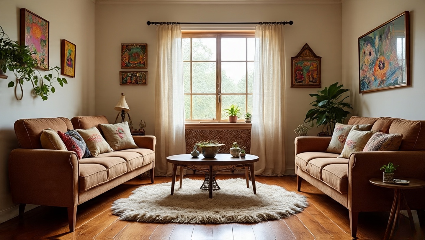 Before you bring in a single pouf, study how people will move through the room. Think of it as a river: you need clear channels for daily life.
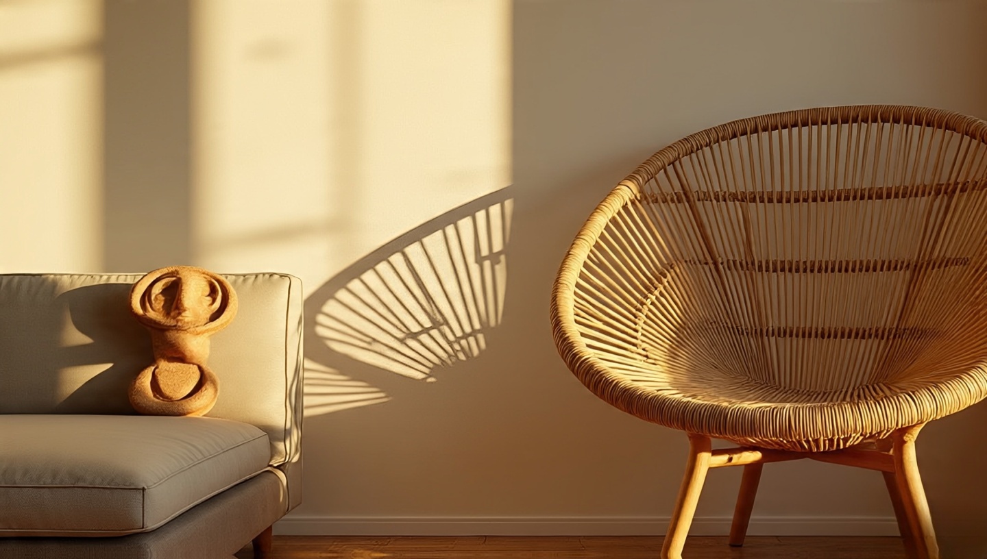 A single oversized sectional can swallow a studio; too many tiny stools create visual noise. Balance is about presence, not just dimensions.
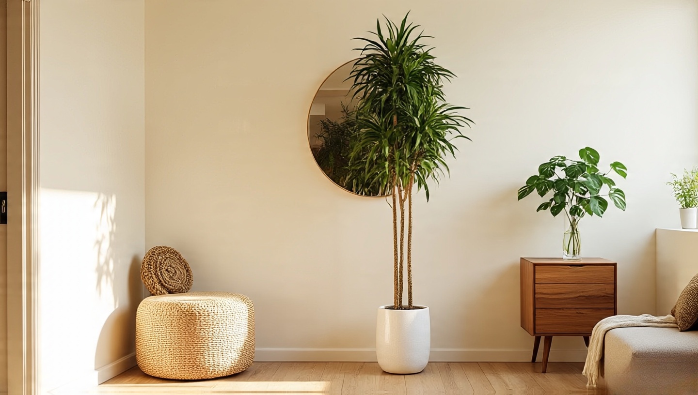 The air around furniture is as important as the furniture itself. Leave breathing room so sunlight can wrap objects like a soft shawl.
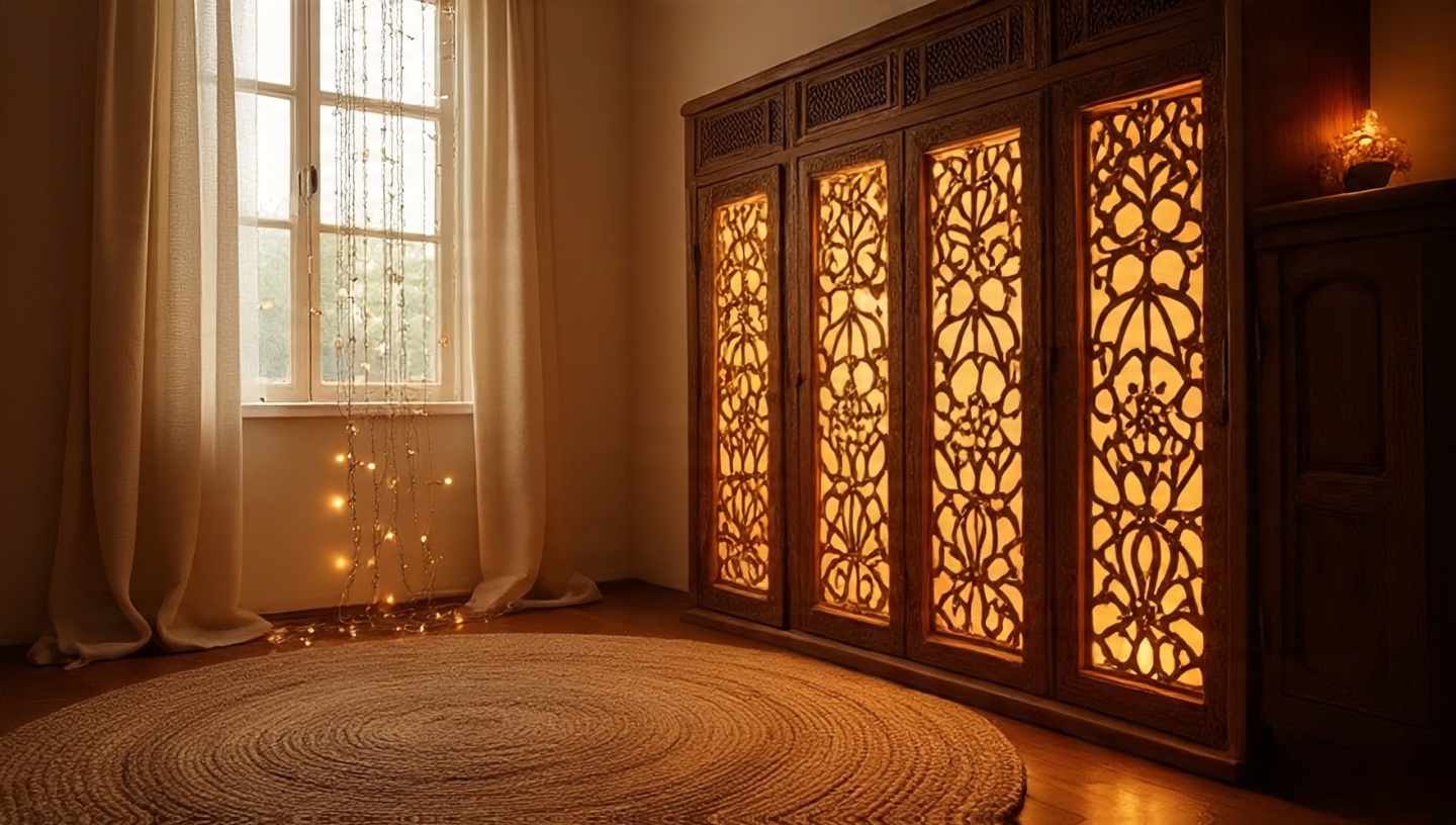 Texture, sound, and scent trick the mind into feeling spaciousness. A beaded curtain that clinks in a breeze, a jute rug underfoot these sensations add dimension without square meters.
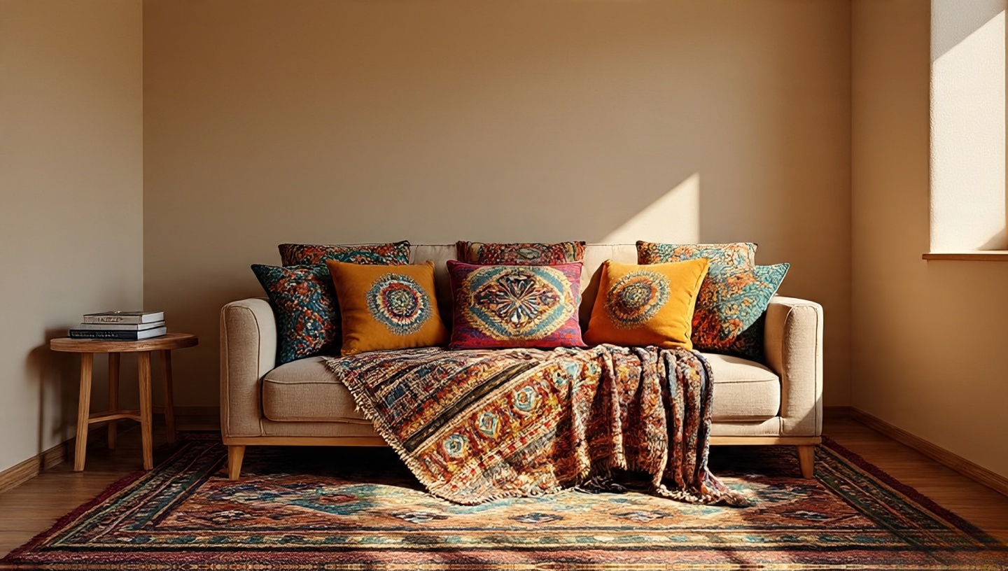 Bold paint can shrink a room. Keep walls soft sand, misty sage, warm ivory and let kilim pillows and tapestries bring the drama.
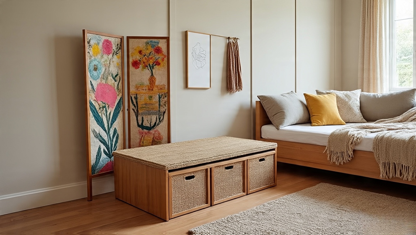 In small Boho homes, pieces must moonlight. A Moroccan tea table becomes a coffee table by day, plant stand by night.
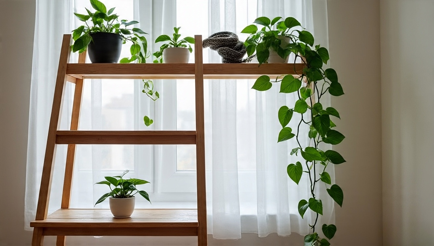 Greenery adds vertical rhythm and softens edges. Think of plants as sculptures that change with the light.
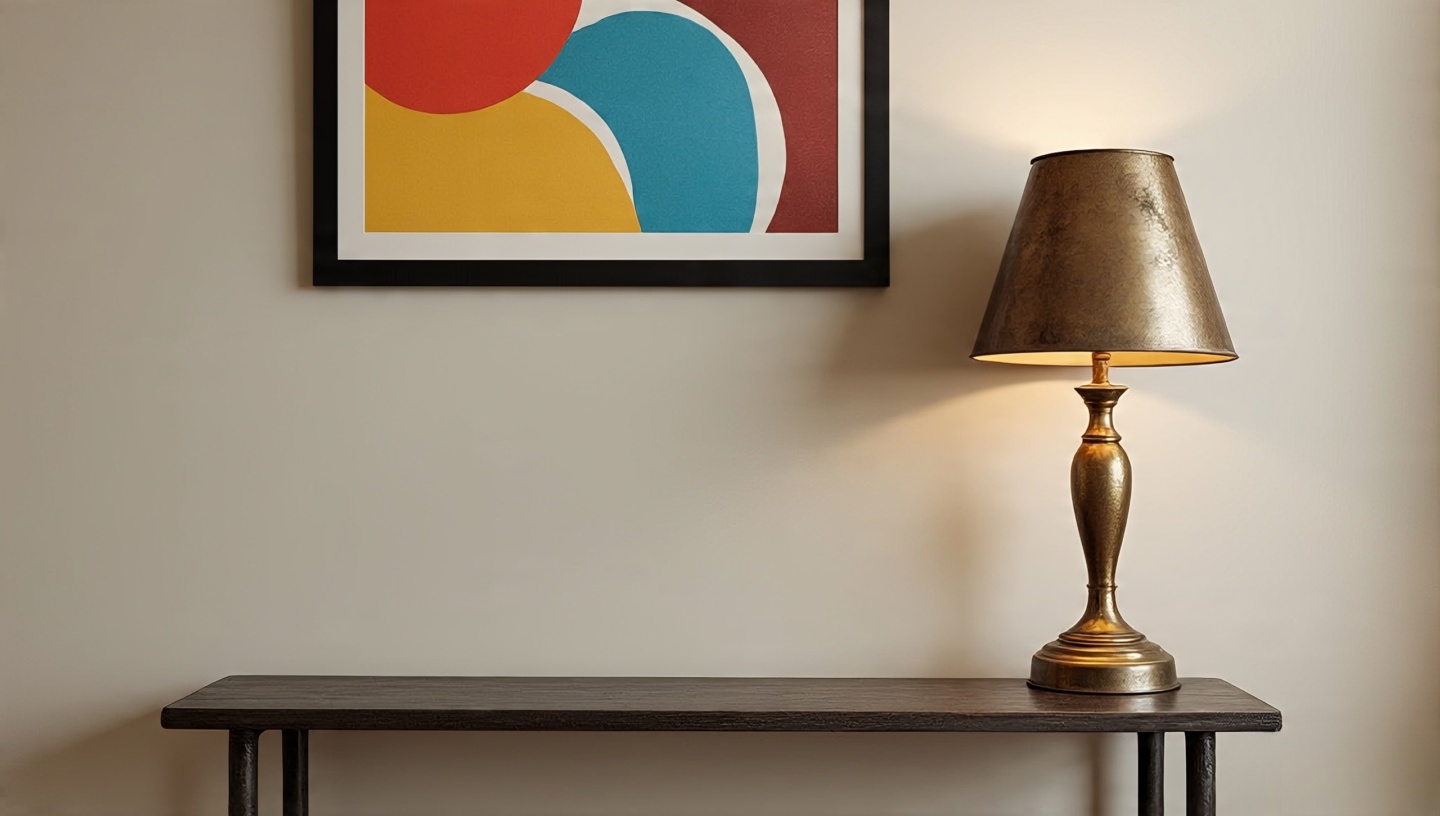 A chipped brass lamp or weathered rocker can anchor a room, but each vintage find deserves space to breathe. For sourcing gems, see this expert guide.
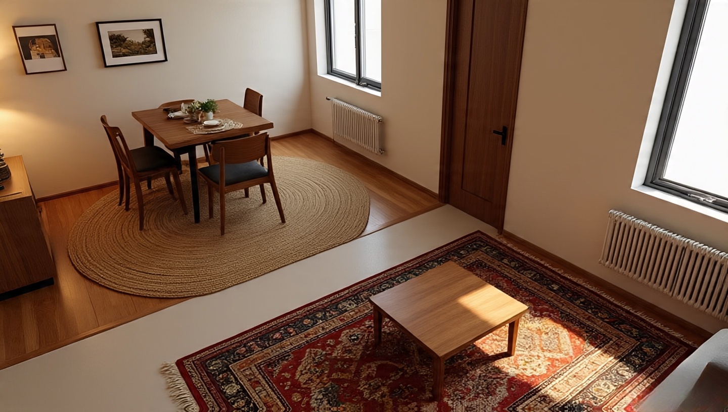
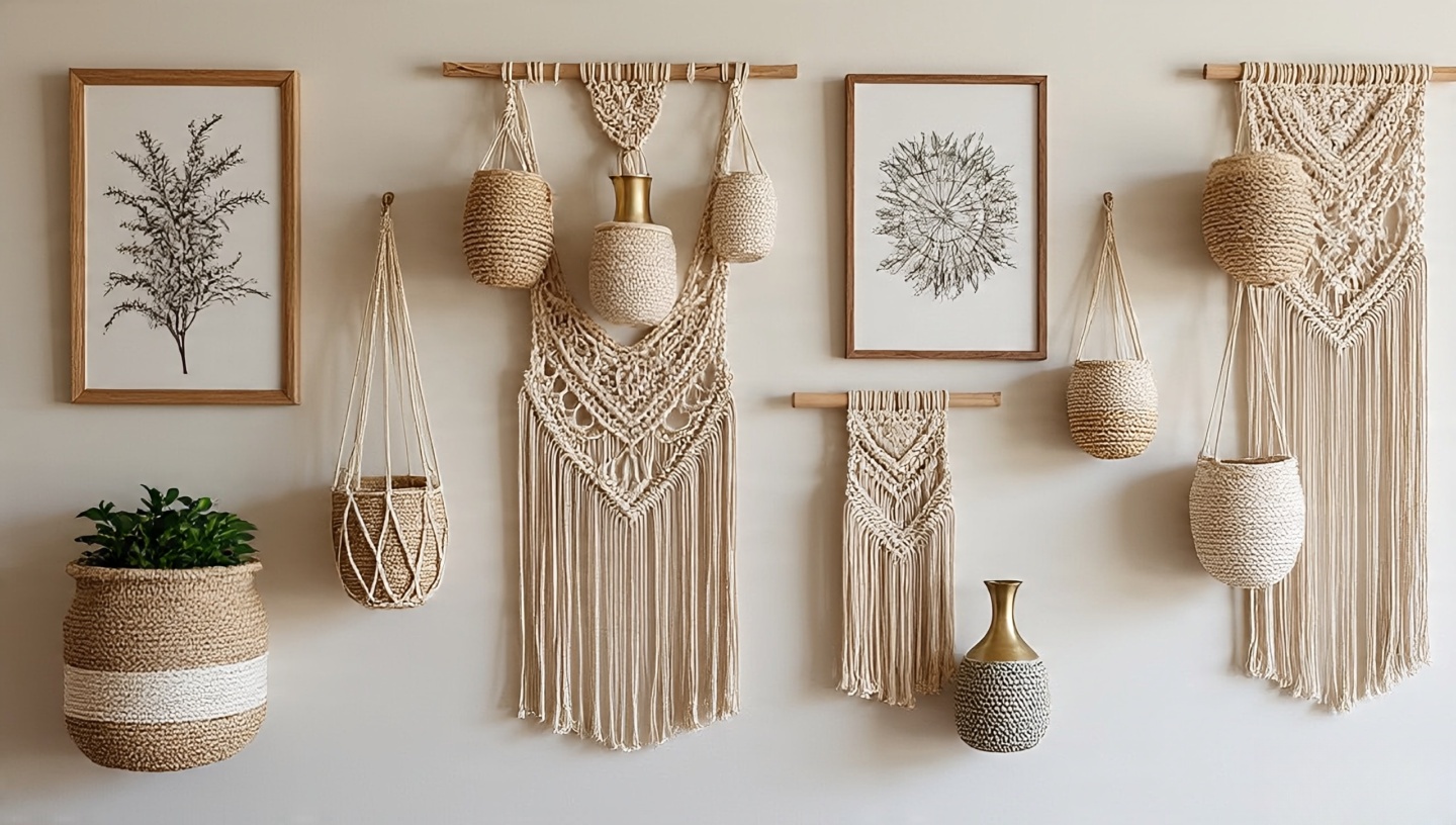 Rotate art seasonally. Lightweight frames or frameless canvases keep walls from feeling heavy. Keep a “maybe box” for accessories store items for a week and see if you miss them before letting them go.


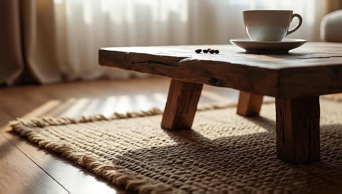
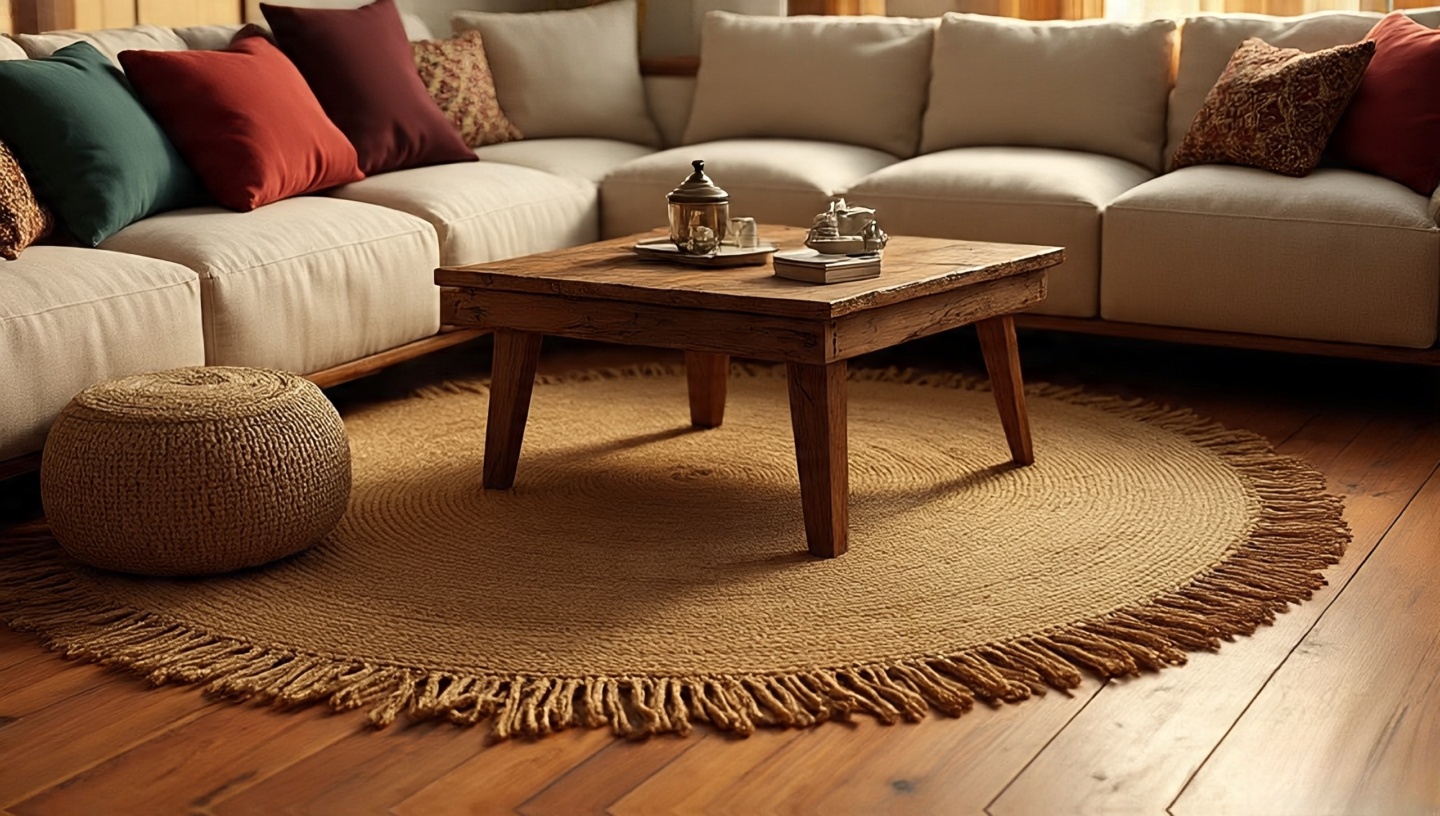
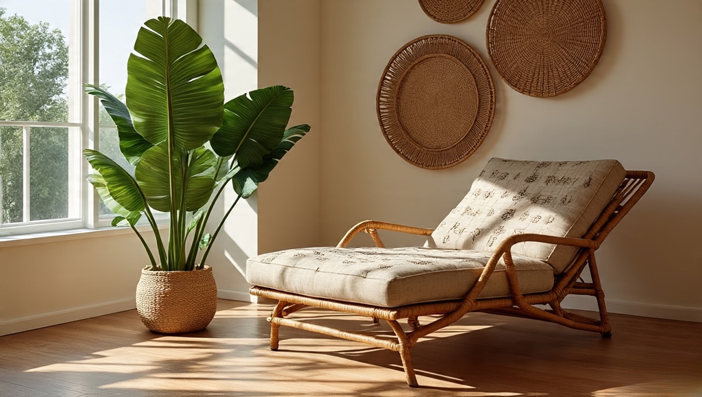
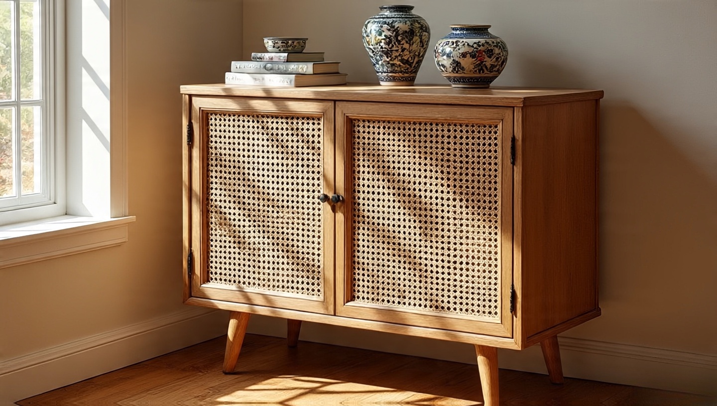
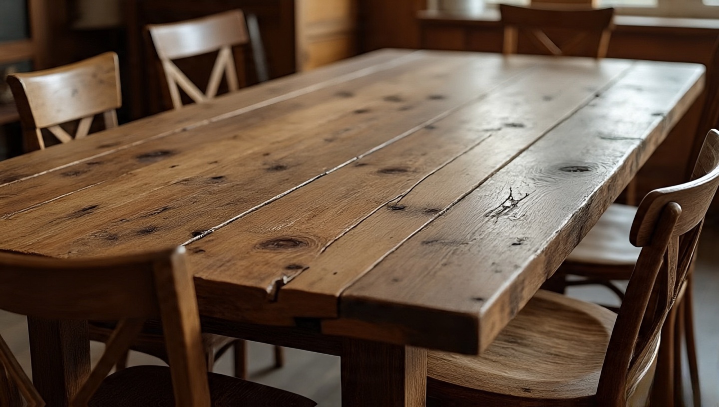
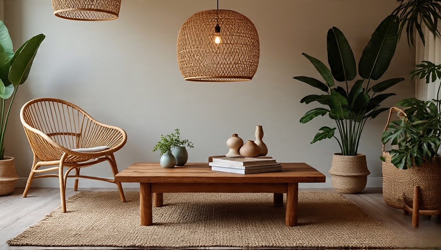
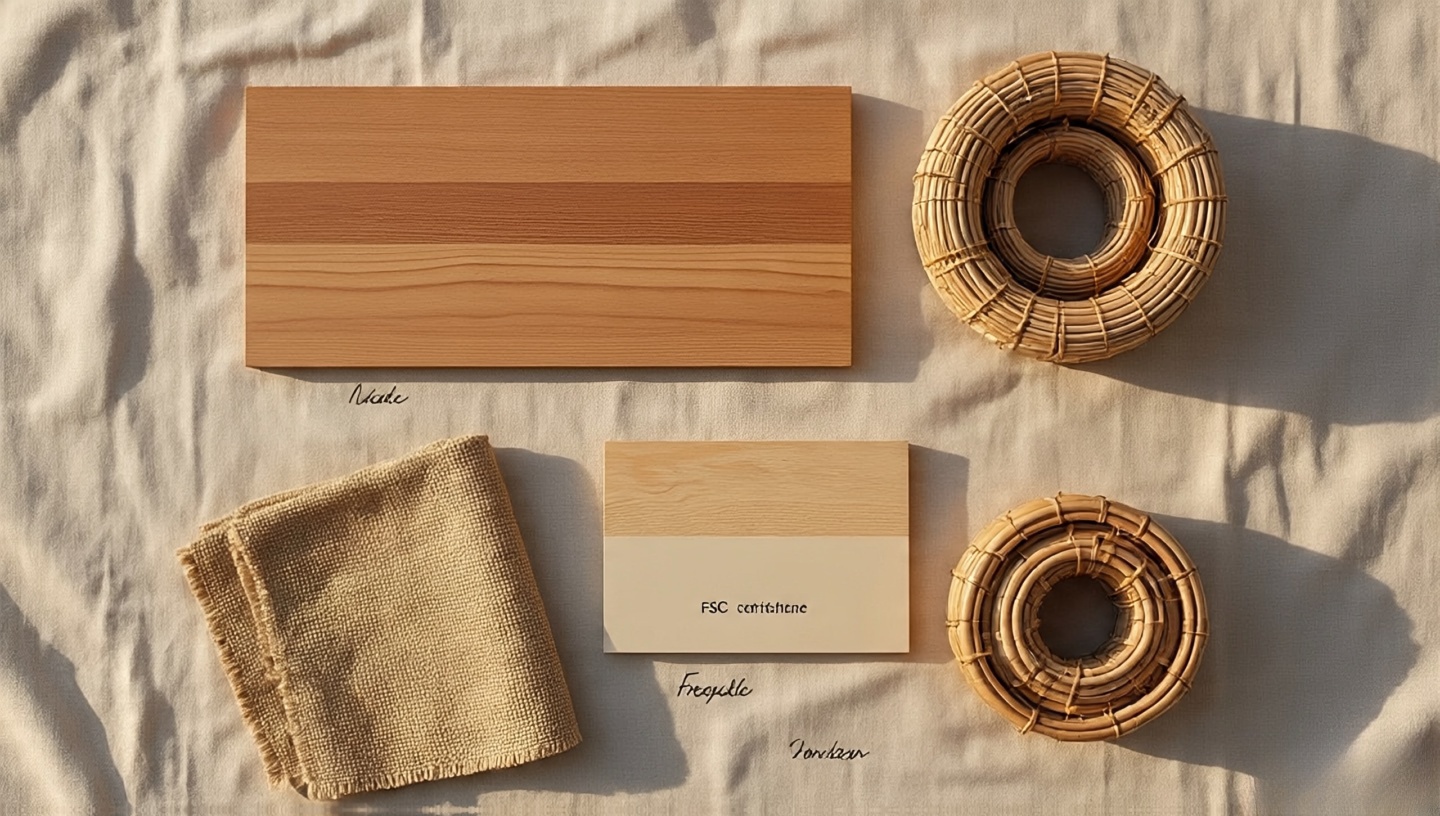

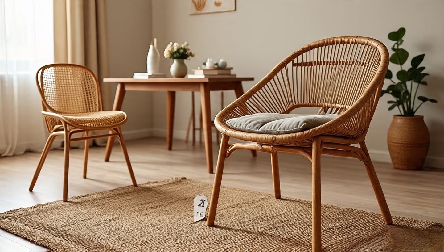
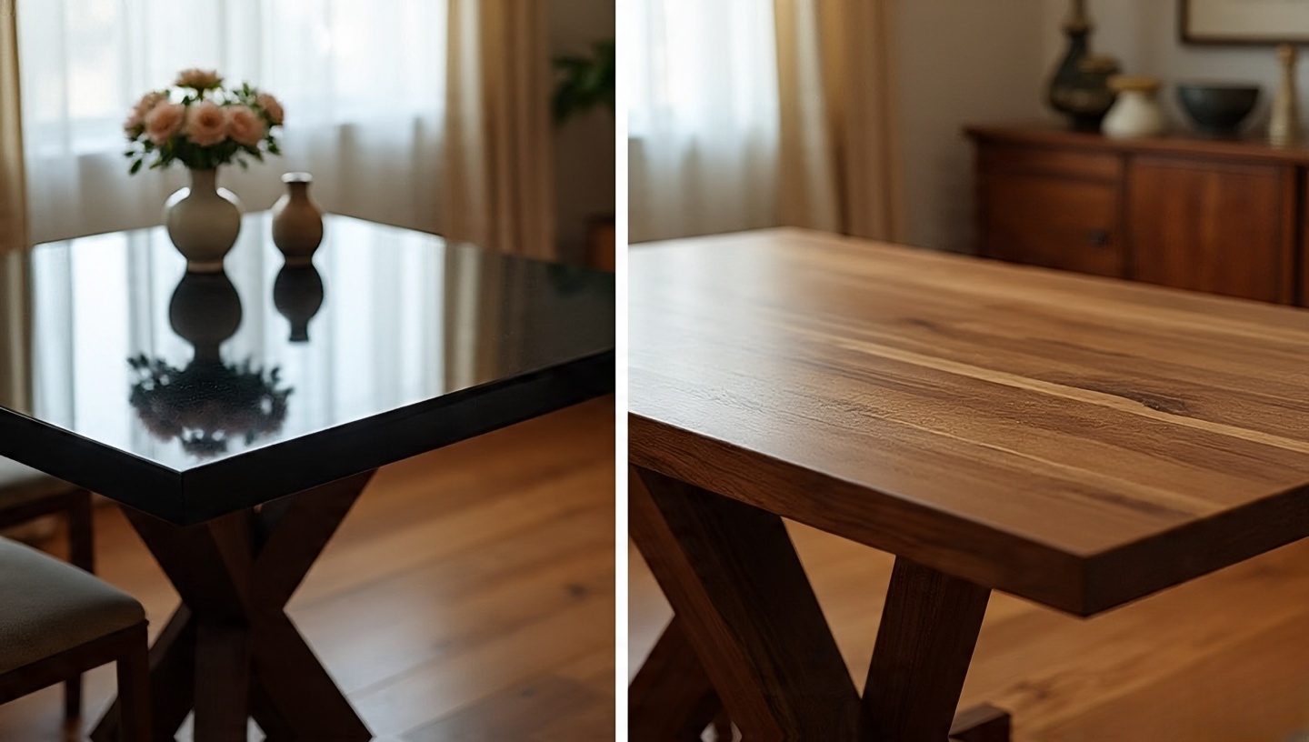
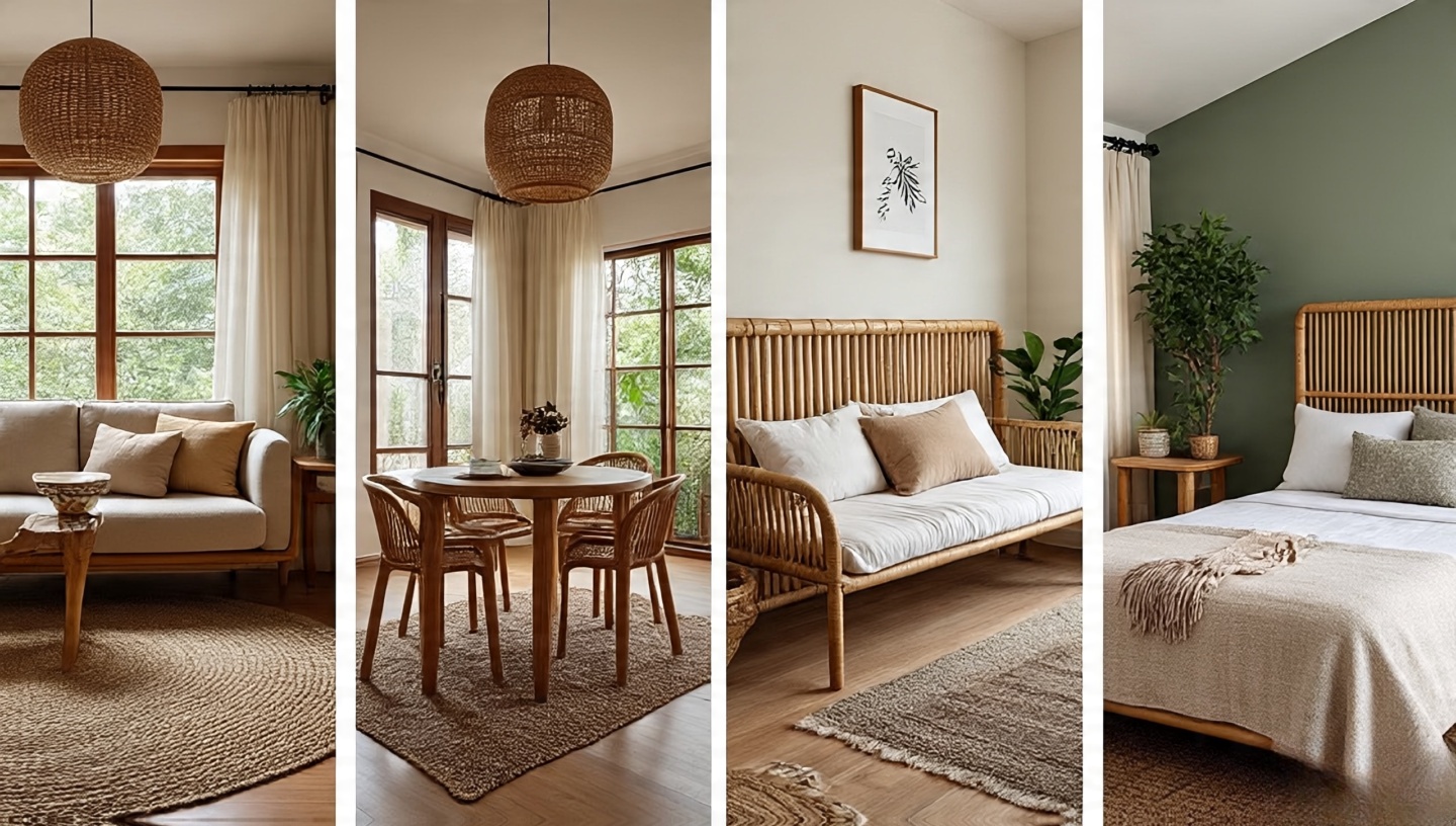

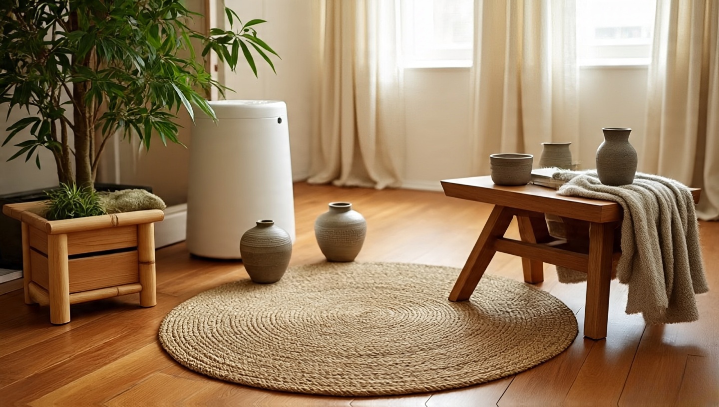
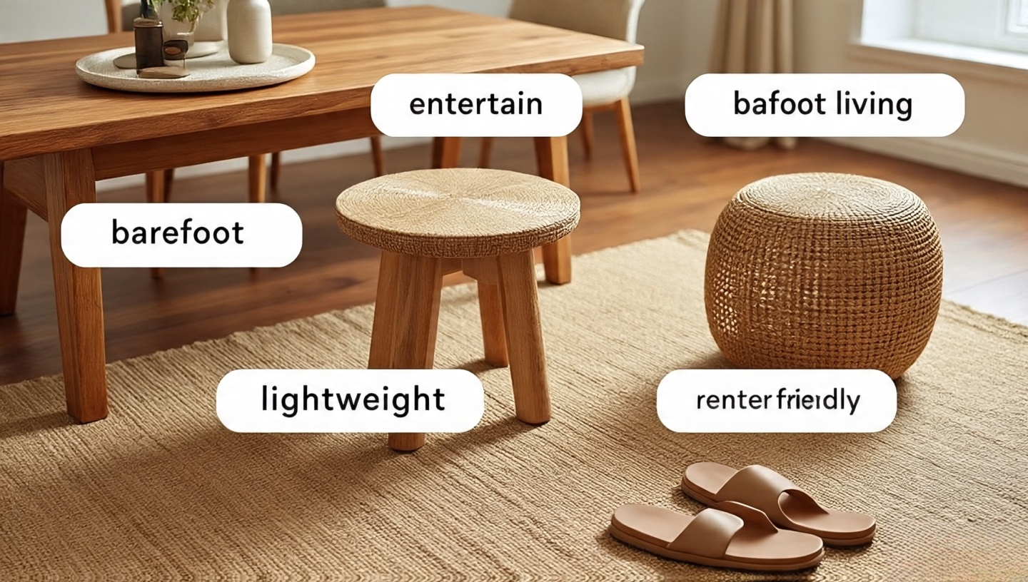
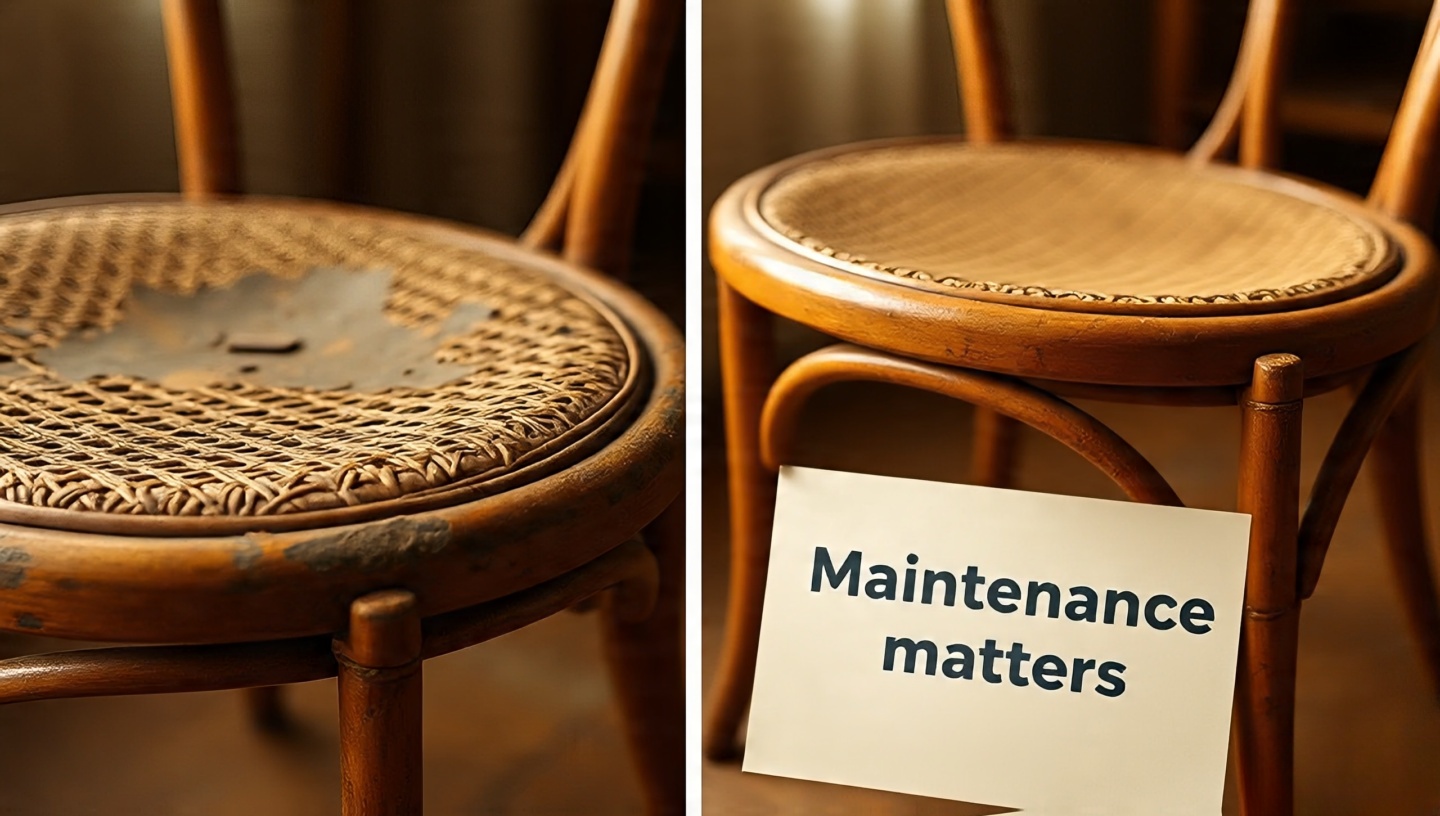
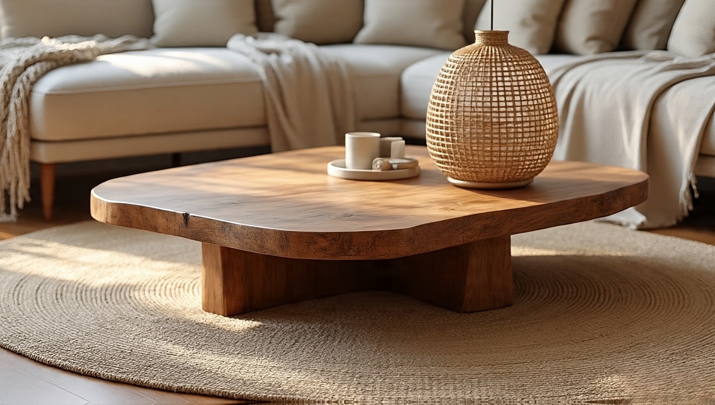
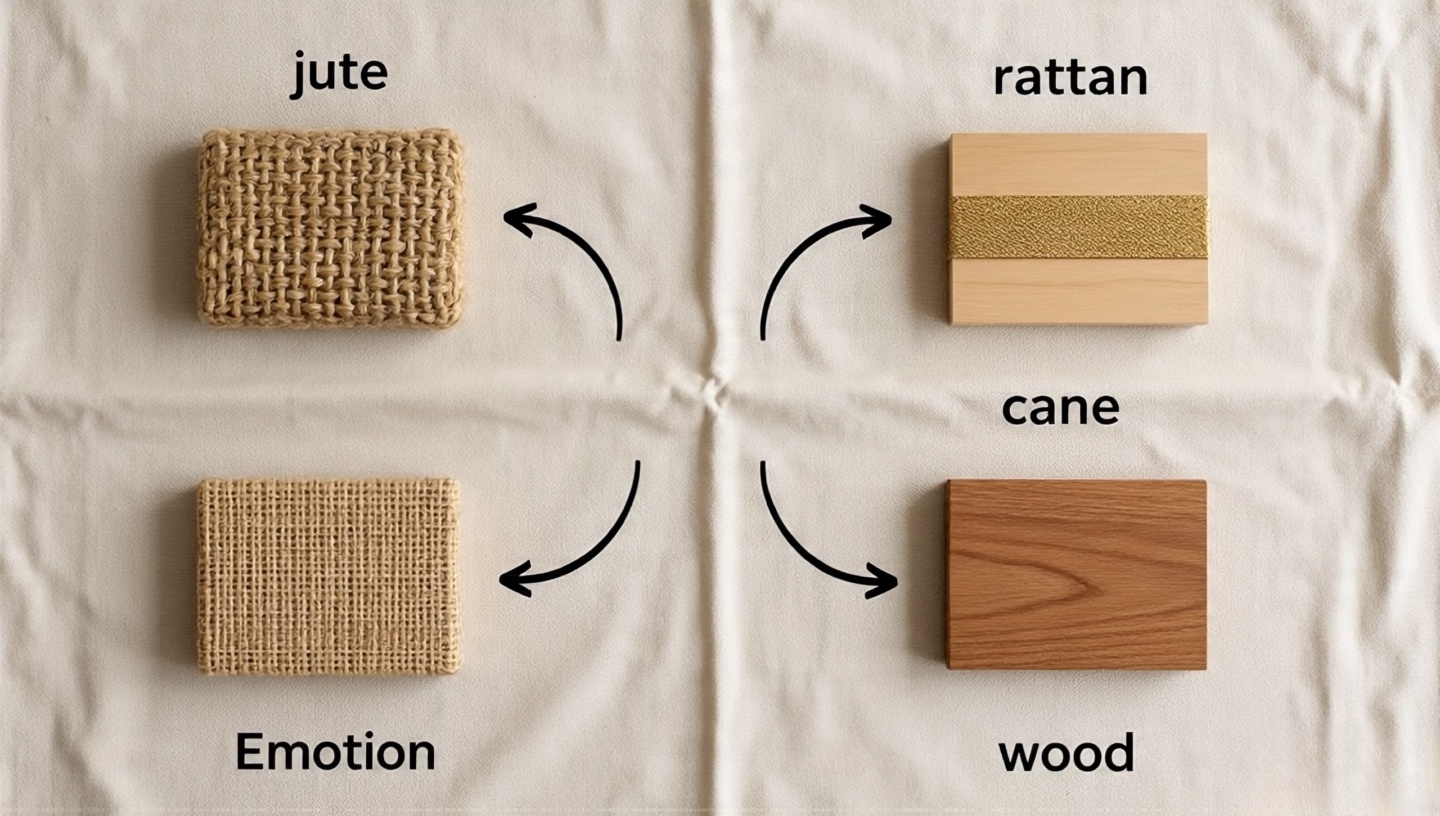
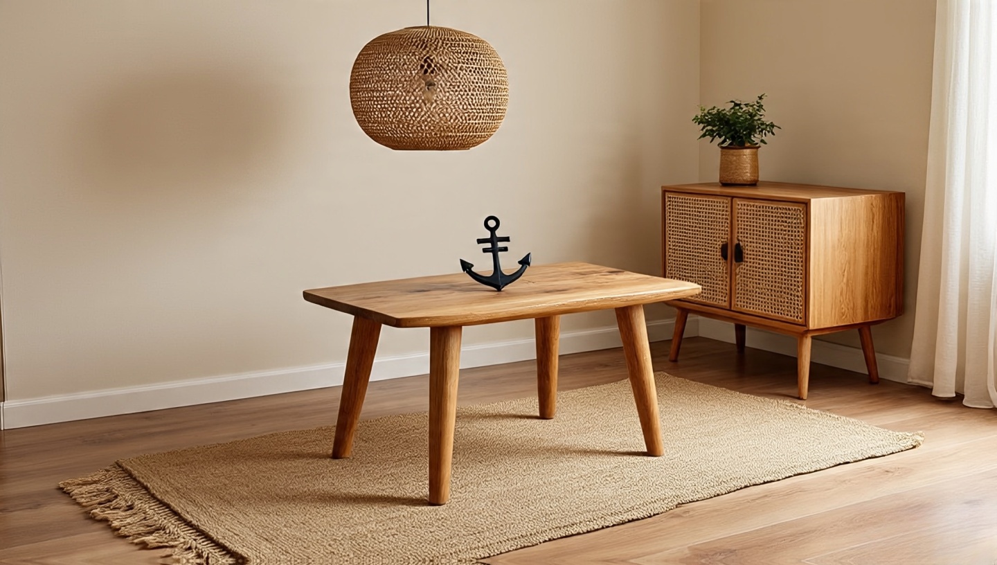


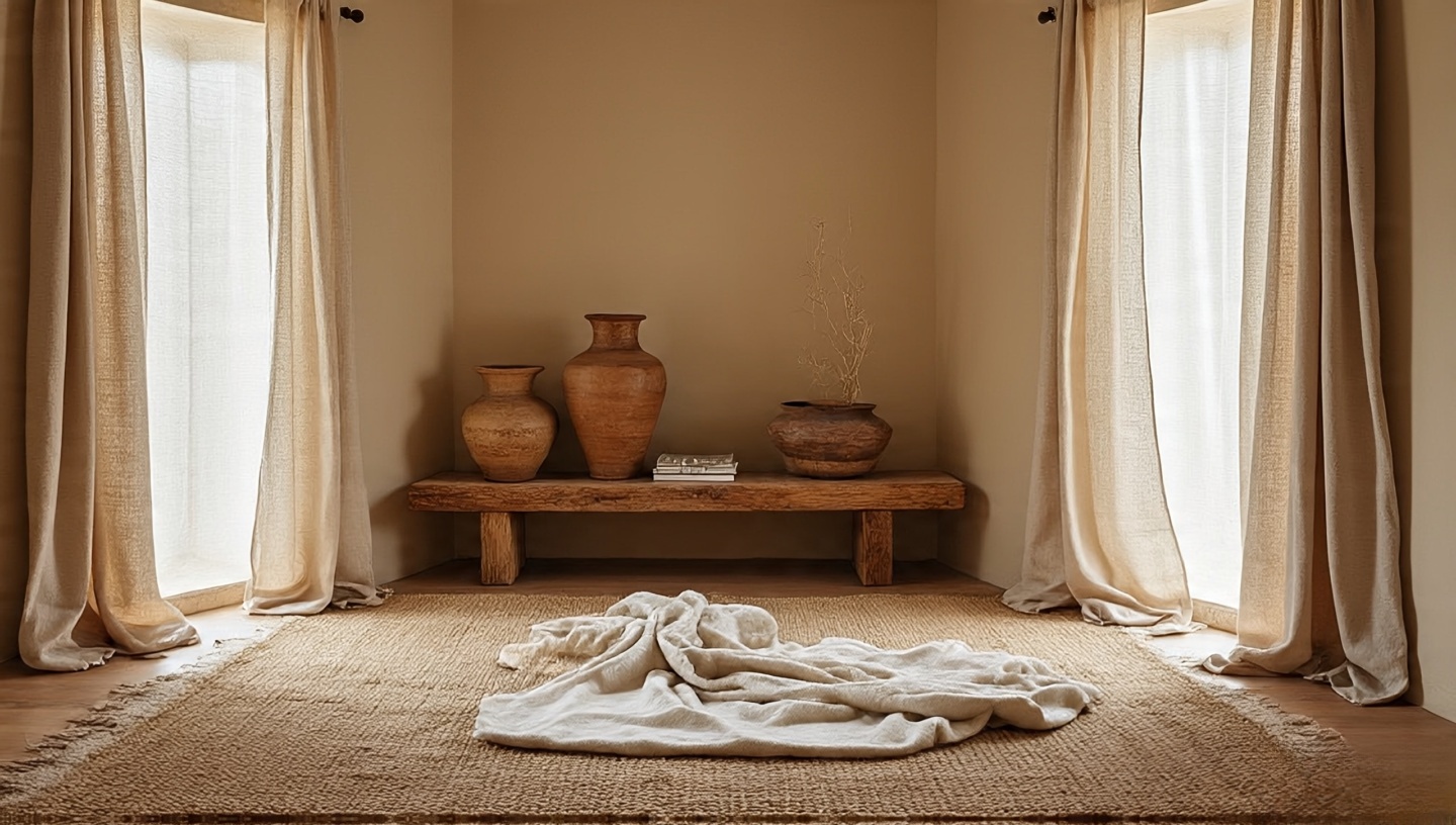
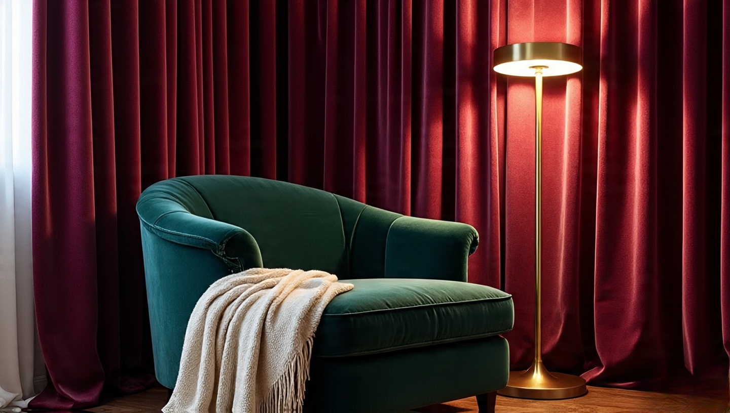
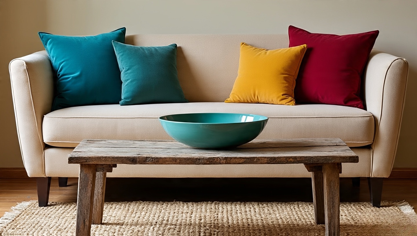
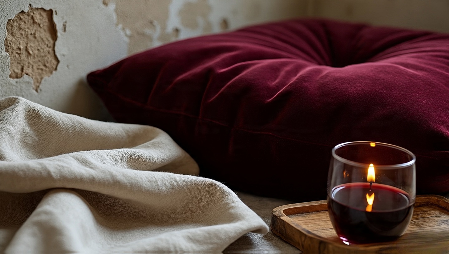
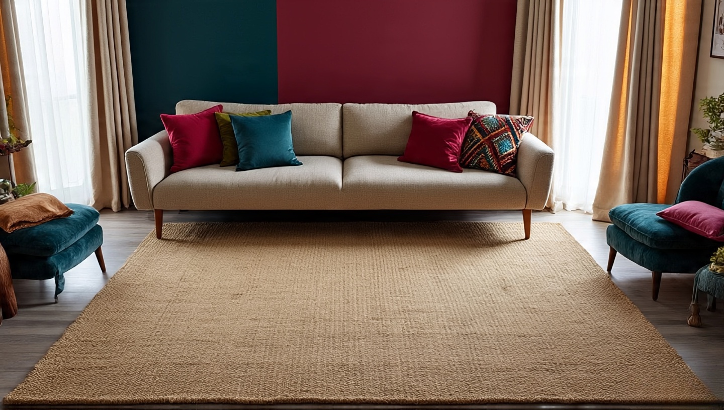
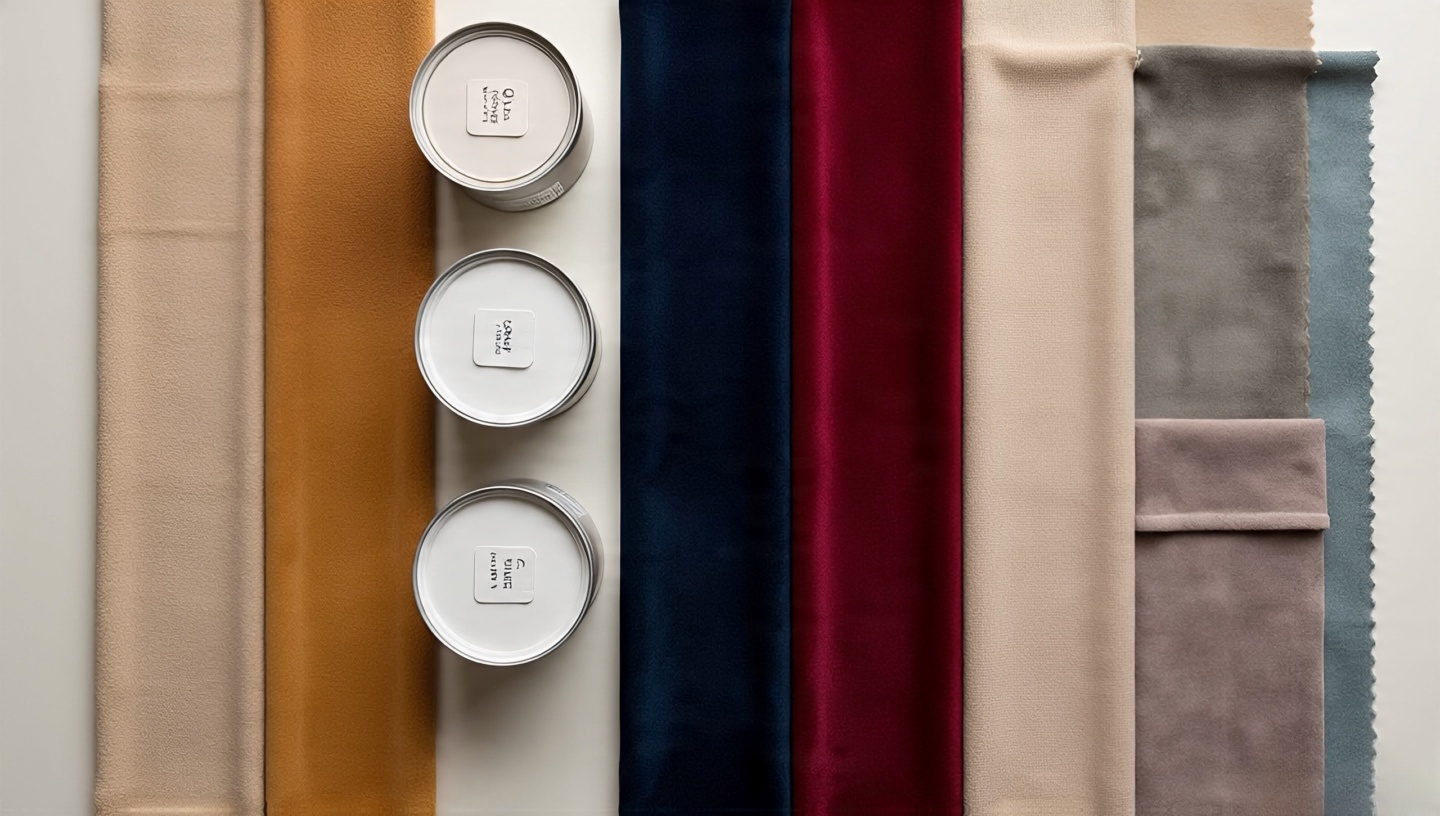
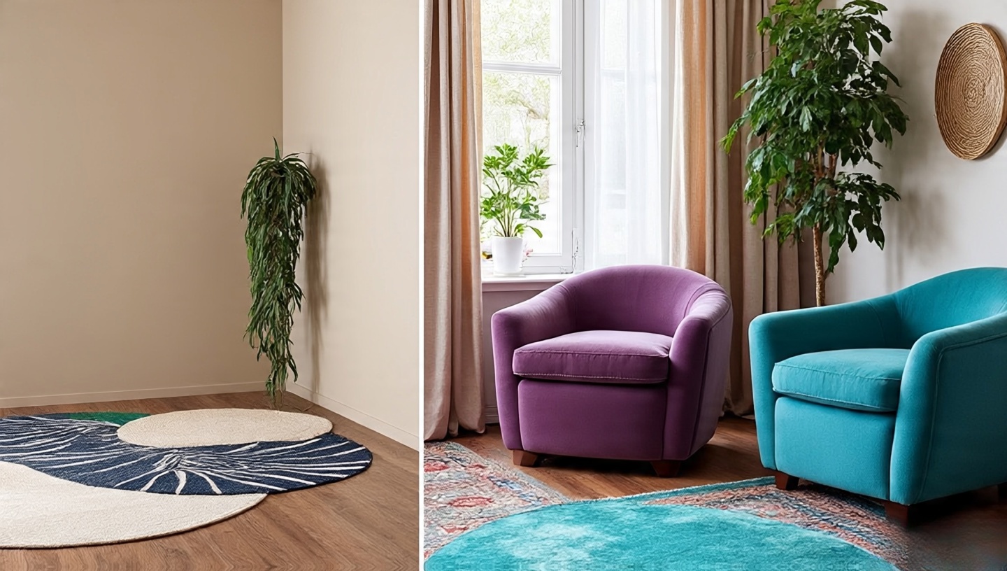
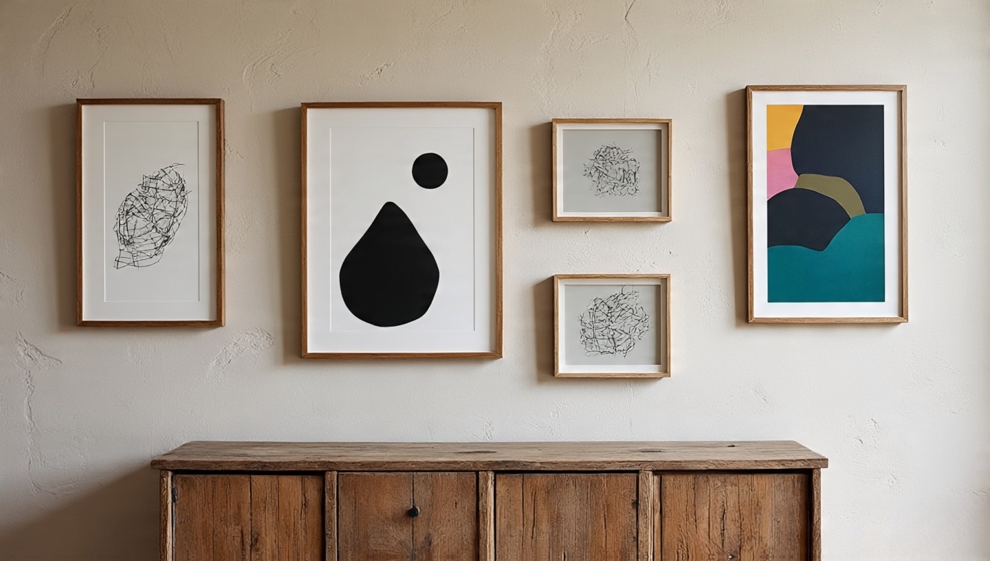
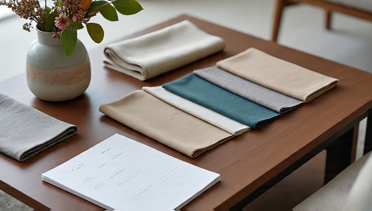
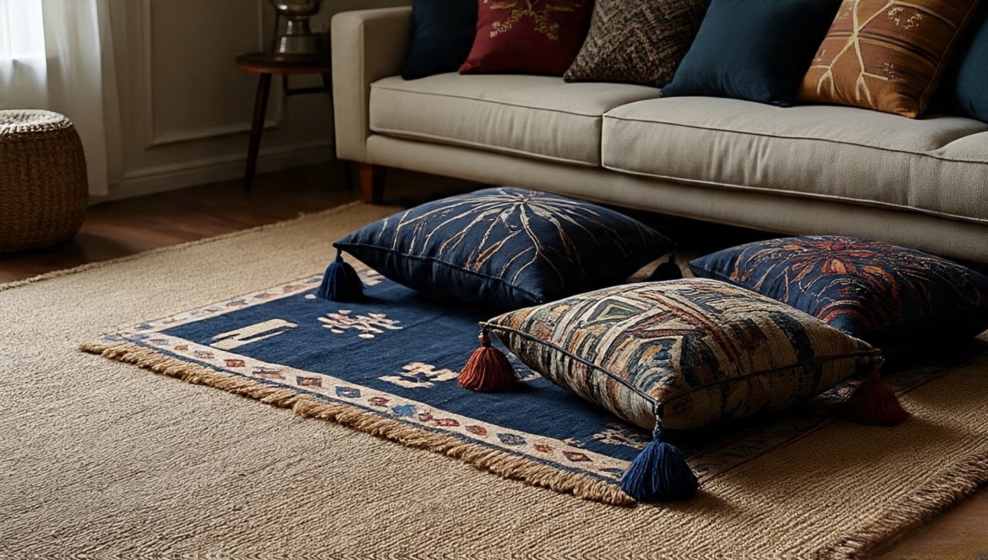
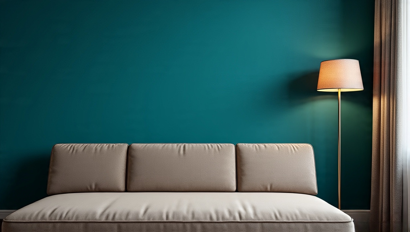
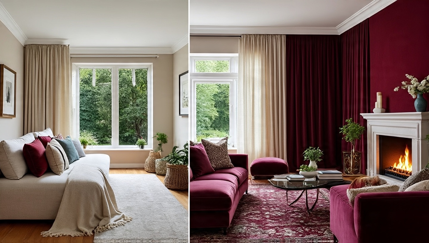
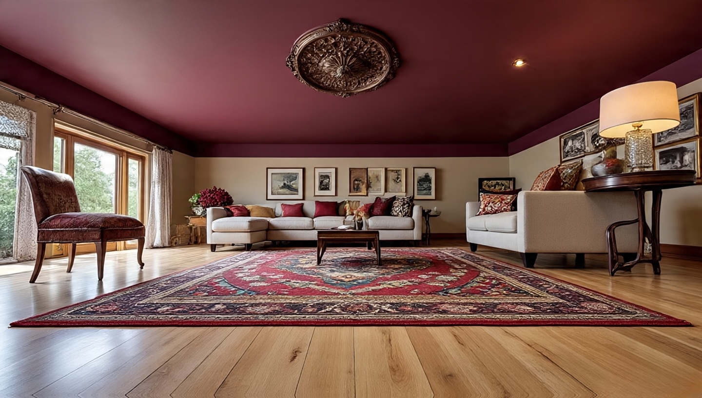
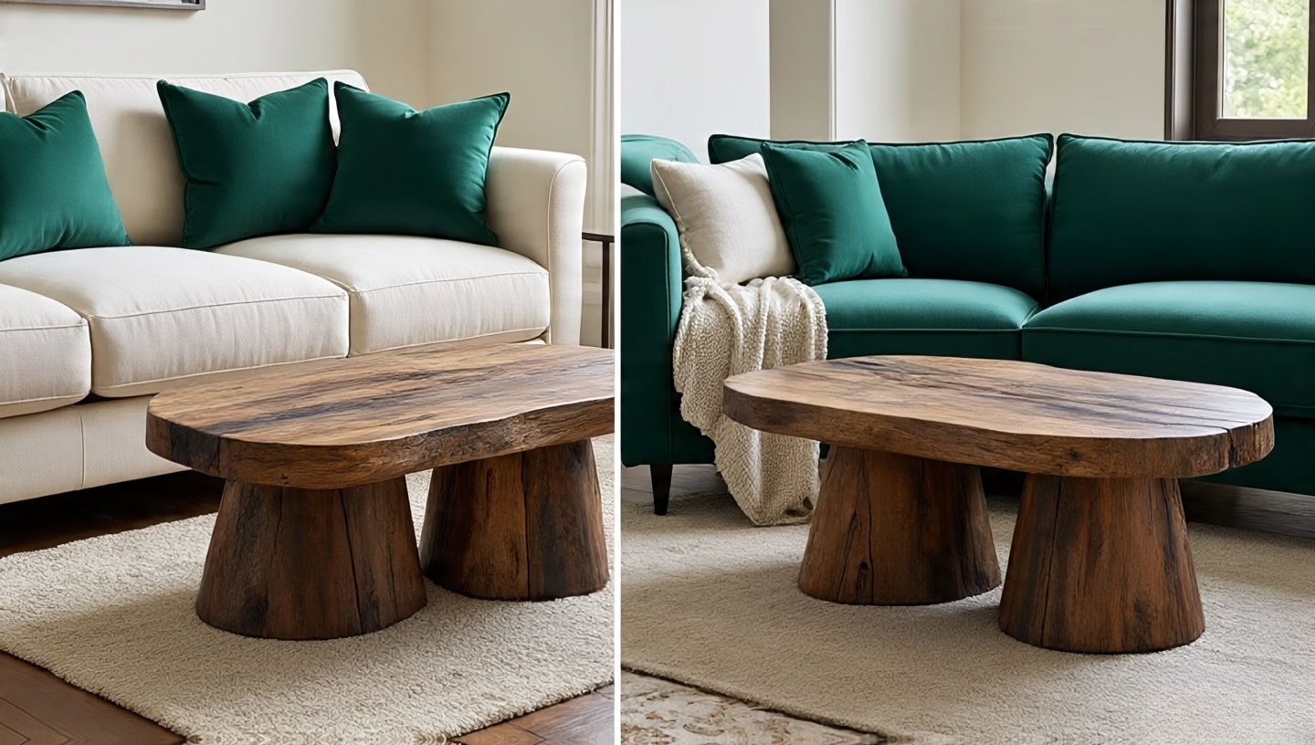
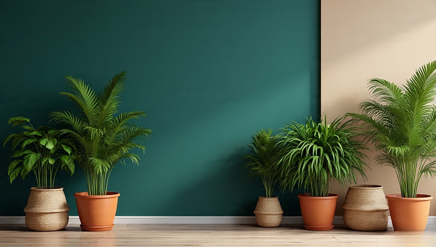
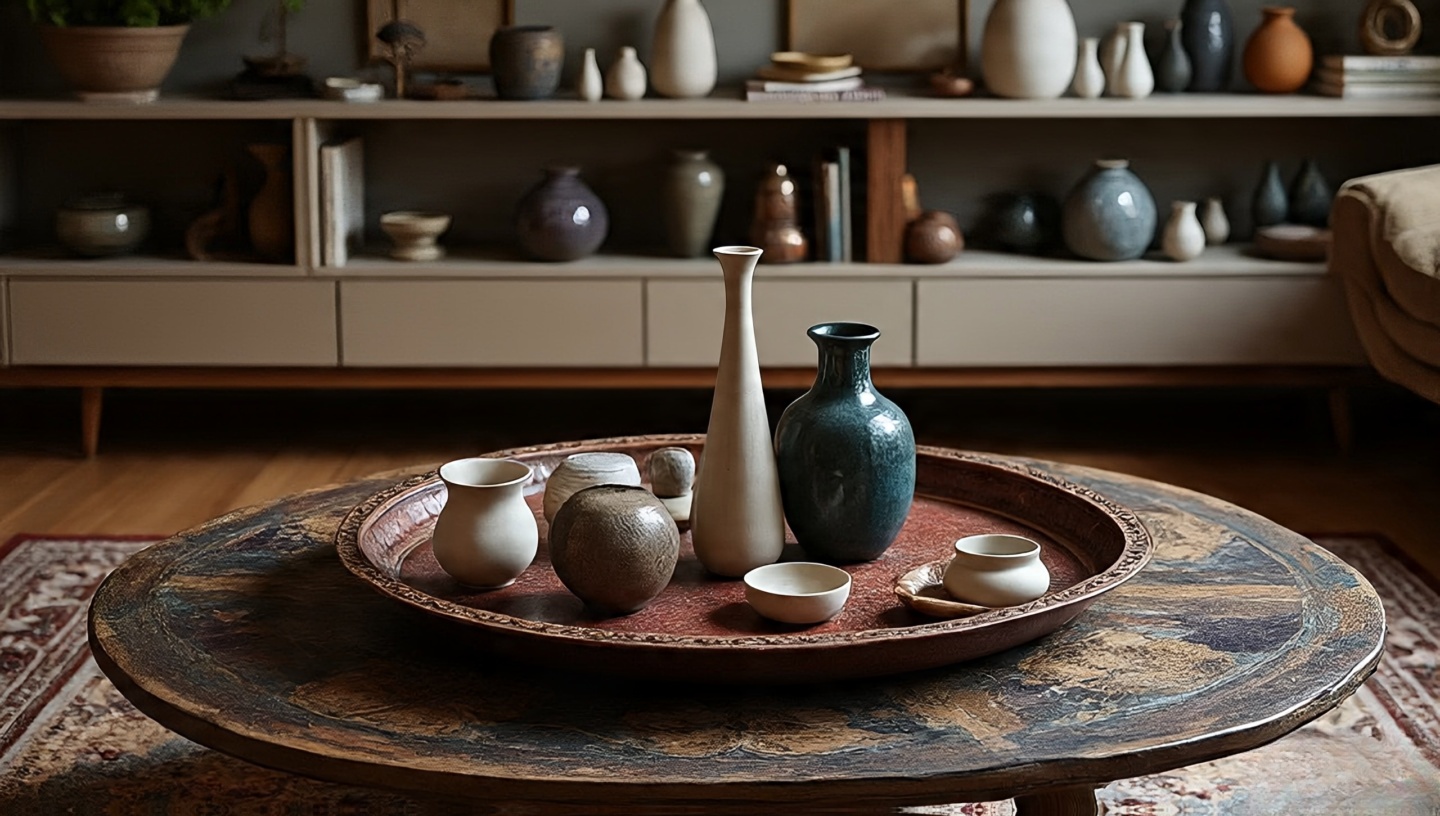


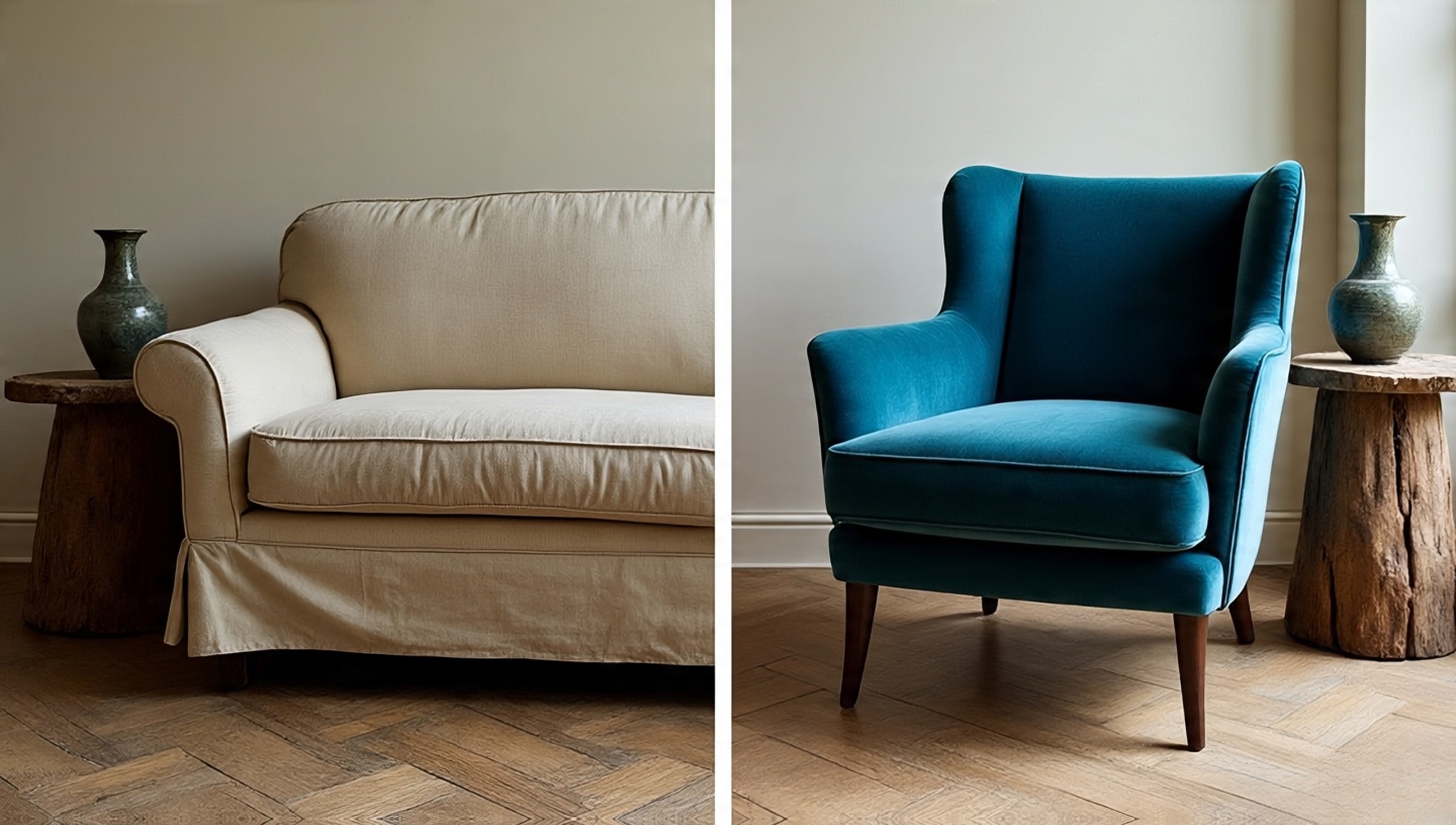

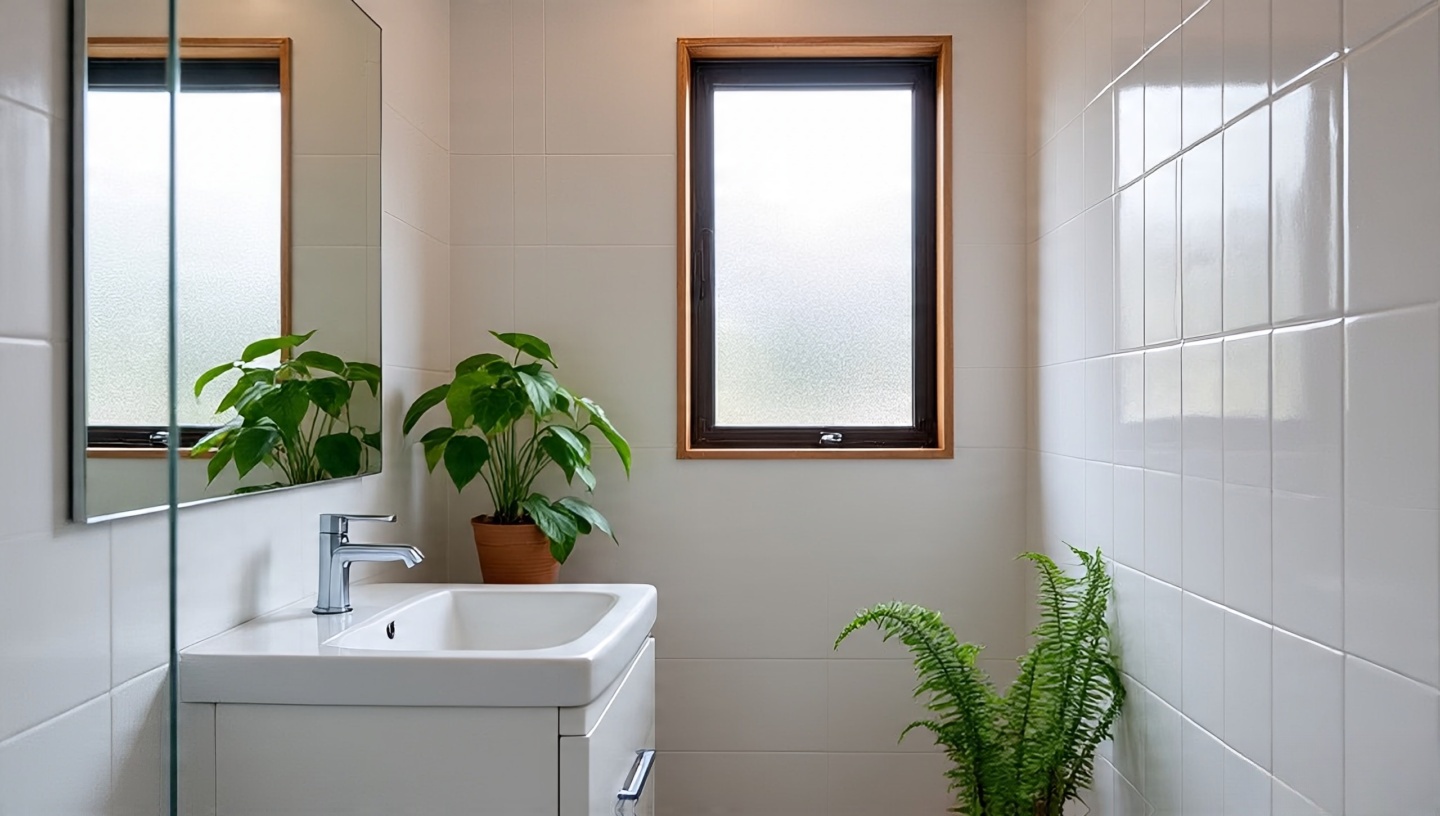 Most people assume bathrooms are plant graveyards. In reality, their humidity is a gift. Ferns sigh with relief in steamy corners. Orchids, often fussy elsewhere, find their rhythm here. The secret is knowing your room’s light levels and pairing them correctly.
 The Boston fern has been my favorite test subject. On a bamboo shelf near the shower, it thrived like it had been waiting years for the right home. Ferns soak up humidity but demand consistent moisture.
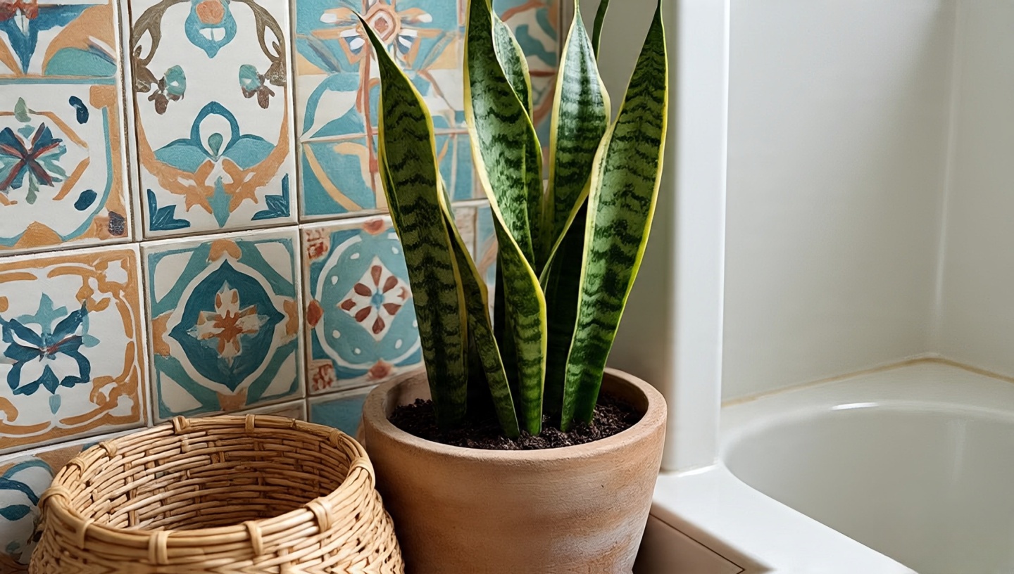 I call snake plants the stoics. They stand tall, striped, and unbothered by low light or missed watering. They’re especially powerful in Boho bathrooms because of their vertical form, which pairs beautifully with patterned tiles.
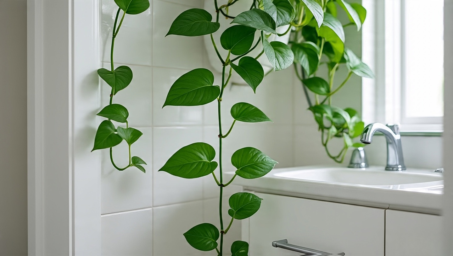 Few plants adapt like pothos. I’ve trained them along mirrors, across shower rods, even up tiled walls with small hooks. Every time, they turn into living drapery.
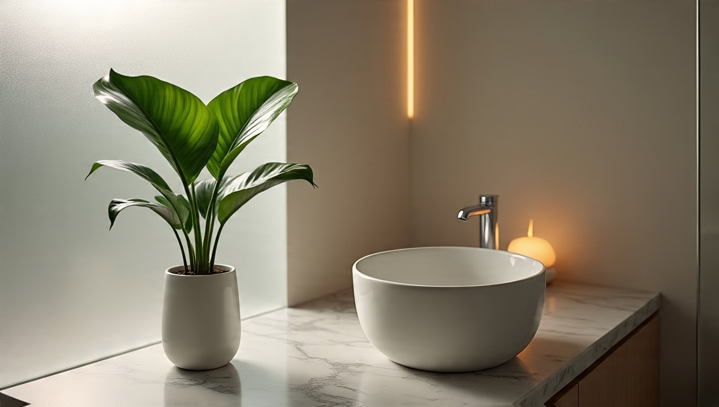 Peace lilies exhale calm. Their glossy leaves and white blooms bring hotel-spa energy without needing professional maintenance. They thrive in medium light but tolerate less.
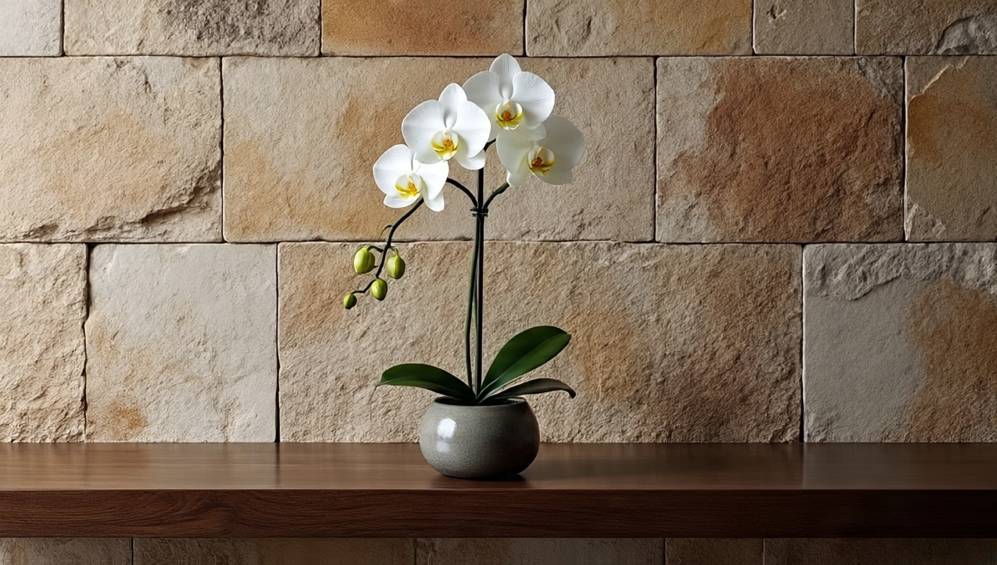 I’ve placed orchids in countless projects, often against natural stone or patterned tiles. Their flowers are dramatic but not overwhelming when used sparingly.
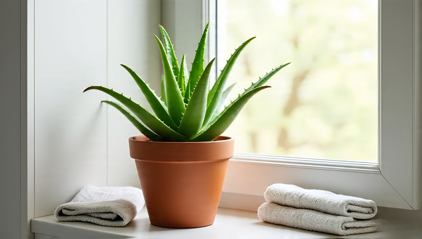 Aloe is a plant with a purpose. In more than one project, I’ve watched clients smile when they realized their bathroom “decoration” doubled as first-aid for burns.
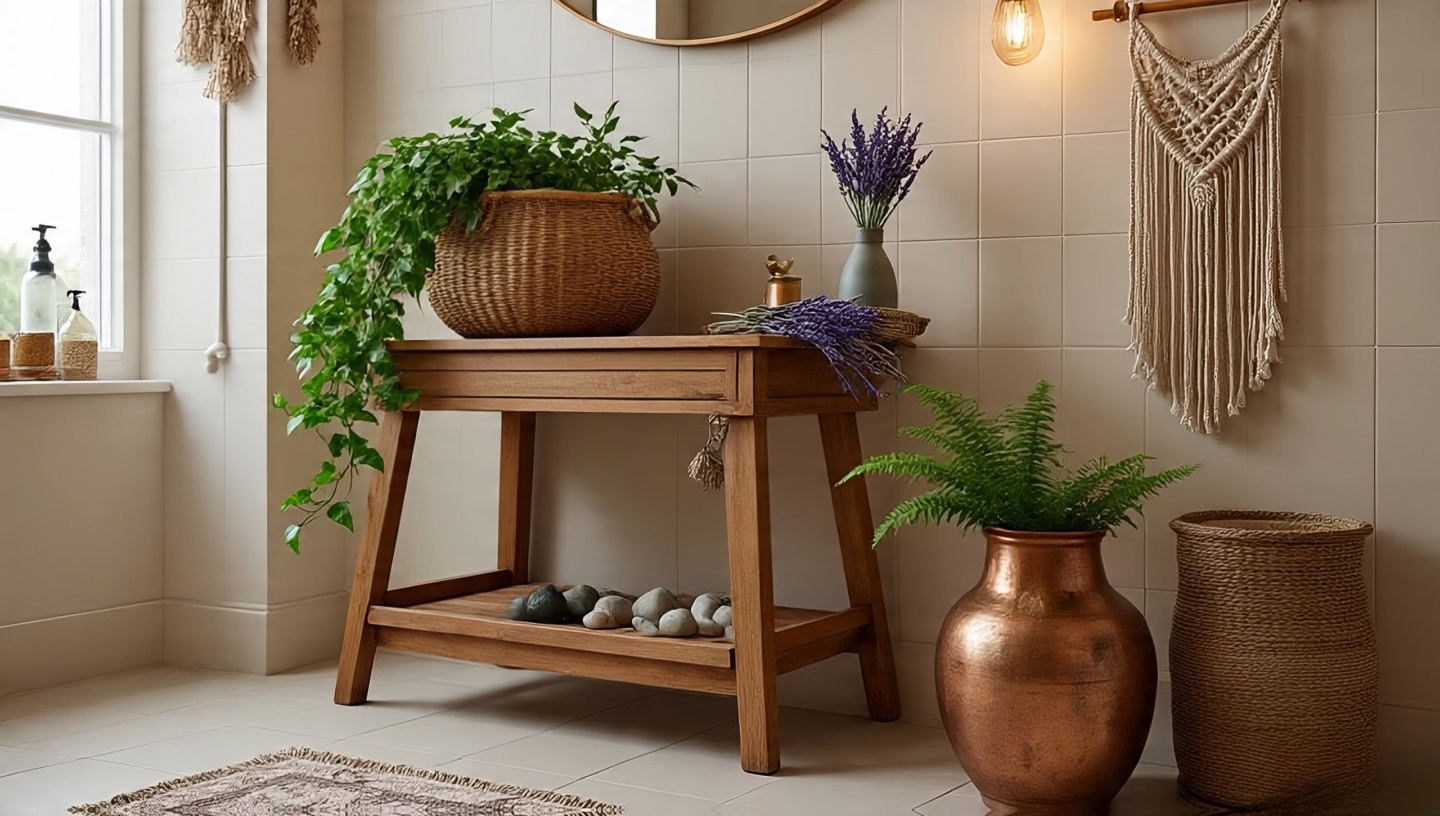
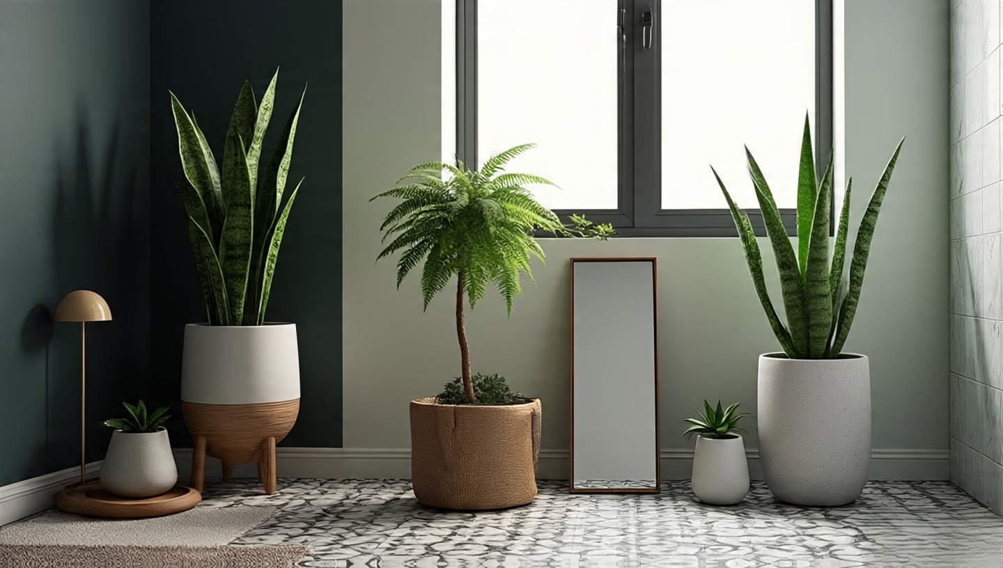
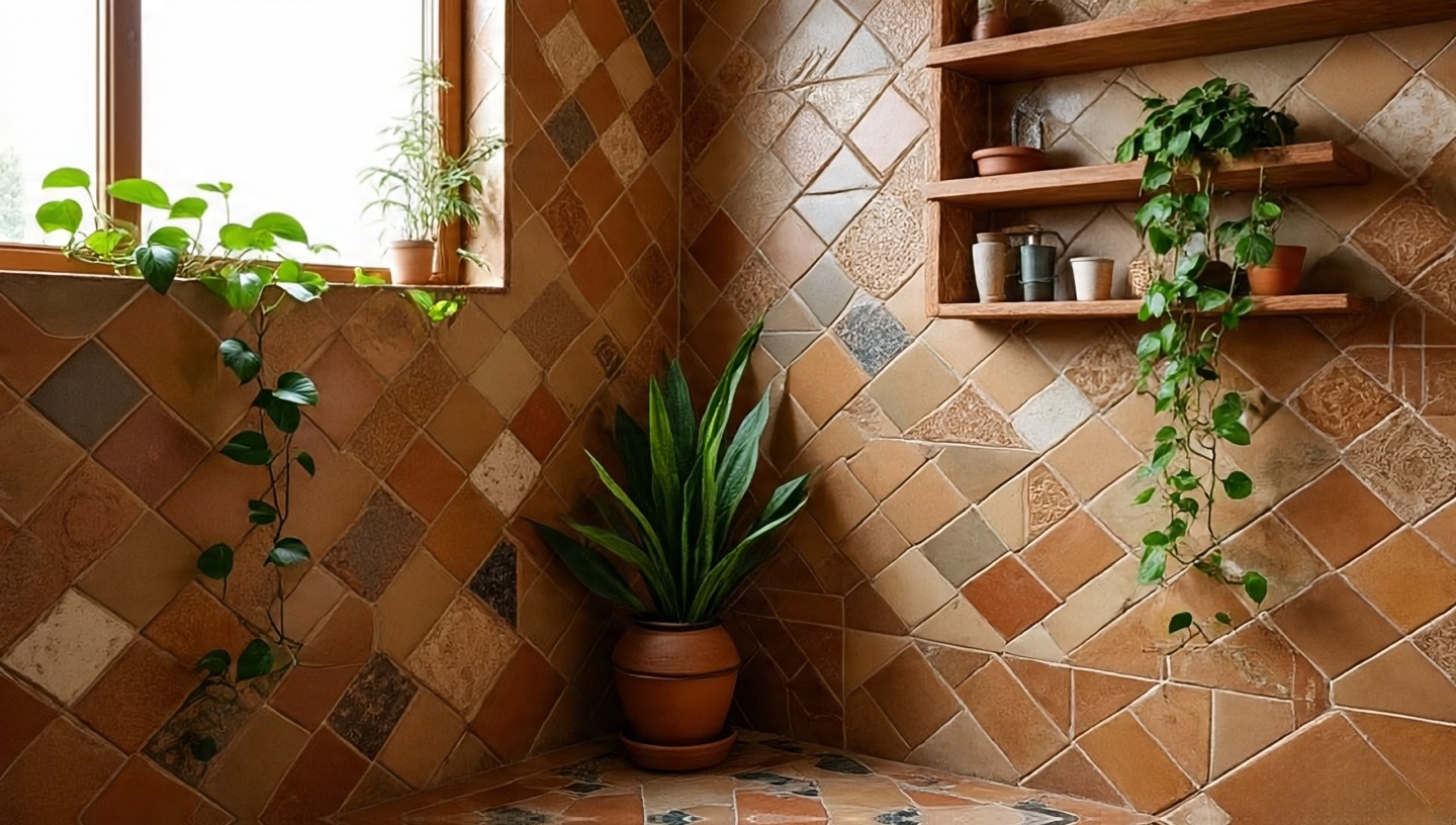 Plants don’t exist in isolation. Pairing them with Boho bathroom tiles amplifies their impact. A snake plant beside patterned tiles reads sculptural. Pothos trailing across earthy zellige tiles feels like nature reclaiming the space. For inspiration, explore
 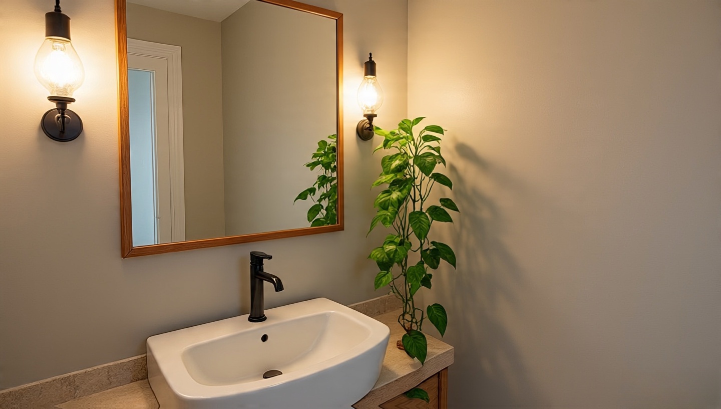 One of the biggest hurdles in bathroom plant design is the dreaded “no window” scenario. I’ve walked into countless apartments where bathrooms felt like caves. Yet, with the right artificial lighting, plants can still thrive.
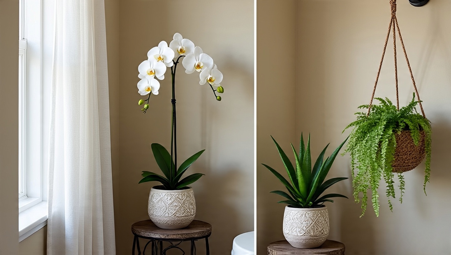 Bathrooms change with the seasons, and so do plants. I’ve seen orchids bloom all winter in a heated loft bathroom, only to suffer in summer when the AC vent blasted them.
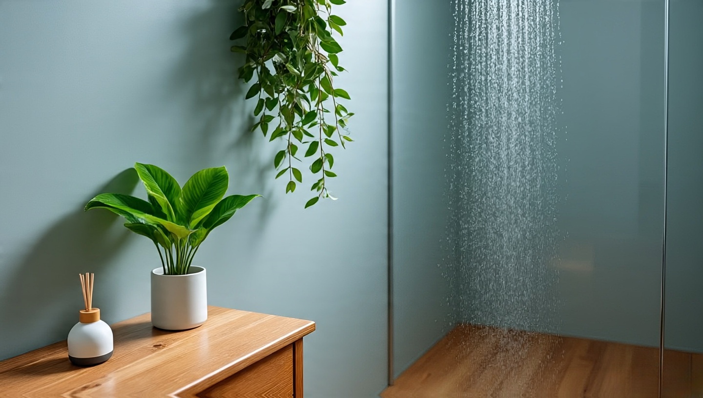 Bathrooms are often filled with synthetic scents. When you add living plants, they subtly change the atmosphere. A peace lily’s faint freshness, or the earthy smell after watering ferns, feels more honest than plug-ins.
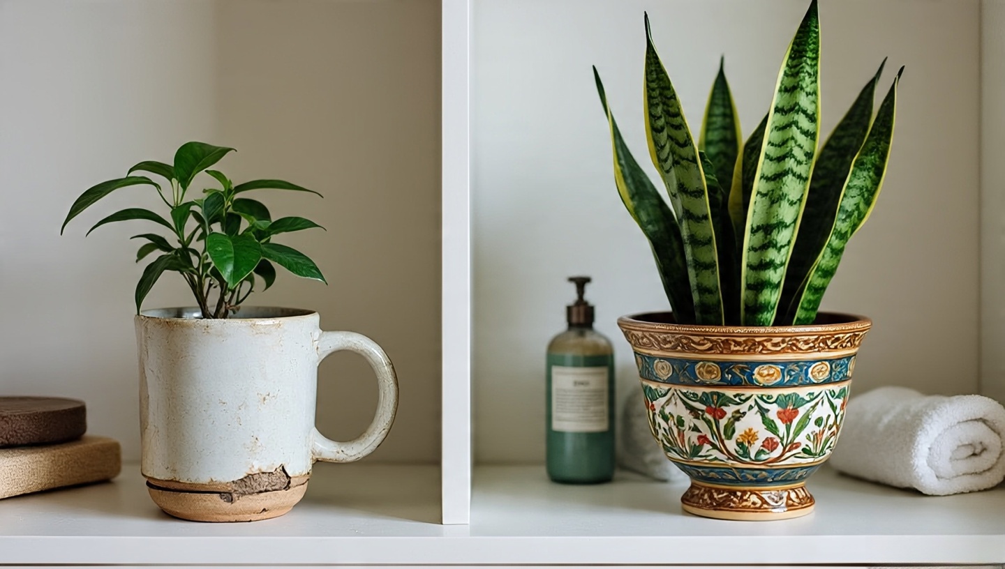 Not all planters are created equal. I’ve worked with clients who splurged on artisan ceramics, and others who used repurposed thrift-store finds. Both can work beautifully.
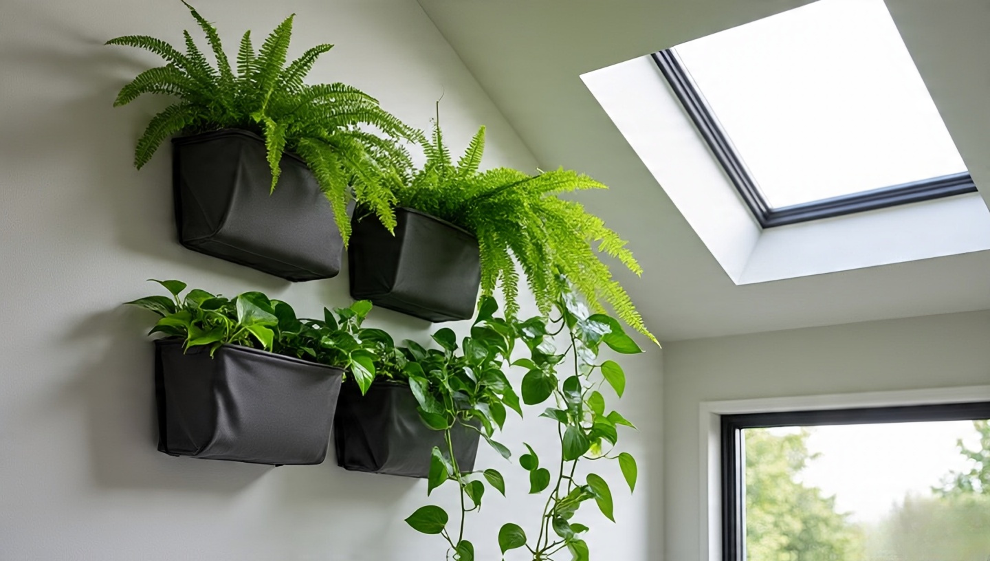 Bathrooms are often tight on floor space. That’s where vertical gardens shine. I once designed a wall of modular planters in a compact Tokyo bathroom. It turned an ordinary shower stall into a lush green box.
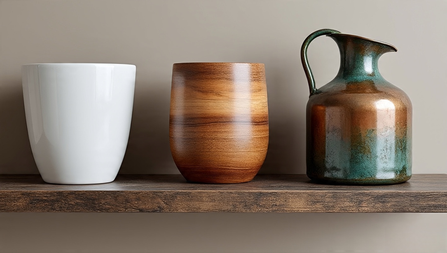 The finishes around your plants matter. Bathrooms are harsh environments steam, heat, and cleaning chemicals all interact with surfaces.
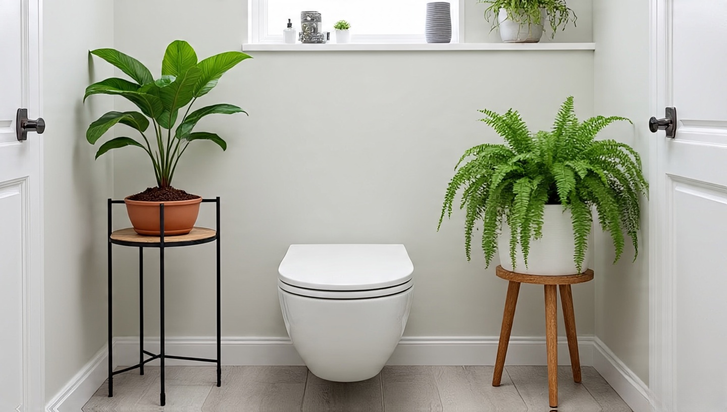
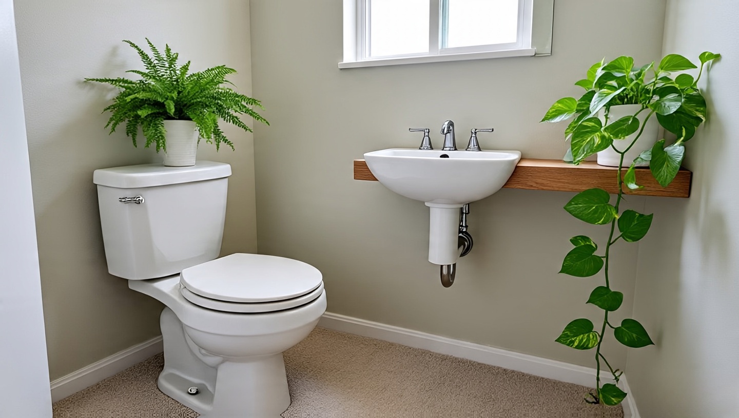 Even the tiniest powder rooms can host plants. A single fern on the back of a toilet tank, or a pothos trailing from a wall shelf, creates life without clutter.
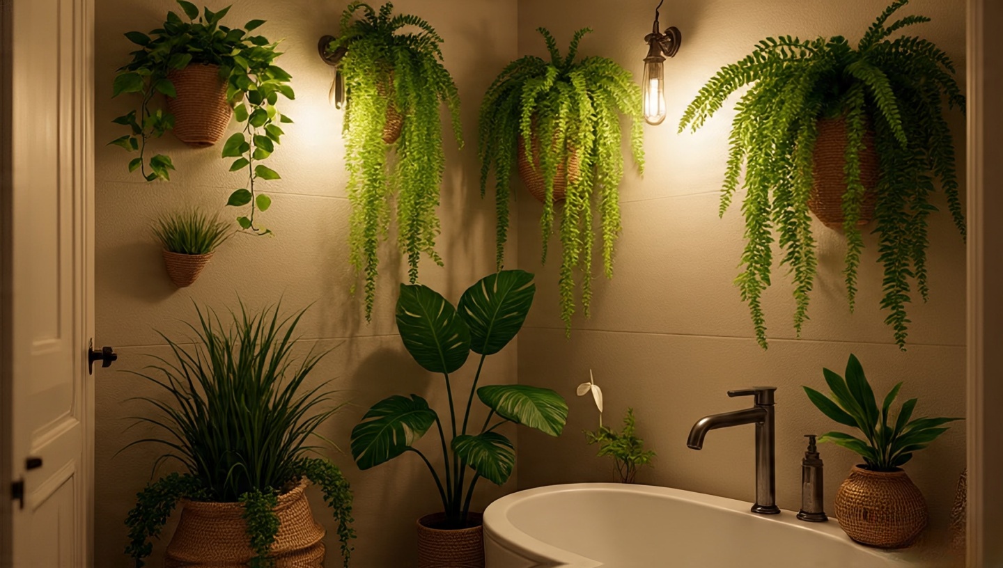 Design isn’t only about aesthetics it’s about how spaces make us feel. Studies show greenery lowers stress levels. But you don’t need research to feel it: stepping into a plant-filled bathroom feels more like entering a retreat than a utility zone.
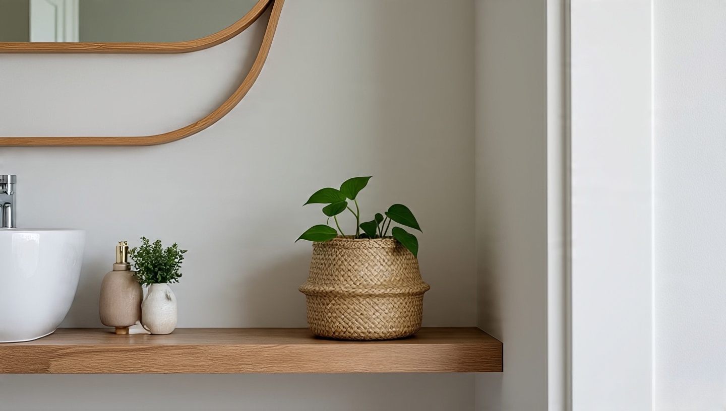 After three decades, my best advice is simple: start small. Try one plant. Watch how it reacts. Bathrooms are tricky microclimates, and not every plant will love yours. But half the fun is in the trial and error. The mistakes teach you as much as the successes.