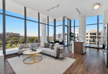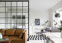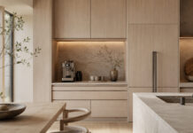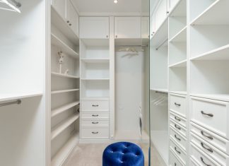


The gallery credited to ARTSTUDIO Design uses black and white across several rooms, with timber tones, gray surfaces, and textiles softening the contrast. The images show that a limited palette can still vary in proportion from one space to another.
Compare the amount of dark surface
The living area uses a dark sectional sofa against pale walls and curtains. The bedroom keeps a similarly light background while concentrating darker material around the bed. In the bathroom, dark surfaces occupy much more of the image.
Try samples in the actual room before extending a dark finish across a large area. Check how the finish looks under normal evening lighting, and obtain the intended product’s cleaning and maintenance instructions.
Notice the outlines
Slim dark fittings and cabinetry edges create a graphic effect against the pale background. In a small room, repeated outlines can become visually busy. Choose the main elements to emphasize rather than copying every contrast at once.
Test the practical arrangement
The kitchen and dining views show how a pale working surface sits alongside dark cabinetry. Mark storage openings and occupied seating on your own plan. Bathroom fixtures, glazing, and lighting require a proper installation specification; their appearance in the image does not establish suitability for another room.
For a reversible first step, compare black and white textiles with a timber or warm neutral sample before changing fixed finishes. The gallery retains the original credits and distinct source views from the consolidated articles. No room dimensions, product performance, or claimed effect on mood is inferred from the palette.
Gallery and image credits