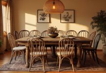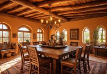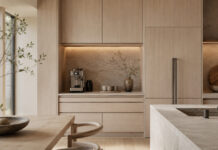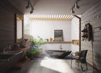

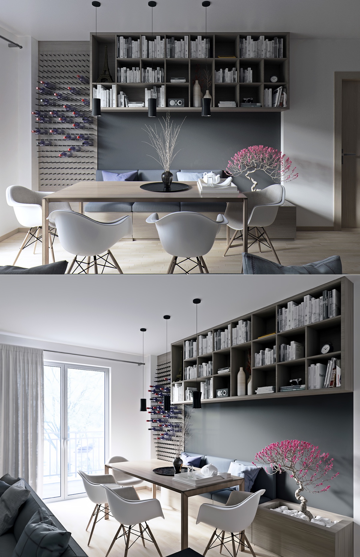
A white dining scheme does not require every chair, wall and floor to match. These images show different ways to use a light base with greenery, timber tones, dark boundaries and decorative accents. Compare what is visible, then test the idea against the dimensions and use of your room.
1. Frame a small light dining setting with greenery
White sculptural chairs and a compact table sit between glazed edges and a green kitchen accent. The stronger colour is kept behind the seating rather than repeated everywhere. Check the table size and clear route to the doors before using a similar courtyard-facing arrangement.
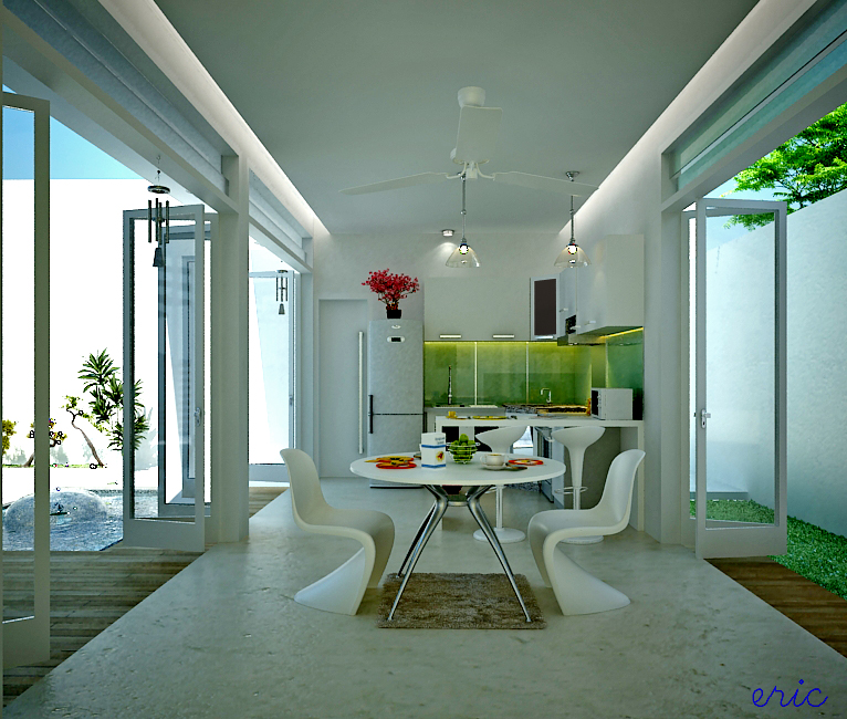
2. Bring warmth through the table
A timber-toned table and chairs give this pale kitchen-dining setting a warmer centre. The broad pendant makes the eating place legible beside the cabinets. You can keep the surrounding scheme light while letting the table provide most of the visual weight.
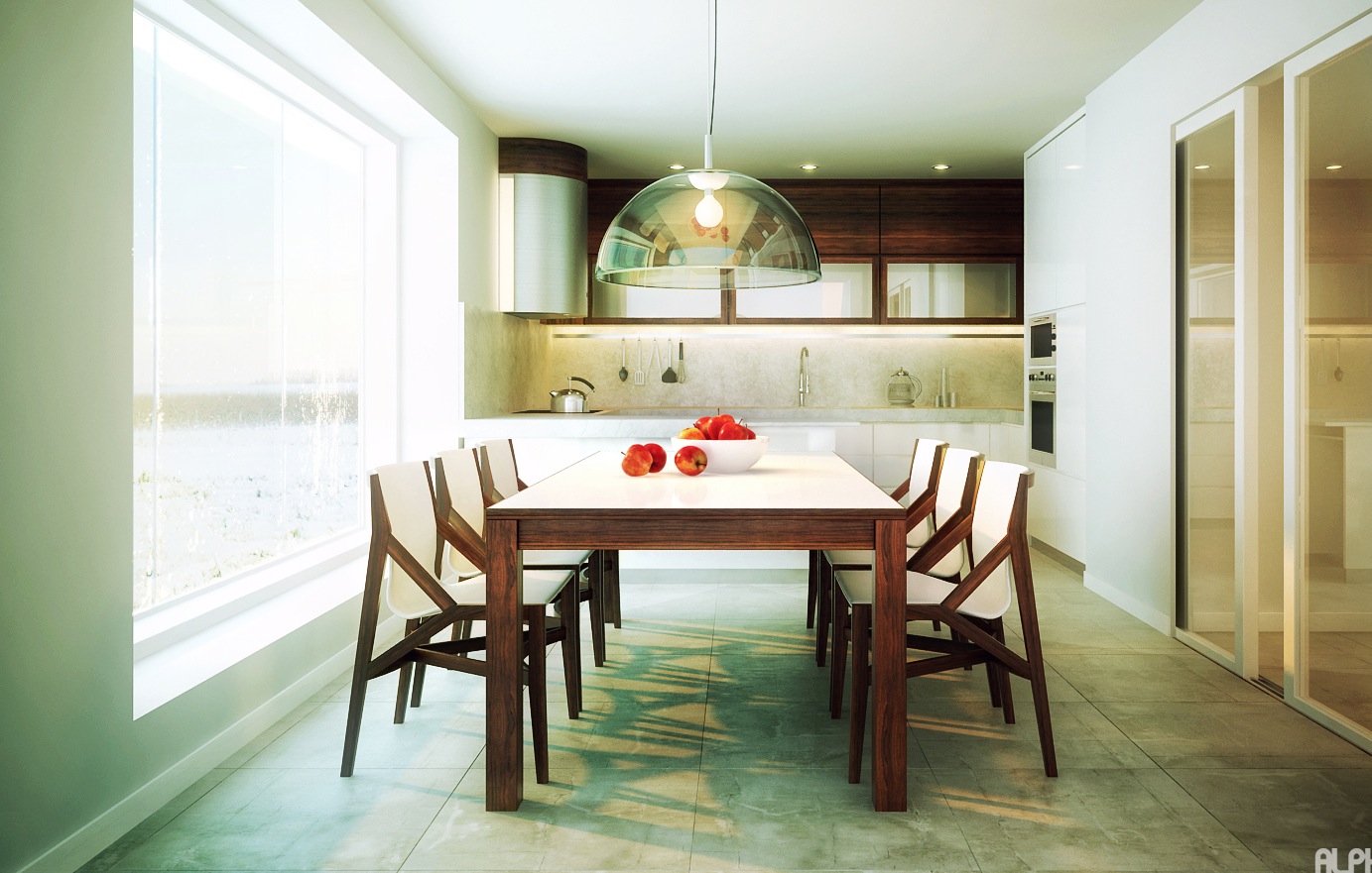
3. Use a darker room boundary
The central light setting is framed by darker walls, a purple-toned strip and a shadowed ceiling edge. This makes the contrast do the work instead of adding more ornaments. Sample dark paint under the actual lighting; the same colour can read quite differently in a brighter room.
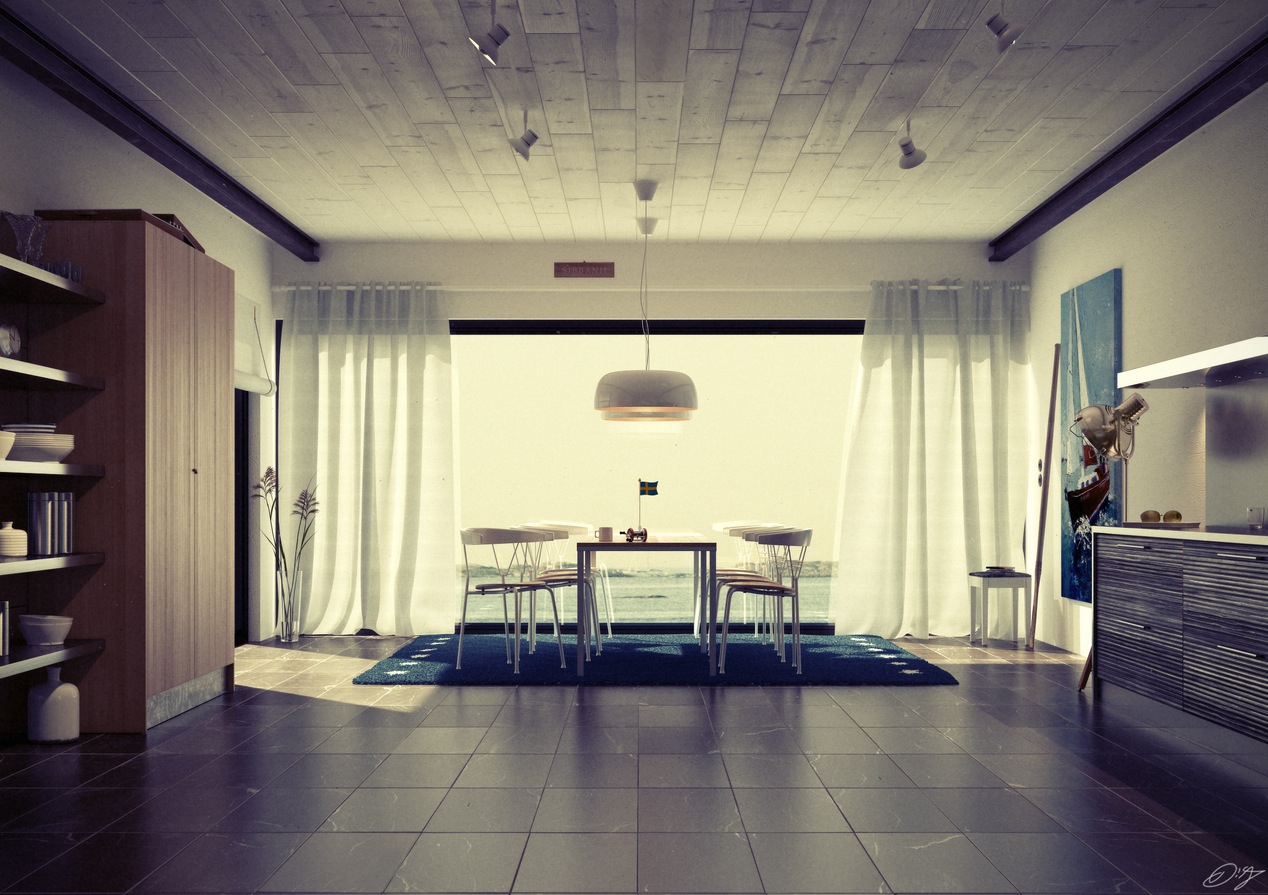
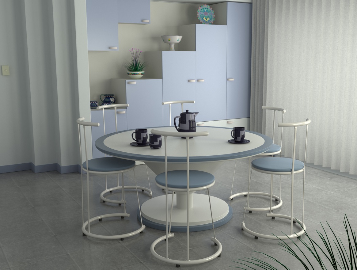
4. Repeat a soft blue-grey accent
The round table and slender chairs remain visually light, while blue-grey surfaces and storage add a restrained secondary colour. A round tabletop still needs useful clearance when every chair is occupied. Compare the full seating footprint rather than the top diameter alone.
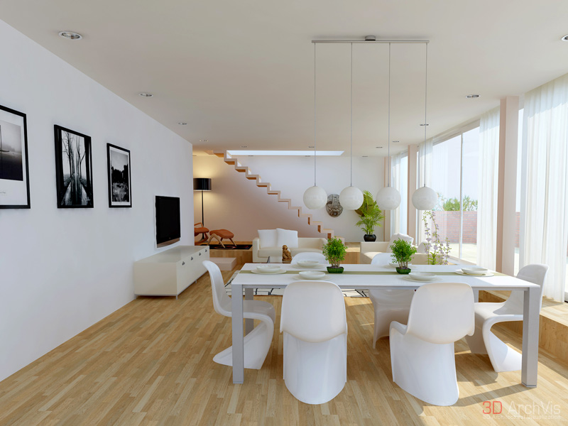
5. Let the floor carry the warmth
White chairs and a light table sit over a warm floor, with stairs and windows shaping the space. The arrangement shows how a restrained palette can still have contrast. Keep routes to the stairs and doors clear when adapting a dining setting in an open-plan room.
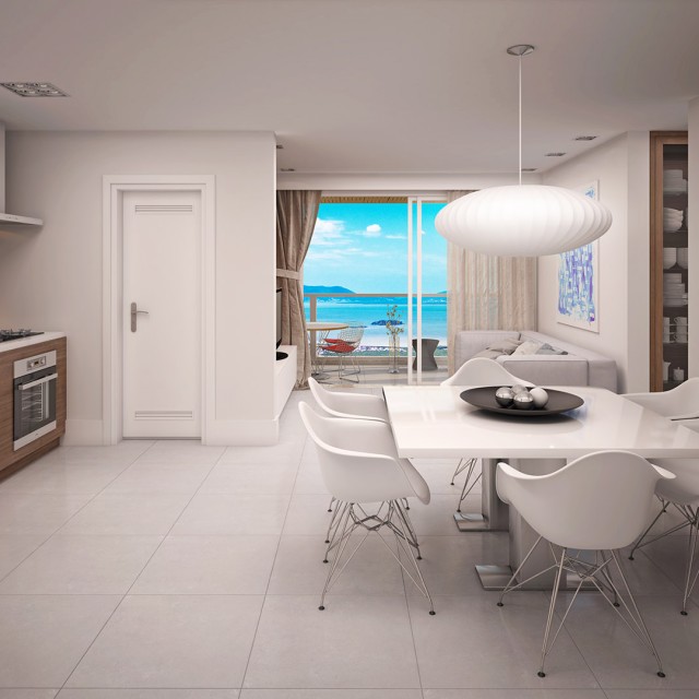
6. Keep the view visible beyond the table
A pale dining setting and a large rounded pendant sit on the axis toward an outdoor view. The quiet furniture palette supports that view. Test glare and evening reflections as well as the daytime photograph before deciding on glazing, shades or a lamp finish.
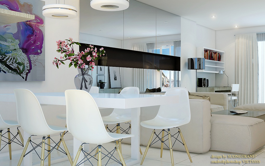
7. Concentrate strong colour in artwork
White moulded chairs and a pale table share the room with a colourful painting and a dark suspended light. The artwork provides most of the colour variation. Repeat one colour in a small object if desired, rather than adding several unrelated accents at once.
8. Use timber-toned surroundings with a light seating group
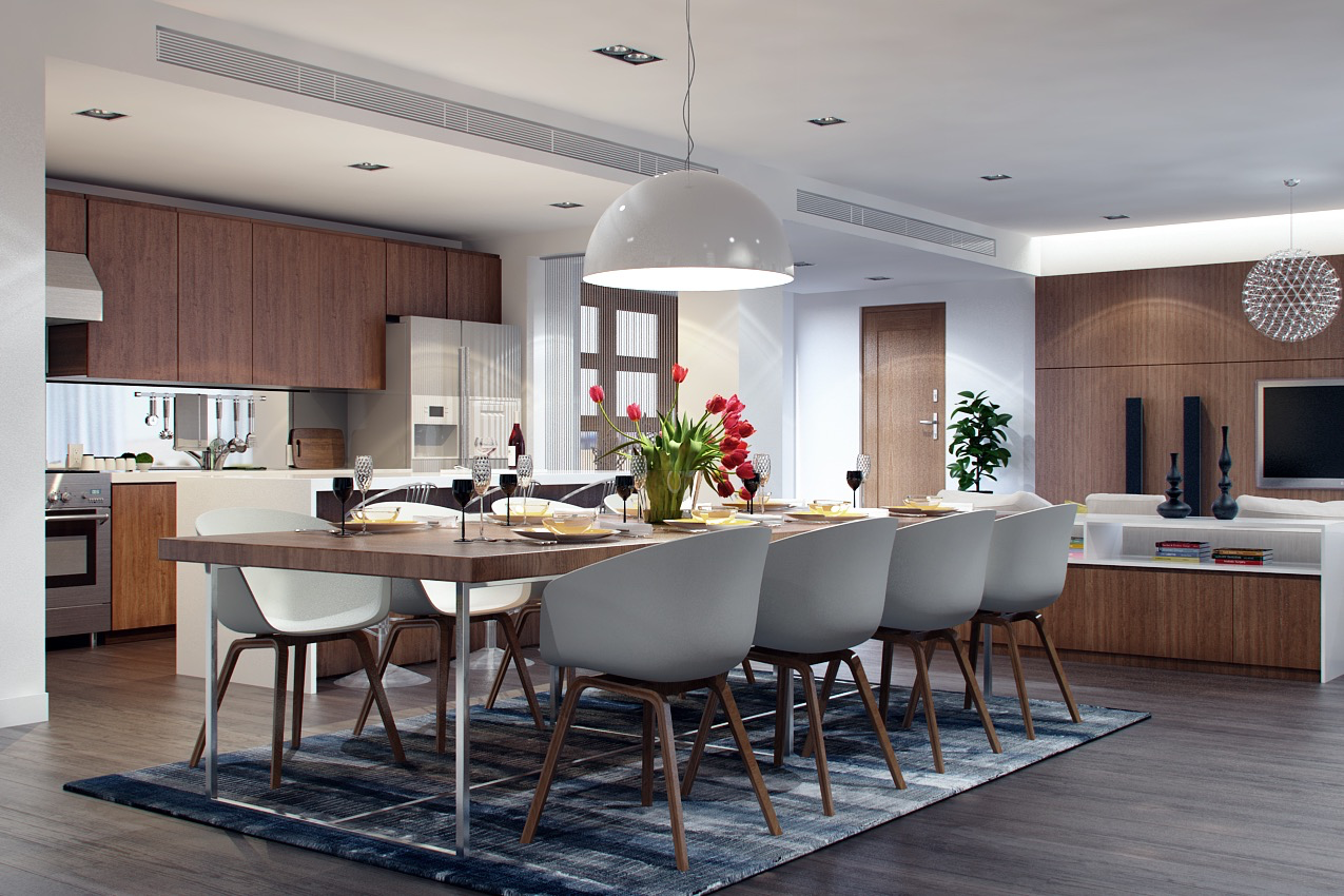
The pale chairs stand out against warmer wall and floor tones, while a darker rug defines the group. This is a balance of surface areas rather than a rule that every surface must be white. Check rug care and chair movement before deciding whether a rug suits your dining routine.
9. Frame the dining area with darker storage
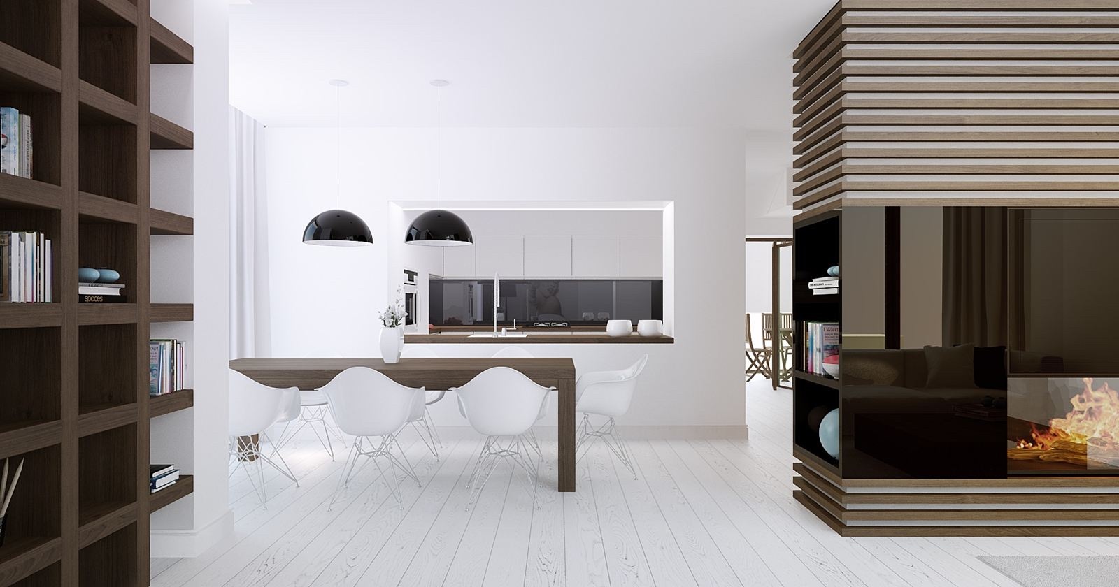
Tall dark shelving makes a strong boundary beside the light table and chairs. The upper slatted element adds another layer of structure. Consider what the shelving will hold and whether its visual weight suits your room instead of copying an empty display alone.
10. Use woven pendants over casual dining
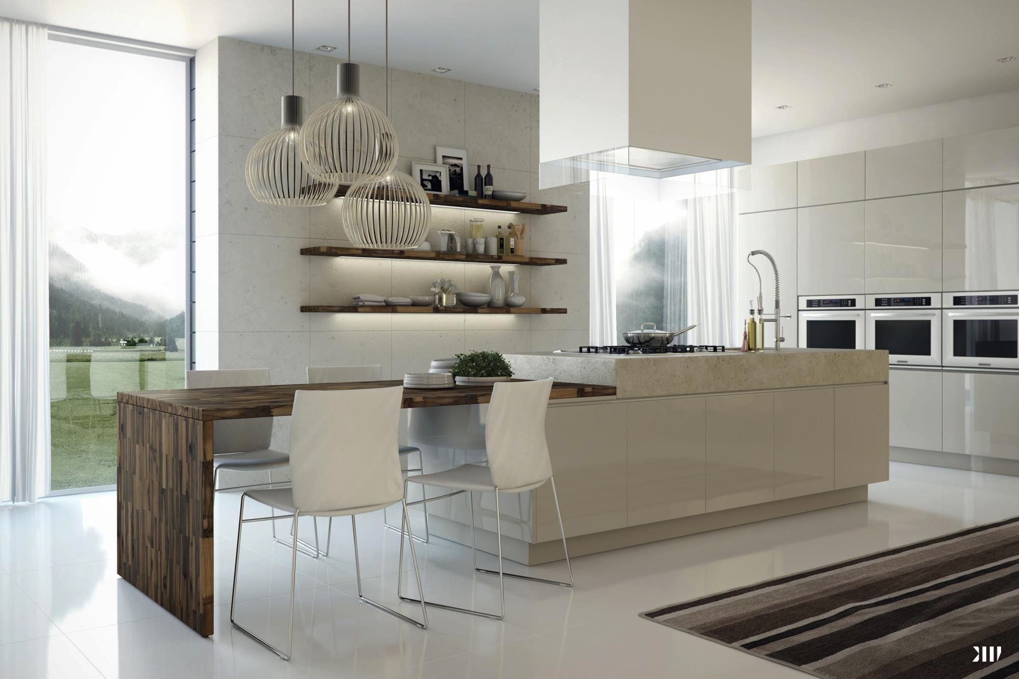
The final example is kitchen breakfast seating rather than a separate formal dining room. Pale fronts and woven-looking pendants share the room with darker open shelving. Decide whether counter seating really meets your household’s eating needs before replacing a conventional table.
Take one principle from each example—where the contrast sits, which surface carries warmth, or how the light defines the table. Obtain material specifications, exact dimensions and the required installation assessment before adapting an idea from a photograph or visualisation.