

Wood-look surfaces can occupy an island front, a cabinet band or almost the entire kitchen. These nine images show how changing the amount and position changes the room. Read them as visual examples: confirm materials, dimensions, appliance clearances and care requirements from the actual products and room design.
1. Keep the wood at the island front
The wood-toned island face stands against a largely white bank of tall cabinets. Dark worktops define the working surfaces, while the stools connect the island to everyday seating. This is a useful approach when you want one warm focal point rather than matching every cabinet front.

2. Use the floor to connect two spaces
Here the timber-coloured floor and level change lead toward the kitchen beyond. The contrast between the darker kitchen enclosure and brighter adjoining space makes that transition prominent. In a real renovation, assess structural changes and accessible circulation before copying a stepped floor arrangement.

3. Give one tall surface the warm finish
A tall wood-toned panel draws attention upward while the counter and seats stay light. The hanging lights repeat that vertical emphasis. Compare this with wrapping every surface: one plane may provide enough warmth while leaving the eating area visually open.

4. Pair pale fronts with a reflective splashback
Light wood-toned upper cabinets sit above a warm, reflective splashback, while lower cabinets remain white. The effect comes from contrasting both colour and reflectivity. Before choosing a similar finish, ask about cleaning, joints and suitability behind the actual cooking area.
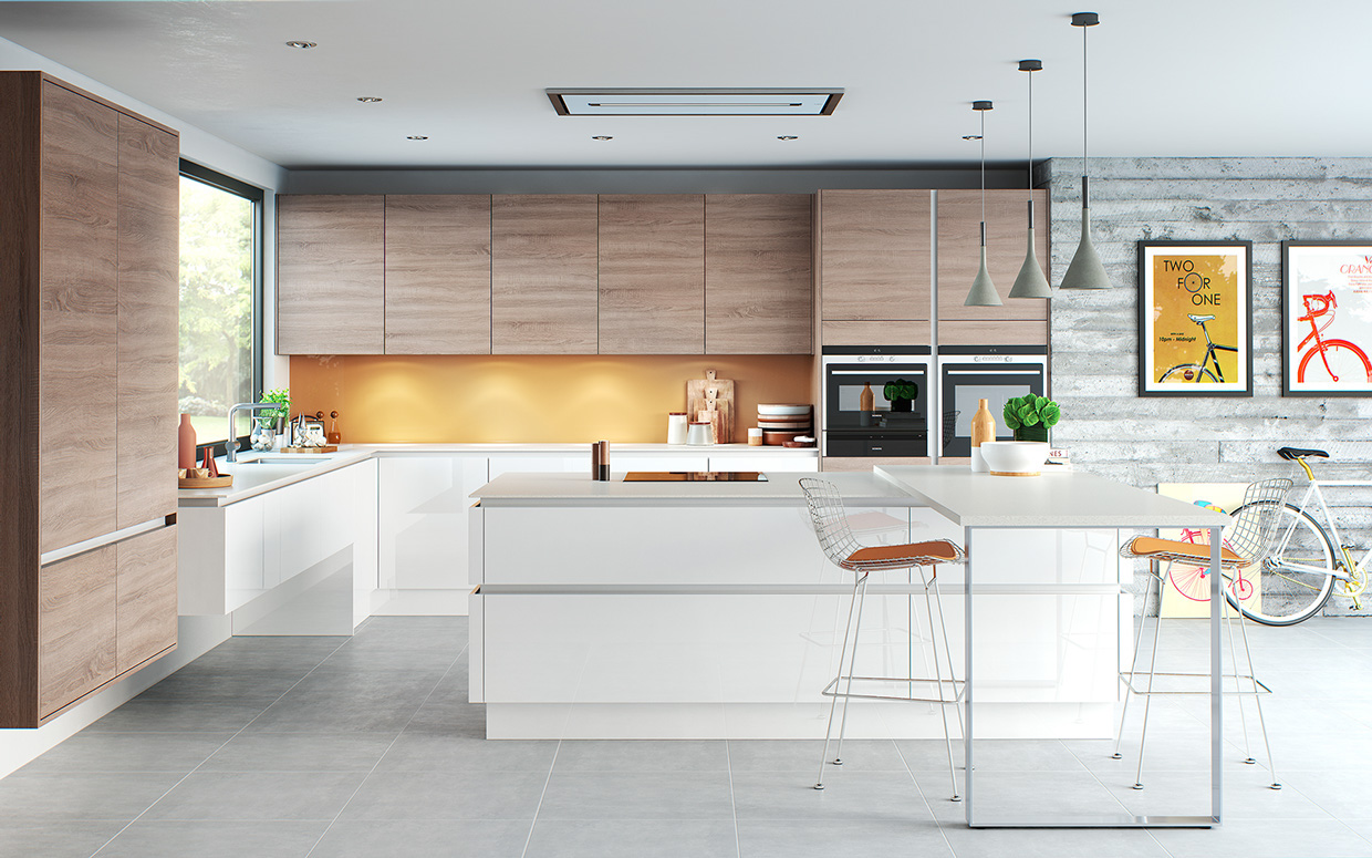
5. Balance a white island with a cabinet band
The pale island is set against a continuous strip of wood-toned cabinetry. Large floor divisions and the prominent hood give the composition a strong framework. Test whether the stools, open appliance doors and main walking route can coexist in your measured layout.

6. Use a light cabinet block inside a warmer envelope
The white upper block stands out from surrounding timber-coloured surfaces. That contrast keeps individual functions legible in a room with a strong grain pattern. Sample the finishes together: several similar wood tones can still look mismatched when their undertones and grain direction differ.

7. Let the ceiling become the accent
Slatted-looking timber surfaces and a skylight give this kitchen a different emphasis from a wood-fronted island. The large hood sits on the same visual axis. Ceiling treatments, ventilation and equipment clearances need coordinated design; an image does not supply an installation specification.

8. Repeat warmth in a niche and the dining table
The cabinetry is mostly quiet grey, with wood-toned surfaces in the recessed working area and nearby dining furniture. Repeating a limited accent can connect the two zones. Keep the recess useful by checking lighting, sockets and cleaning access before adding decorative objects.

9. Use the floor beneath a largely white kitchen
A pale floor carries warmth under continuous white cabinetry, while dark open shelving adds a separate horizontal line. The dining table visually continues the kitchen space. Consider how much storage can remain open in your own household without making daily cleaning and organisation harder.

Choose the location of the warm finish before selecting the exact shade. Compare a small material sample beside the wall colour, worktop and floor under the room’s daytime and evening light. The illustrated grain does not identify a product as solid wood, veneer or a printed finish; obtain that specification separately.
Related reading
- Tiny kitchen ideas for storage, seating and layout
- Kitchen plants: choosing a spot and planning care