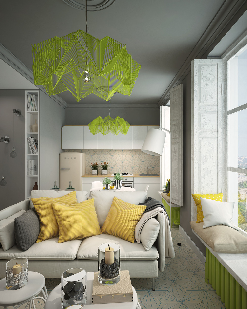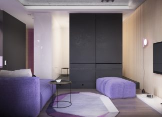


The source gallery credited to Irina Ovsyannikov uses bright green details against pale walls, white brick-looking texture, timber, and gray upholstery. Its useful idea is the controlled repetition of an accent color across connected areas.
Compare the accent at different scales
Green appears in a geometric pendant, seating or small details, and wet-area imagery. A strong color does not need to cover a whole wall to remain noticeable. Try one removable element first and compare it with the existing floor and daylight in your room.
Read the dining and living relationship
The dining table sits near the window while the sofa and television form a separate group. A compact room needs the route between them to remain usable. Mark the actual table, occupied chairs, and sofa on your own plan instead of relying on the apparent scale of a photograph.
Keep storage and wet-area work grounded in specifications
Hallway views show tall storage near doors, while the bathroom uses reflective and green-toned surfaces. Check door swings, cabinet access, and the real products intended for wet use. A gallery does not establish waterproofing or the safe location of electrical fittings.
Use these pictures to create a palette board and a furniture plan. Avoid repeating a specific floor-area claim unless it can be verified from a measured project source. The consolidated gallery below preserves distinct views and original credits, including additional angles previously published in a second RooHome article.
Gallery and image credits